Mojo San
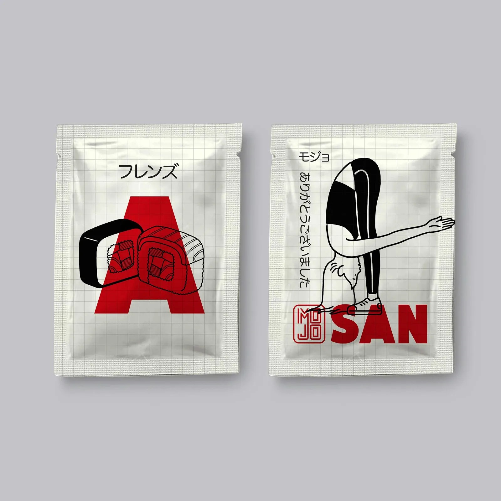
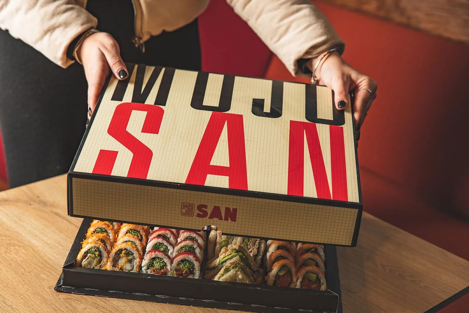
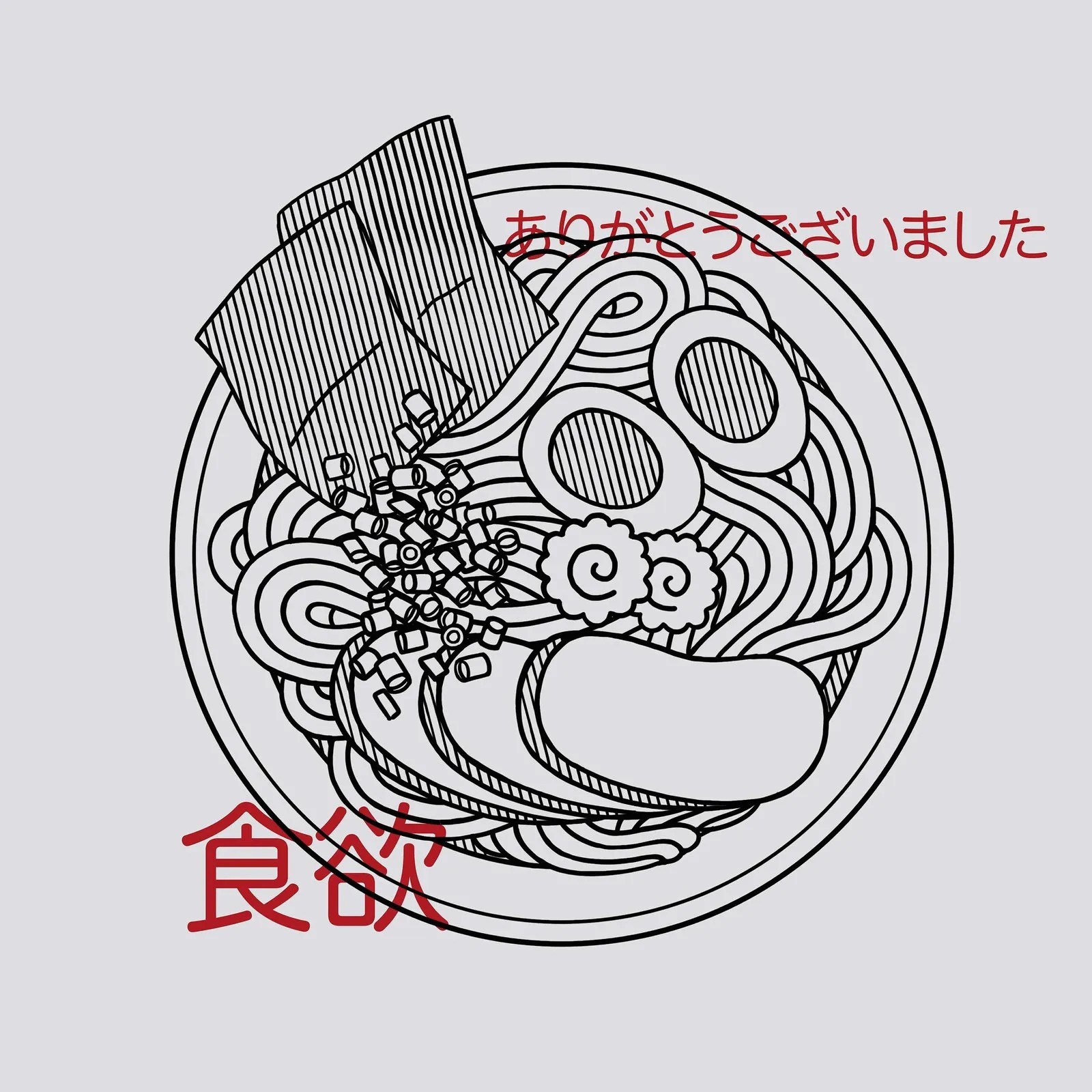
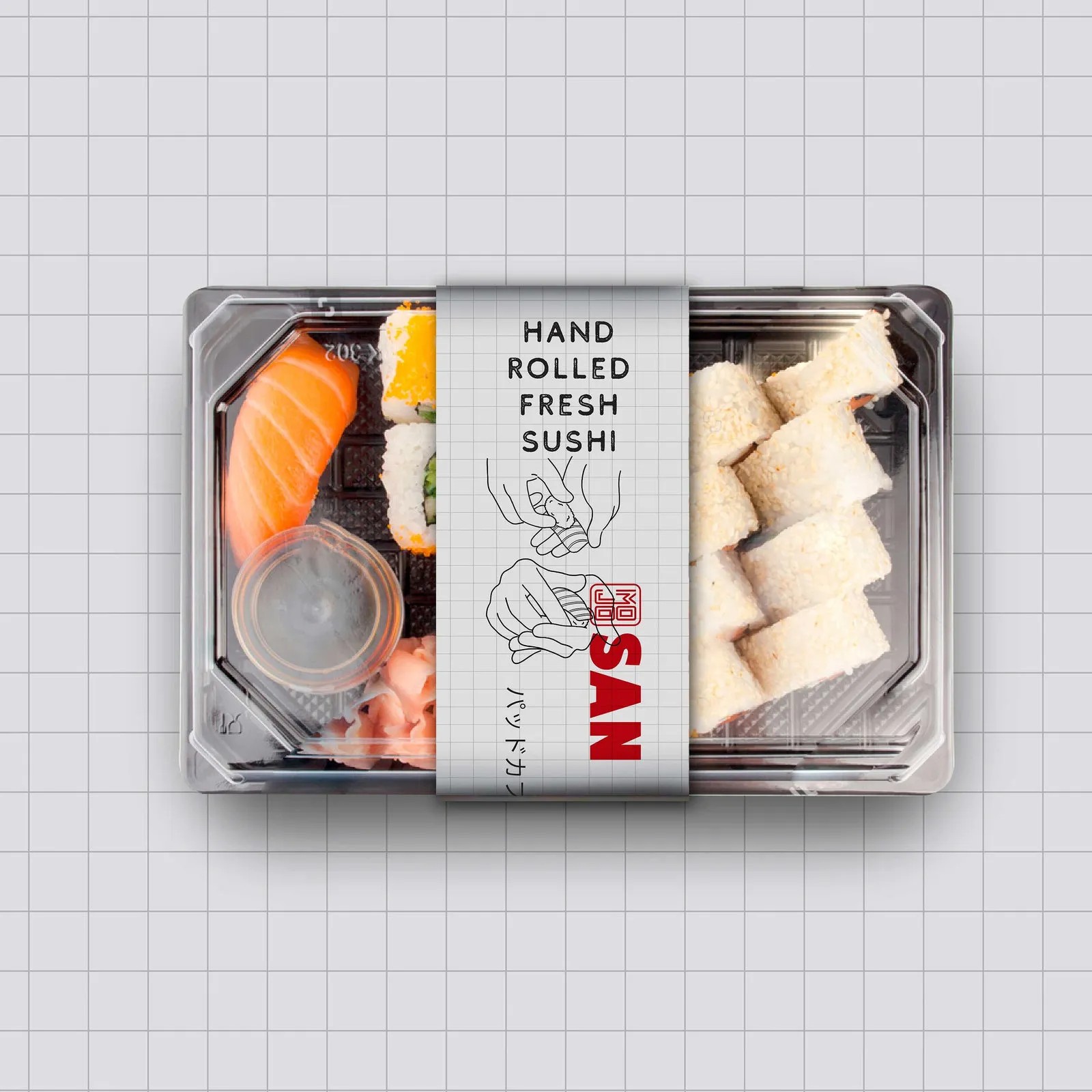
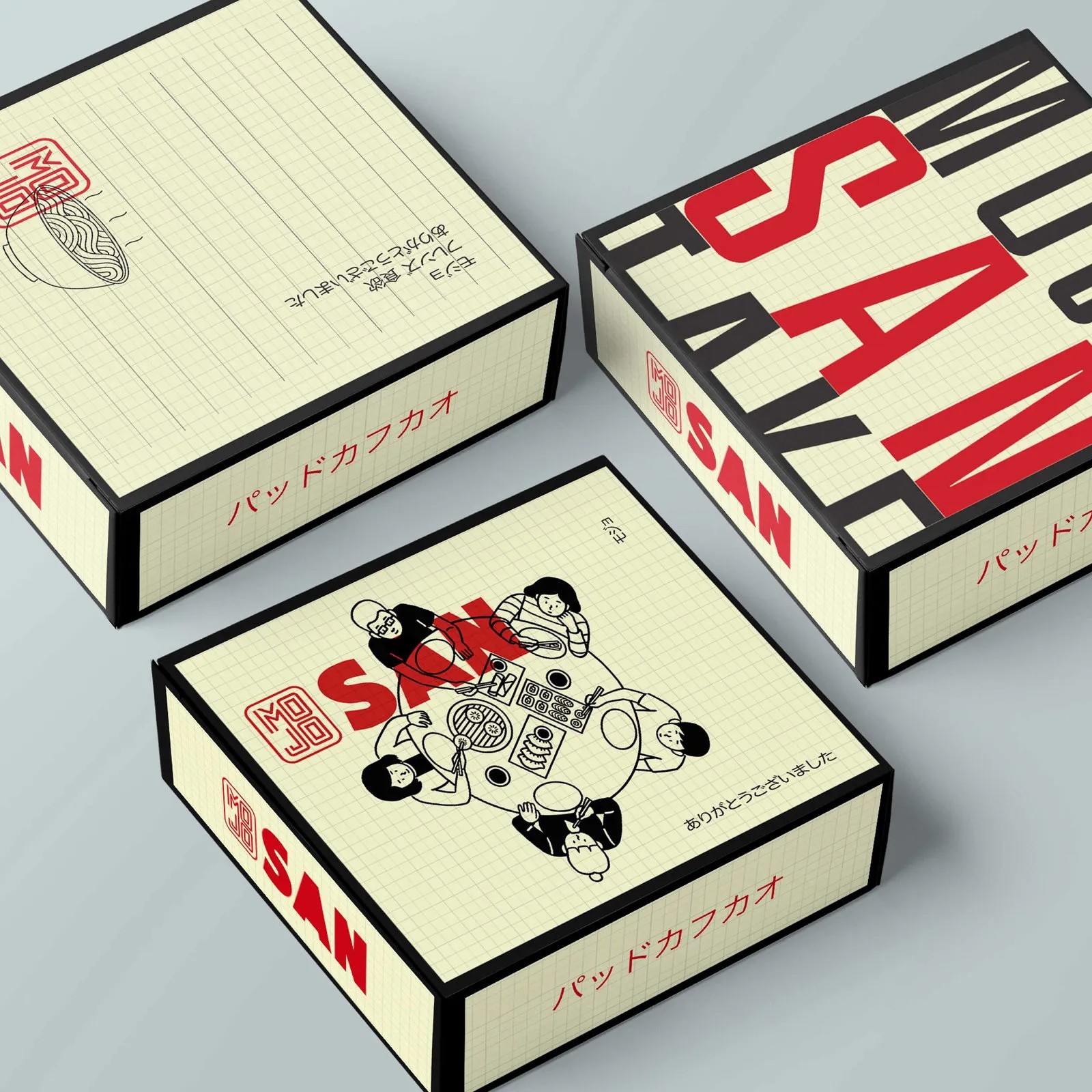
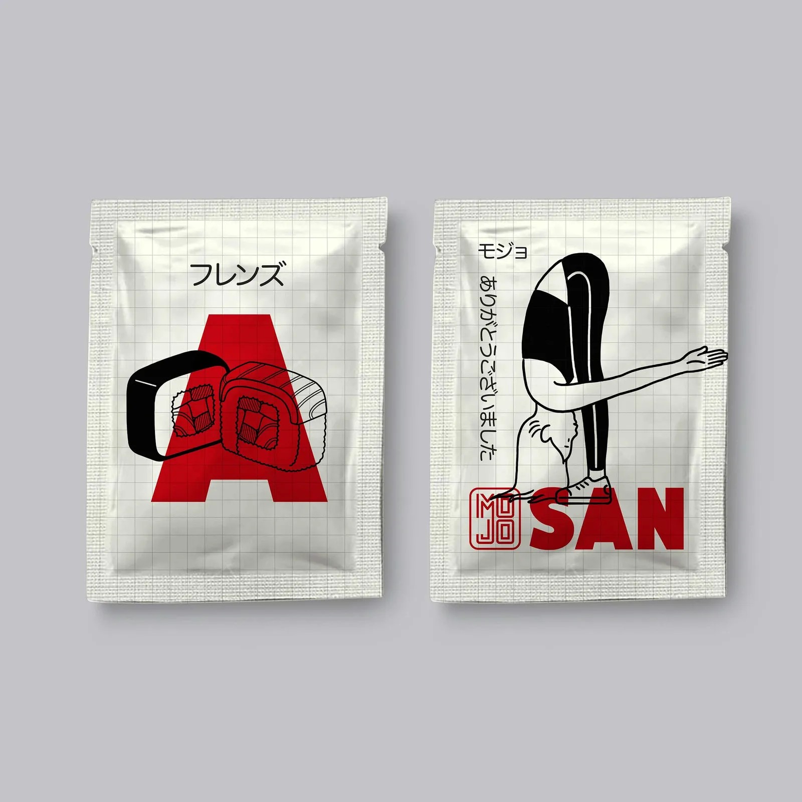
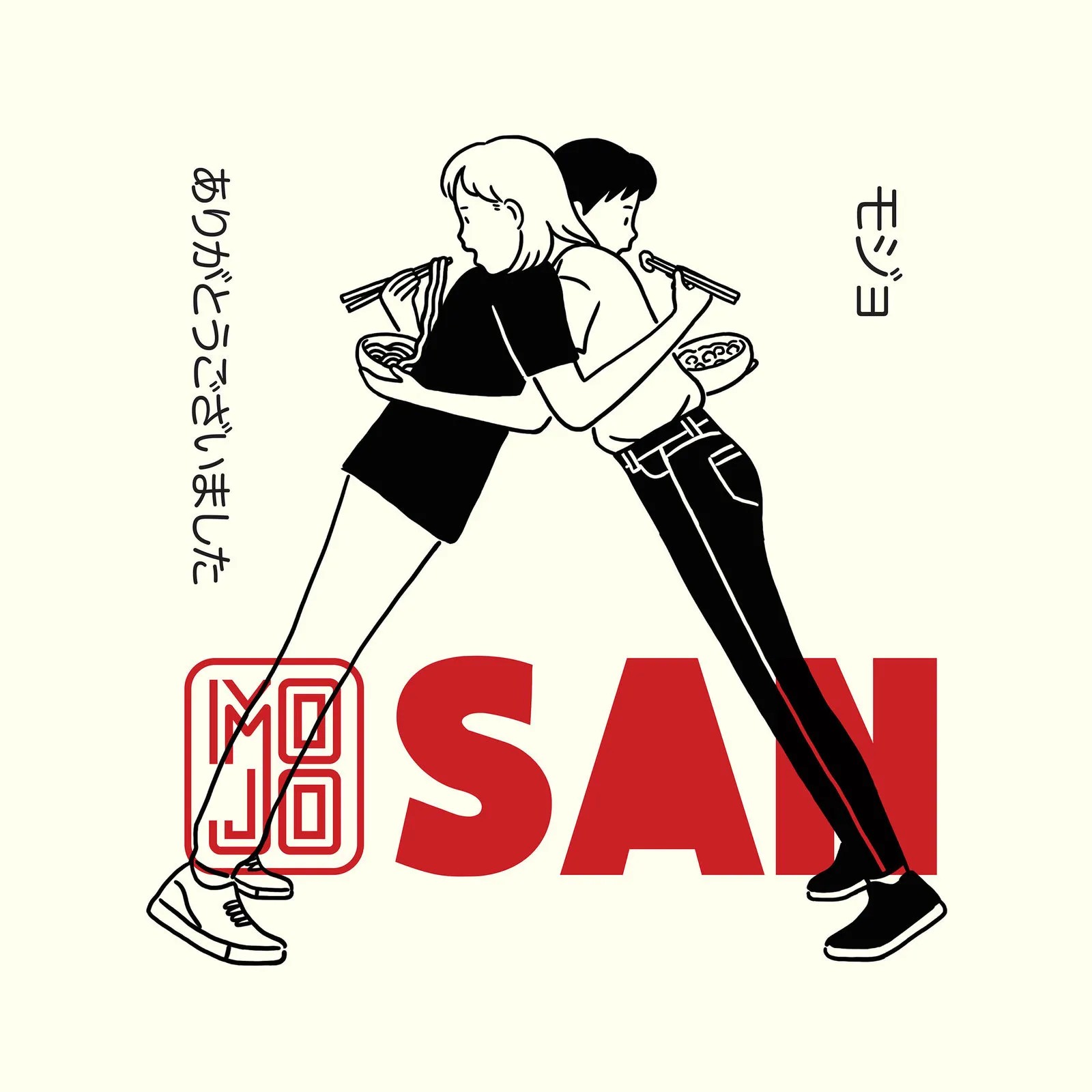
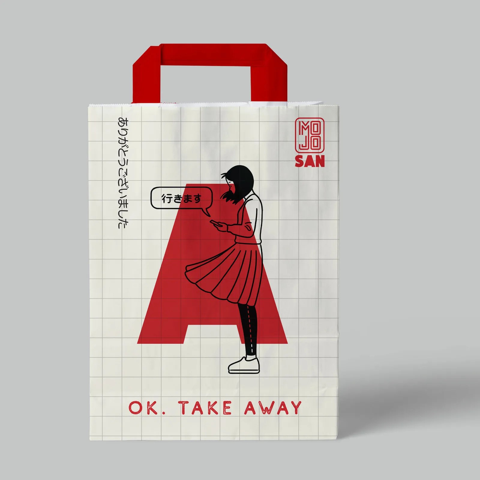
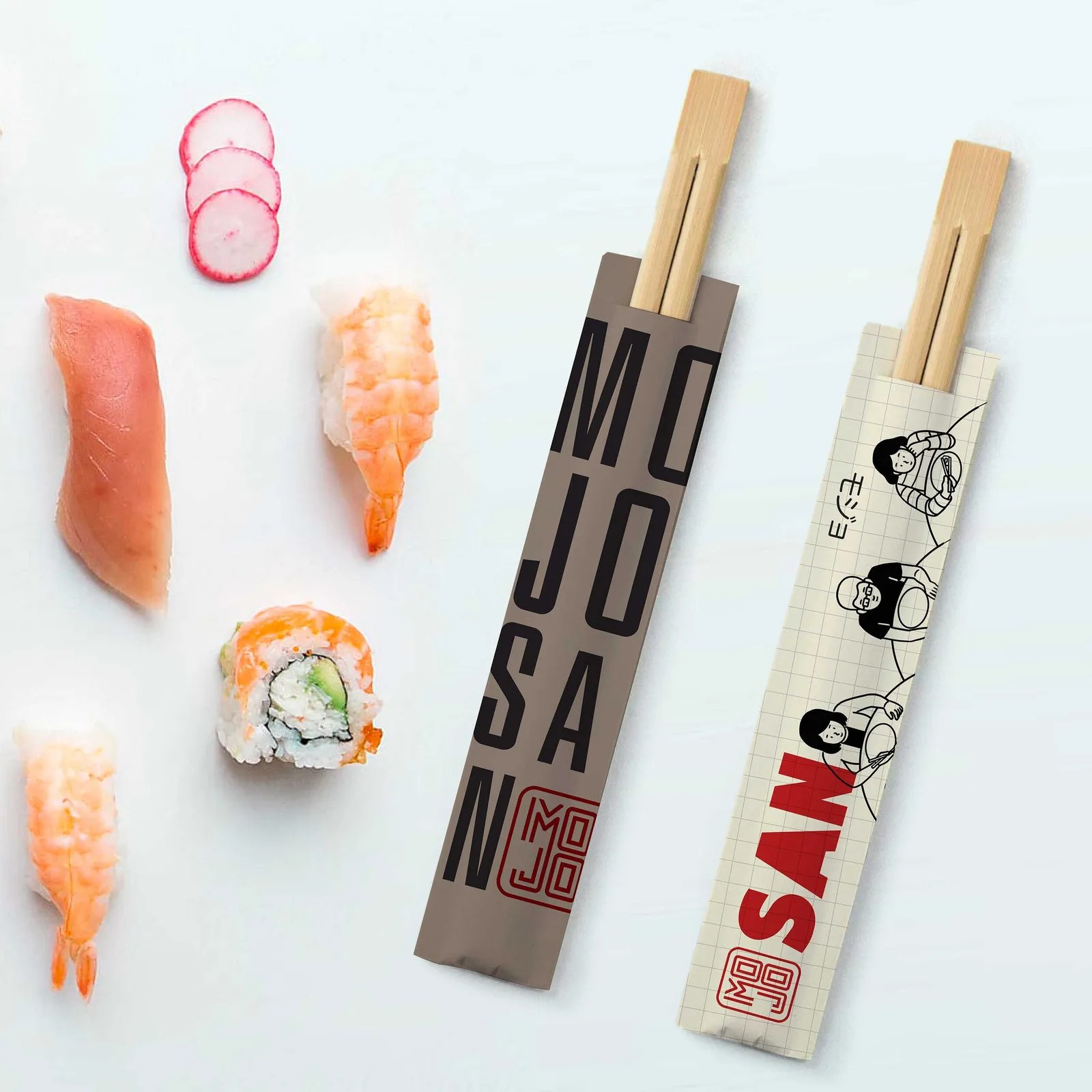
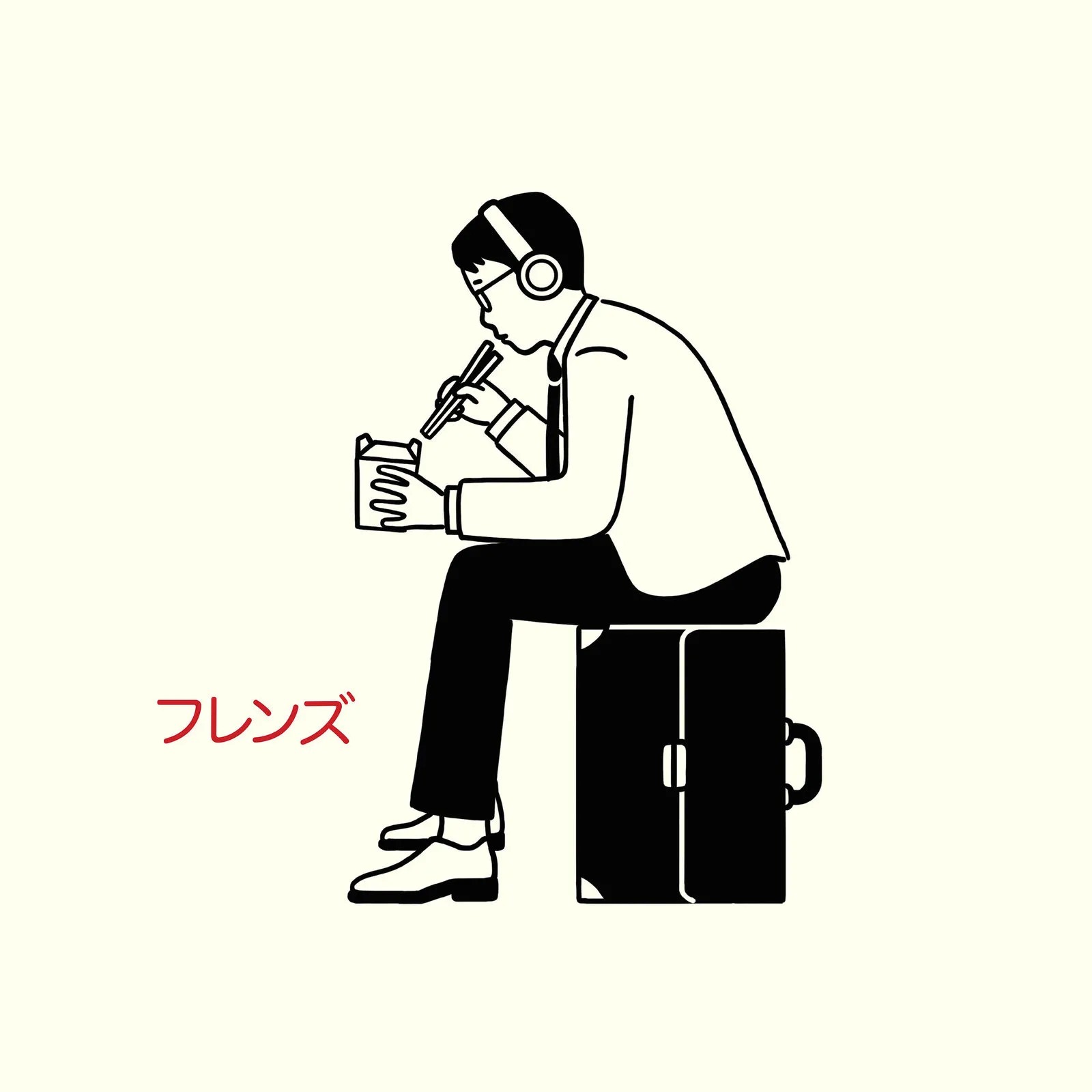
Branding and design for Mojo San, an Asian restaurant chain. I created a playful, character-led identity, with bold red typography and black line illustrations inspired by Japanese manga and street culture. The language runs across packaging, chopsticks, takeaway bags, signage and the interior.
Branding, packaging & illustration: Nadav Shtreimer



Comments
0 commentsLog in to comment or submit projects