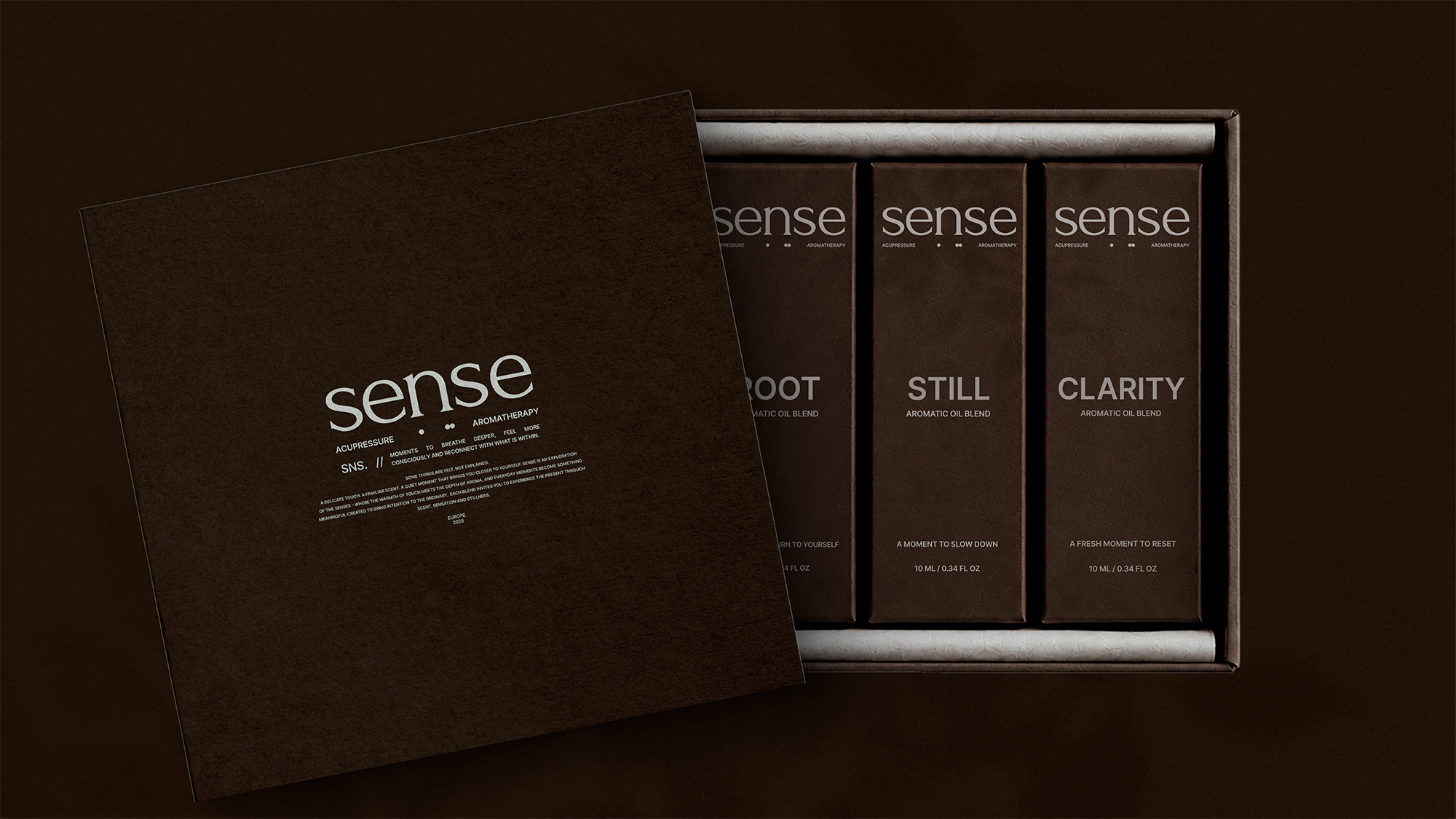

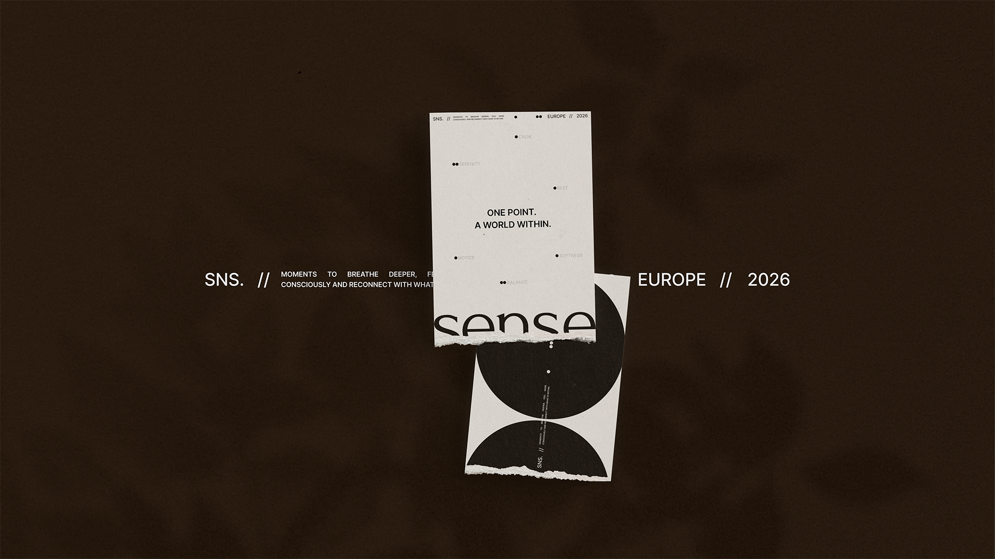
SENSE. is a packaging design concept for a wellness brand that explores the relationship between aromatherapy, acupressure and mindful self-care.
The project is built around the idea that reconnecting with yourself can begin with something small — a touch, a breath, a single drop. This philosophy became the foundation of the brand’s visual identity and packaging design.
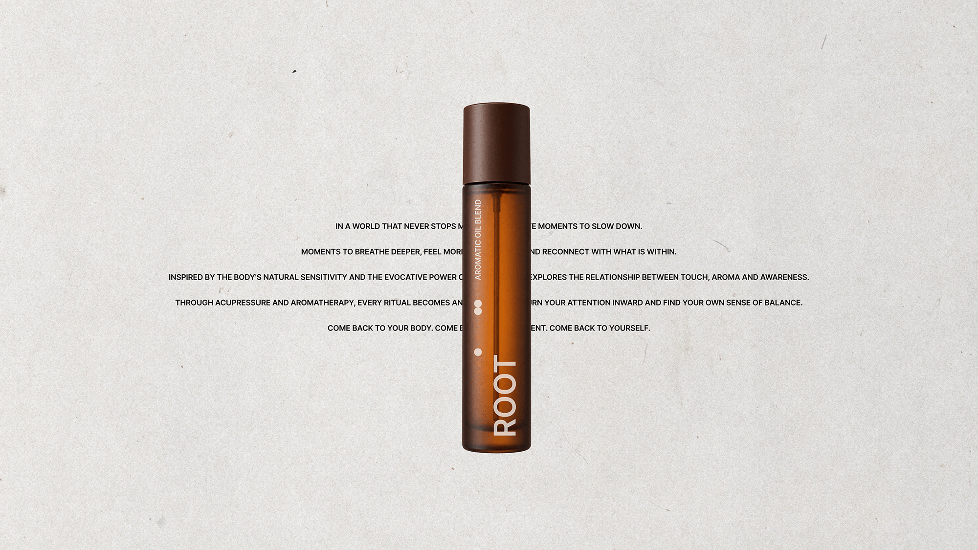
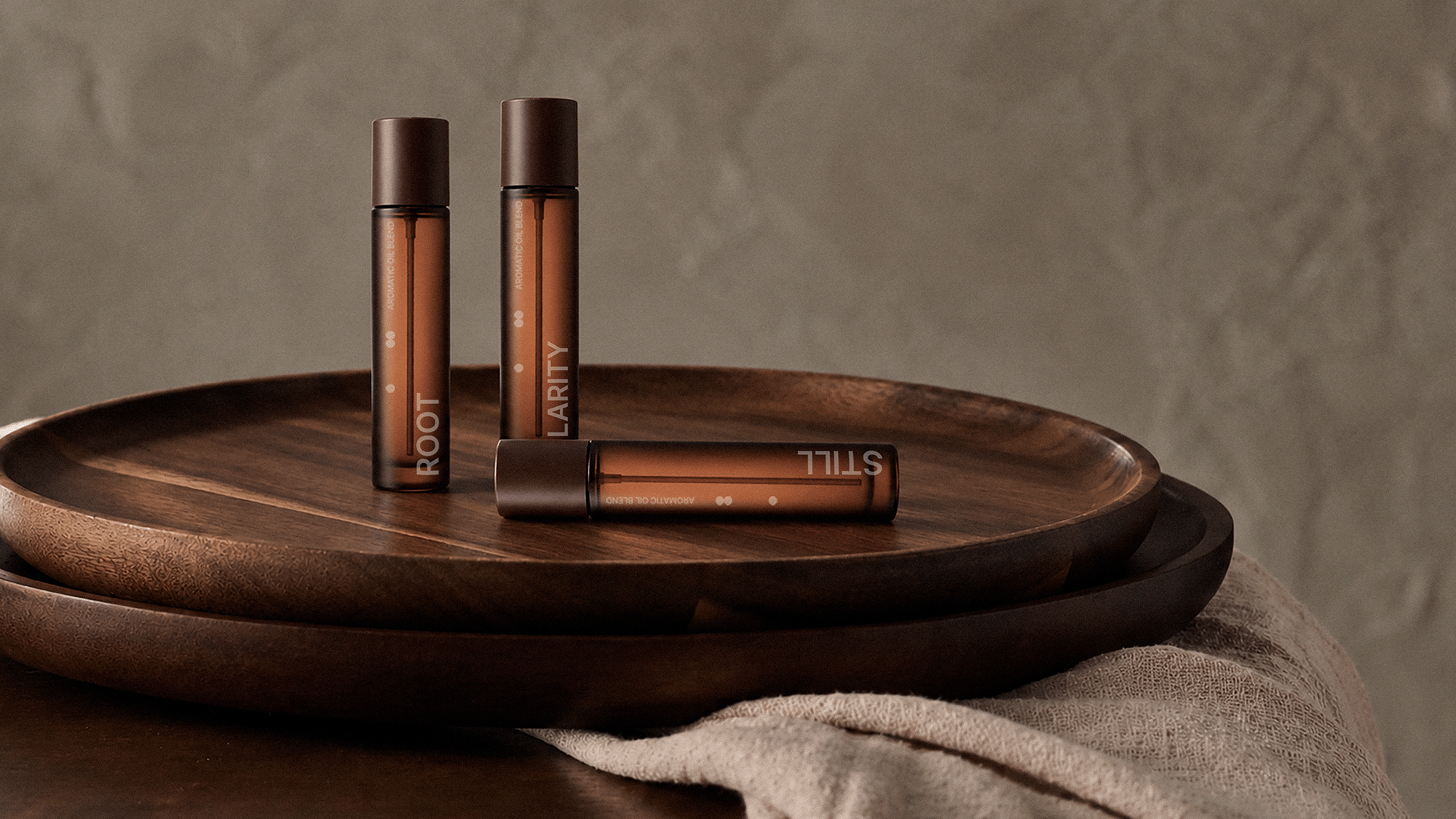
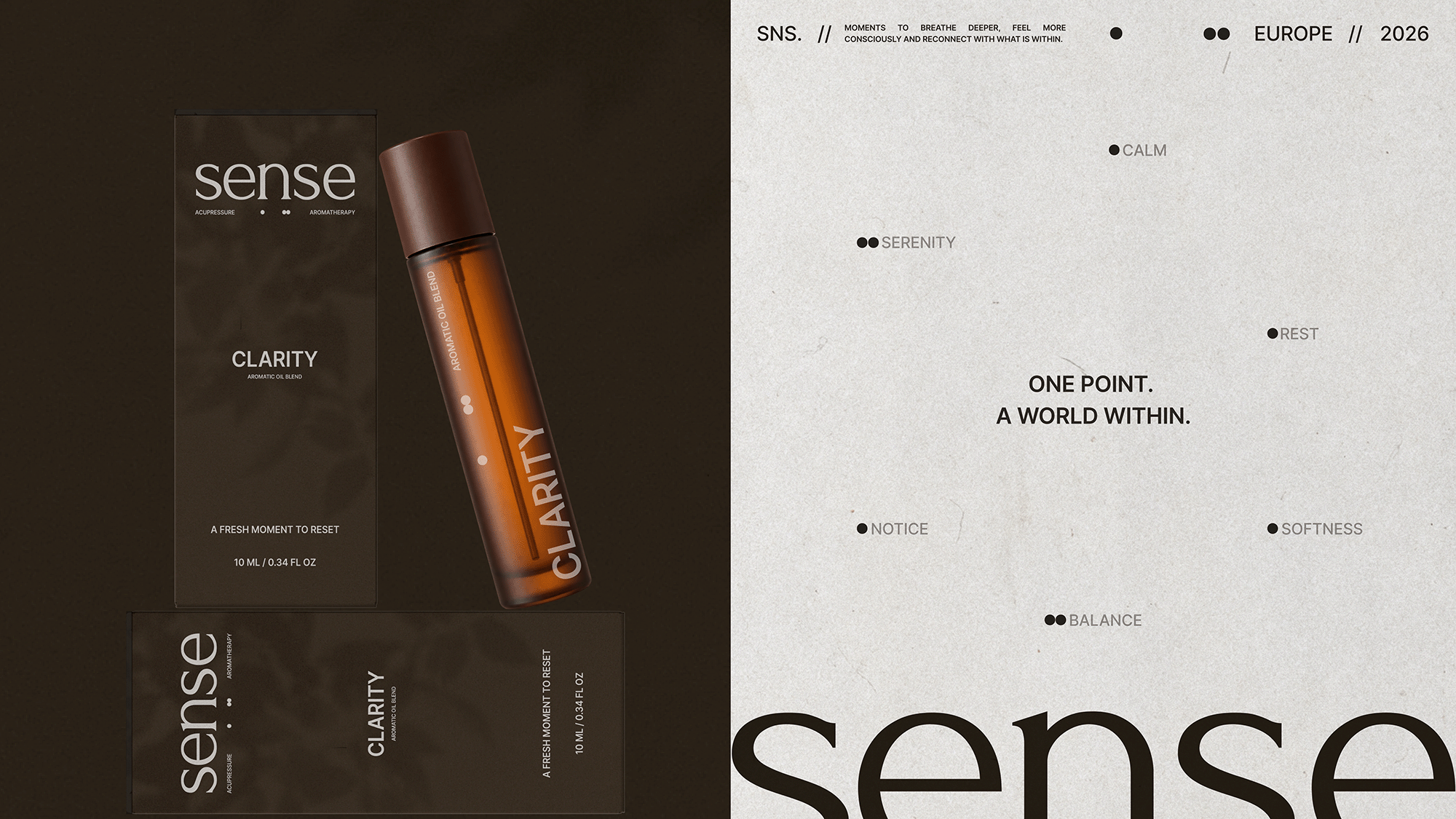
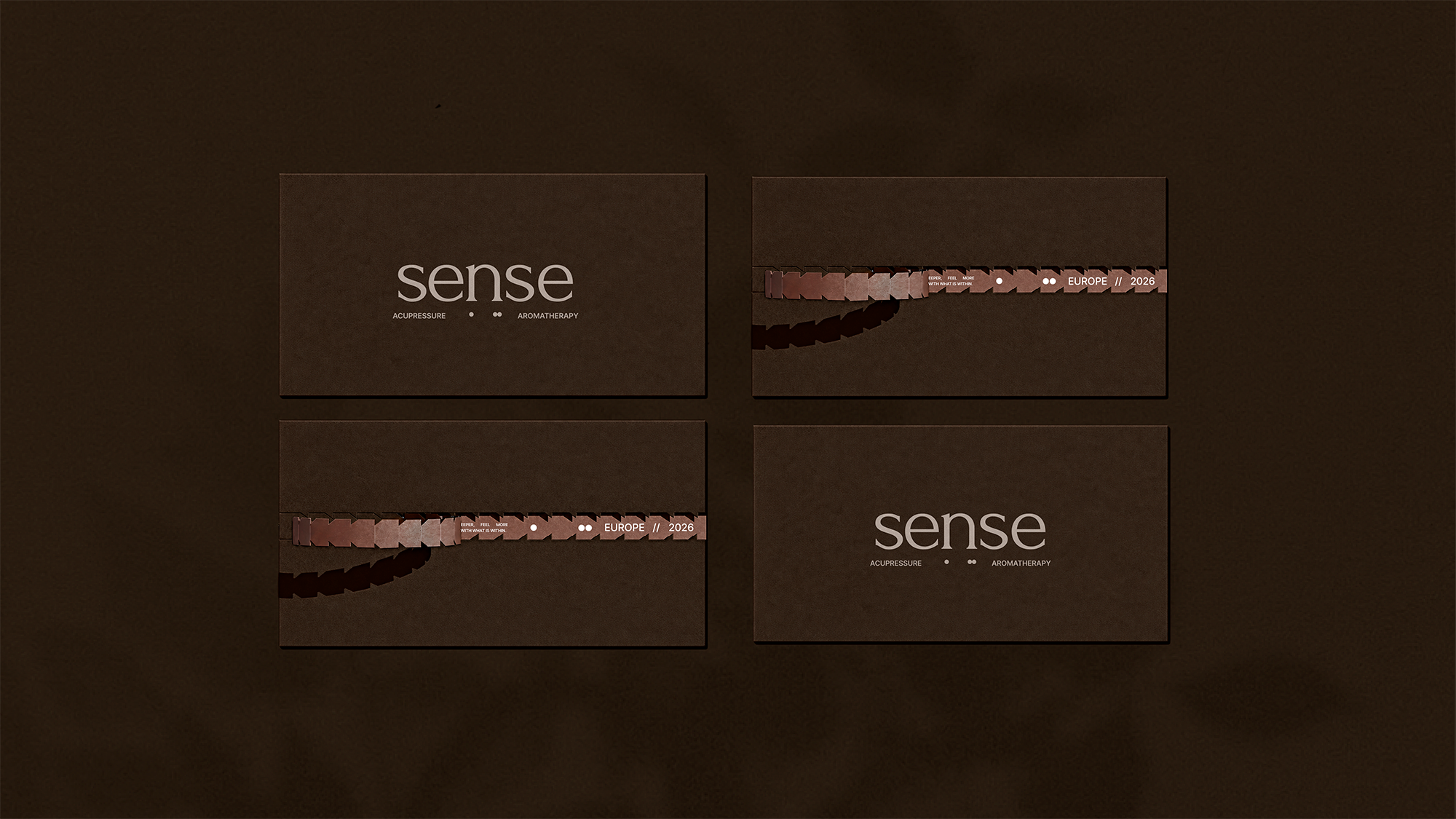
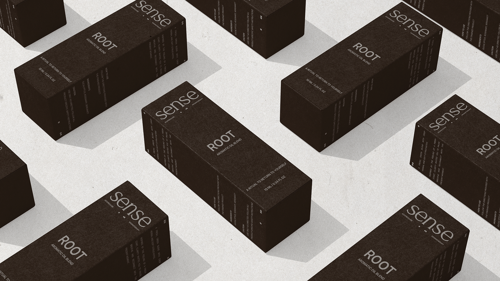
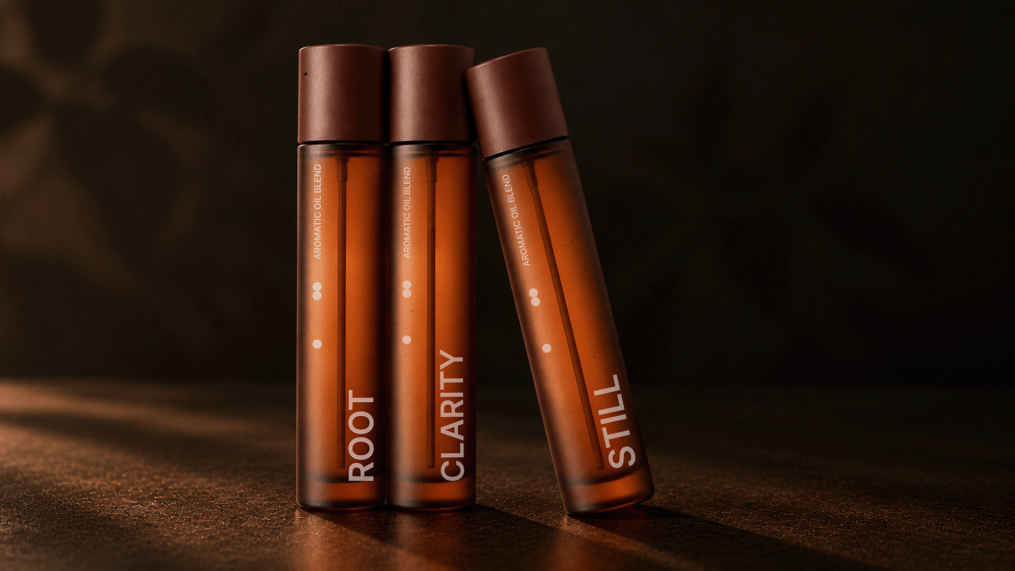
The visual direction combines understated elegance with a warm, sensory aesthetic. Deep chocolate tones, amber glass, tactile surfaces and delicate typography create a sophisticated visual language that feels intimate, natural and contemporary.
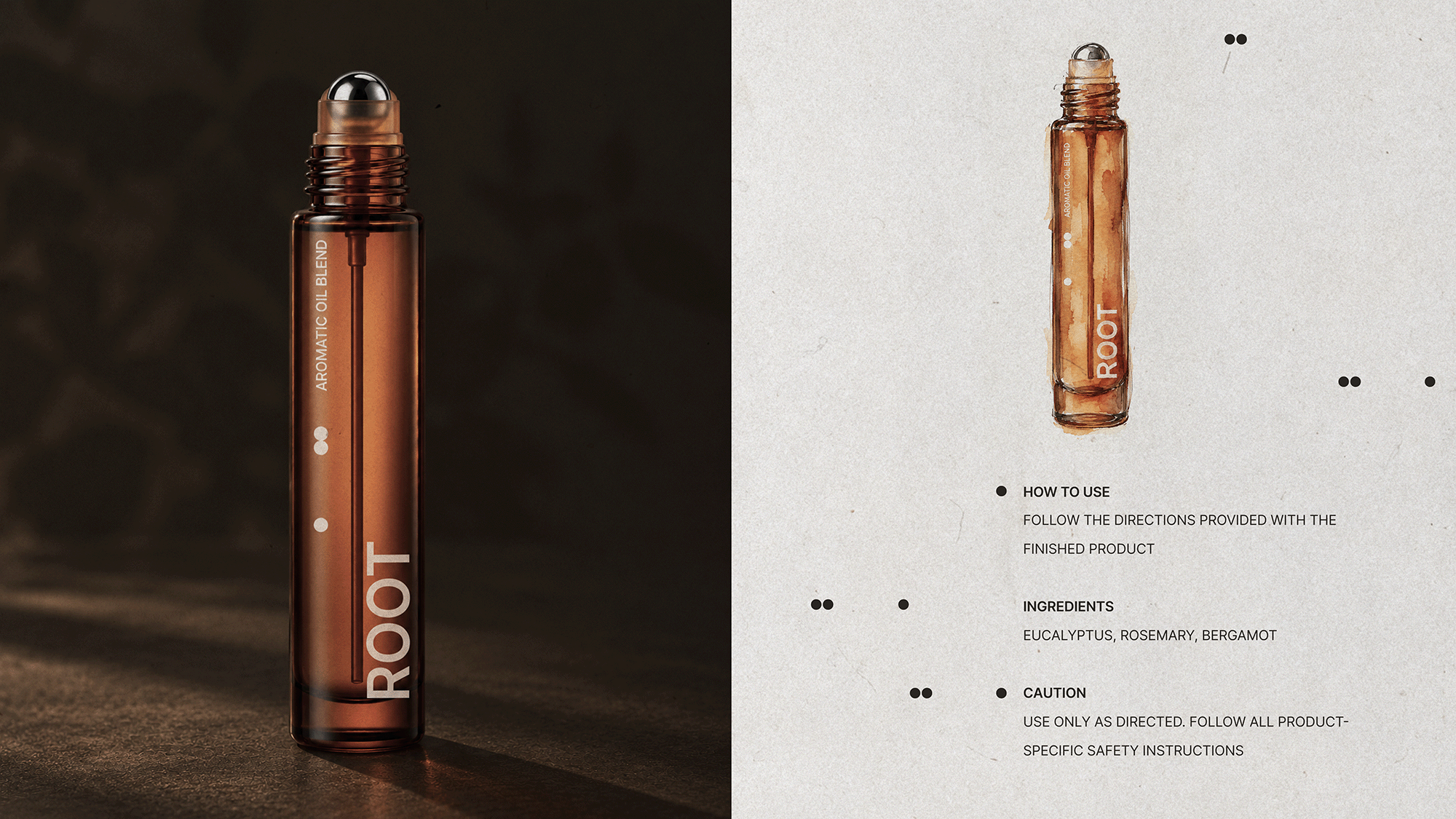
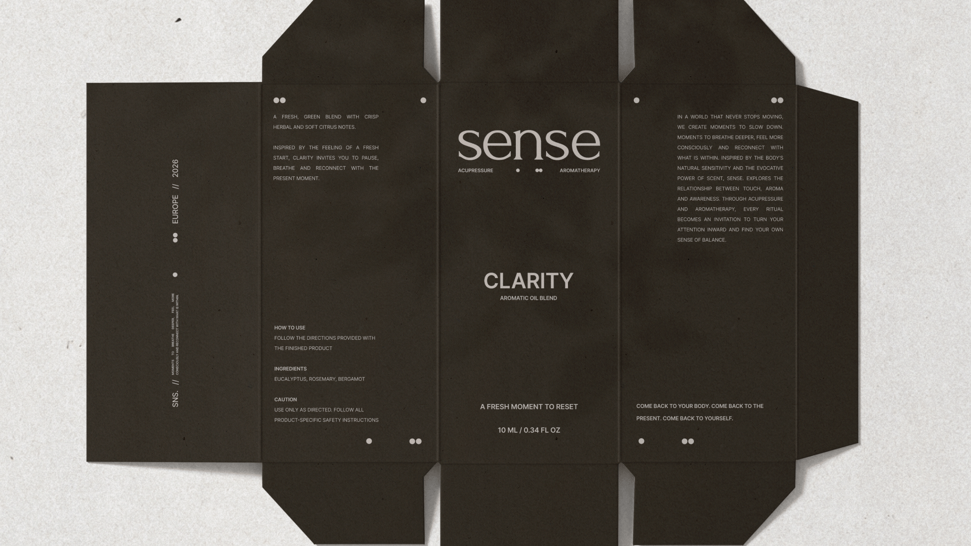
The collection consists of three aromatic blends: ROOT, STILL and CLARITY. Each product has its own name and character, while the consistent use of colour, materials and graphic elements brings the entire collection together as one unified system.
The packaging includes individual roller bottles, product boxes and a presentation set. Particular attention was given to the relationship between the bottle and its outer packaging, the placement of information, and the overall unboxing experience.
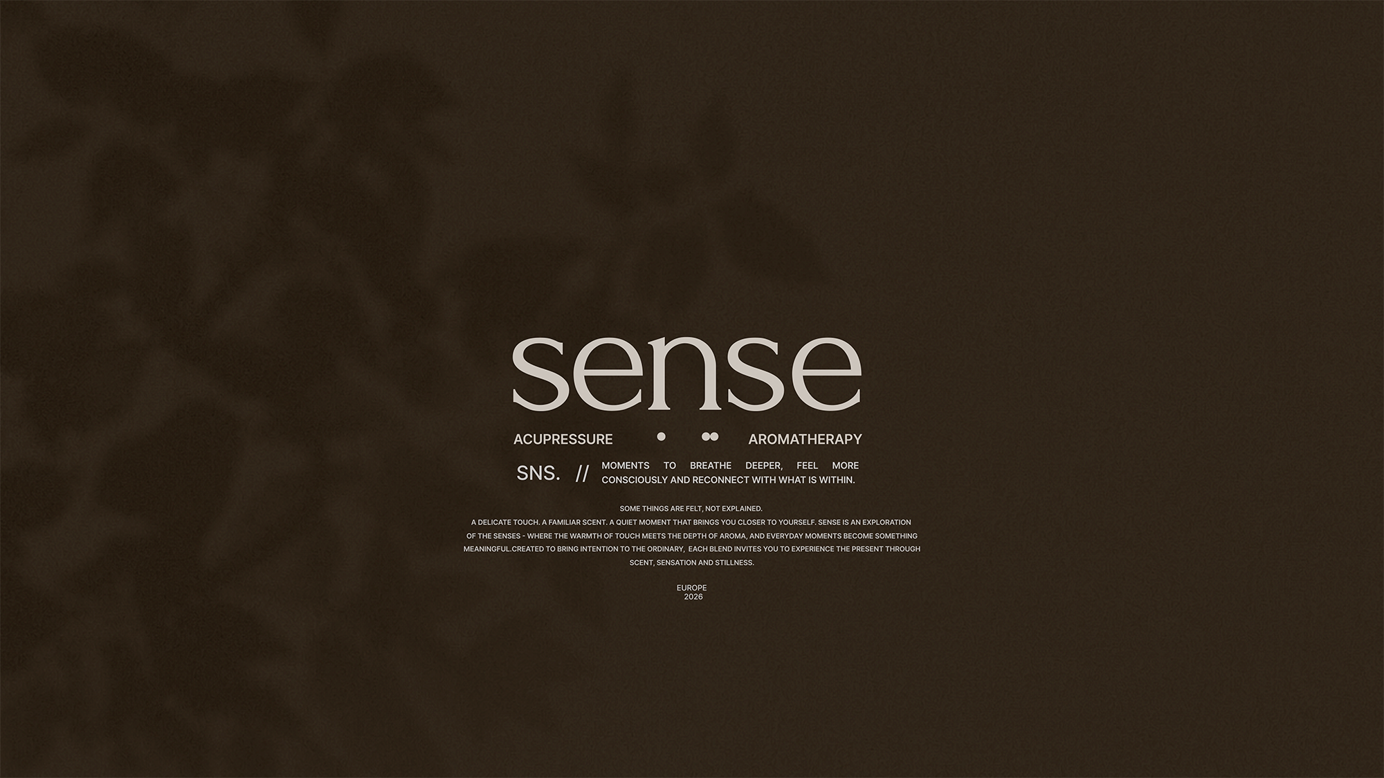
At the heart of the design is the dot — a simple graphic symbol representing a point of touch, focus and connection. It reflects the essence of SENSE.: a reminder that even the smallest moment can become an opportunity to reconnect with yourself.
SENSE. brings together form, material and meaning to transform everyday self-care into a considered sensory experience.
One point. A world within.
 Derrick Lin
 Sophiagdotcom
 Sofia Nikishina
 studionerius
 monther al omari
 Monroe
 KateChachava
 Snob Duck
 宏洛图品牌设计HONGLT
 Studio Six F
 Just Design
 New Century Design
 VIEWPOINT
 Abbydraw Designs Unique Conceptual Branding & Packaging Designing Ideas
 BexNelson
 Vladimir Shmoylov
 Kris
 Agence des Coteaux
 Rabia zouina
 www.branding.uz
 Diego Alves do Amaral
 studioaslihan
 Minim Brand Design
 DesignPro