Curator's PicksSubmit a projectShare your work

Explore by Country

AfghanistanAfricaAlbaniaAlgeriaAmerican SamoaAndorraAngolaAnguillaAntarcticaArgentinaArmeniaAsiaAustraliaAustriaAzerbaijanBahamasBahrainBangladeshBarbadosBelarusBelgiumBeninBoliviaBosnia and HerzegovinaBotswanaBrazilBritish Indian Ocean TerritoryBrunei DarussalamBulgariaCambodiaCameroonCanadaChileChinaChristmas IslandColombiaCosta RicaCote D'ivoireCroatiaCubaCyprusCzech RepublicDemocratic People's Republic of KoreaDenmarkDominican RepublicEcuadorEgyptEl SalvadorEstoniaEthiopiaEuropeFijiFinlandFranceFrench GuianaFrench Southern TerritoriesGeorgiaGermanyGhanaGlobalGreeceGuadeloupeGuatemalaGuyanaHaitiHondurasHong KongHungaryIcelandIndiaIndonesiaIranIraqIrelandIsraelItalyJamaicaJapanJordanKazakhstanKenyaKuwaitKyrgyzstanLatviaLebanonLibyaLithuaniaLuxembourgMacedoniaMadagascarMalaysiaMaldivesMaliMaltaMarshall IslandsMauritiusMexicoMoldovaMonacoMongoliaMontenegroMoroccoMyanmarNepalNetherlandsNew CaledoniaNew ZealandNicaraguaNigeriaNorth AmericaNorwayOceaniaOmanPakistanPalestiniaPanamaPapua New GuineaParaguayPeruPhilippinesPolandPortugalPuerto RicoQatarRepublic of KoreaRepublic of KosovoRomaniaRussian FederationSan MarinoSao Tome and PrincipeSaudi ArabiaSenegalSerbiaSeychellesSingaporeSlovakiaSloveniaSomaliaSouth AfricaSouth AmericaSpainSri LankaSudanSwazilandSwedenSwitzerlandSyrian Arab RepublicTaiwanTajikistanThailandTrinidad and TobagoTunisiaTurkeyTurkmenistanUgandaUkraineUnited Arab EmiratesUnited KingdomUnited StatesUnited States Minor Outlying IslandsUruguayUzbekistanVanuatuVenezuelaViet NamVirgin Islands, U.S.YemenZambiaZimbabwe

Materials

Browse all

GreenLine vodka redesign created by ARMBRAND
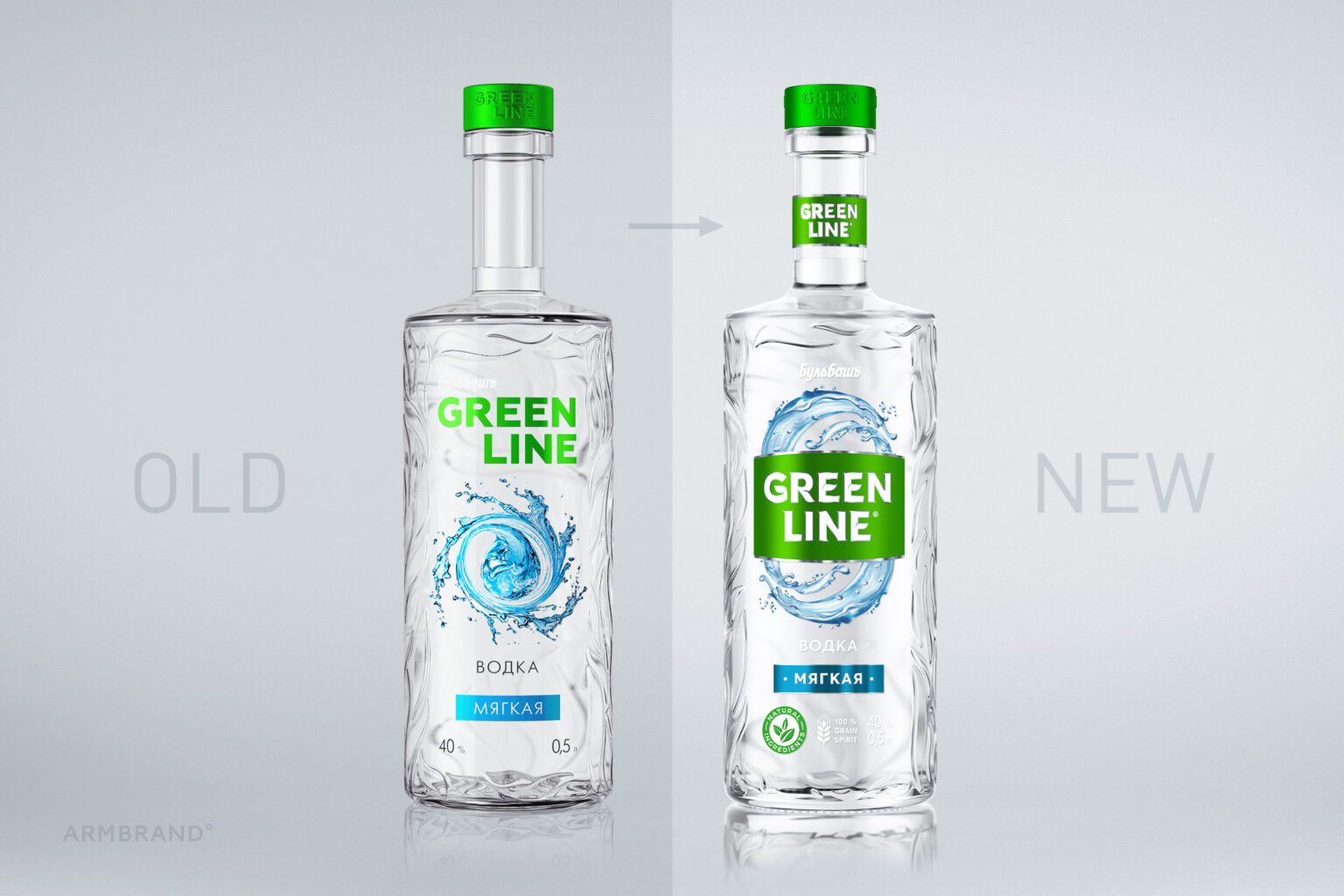
The goal was to make vodka more noticeable on the shelf keeping a unisex position for the target audience while maintaining continuity.

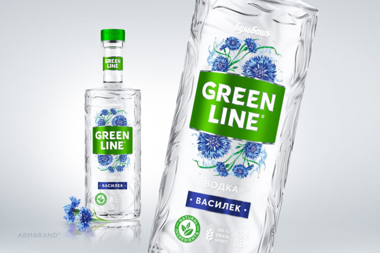
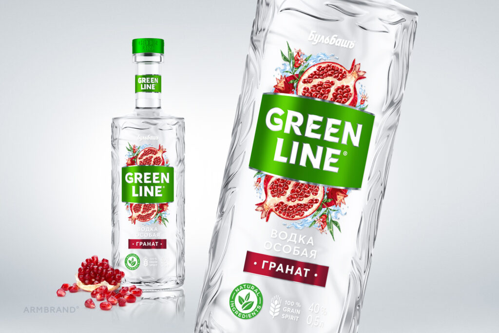
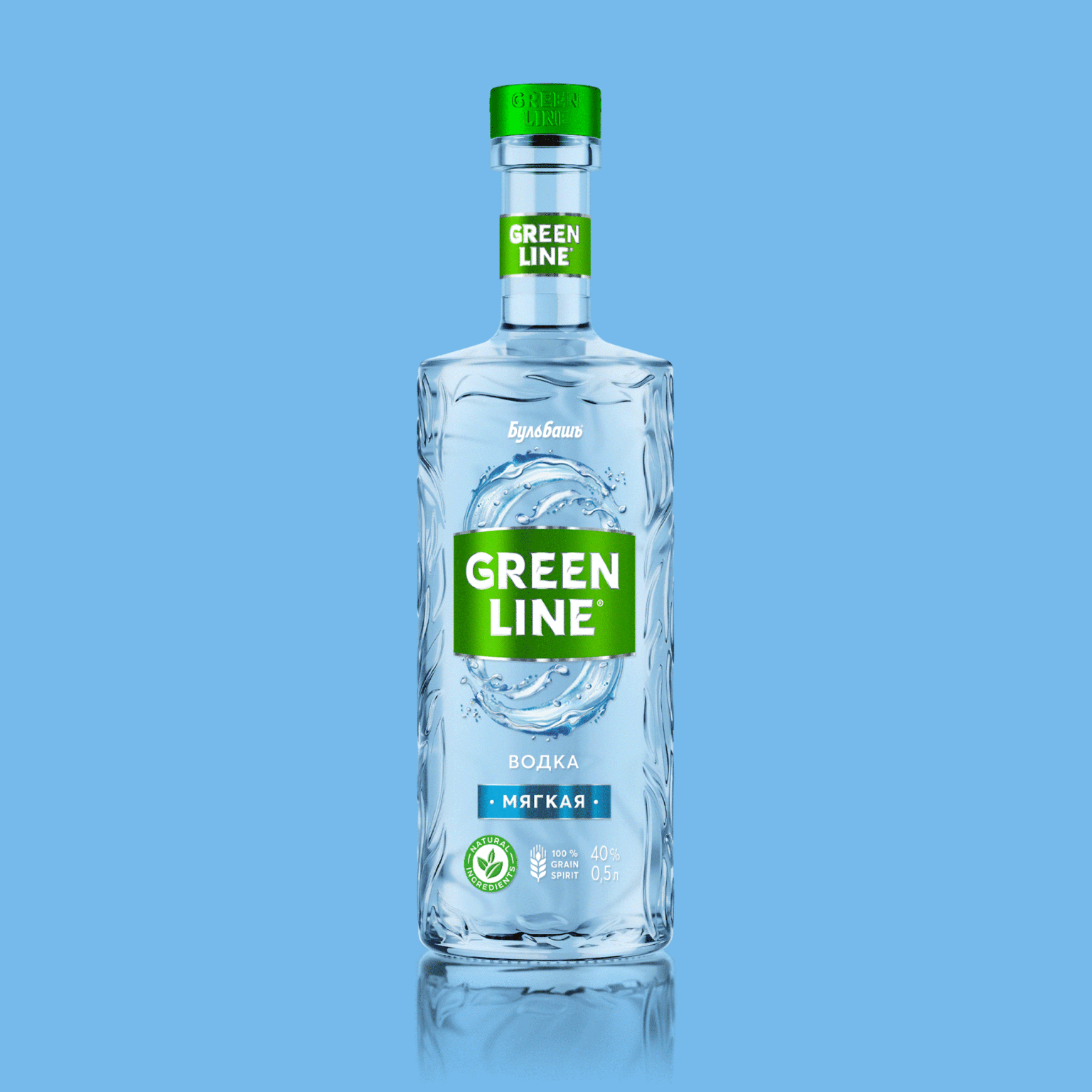
We have developed the logo with unique lettering that fits the bottle and brand positioning. The added green plate forms a single block on the shelf, symbolizing the name GREENLINE.

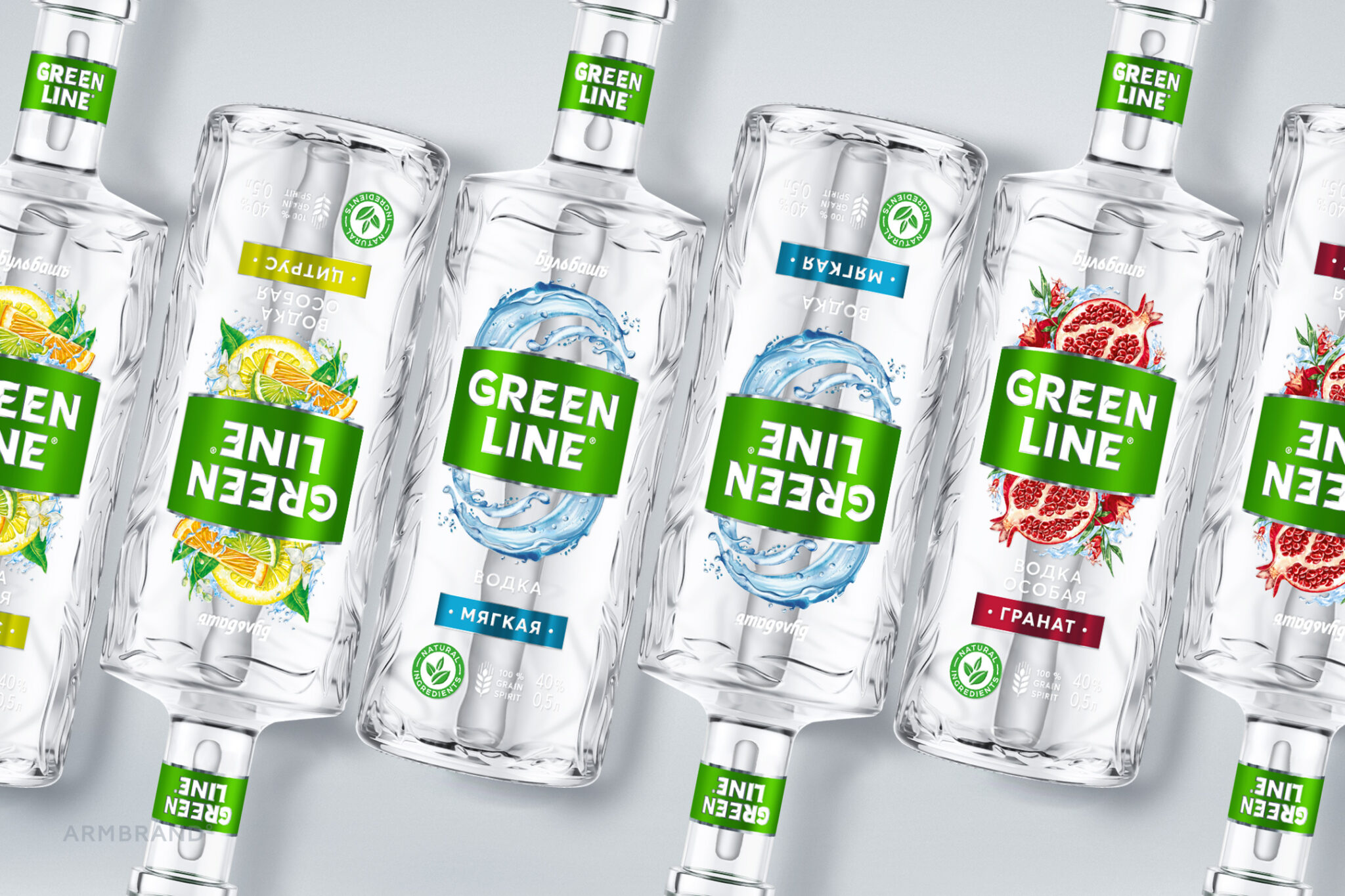
The composition became centralized. The images, being inverted as on playing cards, make the design bit frisky, what is important for a product that is used in companies with a possible female presence. Instead of photographic images, we created for the product zone the unique illustrations bringing vivacity, dynamics, holiday mood. To strengthen the environmental theme and modern orientation of the image, we added understandable pictograms at the foot of the label.

The result is a solid line that stands out significantly on the shelf and strengthens the brand’s position among the target audience.
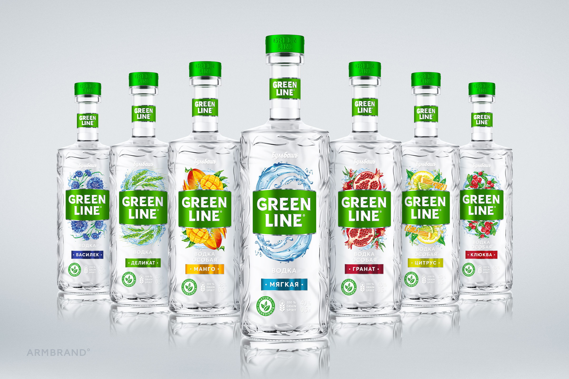
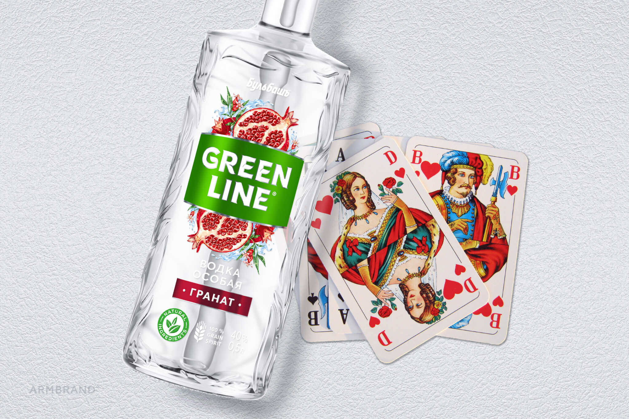
 

GreenLine vodka redesign created by ARMBRAND, vodka packaging design by ARMBRAND. Image 1 of 6.GreenLine vodka redesign created by ARMBRAND, vodka packaging design by ARMBRAND. Image 2 of 6.GreenLine vodka redesign created by ARMBRAND, vodka packaging design by ARMBRAND. Image 3 of 6.GreenLine vodka redesign created by ARMBRAND, vodka packaging design by ARMBRAND. Image 4 of 6.GreenLine vodka redesign created by ARMBRAND, vodka packaging design by ARMBRAND. Image 5 of 6.GreenLine vodka redesign created by ARMBRAND, vodka packaging design by ARMBRAND. Image 6 of 6.