Curator's PicksSubmit a projectShare your work

Explore by Country

AfghanistanAfricaAlbaniaAlgeriaAmerican SamoaAndorraAngolaAnguillaAntarcticaArgentinaArmeniaAsiaAustraliaAustriaAzerbaijanBahamasBahrainBangladeshBarbadosBelarusBelgiumBeninBoliviaBosnia and HerzegovinaBotswanaBrazilBritish Indian Ocean TerritoryBrunei DarussalamBulgariaCambodiaCameroonCanadaChileChinaChristmas IslandColombiaCosta RicaCote D'ivoireCroatiaCubaCyprusCzech RepublicDemocratic People's Republic of KoreaDenmarkDominican RepublicEcuadorEgyptEl SalvadorEstoniaEthiopiaEuropeFijiFinlandFranceFrench GuianaFrench Southern TerritoriesGeorgiaGermanyGhanaGlobalGreeceGuadeloupeGuatemalaGuyanaHaitiHondurasHong KongHungaryIcelandIndiaIndonesiaIranIraqIrelandIsraelItalyJamaicaJapanJordanKazakhstanKenyaKuwaitKyrgyzstanLatviaLebanonLibyaLithuaniaLuxembourgMacedoniaMadagascarMalaysiaMaldivesMaliMaltaMarshall IslandsMauritiusMexicoMoldovaMonacoMongoliaMontenegroMoroccoMyanmarNepalNetherlandsNew CaledoniaNew ZealandNicaraguaNigeriaNorth AmericaNorwayOceaniaOmanPakistanPalestiniaPanamaPapua New GuineaParaguayPeruPhilippinesPolandPortugalPuerto RicoQatarRepublic of KoreaRepublic of KosovoRomaniaRussian FederationSan MarinoSao Tome and PrincipeSaudi ArabiaSenegalSerbiaSeychellesSingaporeSlovakiaSloveniaSomaliaSouth AfricaSouth AmericaSpainSri LankaSudanSwazilandSwedenSwitzerlandSyrian Arab RepublicTaiwanTajikistanThailandTrinidad and TobagoTunisiaTurkeyTurkmenistanUgandaUkraineUnited Arab EmiratesUnited KingdomUnited StatesUnited States Minor Outlying IslandsUruguayUzbekistanVanuatuVenezuelaViet NamVirgin Islands, U.S.YemenZambiaZimbabwe

Materials

Browse all

PIKL

Logotype | Identity | Packaging design

PIKL

Logotype and identity
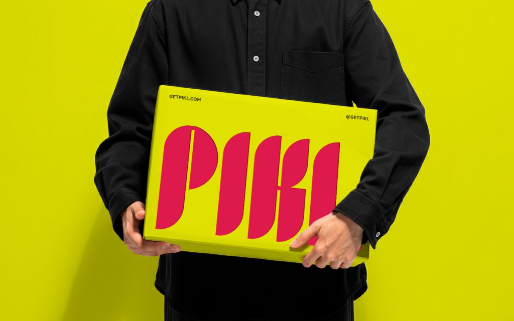
The PIKL brand aims to bring fun and liveliness to the world of vegetables spreads, with a name derived from “pickle” to reflect its playful and energetic identity. The logo design captures the heart of the brand through a unique font featuring a delicate leaf element, symbolizing the company’s focus on natural ingredients and environmental consciousness. The bold typeface reinforces sustainability and reliability, making the brand stand out. A strong contrast between deep green, representing nature and eco-friendliness, and warm pink, conveying energy and vitality, ensures high visibility in a busy market. The overall design is clean, modern, and minimalist, making it memorable, versatile, and scalable for applications across digital media, packaging, and signage.

The brand identity extends beyond the logo, incorporating a vibrant yet natural visual language that emphasizes freshness, quality, and sustainability. Playful typography and organic shapes enhance the brand’s approachable feel.

Packaging design
The packaging design follows the same principles, ensuring a bold shelf presence with its strong color contrast and eye-catching typography. Sustainable materials and thoughtful design choices, such as minimal yet informative labels, reinforce the brand’s mission. The result is a cohesive, visually striking, and eco-conscious brand experience that stands out in the competitive market of vegetable spreads.


PIKL, spread packaging design by Lana B, Kuwait. Image 1 of 5.PIKL, spread packaging design by Lana B, Kuwait. Image 2 of 5.PIKL, spread packaging design by Lana B, Kuwait. Image 3 of 5.PIKL, spread packaging design by Lana B, Kuwait. Image 4 of 5.PIKL, spread packaging design by Lana B, Kuwait. Image 5 of 5.