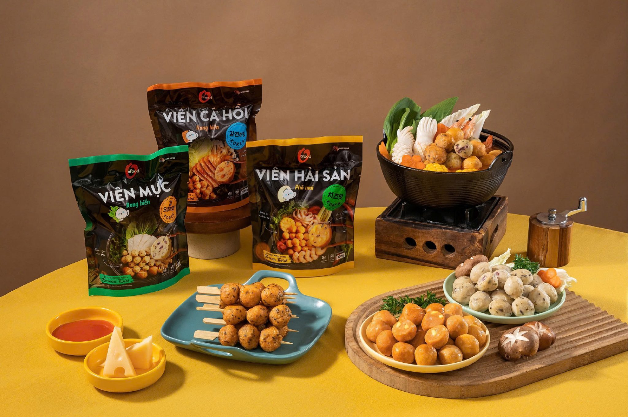

O’Food new product packaging design by Minto Vietnam
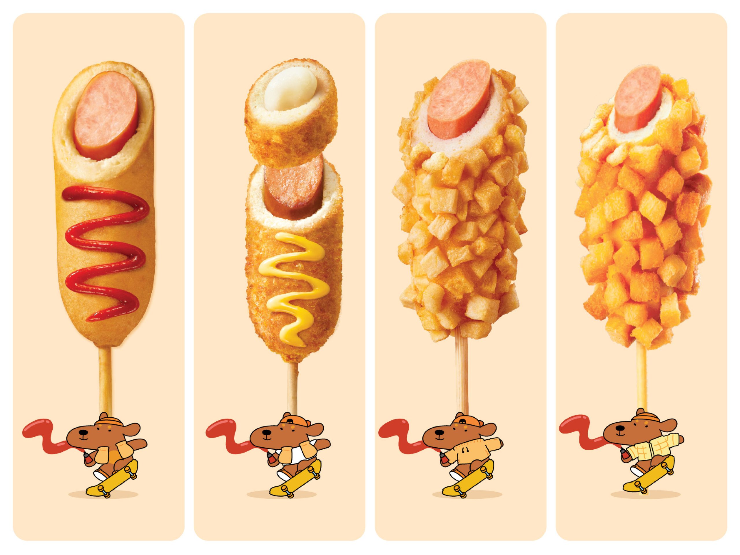
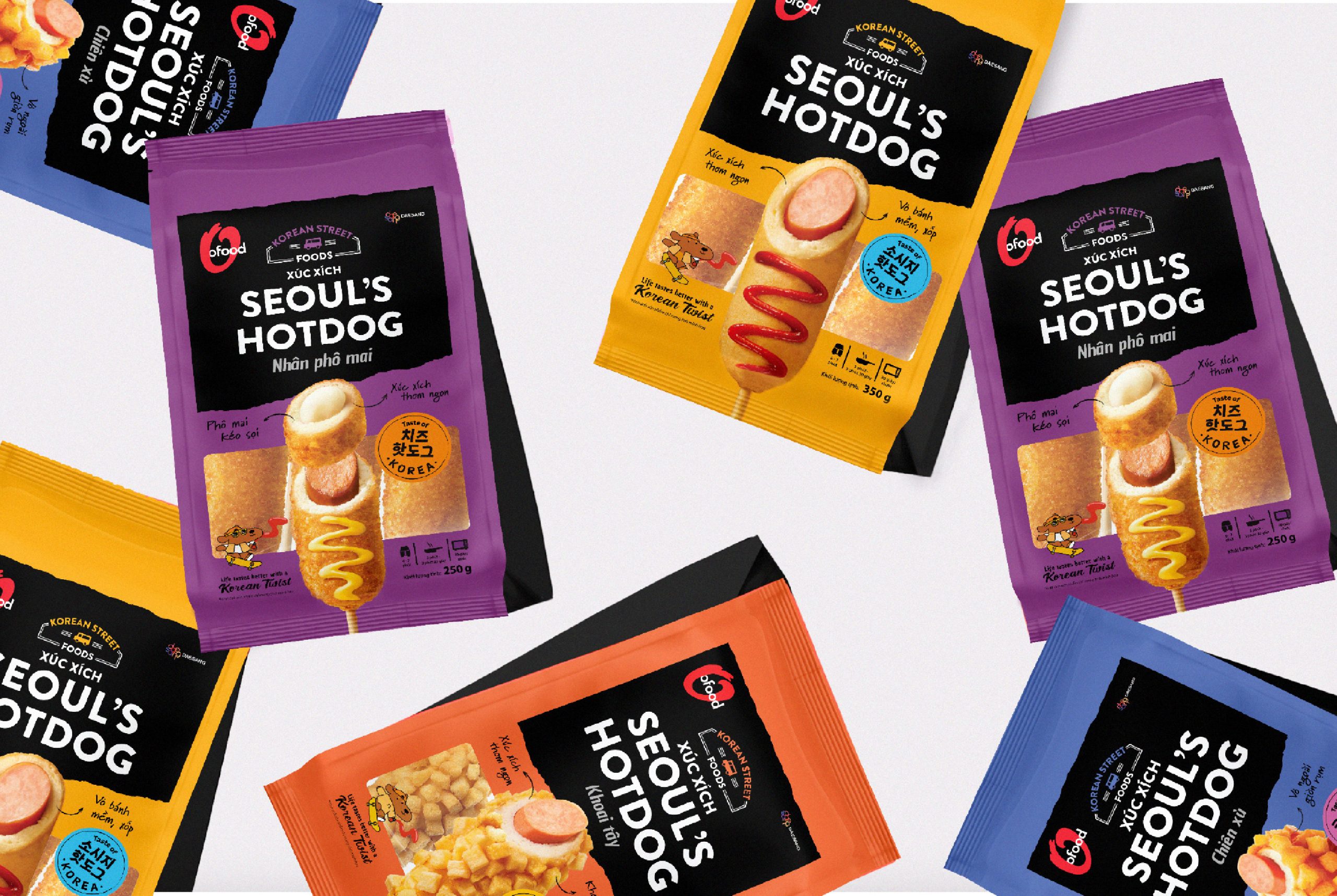
O’Food, part of Daesang Corporation, is a well-known Korean food brand in the global market, with a presence in over 72 countries. This project’s scope was to create a new packaging visual for their new ready-to-cook product line and a renewed version of their Sausage packaging.
In a supermarket filled with choices, we aimed to make the products more eye-catching on the shelf and convey the emotional and functional benefits to consumers.
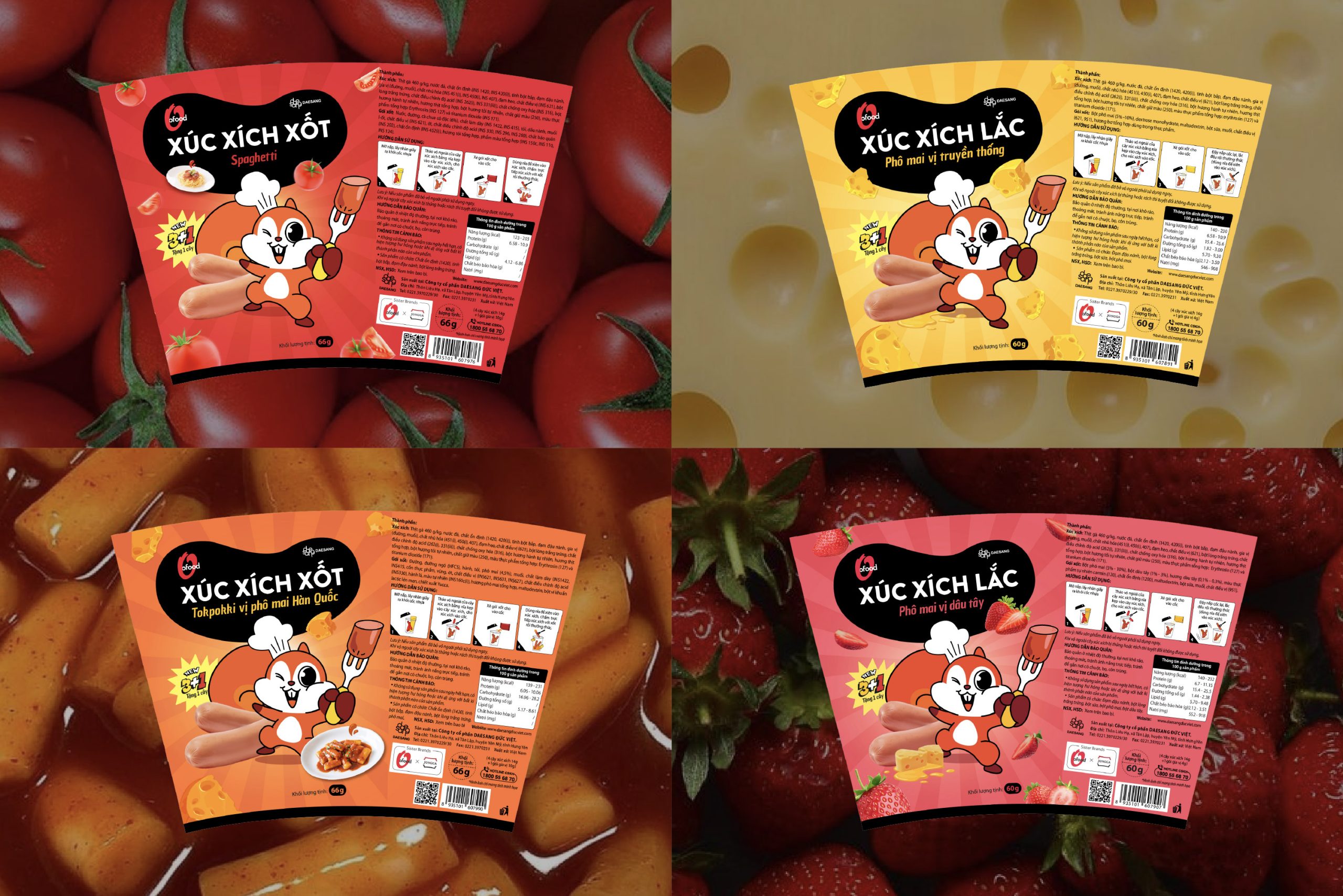
We create characters for each product as the key to emotionally attracting consumers. With their unique appearance and gestures, they represent their product line. By looking at the character, you can tell which product it is. These characters are not just decoration, they help catch consumers’ eyes and add uniqueness, liveliness, and emotion to the package.
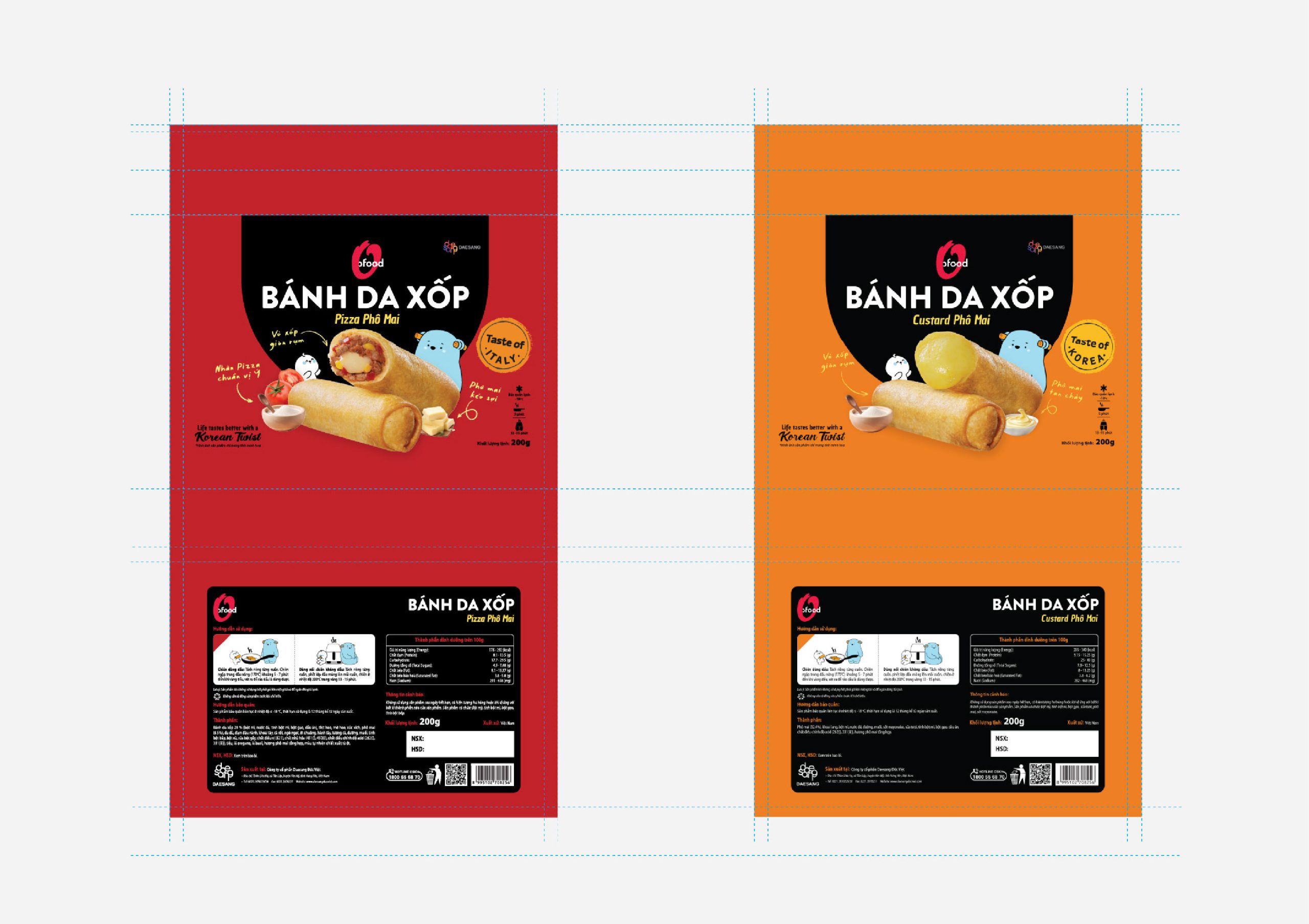
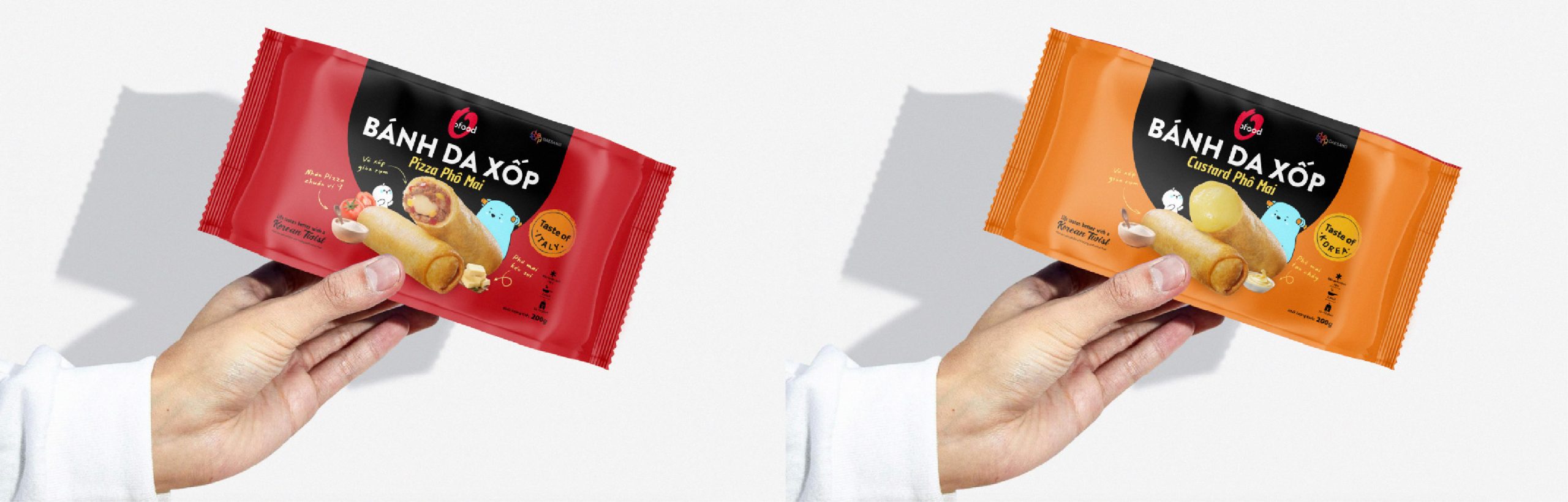
For the package design, our intention is not just to craft a design that can quickly attract people’s attention but can also add a little support, helping consumers know the products just by a glance and easily see full product information when in their hands. With the high-contrast color, real product visuals, clean product names placed on the front, and clear information on the back, our package can cover all of our needs.
This project is an example of how our creative approach can not only create packaging but also an emotional connection between the brand and the consumer, helping O’Food increase the product’s value in the market.
—
Thông tin credit:
Agency: Minto Vietnam
Client: O’Food






 sophioc
 Marta Wasilewska
 House of Thought
 Krithika Chakkaravarthy
 Reema
Reema Oksana
 Palashcc
 KoverCsengeAgnes
 Carreto Concepts Design Studio
 Viktoriia Graber
 Sealburger
 Farah Haddad
 Sami Asaad
 Modern Theory
 PLUSDESIGbd
 Ayanna
 Flow Creative
 jonathanag90
 Creative Platform
 alchimistestudioParis
 Eman AlGhasra
 andreamarinnn