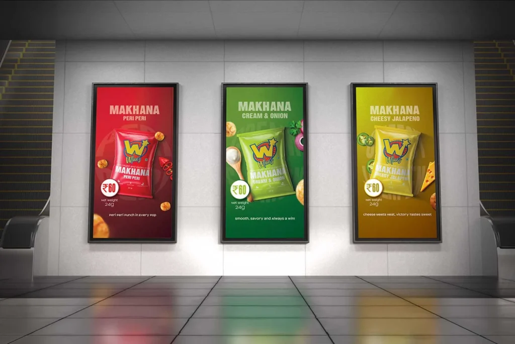

Premium Makhana Branding by DN Designs
Wlue’s is a premium makhana (fox nut) brand with a mission to make healthy snacking fun, trendy, and exciting. While makhana is widely recognized as a nutritious superfood, its packaging and branding in the market often feel outdated or too traditional. Wlue’s wanted to stand apart as a modern, Gen Z-friendly brand that could capture attention both on shelves and on social media.
DN Designs partnered with Wlue’s to redefine their brand identity and packaging design, creating a look that feels bold, playful, and premium at the same time.
The Challenge
- The healthy snacking market is highly competitive with several players offering similar products.
- Most makhana brands leaned toward generic, earthy, or traditional packaging, failing to connect with younger audiences.
- Wlue’s needed to strike the right balance between premium appeal and youthful energy — something the category lacked.
The key question was:
👉 How do we transform Wlue’s into a premium, trendsetting brand while staying true to its healthy, natural essence?
Research & Insights
To answer this, DN Designs explored:
- Market Trends: Rising demand for healthy, guilt-free snacks, especially among urban youth.
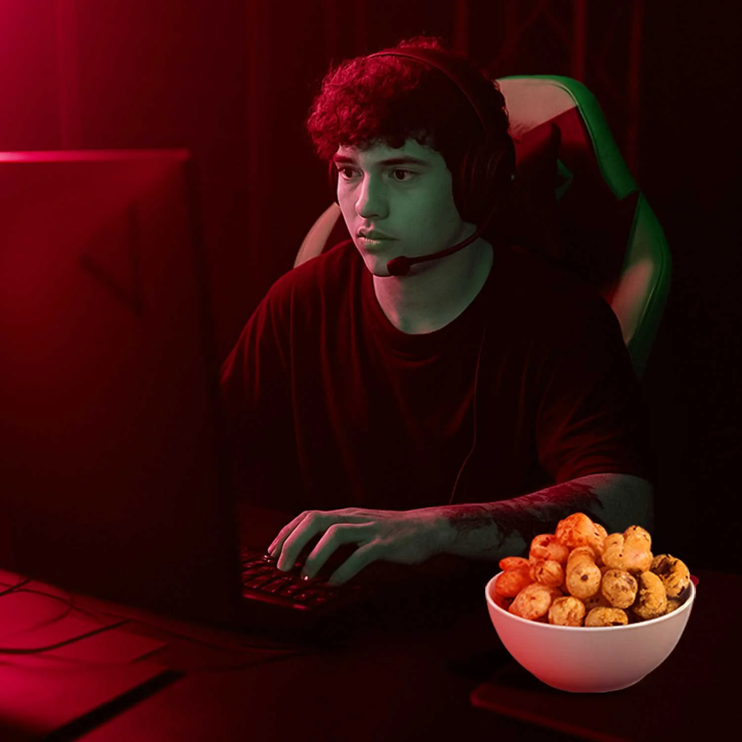
- Consumer Behavior: Gen Z and millennials seek brands that are bold, Instagrammable, and story-driven.
- Competitive Landscape: Most competitors lacked visual differentiation, opening an opportunity for Wlue’s to own a playful, premium niche.Creative Strategy
We built the strategy around one core idea:
✨ “Make healthy snacking exciting.”
- Brand Personality: Fun, bold, confident, and premium.
Tone of Voice: Youthful, quirky, and relatable.
Design Approach: A balance of vibrant colors, minimal structures, and bold typography to appeal to Gen Z while ensuring shelf presence.
Design Execution
1. Brand Identity
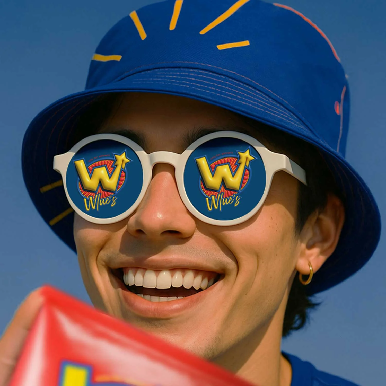
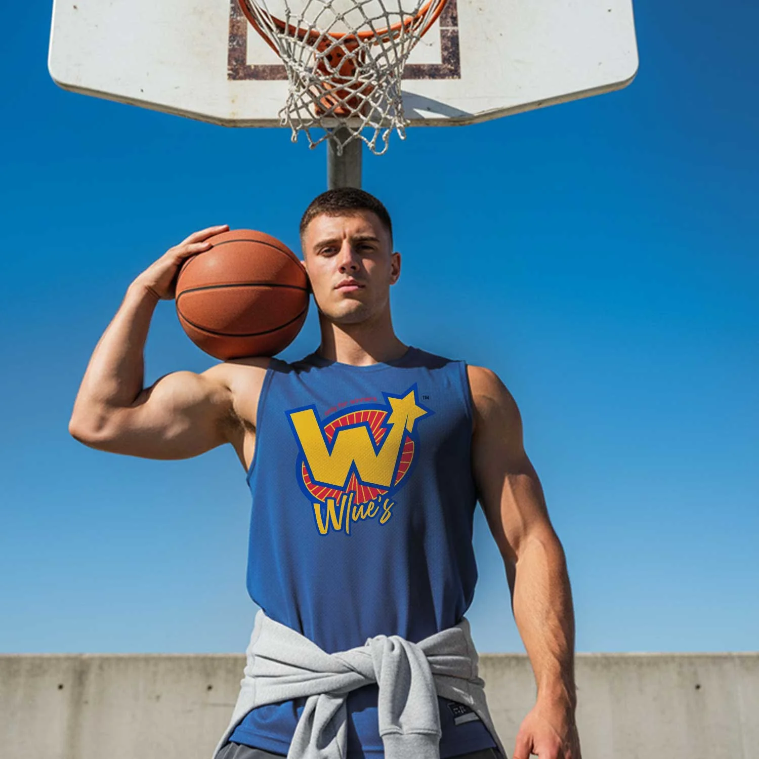
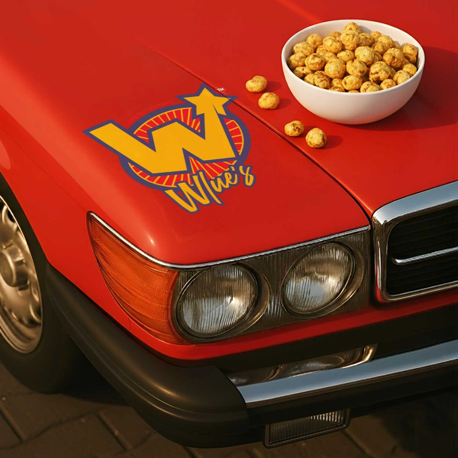
We crafted a logo that is modern, memorable, and adaptable — giving Wlue’s a strong foundation to scale across digital and print touchpoints.
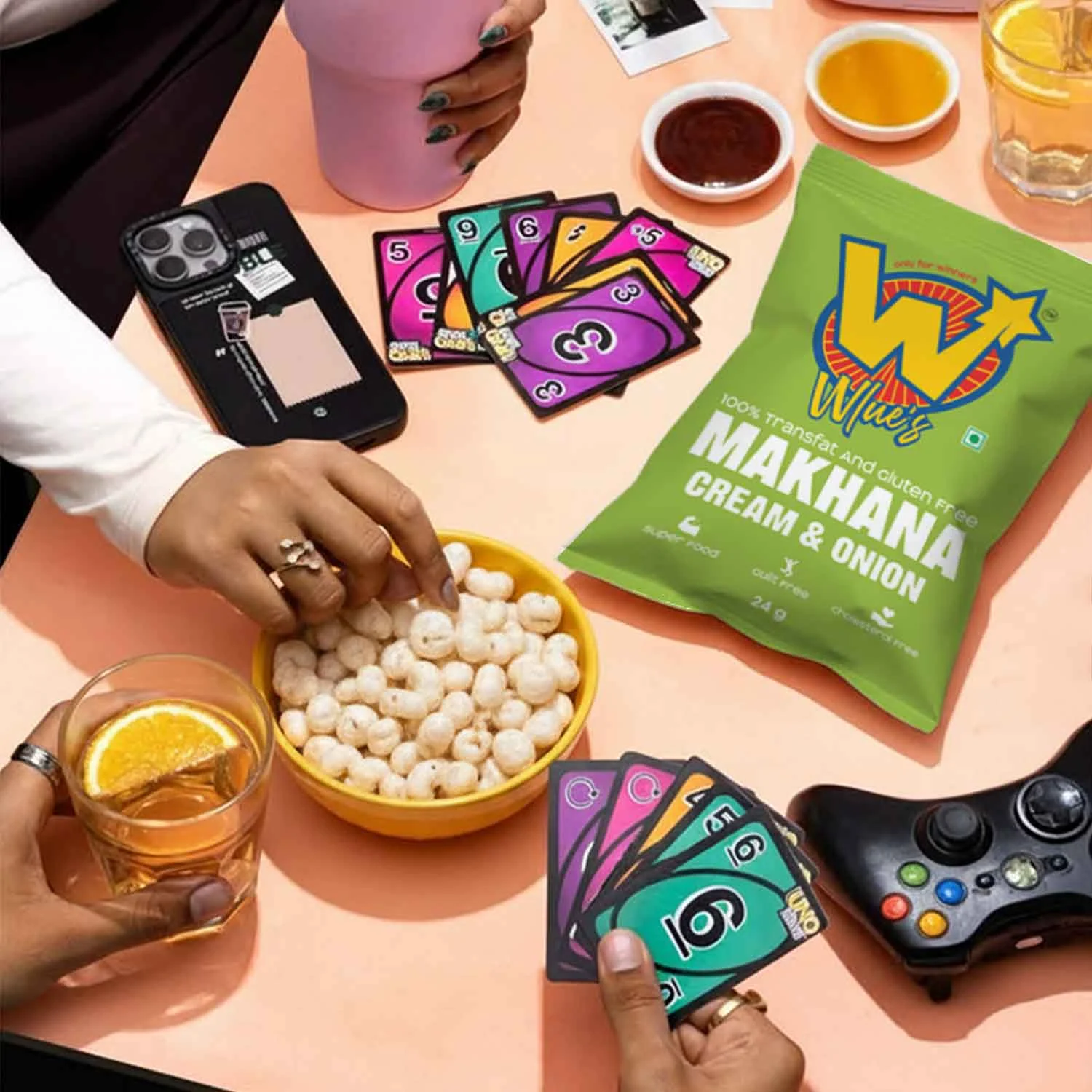
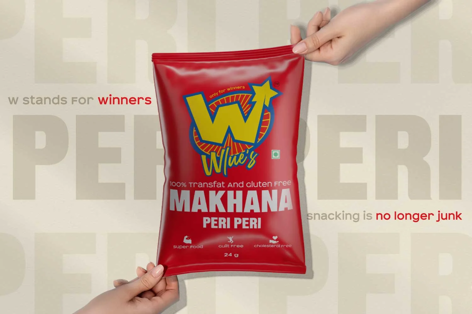
2. Packaging Design
- A vibrant color palette to differentiate SKUs while remaining playful.
- Minimal yet striking layouts that feel premium on shelves.
- Fun visual storytelling with quirky elements to reflect the brand’s personality.
3. Typography & Colors
- Bold, legible fonts for instant recall.
- Bright, Gen Z-inspired colors paired with premium tones for a balanced look.
Outcome & Impact
- Wlue’s packaging now commands shelf presence and stands out in a cluttered market.
- The bold visual identity resonates with young, health-conscious consumers.
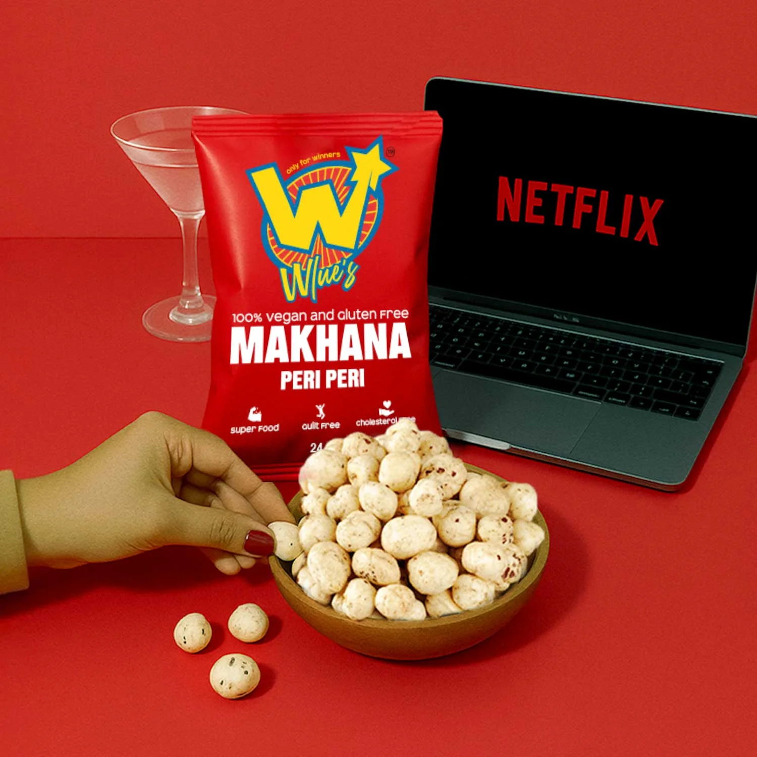
- The brand gained a strong social media appeal, making makhana look fun and stylish.
- Positioned Wlue’s as a premium yet approachable lifestyle snack brand.
Conclusion
Through strategic thinking and bold design, DN Designs helped Wlue’s break away from conventional snack branding. The result was a fresh, vibrant brand identity and packaging system that not only conveys health and quality but also emotionally connects with Gen Z consumers.
✨ At DN Designs, we believe every brand has the potential to tell a story. With Wlue’s, we turned healthy snacking into a trend-driven, premium experience.

 IDEOLOGO
 Eva Chistyakova
 Open Strategy & Design
 cem kutlu
 monther al omari
 Bonsanco Creative Studio
 Confetti Design Studio
 古戈品牌
古戈品牌 Rare Ideas
 Studio Pistache
 Studio Tumpic/Prenc
 Atiq Alam
 bachir bachchar
 Akshita Agarwal
 Carreto Concepts Design Studio
 Hollóka Grafikai Műhely / Graphic Design Studio
 Arsen Avetisyan
 Derrick Lin
 Axiniya Knyazeva
 Hadi Samir
 Furt Goods