
Challenge:
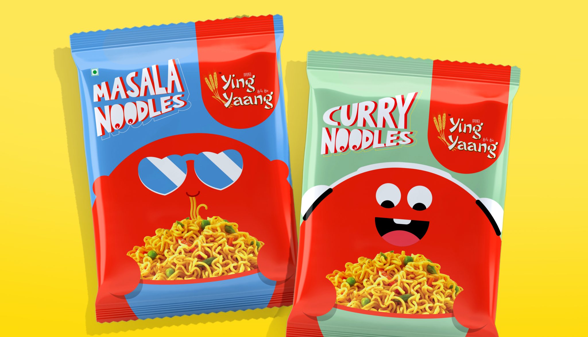
Ying Yaang entered an instant noodle market ruled by category heavyweights and promptly disappeared. Surrounded by packs that looked and sounded the same, the brand had no visual distinctiveness and no reason to be picked off the shelf.
Objective:
Break through a saturated category and give Ying Yaang a recognisable identity that demanded attention at shelf level.
Solution:
We studied the brand. Then the competition. The pattern was obvious – sameness. So we rebuilt Ying Yaang from the pack outward, introducing a bold, lovable mascot inspired by the unmistakable shape of a panda (sorry, koalas). The new visual system was flexible, character-led, and impossible to miss.
Outcome:
Ying Yaang went from invisible to unmissable, claiming space on shelves and a place on the table.


 janardhanpokala
 Derrick Lin
 VincoStudio
 lisakaplina
 CreativeWise
 alchimistestudioParis
 Adriana Adamo
 tauqueer
 MAISON D'IDÉE Prague
 Pixels Studio
 Atchayaa
 DESIGN CONCEPTS
 hello ocean
 monther al omari
 the Labelmaker
 alamgirbrands
 kat bres
 Vantablack Studio
 GruppoSaida
 studiorevv
 grafisercreative
 Kate Reichel
 UPRISE