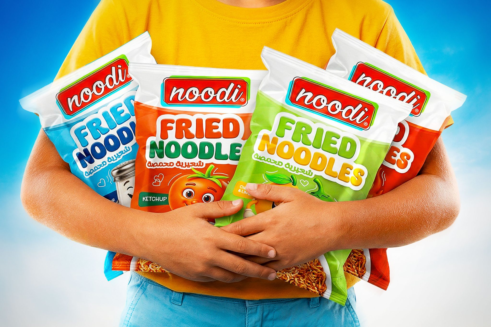

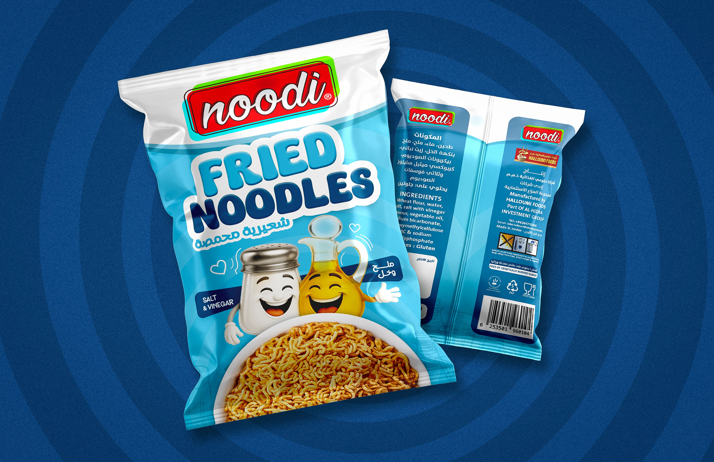
This project presents a vibrant packaging design series for Noodi, a fun and flavorful snack brand by Halloumi Foods Company, based in Jordan. Noodi is a fried crispy noodle snack created primarily for children, combining playful energy with bold taste experiences.
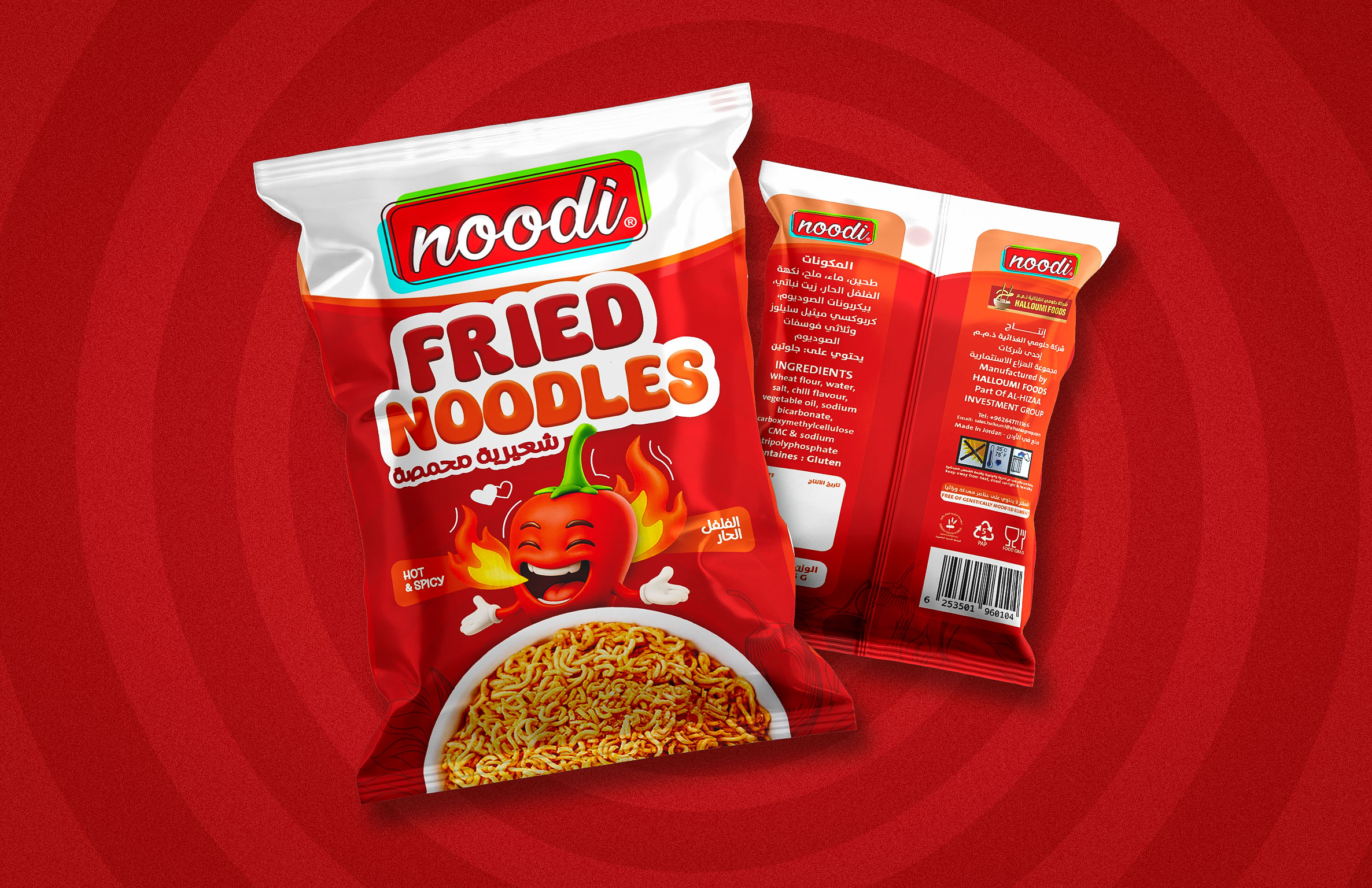
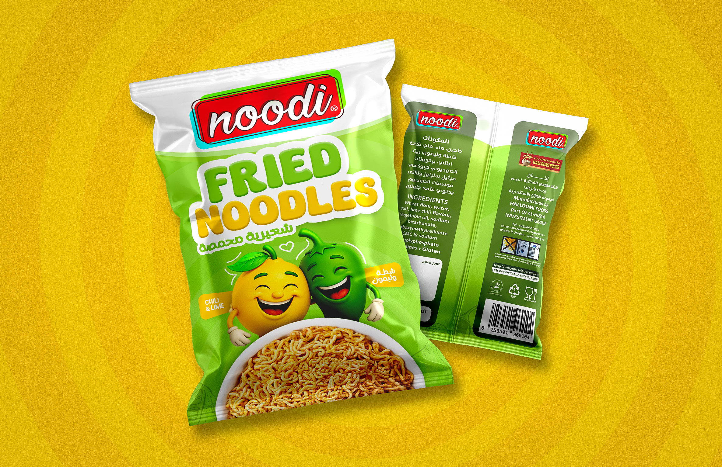
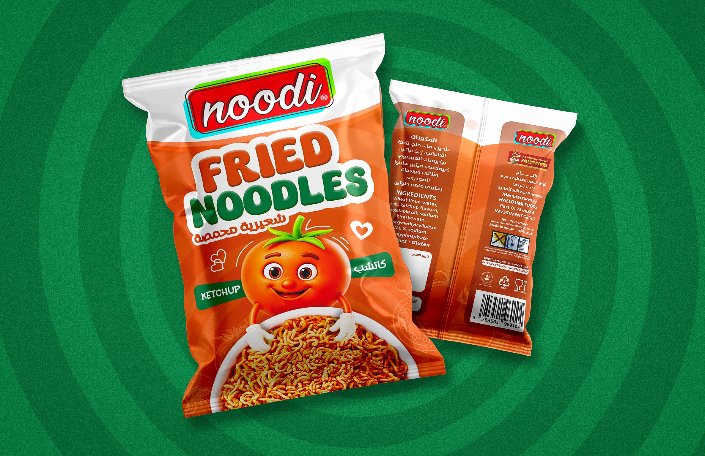
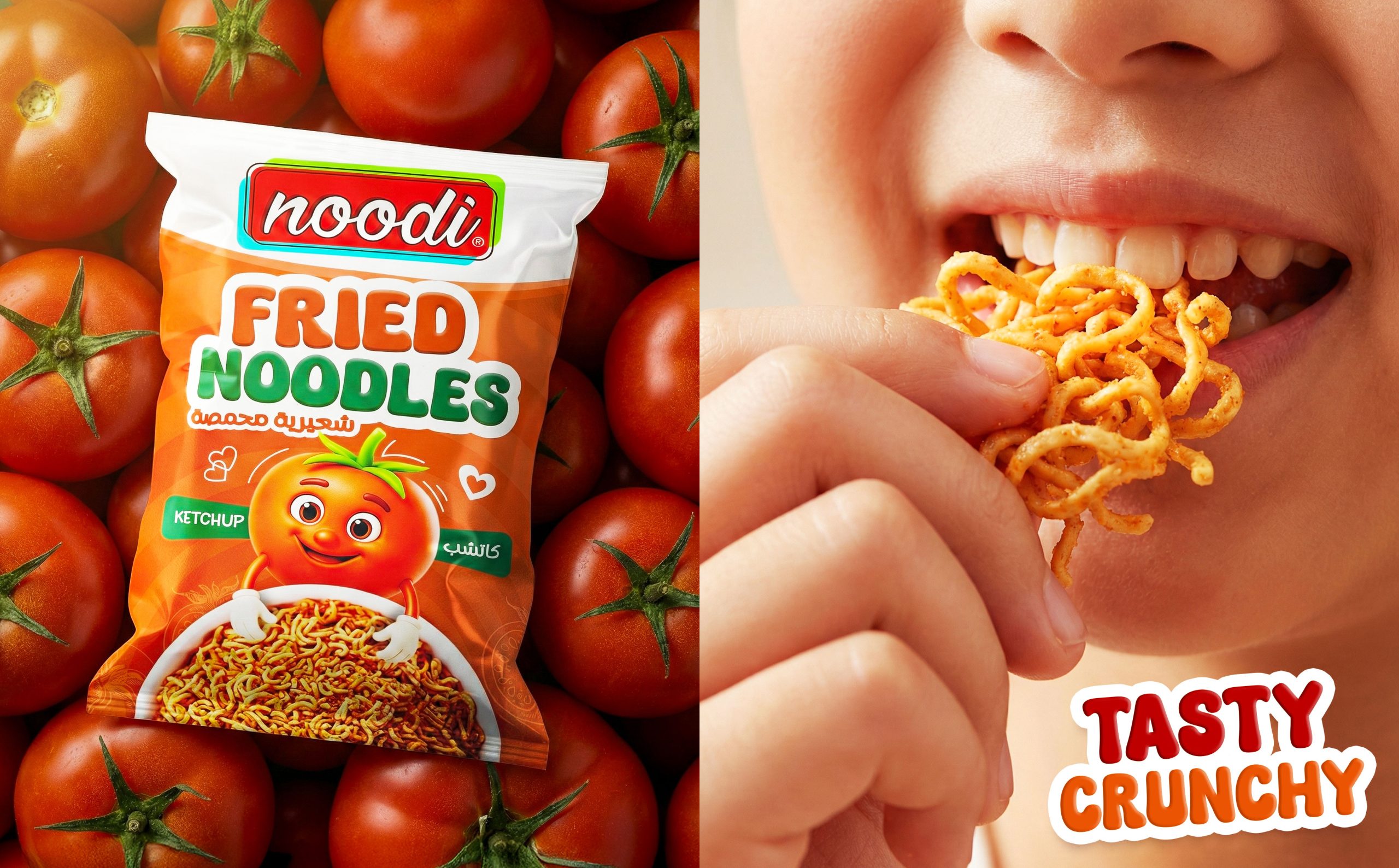
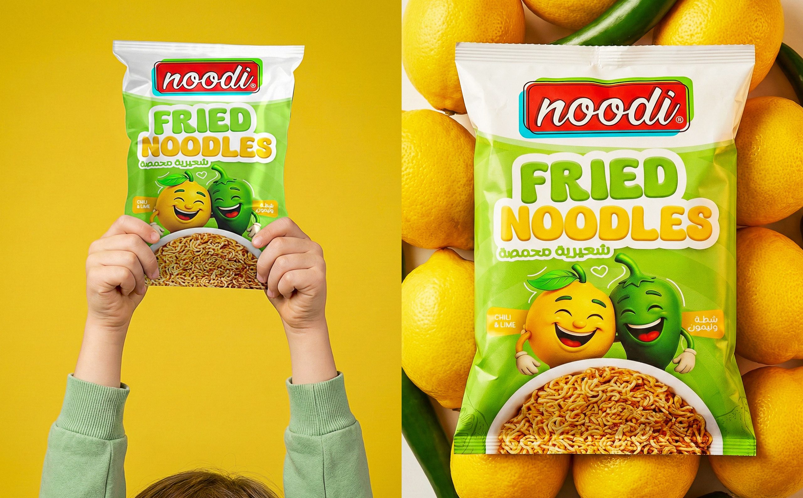
The concept behind this project focuses on building a cheerful, engaging visual identity that instantly connects with young audiences while remaining appealing to parents. The collection features four distinct packaging designs, each representing a different flavor, carefully differentiated through dynamic color palettes, expressive typography, and lively graphic elements. The designs emphasize movement and crunch through energetic compositions that reflect the snack’s crispy texture and fun personality. Character-driven illustrations and bright backgrounds enhance shelf visibility and strengthen brand recognition.
The goal of the project was to create a cohesive yet flexible packaging system that allows each flavor to stand out individually while maintaining a unified brand identity. Through strategic design choices and a child-centered creative approach, this project transforms Noodi into more than just a snack—it becomes a joyful, memorable experience that celebrates flavor, fun, and creativity in every pack.
The Challenge:
The main challenge was transforming a visually ordinary package into a brand that could truly compete on shelf and connect with children. The old design lacked energy, personality, and a clear visual hierarchy, making it difficult for the product to stand out in a crowded snack market. The brand presence was weak, the flavors were not clearly differentiated, and the packaging did not communicate the crunchy, playful nature of the product. It felt static and disconnected from its young target audience. The struggle was not only to redesign the pack, but to rebuild the identity—creating something bold, fun, and memorable while maintaining clarity and strong shelf impact.
The Process:
The redesign journey started with understanding the product itself. The client shared close-up images of the crunchy fried noodles to help me study their texture, shape, and character. This helped define how the product should be visually represented.
The second milestone was the first design cycle, where two different creative directions were developed and presented, exploring layout structure, color blocking, and brand emphasis.
In the third milestone, the concept evolved: the client decided to introduce a cartoon character for each flavor. This shifted the design direction toward a more playful, child-centered approach and opened the door for stronger emotional connection.
The Solution:
The final designs deliver a bold, unified, and highly recognizable packaging system. Each flavor is color-coded for instant differentiation while maintaining a consistent structure across the range. The newly introduced characters embody the personality of every flavor, making the packs more engaging and memorable for children. Strong typography, clean hierarchy, and a clear product focus ensure visibility and impact on shelves. The result is a cohesive brand experience that reflects fun, flavor, and crunch in a modern and confident way.
Credits:
Client: Halloumi Foods
Location: Jordan
Art Direction: Mohamed K. Eldmrdash
Thanks, hope you liked it.
If you like to get in touch just send me a message.

 Derrick Lin
 VincoStudio
 lisakaplina
 CreativeWise
 alchimistestudioParis
 Adriana Adamo
 tauqueer
 MAISON D'IDÉE Prague
 Pixels Studio
 Atchayaa
 DESIGN CONCEPTS
 hello ocean
 monther al omari
 the Labelmaker
 alamgirbrands
 kat bres
 Vantablack Studio
 GruppoSaida
 studiorevv
 grafisercreative
 Kate Reichel
 UPRISE