

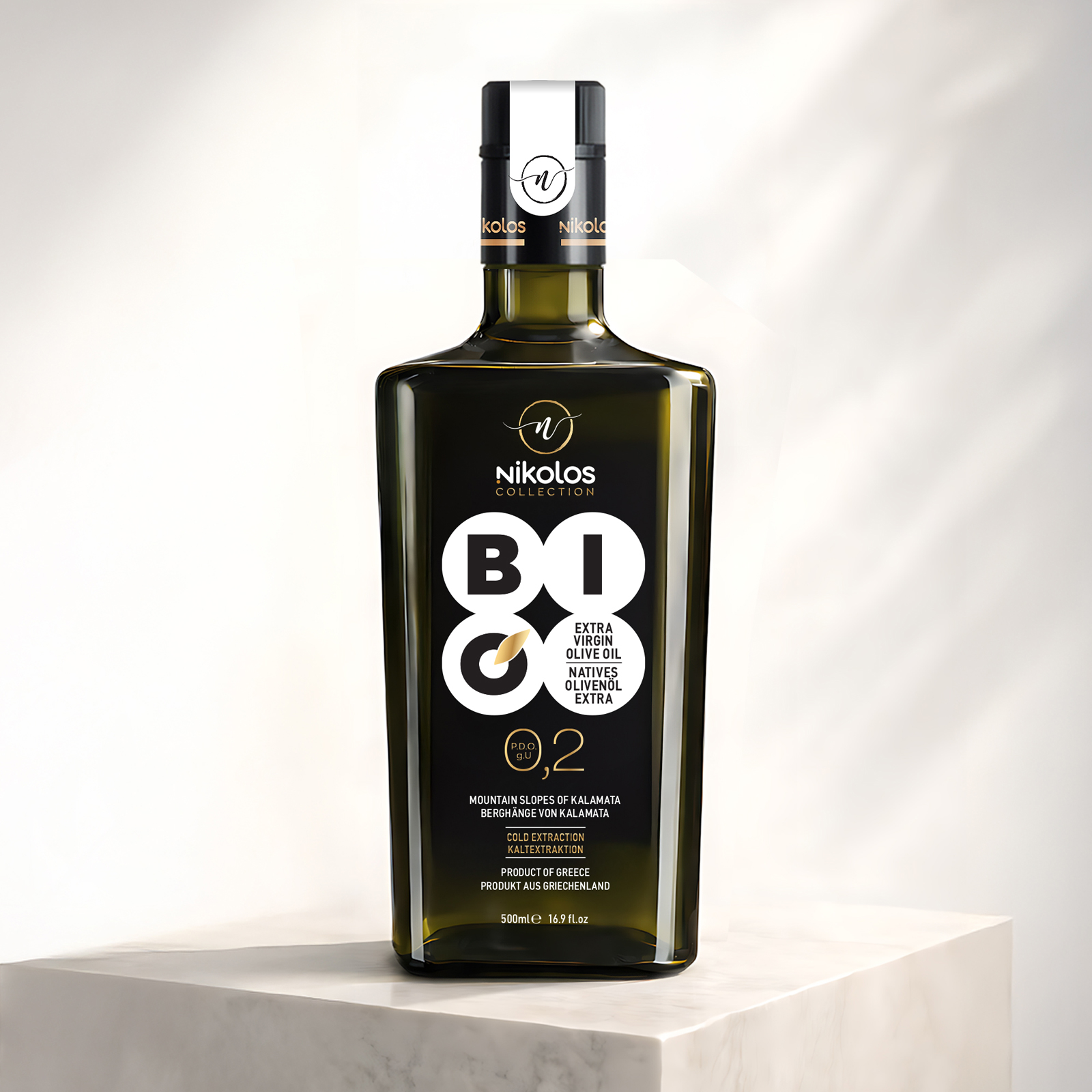
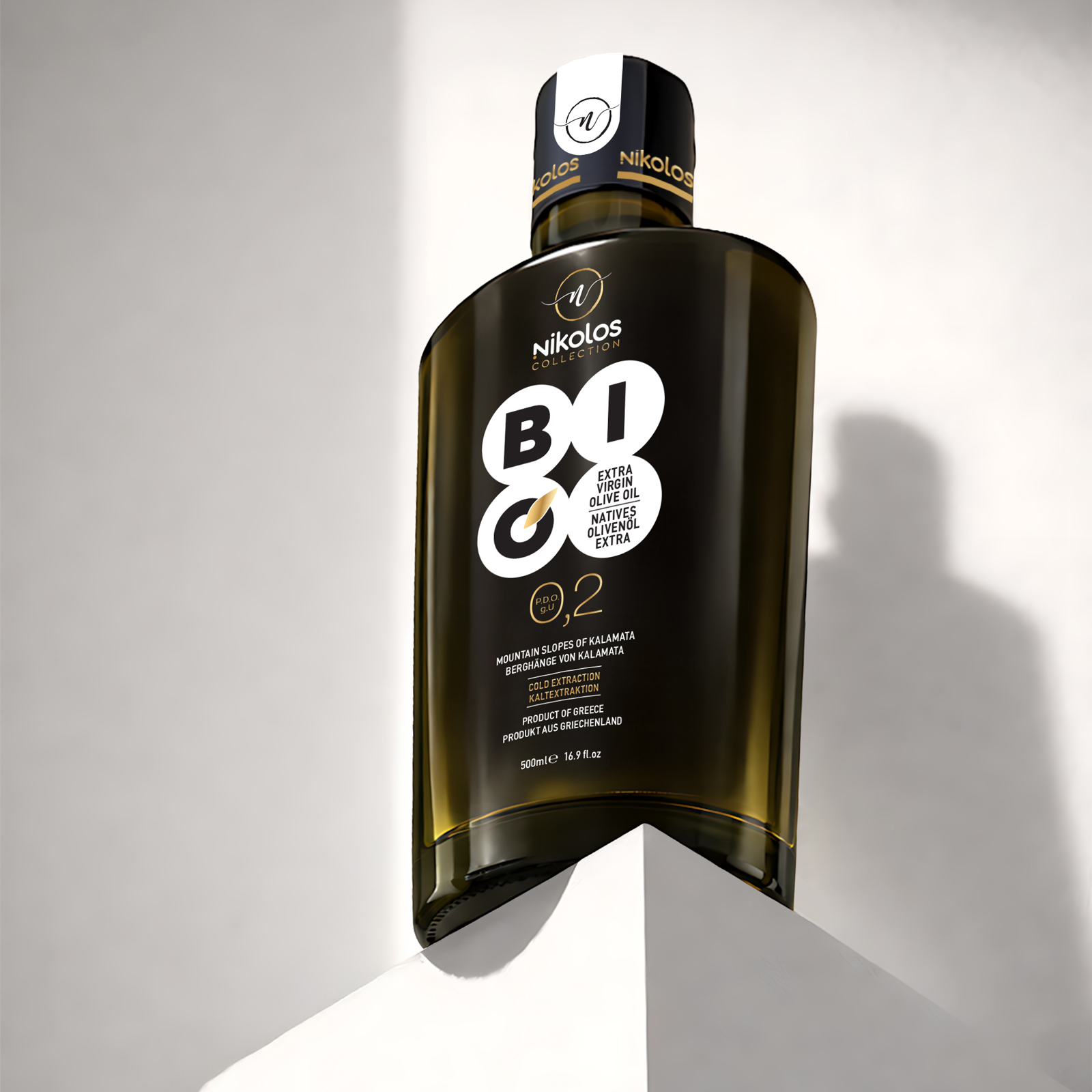
The client’s objective was to create a packaging design that reflects the purity and quality of a premium organic extra virgin olive oil.
A product rooted in origin, natural production and respect for the raw ingredient.
The packaging needed to feel simple, clean and timeless.
Free from visual noise or unnecessary decoration.
And clearly positioned within the premium category.
Our strategy was based on the philosophy of minimal design and meaningful communication.
We focused on clean forms and a strict typographic structure.
The color palette was intentionally reduced to essential tones.
Graphic elements were used only when absolutely necessary.
Every detail serves a clear purpose and function.
The result is a packaging design that feels refined yet powerful.
It highlights the authenticity and quality of the olive oil.
It stands confidently on the shelf.
Communicating purity, trust and natural value.
A design that allows the product itself to take the lead.


 monther al omari
 43oz
43oz Thirst
 Carreto Concepts Design Studio
 M&A CREATIVE AGENCY
 pastellofactory
 Omar Altayeb
 Cocoon Prague
 古戈品牌
古戈品牌 Pascal Riviere Design
 ZIMO Studio
 alchimistestudioParis
 Valérie Colace
 Platon Ivantsov
 Leyma Design
 Dina Gamal eldin
 clermentza
 Redlana
 anushrishah
 Natania Doshi
 NewFolderStudio
 francapovilla
 Mother Tongue Design
 CJMartins