

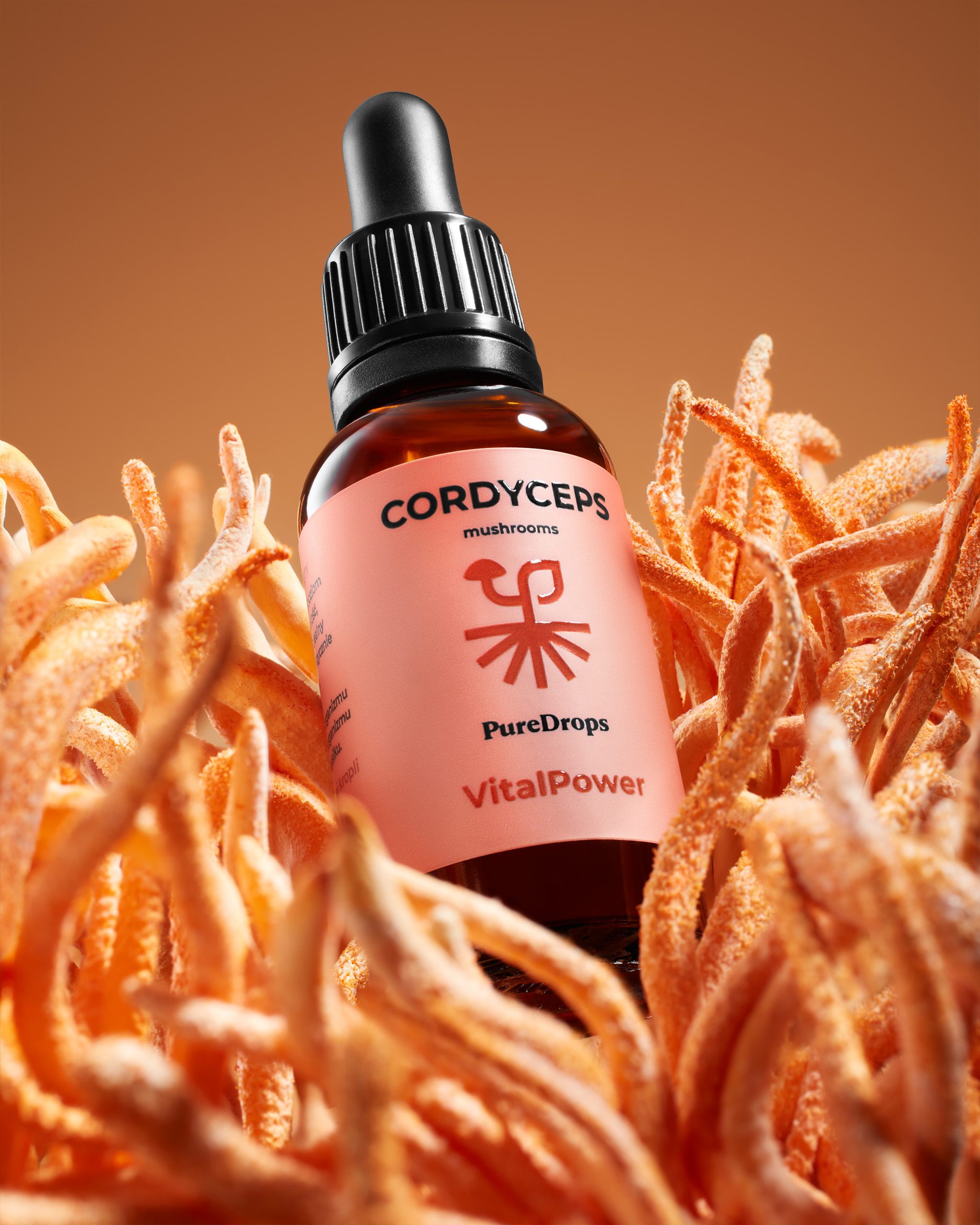
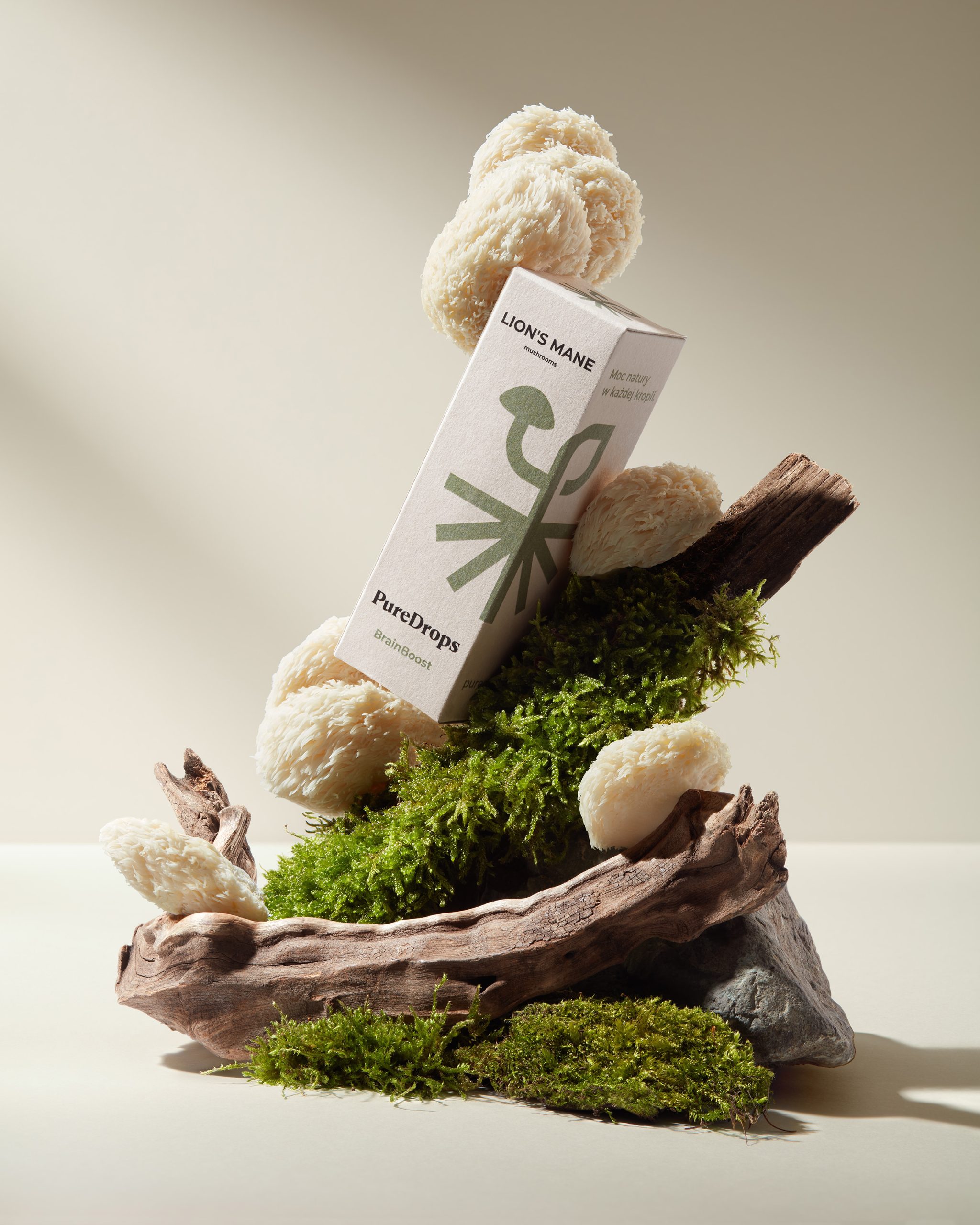
Pure Drops is a Polish brand specialising in the creation of natural extracts from plants, herbs and adaptogenic mushrooms. The first product line includes the vital mushrooms Lion’s Mane and Cordyceps, as well as the adaptogenic herb Ashwagandha. The scope of our work included the design of a logo and packaging system for the entire product line.
The central element of the visual identity is an original signet that combines three symbols of nature in a synthetic form: a mushroom, a leaf and a root/soil. This minimalist sign is a metaphor for the full life cycle of a plant – from roots to fruiting body – emphasising the natural origin and holistic effect of the products.
The signet is designed in a modular way, so it can change its interpretation depending on the product category. In the case of mushroom extracts, it clearly emphasises the shape of a mushroom cap, while in herbal products, its orientation emphasises the leaf motif.
A characteristic element of the packaging system is the use of the logo, which extends across two adjacent sides of the box, creating a consistent key visual for the brand when the packaging is closed. As a result, the packaging becomes not only a carrier of information, but also an element that builds a recognisable graphic form in the sales space.
Each product in the portfolio has been given its own colour scheme inspired by the natural ingredients. Colour acts as an intuitive navigation system throughout the product line, while maintaining the brand’s aesthetic consistency.




 Studio Zak
 Ander Sanchez
 Atipus
 Widarto Impact
 hovski
 Ohmybrand
 CreativeWise
 Rauf Karaev
 Hooperstudio
 La Nube de Ideas
 Modern Theory
 Akim Melnik Design Studio
 preflightcreative
 Seyf El Haq Menouer
 Badraddine Attik
 Samriddhi Ravi
 Alessandro Ammaturo
 Amblr Studio
 vladlenalevit
 Sis Tsarukyan
 monther al omari
 alchimistestudioParis
 designsbysukaina
 About House of Ta
 Amjad Battal