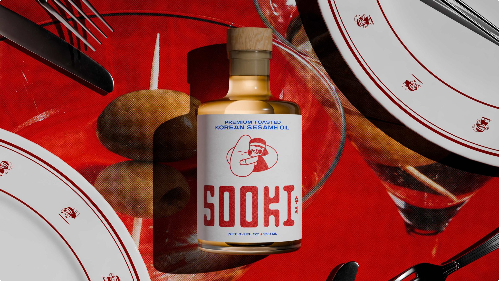

Sesame oil isn’t new, but Sooki’s approach to it is. In the U.S., it’s often treated as a background ingredient, something you reach for at the very end rather than something you build a meal around. Joseph and Hannah Choi of Sooki Foods came to us with a different point of view. They wanted to introduce a premium Korean sesame oil that highlights its depth, versatility, and cultural roots, while still feeling approachable and relevant to a broader audience.
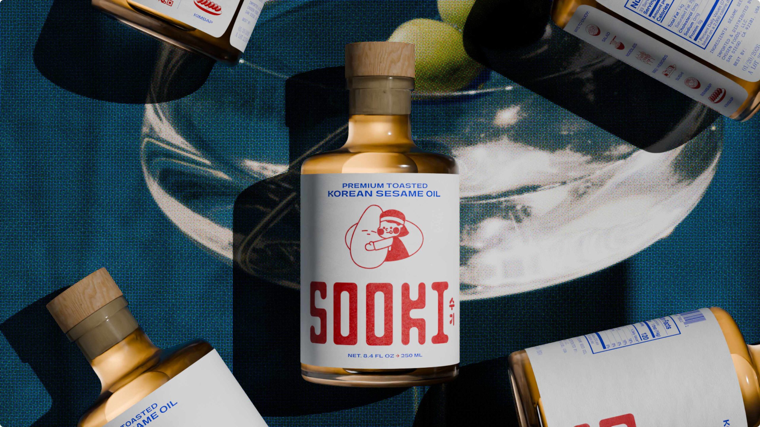
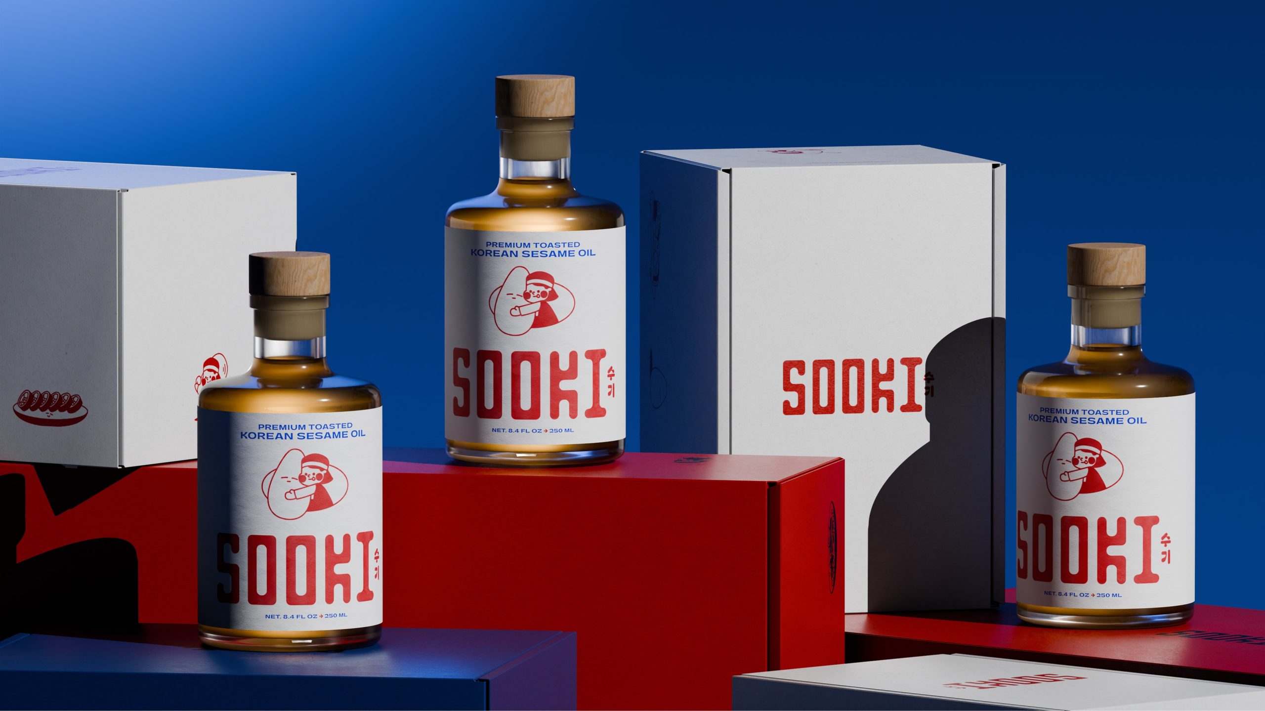
We built a brand that brings sesame oil forward. Grounded in Sooki’s family story and traditional production methods, the identity balances heritage with a more modern, expression. The result positions Sooki as something you don’t tuck away in a cabinet, but keep out on the kitchen counter.
Curator’s Insight – Sesame oil gets its moment.
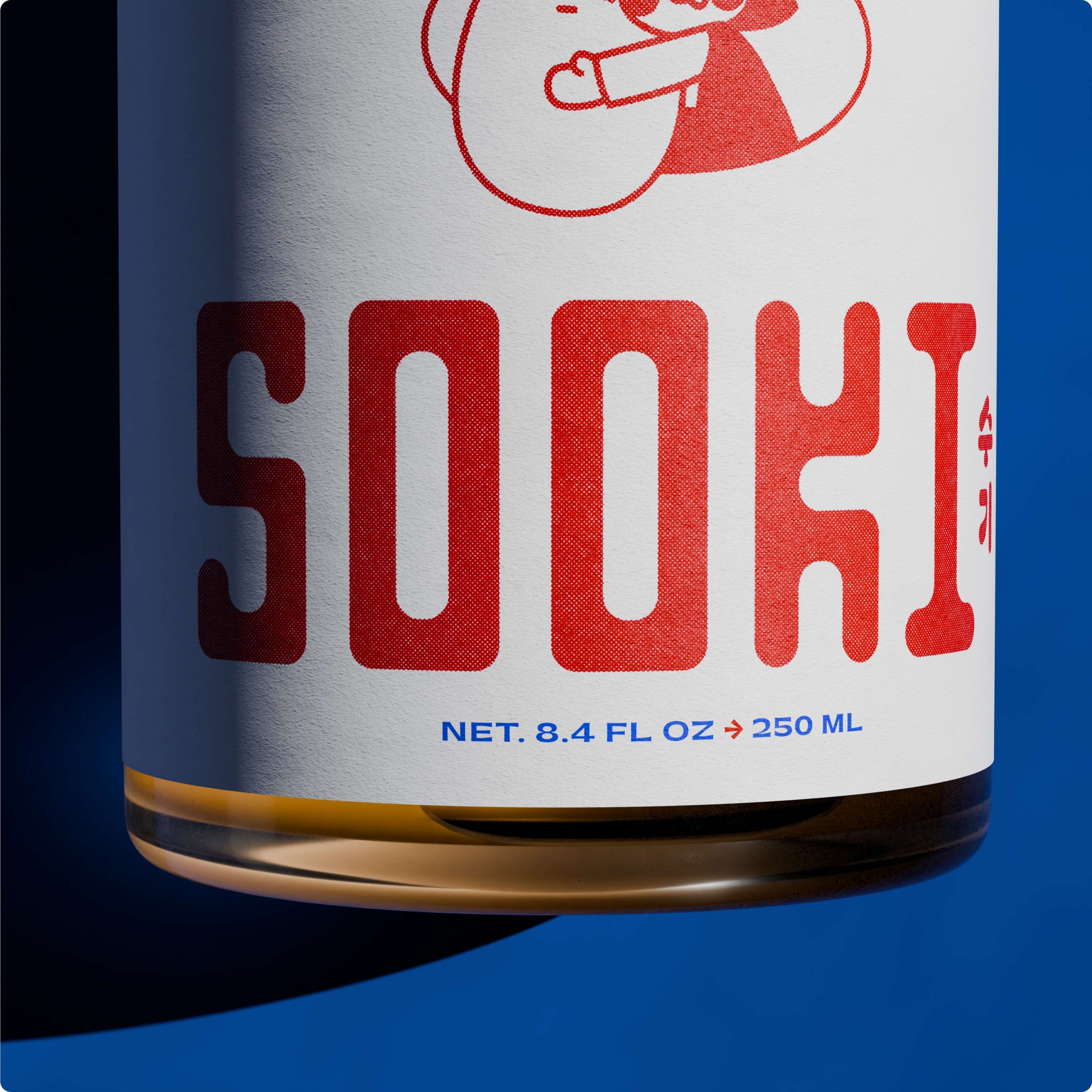
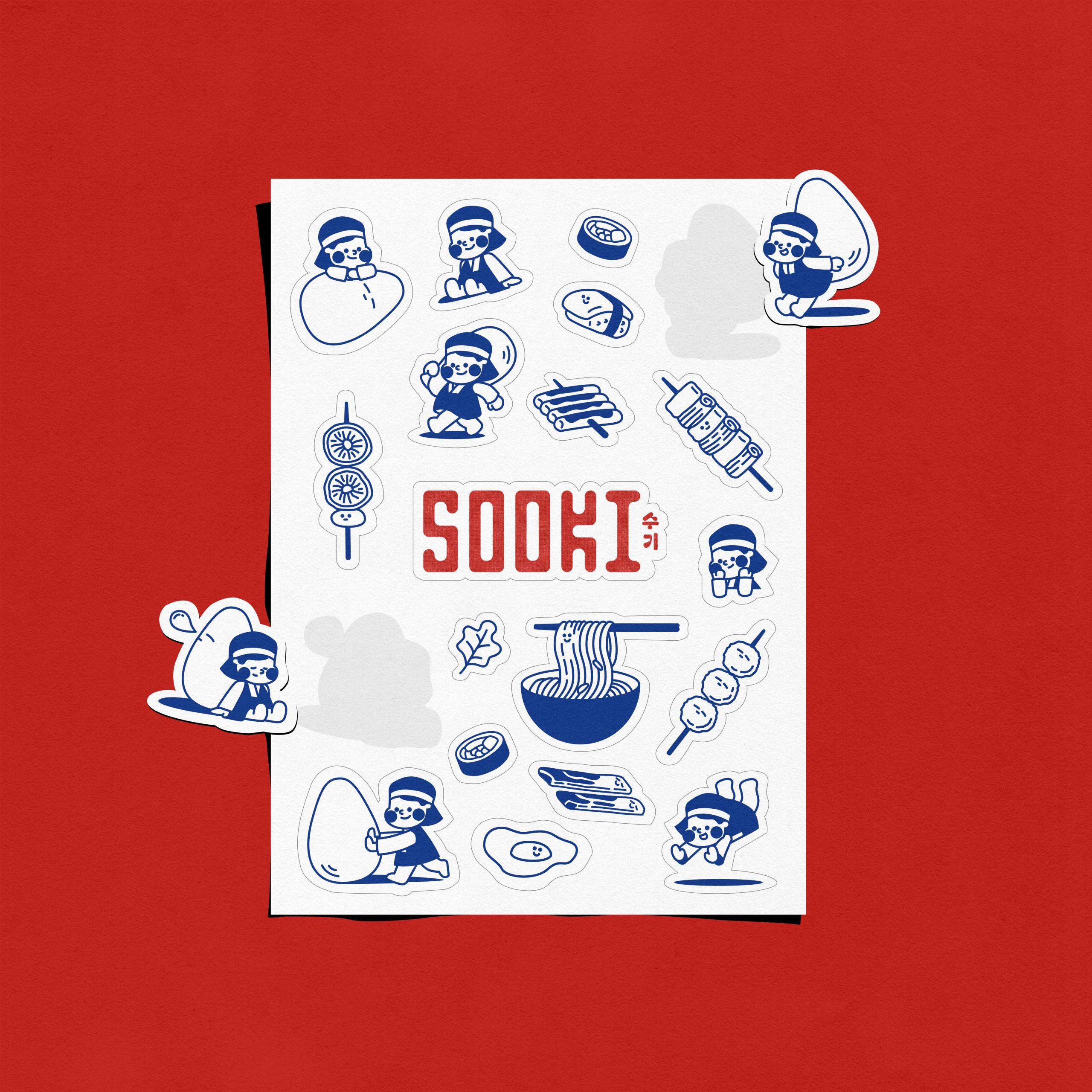
Sooki Foods reframes a pantry staple as the hero ingredient it deserves to be. Designed for Joseph and Hannah Choi, the brand draws from their Korean-American heritage and small-batch production methods, translating that story into an identity that feels both rooted and contemporary. The chunky slab-serif wordmark, the hand-drawn mascot, and the bold red-on-white label all signal something worth putting on the counter rather than hiding in a cabinet.



 Furt Goods
 Atiq Alam
 宏洛图品牌设计HONGLT
 Ampersand Creative
 Modern Theory
 Palashcc
 neo creative studio
 Axiniya Knyazeva
 Valérie Colace
 Anshuman
 Archi Jain
 DESIGN CONCEPTS
 Shapers Studio
 jamajkajakub
 tamara barakat
 Derrick Lin
 VincoStudio
 lisakaplina
 CreativeWise