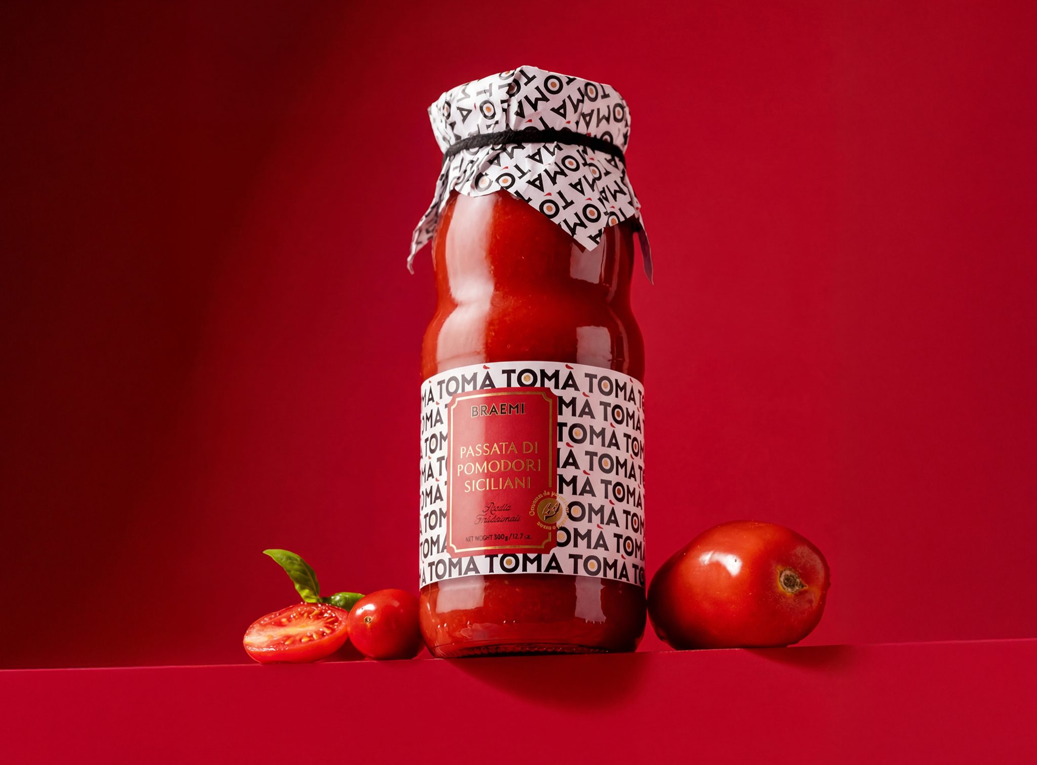

TOMÀ is a tomato sauce brand built on a simple but distinctive linguistic insight. The name works on two levels: when repeated, TOMÀ naturally reads as “tomato”, making the category instantly recognizable. In Sicilian dialect, “tò mà” also means “your mum”, evoking a sauce made the way your mum would at home.
This dual meaning is translated into two complementary design directions.
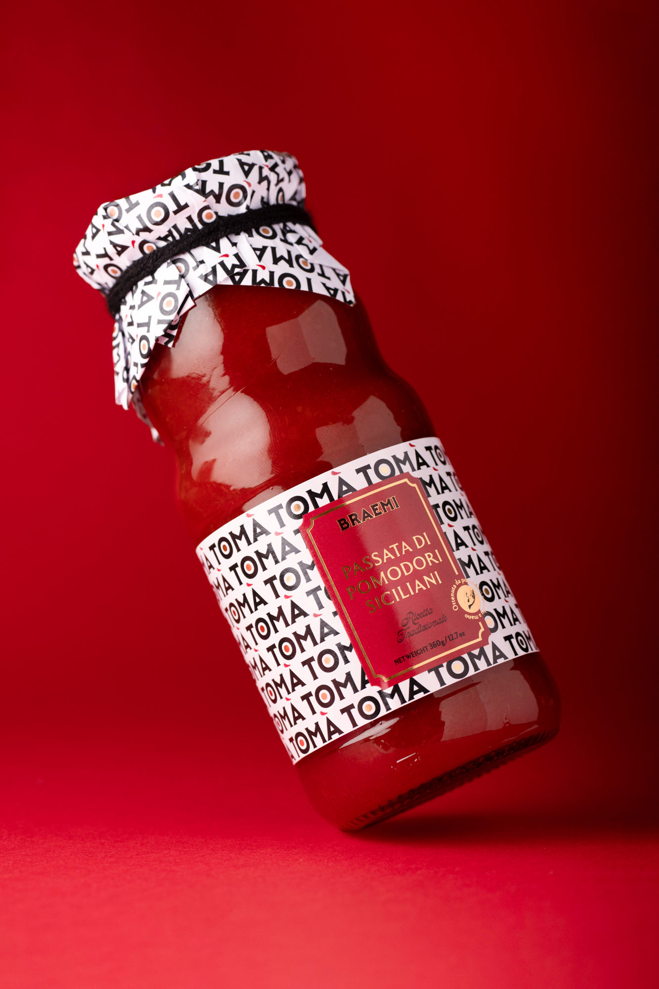
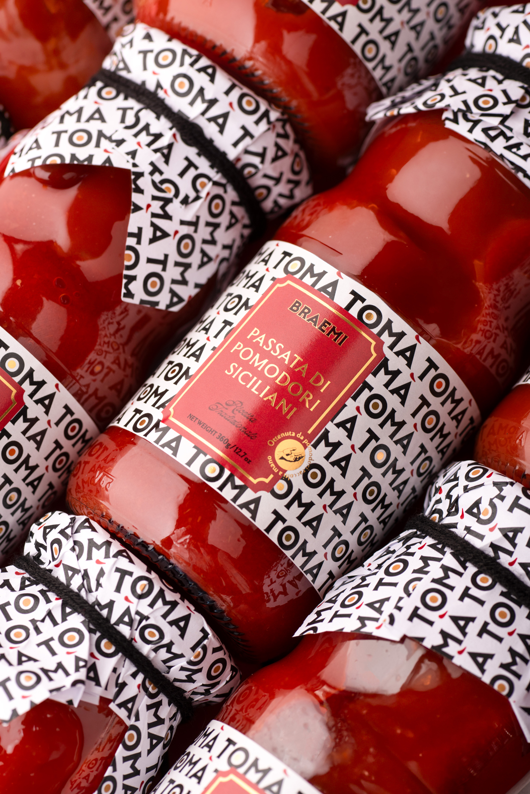
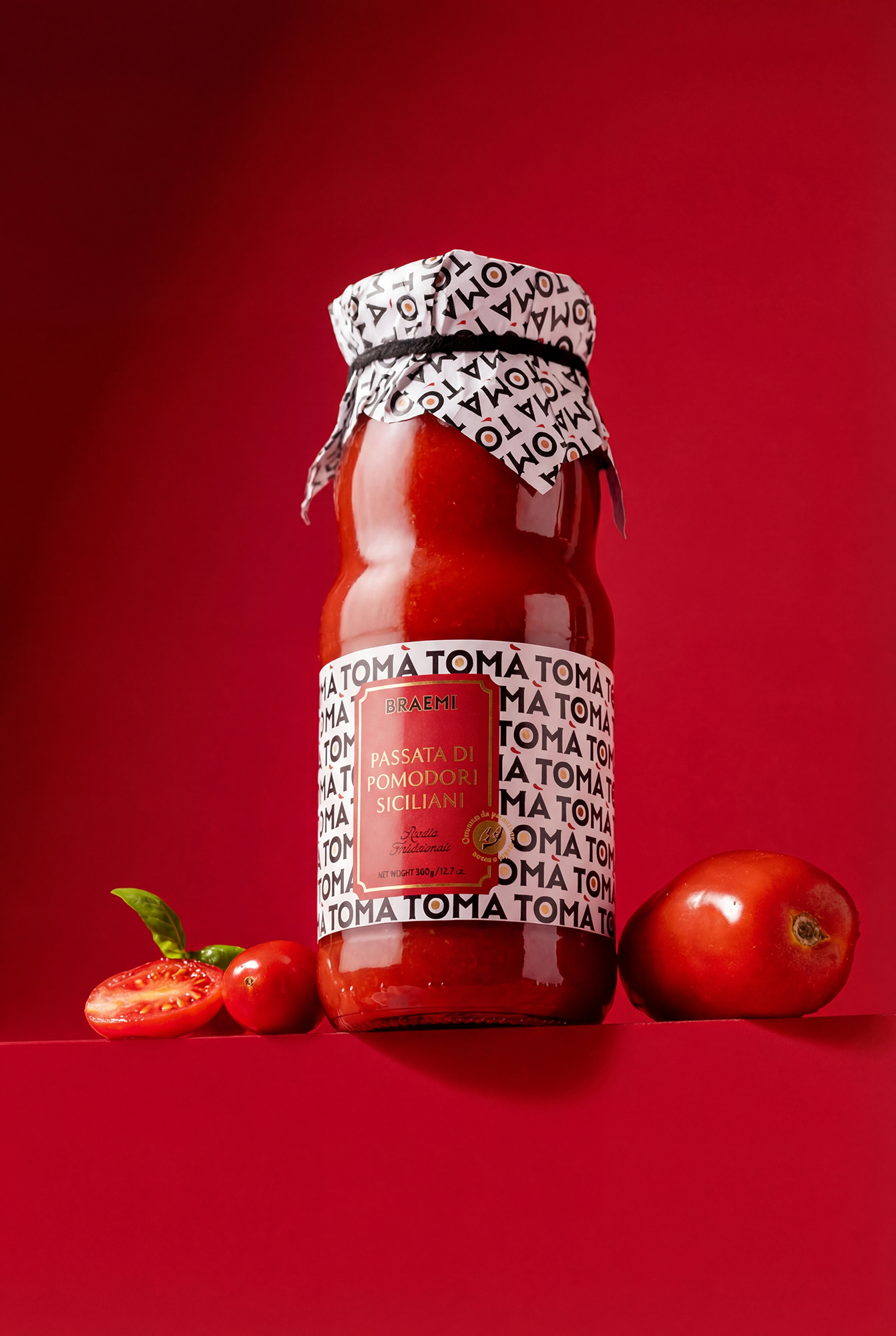
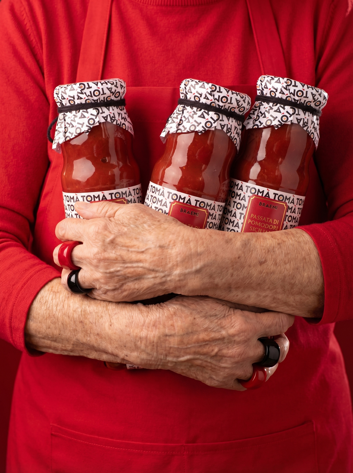
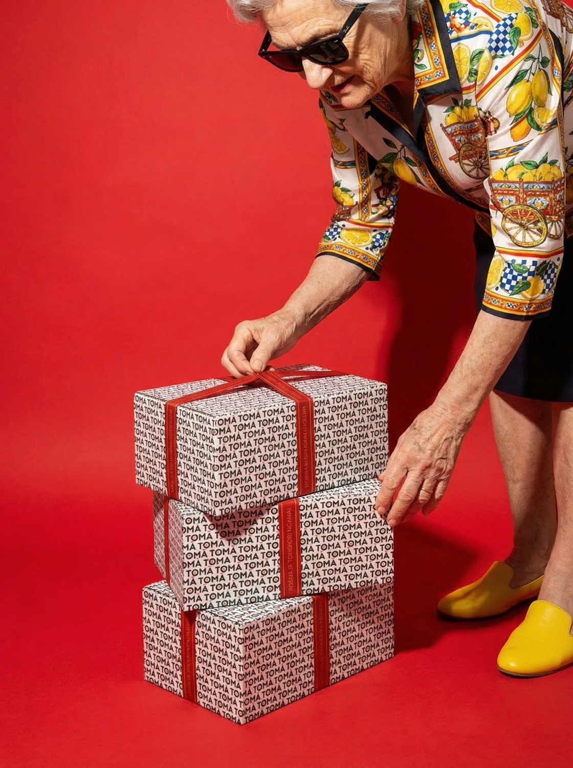
On one side, the logotype becomes a visual system. Designed to be repeatable, it forms a rhythmic pattern that subtly spells “tomato”, creating a strong and ownable graphic identity that enhances memorability and shelf impact.
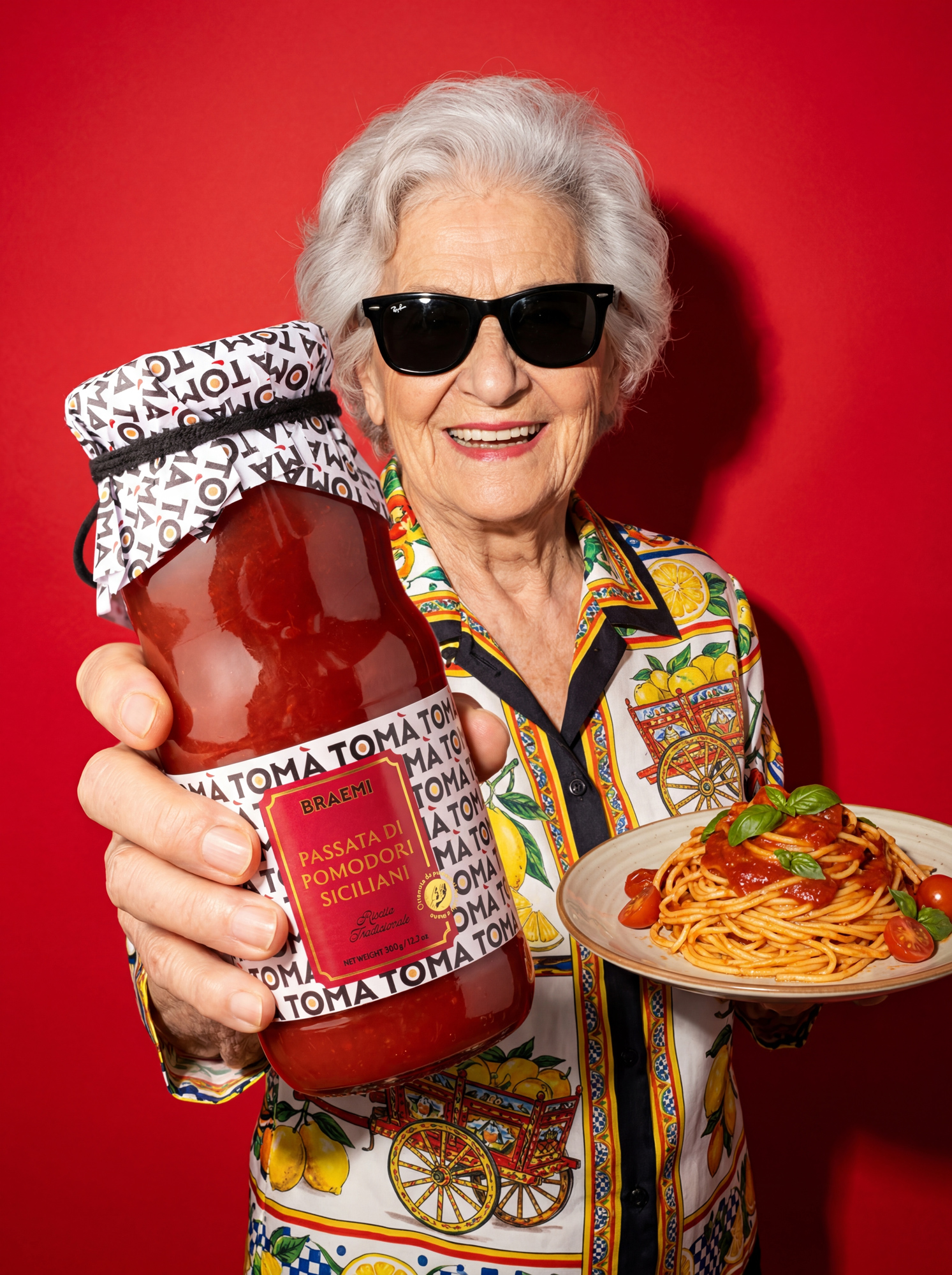
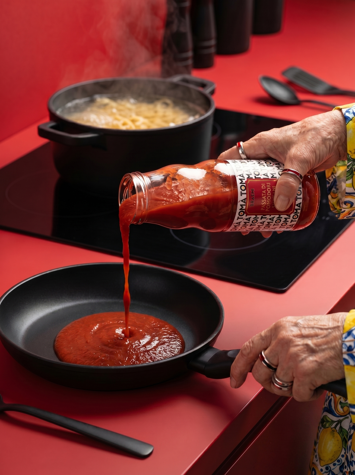
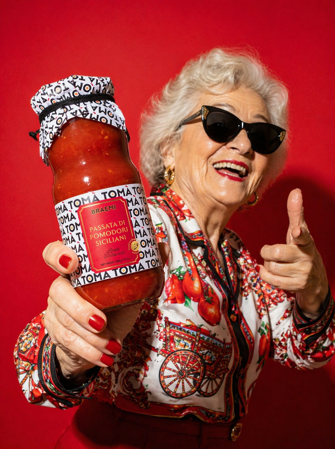
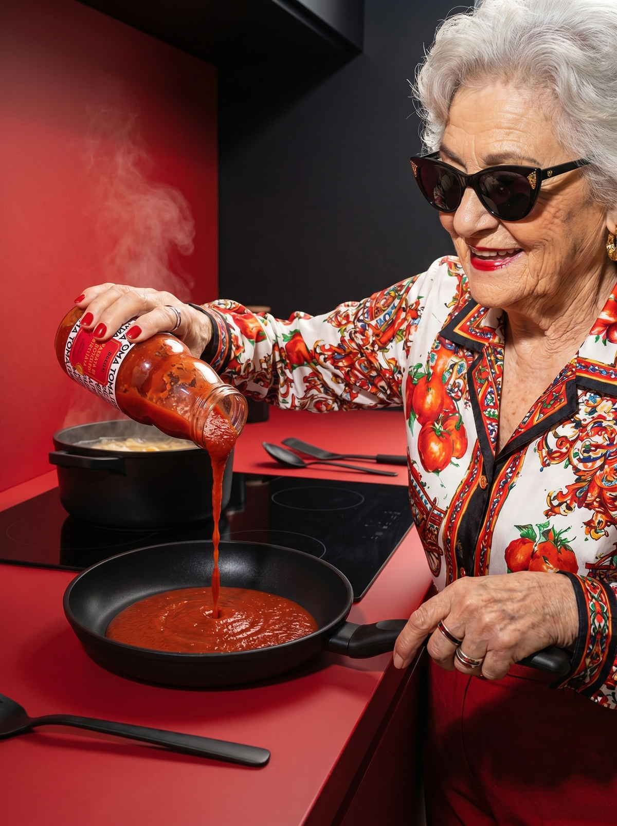
On the other, it informs the brand’s visual direction. The idea of “your mum” is reinterpreted through the figure of the grandmother transformed into a bold and unexpected character. Styled in a vibrant Sicilian shirt and portrayed with a confident, almost iconic attitude, she becomes a “pop grandmother”: a symbol of authenticity translated into a contemporary visual language.
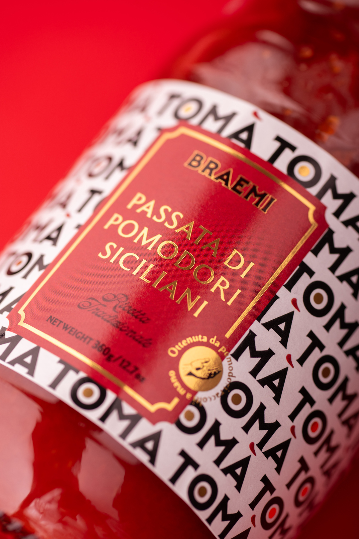
The design balances two visual languages. The repeated logotype generates a contemporary background pattern that conveys rhythm and modernity, while the central label adopts a more composed and apparently classical layout that reassures and structures information. This contrast creates both impact and familiarity.
A key detail is the accent mark, interpreted as a brushstroke of sauce. This transforms a typographic element into a sensory cue that connects directly to the product’s texture and essence.
In a category dominated by traditional and nostalgic codes, TOMÀ takes a contemporary approach. Instead of relying on clichés, it communicates homemade quality through language, rhythm, and visual simplicity.
Curator’s Insight – TOMÀ TOMÀ TOMÀ… say it fast enough and you’ve already said everything.
TOMÀ is a Sicilian passata brand built on a clever linguistic loop: repeat the name and it reads “tomato.” In Sicilian dialect, tò mà also means “your mum”, and that double meaning drives every design decision. The logotype becomes an all-over pattern that spells out the category through pure rhythm, while the central label holds things together with a composed, almost classical layout. The accent mark doubles as a brushstroke of sauce. And fronting it all? A silver-haired nonna in Ray-Bans and a Sicilian print shirt, homemade quality reframed as a pop icon.
 Li Jie
 Lung-Hao Chiang
 Alessandro Ammaturo
 Antonia Skaraki
 Narrow House Packaging Branding & Design
 teresaredon
 Eva Chistyakova
 Akshay 11
 cheleto
 nadayasser13e
 hello ocean
 Modern Theory
 Alexander Skurihin
 Valérie Colace
 Squad
Squad Studio Zak
 Bhumika Singh
 宏洛图品牌设计HONGLT