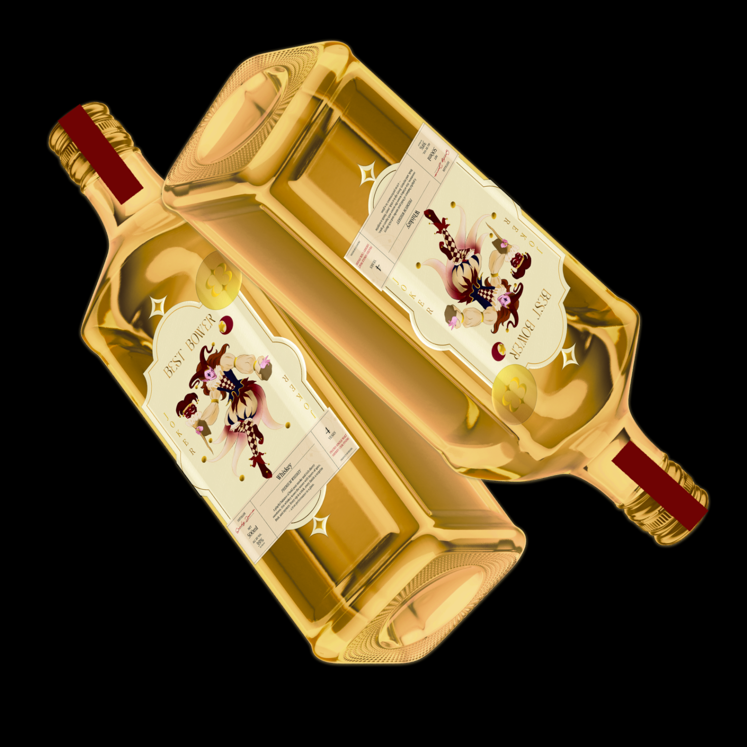

Best Bower Premium Reserve is designed around the idea of performance rather than traditional whiskey nostalgia. I used the Joker as the central narrative device to reflect the whiskey’s layered character balancing toasted barley, caramel warmth, vanilla softness, and hints of peat smoke and sherry sweetness. The front label follows a playing-card structure, turning the bottle into a symbolic and collectible object that introduces a sense of rhythm, surprise, and personality before the first sip.
This playing-card logic continues onto the back label to maintain continuity across the bottle and strengthen the storytelling. Gold detailing and the seal element add a sense of ceremony and authenticity, grounding the illustration within a premium context. Instead of relying on heritage clichés, the design presents the whiskey as something layered and experiential a performance that unfolds gradually in the glass.


 sophioc
 Marta Wasilewska
 House of Thought
 Krithika Chakkaravarthy
 Reema
Reema Oksana
 Palashcc
 KoverCsengeAgnes
 Carreto Concepts Design Studio
 Viktoriia Graber
 Sealburger
 Farah Haddad
 Sami Asaad
 Modern Theory
 PLUSDESIGbd
 Ayanna
 Flow Creative
 jonathanag90
 Creative Platform
 alchimistestudioParis
 Eman AlGhasra
 andreamarinnn