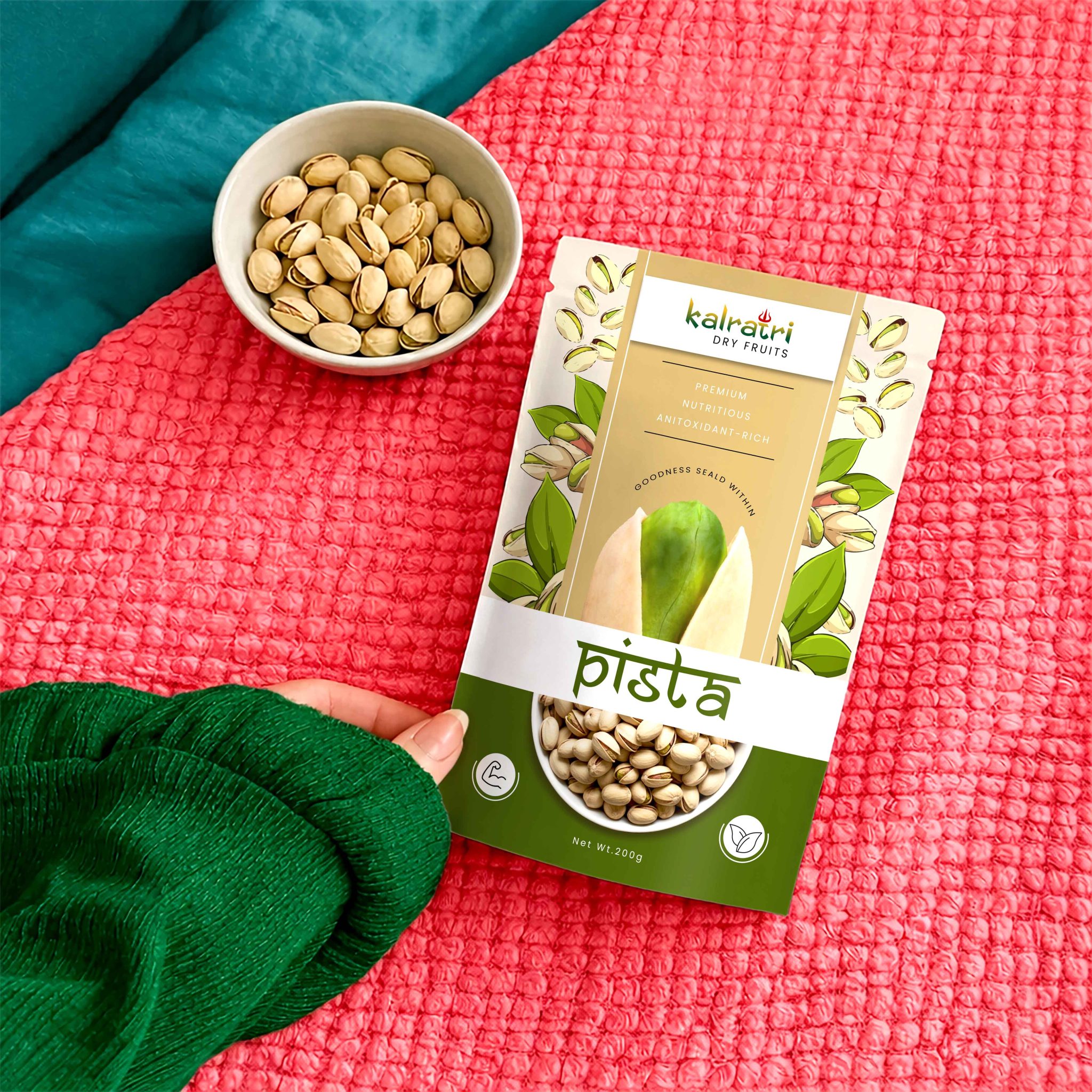

Kalratri is a dry fruits–based brand for which we delivered a complete, end-to-end brand-building solution, encompassing brand strategy, brand identity, and packaging design. The project began with establishing a strong strategic foundation aimed at positioning Kalratri as a premium, powerful, and highly trustworthy brand within a competitive market. We focused on creating a brand that not only reflects quality and authenticity but also evokes a sense of richness and depth—qualities deeply associated with dry fruits in the Indian context.
Our strategy centered around building a distinctive positioning that blends traditional values with a modern, aspirational appeal. Kalratri was envisioned as a brand that carries cultural depth while appealing to contemporary consumers who seek both quality and aesthetic sophistication. This strategic direction became the guiding force behind every creative decision, ensuring consistency and clarity across all brand touchpoints.
For the brand identity, we developed a bold and memorable visual language that captures the essence of the name Kalratri—strong, intense, and rooted in heritage. The logo was designed with a sense of authority and elegance, using refined typography that conveys trust and premium quality. The color palette plays a crucial role, combining deep, rich tones with subtle accents to reflect indulgence, warmth, and luxury. These elements together create a visual identity that feels both powerful and timeless.
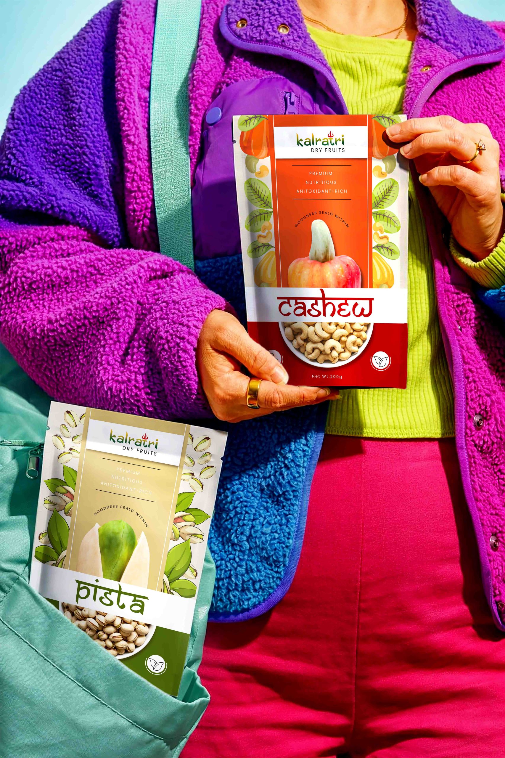
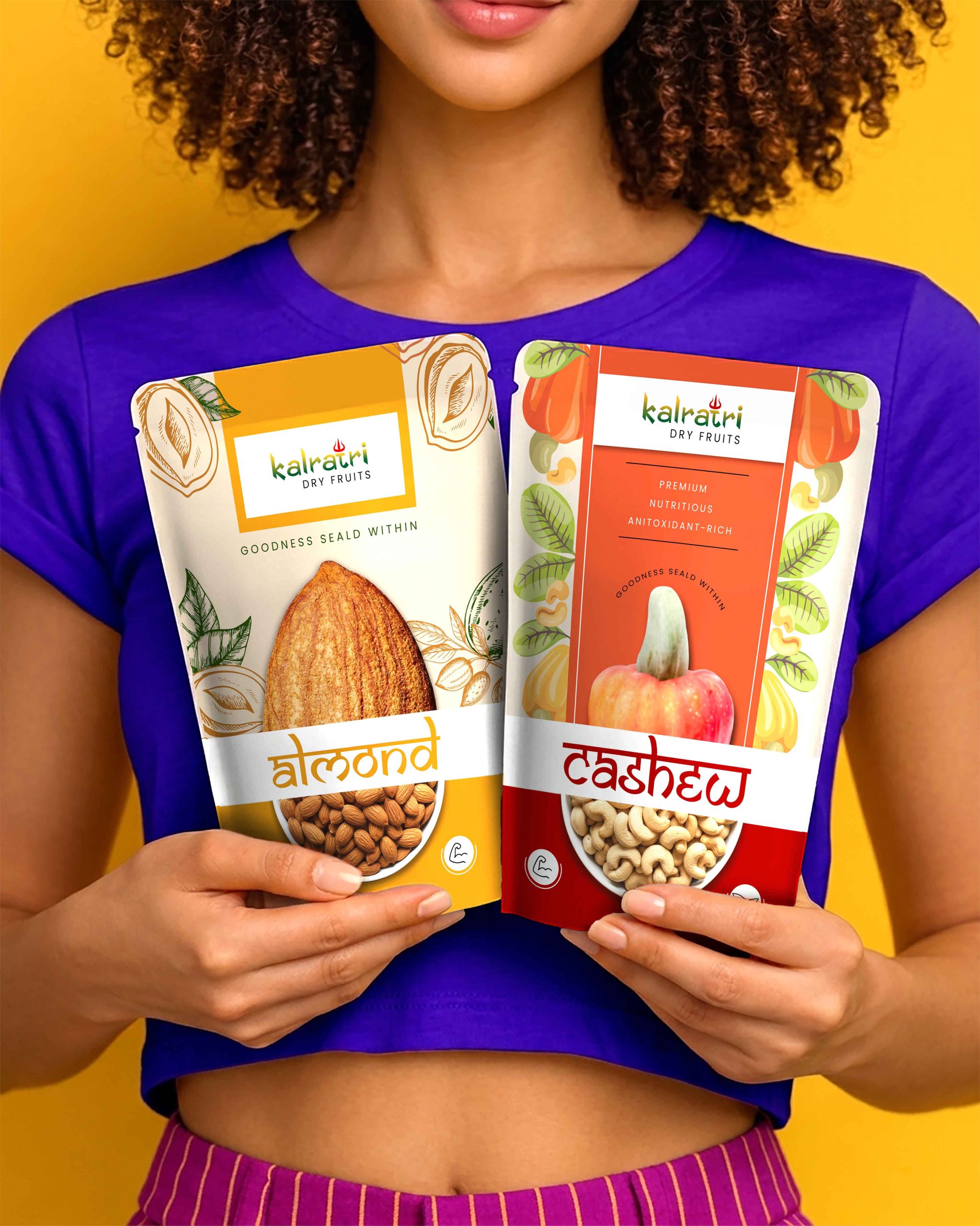
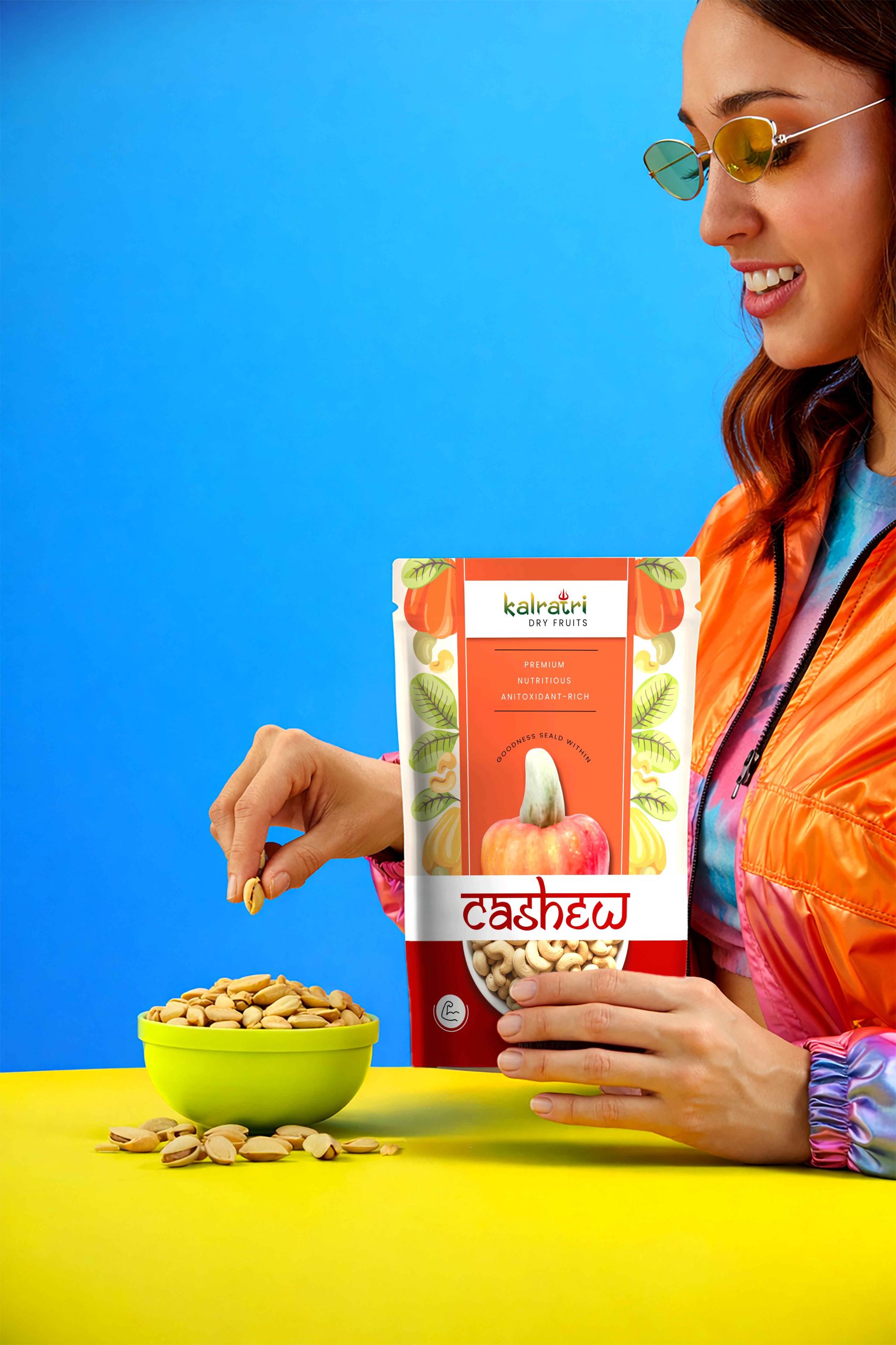
The packaging design was crafted to elevate shelf presence while clearly communicating the brand’s core values of purity, quality, and indulgence. We created a structured and cohesive packaging system that allows for easy scalability across multiple SKUs while maintaining a unified brand language. Each pack was designed with a clear visual hierarchy, ensuring that key information such as product type, quality cues, and brand identity are instantly recognizable. The use of rich colors, clean layouts, and premium detailing enhances the overall perception of the product, making it stand out in a crowded retail environment.
Special attention was given to balancing visual richness with clarity. While the design embraces depth and boldness, it avoids unnecessary clutter, allowing the product to feel premium yet accessible. Subtle design elements inspired by tradition add character without overwhelming the modern aesthetic.
Overall, the brand strategy, identity, and packaging design for Kalratri come together to form a cohesive and impactful brand system. It successfully positions Kalratri as a premium, trustworthy choice in the dry fruits category—one that resonates with consumers looking for quality, authenticity, and a refined brand experience.


 Derrick Lin
 43oz
43oz vitoramockup
 Oksana
 KOS
KOS Hui Hua
 Rana Elkady
 Modern Theory
 Eclectic M
 Katya Slobodskaia
 Evgenia Beresneva
 CreativeWise
 宏洛图品牌设计HONGLT
 erandy
 Abbas Sayyed
 Ollie
Ollie Moço Wine Branding
 khadijaaljifri
 Abdulrahman Taha
 Juana Sarabia
 Mohammed Nasr Sharfi