
IDENTITY SYSTEM / PACKAGING / VISUAL IDENTITY / CREATIVE DIRECTION BRANDING
Nocaff Canned Coffee
Packaging Design
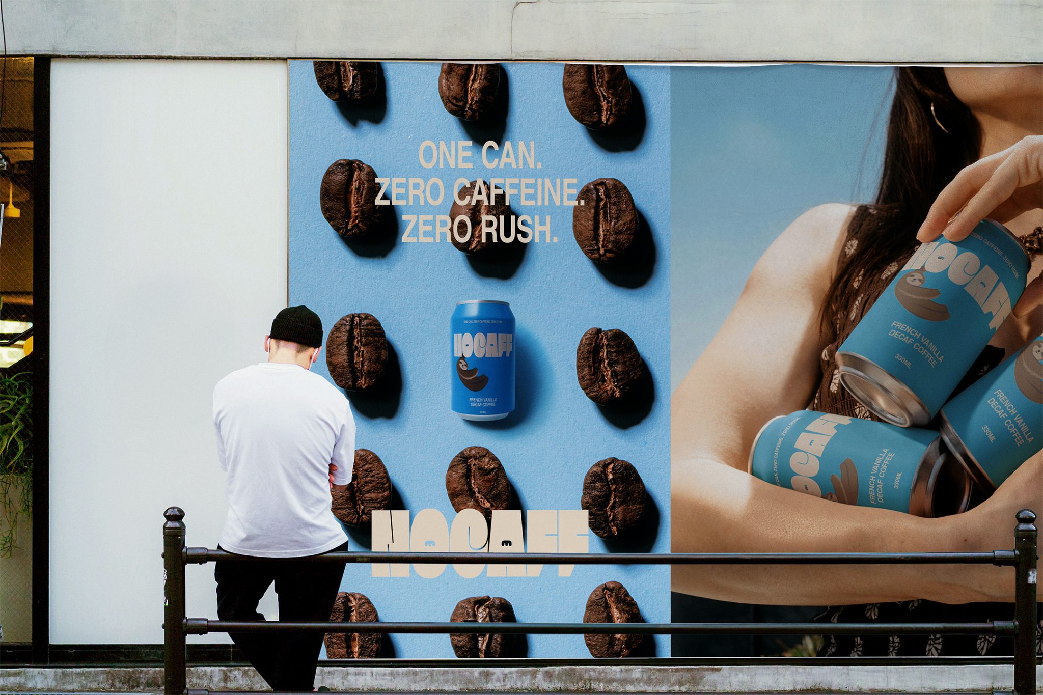
Not every coffee moment needs to come with a rush. Nocaff was created for people who want the comfort, taste, and ritual of coffee without the caffeine rush that usually follows. It is a decaf coffee brand made for slower mornings, calmer evenings, and anyone who wants to enjoy a can of coffee without feeling pushed by it.
With a French Vanilla flavour profile and an identity rooted in ease, Nocaff speaks to people who like sweet, relaxing flavours and want something that feels reassuring rather than overstimulating. It’s coffee for the people who want the experience, but not the tension.
Nocaff sits in a crowded drinks market where coffee packaging often looks the same before you have even picked it up. This project focused on creating a brand identity and canned coffee label for a decaf product aimed at 18-40 year olds who want something calm, flavourful, and easy to reach for. The audience already understands coffee, but they are looking for a version that better fits the pace they want to live at. The challenge was to make something that felt modern and distinctive without losing the quiet appeal of decaf.
The canned coffee industry is full of familiar cues. Coffee beans. Curved wordmarks. Repetitive labels. Safe choices that blended into the shelf instead of standing out from it. Nocaff needed to break away from that pattern. It had to feel bold enough to get noticed, but still soft enough to reflect the product’s calmer purpose. That balance mattered. Too much energy would have felt wrong. Too little would have disappeared. The goal was to create packaging that could catch the eye of new customers, communicate flavour clearly, and still hold onto the relaxed, self-aware personality of the brand.
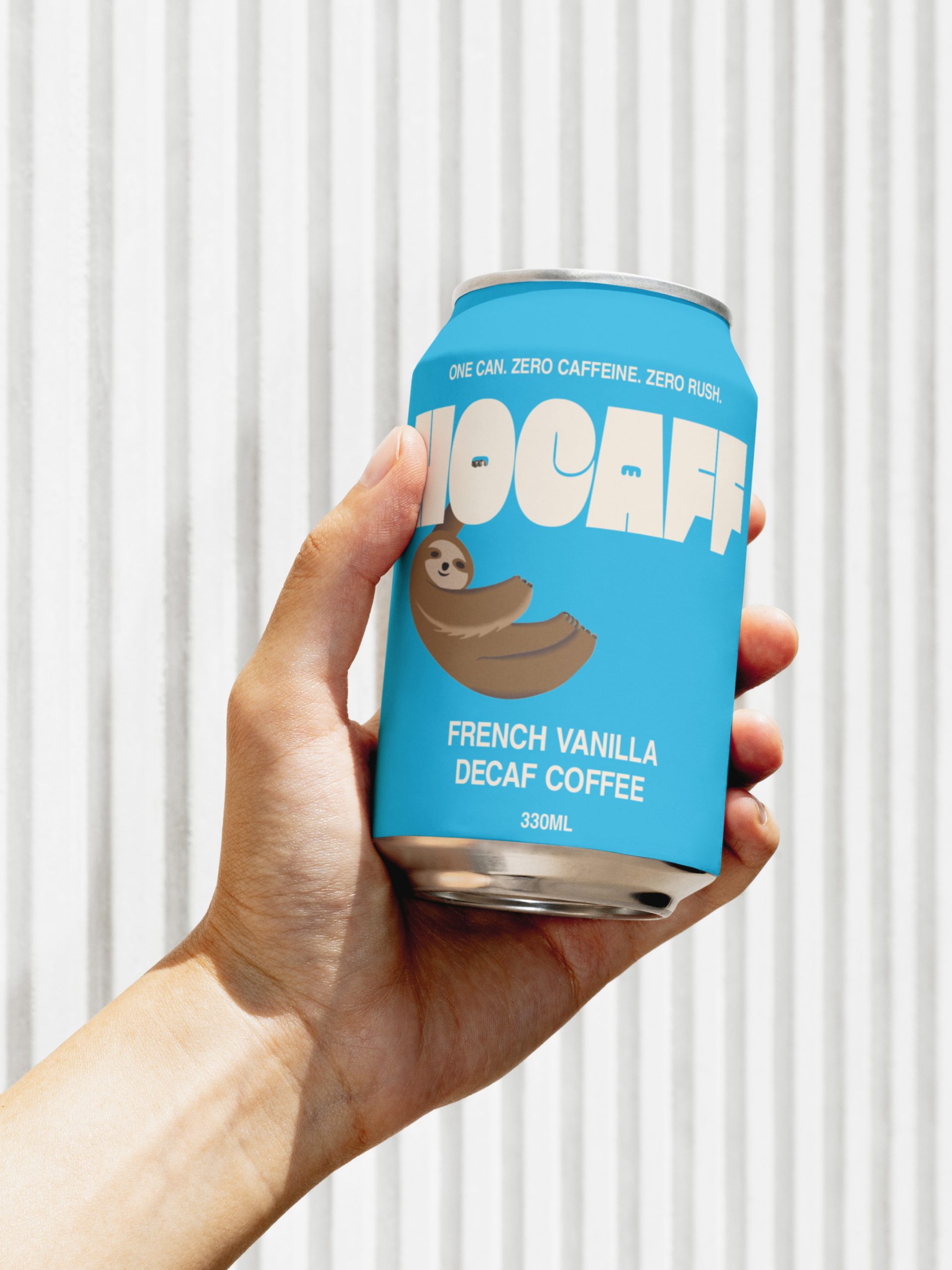
I approached Nocaff by looking for a way to make calm feel visual. The concept grew around the idea that decaf doesn’t need to feel dull or overly serious. It can still be fun. It can still be expressive. It can still have presence. From there, I developed a wordmark with a hand-grip counter and subtle eye details in the O and A. These details add personality and tension in the right places, making the brand feel considered rather than overly decorative. Every choice was made to support the same message: calm does not have to be plain.
That idea led naturally into the illustration system. A sloth became the perfect visual anchor for the label, holding onto the hand grip of the O as a quiet cue for slowness, ease, and laid-back enjoyment. It gave the brand a memorable personality while reinforcing what Nocaff stands for: coffee without the rush. The result is a brand that feels easygoing, modern, bold, and just intriguing enough to make someone take a second look.
The colour palette was built to feel fresh, calm, and distinctive on shelf. The primary blue brings energy and clarity without feeling aggressive. It gives Nocaff a bright, modern presence that helps the can stand apart from the usual coffee category. The secondary cream softens the overall look and adds warmth, creating a more relaxed balance against the stronger blue.
The sloth illustration uses a darker, earthy set of tones to give the character depth and a tactile, grounded feel. These colours help the illustration feel rich and expressive without overpowering the label. Together, the identity creates a look that is upbeat, minimal, and memorable.
In the end, Nocaff feels like a decaf brand with a clear point of view. It no longer blends into the background of the coffee industry. It stands with more confidence, more personality, and a stronger sense of intent. The final identity gives the product a visual language that is calm without being quiet, bold without being loud, and distinct without losing its sense of ease.
Nocaff is now ready to meet an audience that wants flavour, comfort, and a coffee ritual that fits their pace.
By Jeremiah Haastrup
Creative Developer & Designer
Available in London, UK & Worldwide
Instagram | Premium Brand Kits & Enquiry




 monther al omari
 43oz
43oz Thirst
 Carreto Concepts Design Studio
 M&A CREATIVE AGENCY
 pastellofactory
 Omar Altayeb
 Cocoon Prague
 古戈品牌
古戈品牌 Pascal Riviere Design
 ZIMO Studio
 alchimistestudioParis
 Valérie Colace
 Platon Ivantsov
 Leyma Design
 Dina Gamal eldin
 clermentza
 Redlana
 anushrishah
 Natania Doshi
 NewFolderStudio
 francapovilla
 Mother Tongue Design
 CJMartins