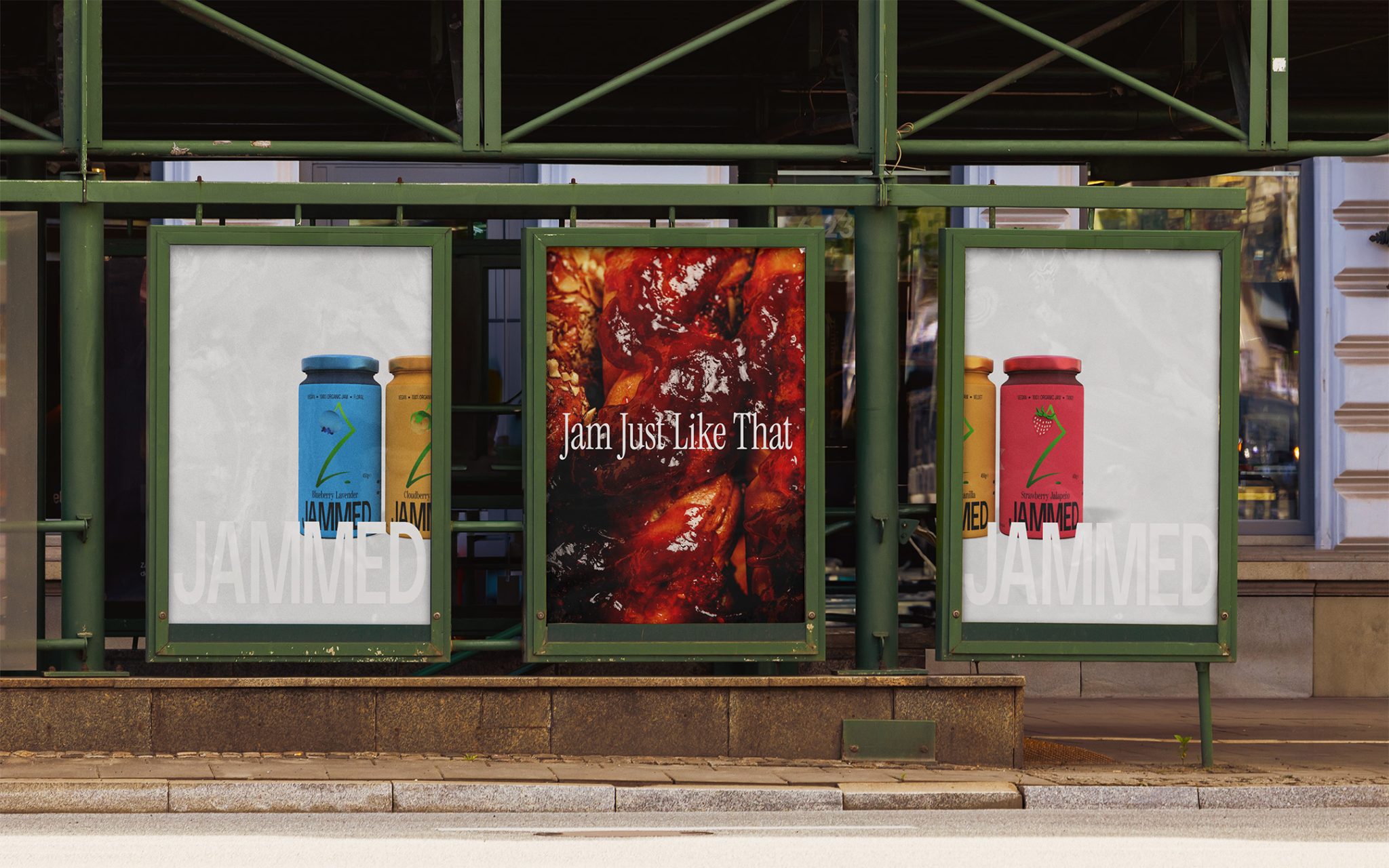

Jammed is a bold jam brand made for people who want more from breakfast, snacks, and everyday food moments. Made in Spain and the UK, the brand speaks to a young, adventurous audience aged 16–40 who are drawn to sweet but unexpected flavour combinations and are always looking for something with a little more edge.
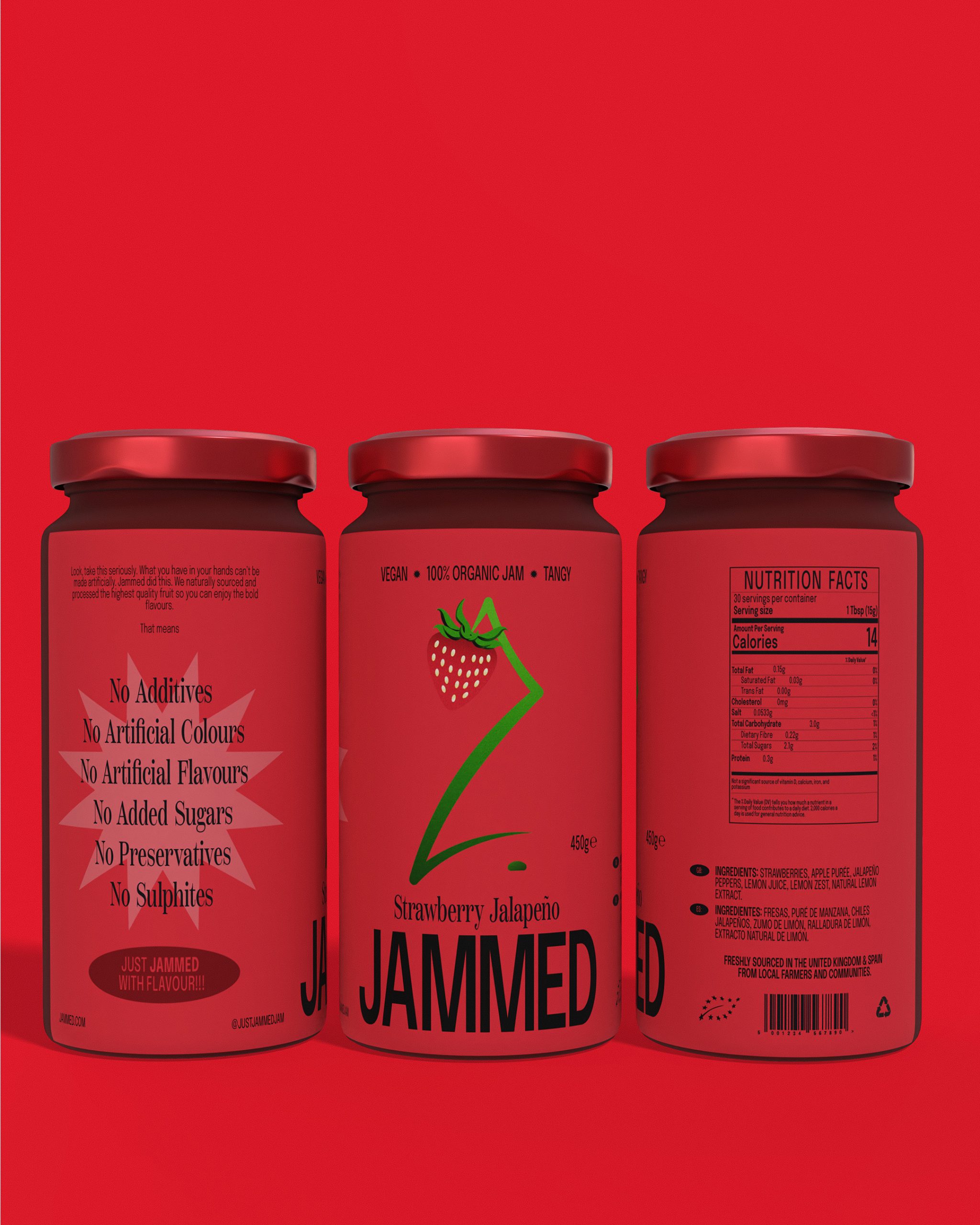
The challenge was not only to make the packaging look different, but to make it feel genuinely exciting, while still communicating taste clearly and honestly. The brand needed to connect with people who are curious, selective, and hard to impress. This audience does not want empty promises or exaggerated flavour claims. They want something that looks as bold as it tastes.
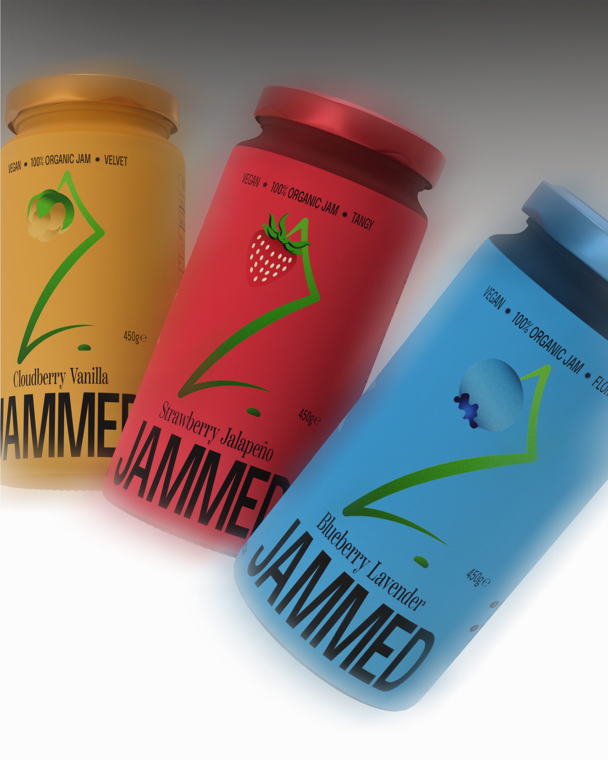
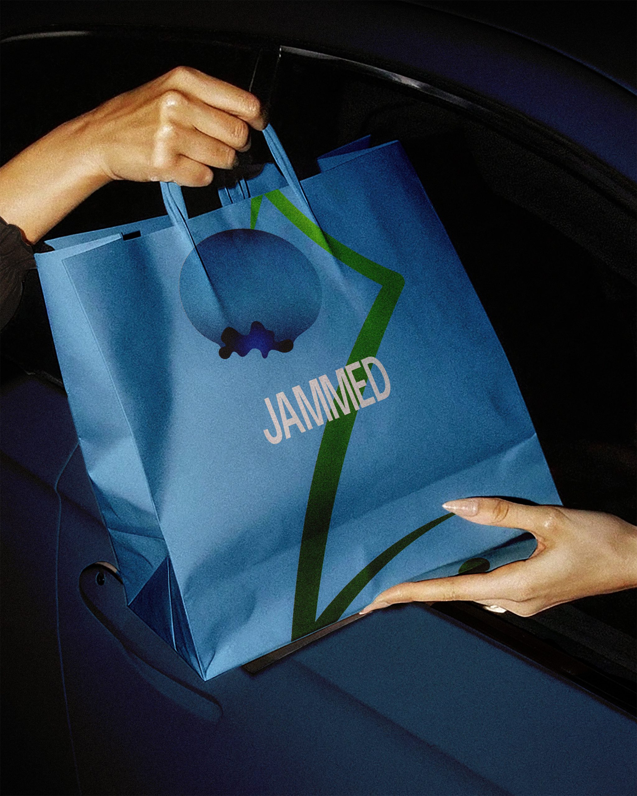
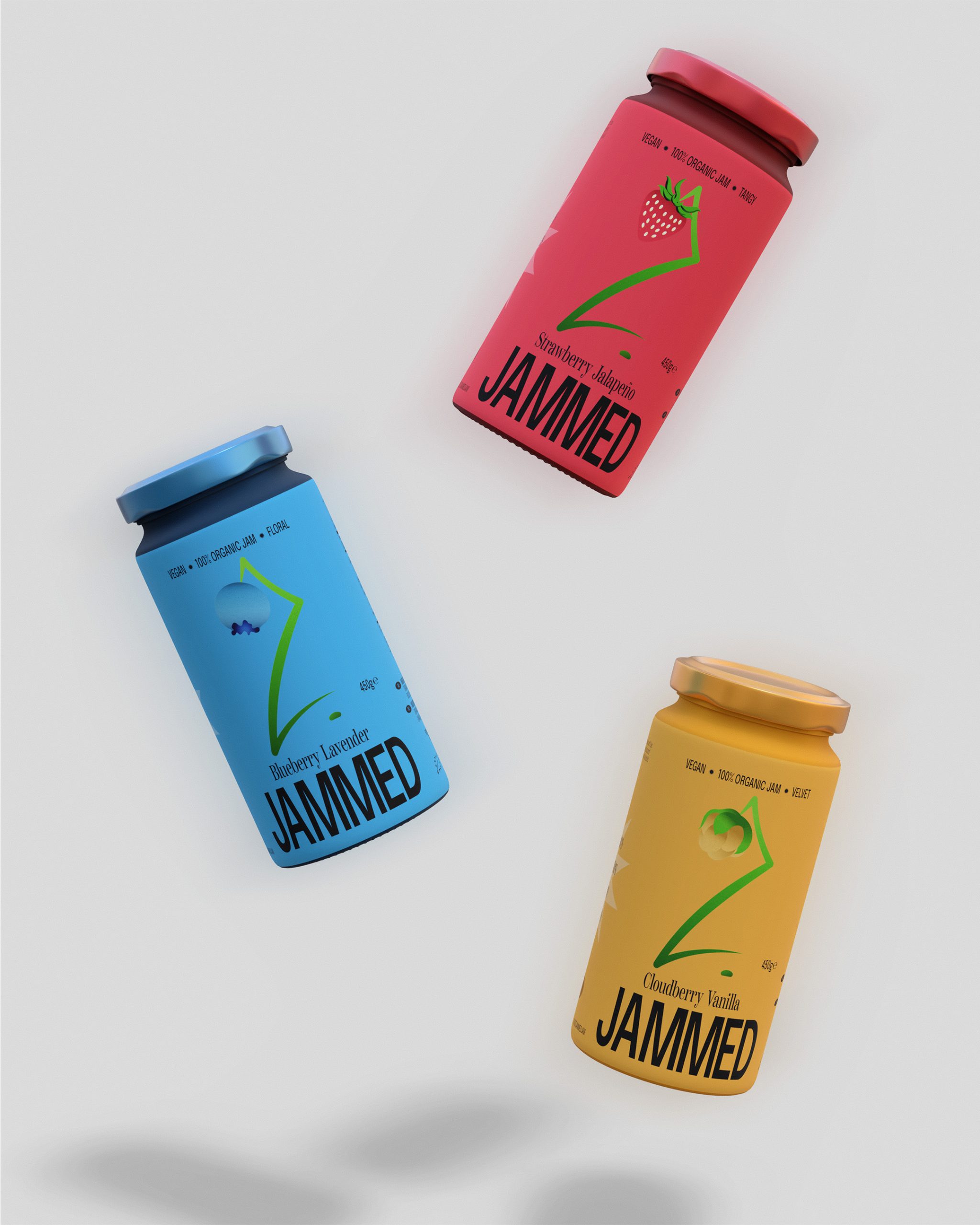
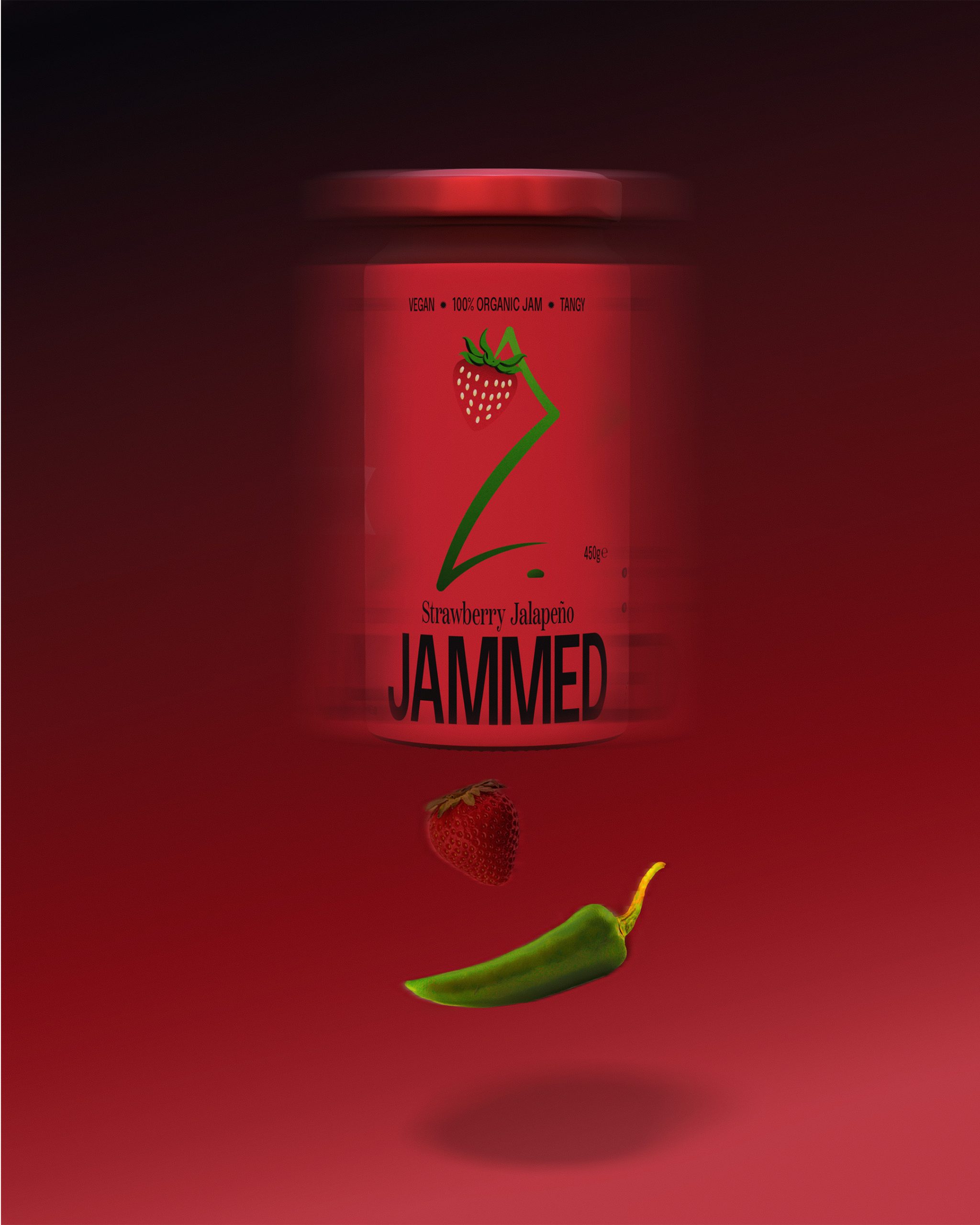
I approached Jammed as a brand that should feel vibrant, confident, and a little unexpected from the first glance. The idea was to create an identity that captured the sense of fruit at its peak: ripe, vivid, and ready to be enjoyed. That led to a label system built around a central illustration of the key fruit flavour, shown hanging from a vine, almost in the moment before being picked.
This concept gave the brand a sense of energy and anticipation. It made the jars feel alive, while also giving each flavour its own clear personality. The slogan, “Jam just like that” helped reinforce the casual and confident tone without trying too hard.
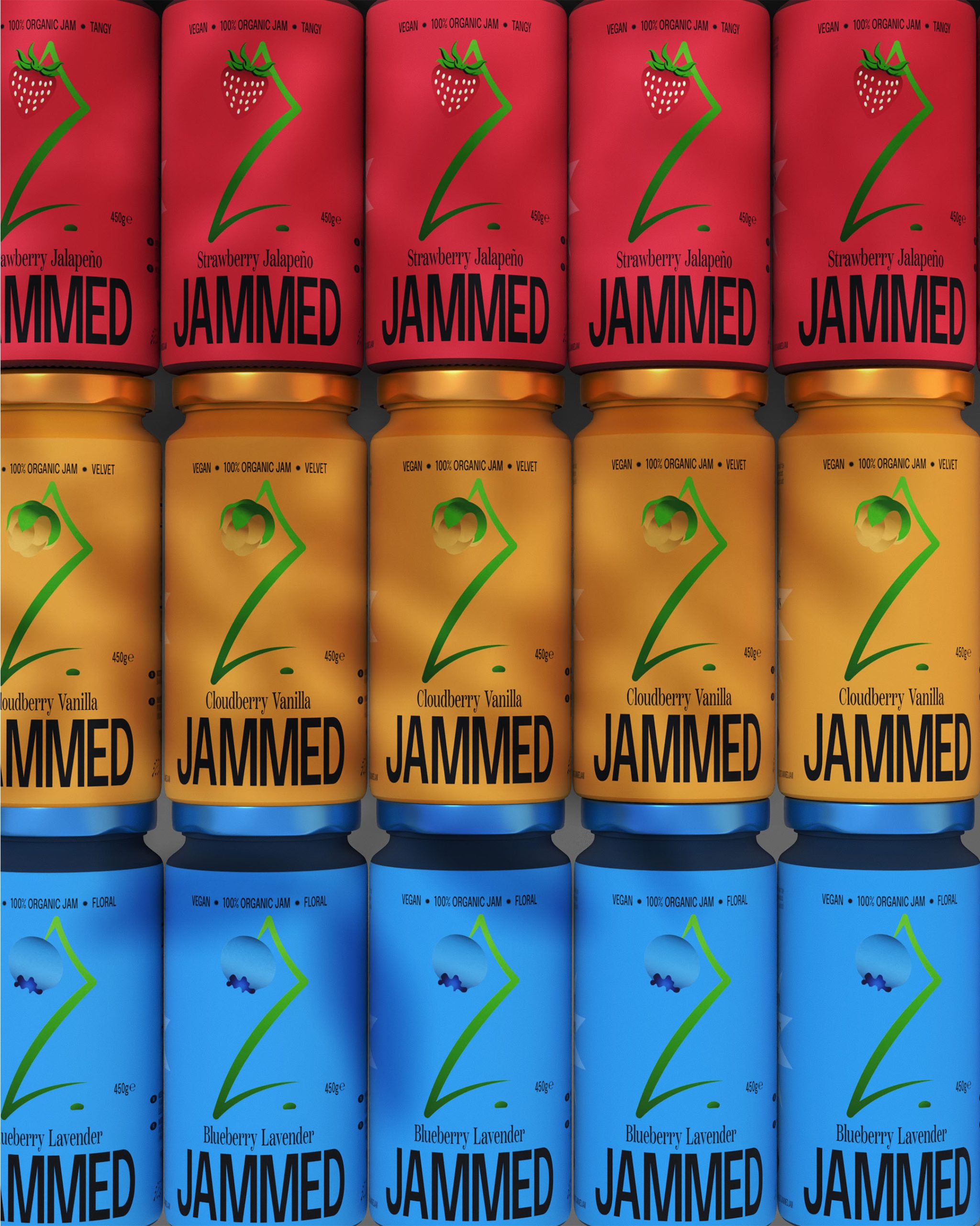
The visual identity was designed to feel vivid and intriguing. Each flavour has its own colour palette, giving the range strong shelf presence while keeping it unified. The illustrated fruit motif adds personality, while helping the brand feel more ownable than standard jam brands.
In the end, Jammed feels like a brand with clear personality and strong shelf presence. It no longer blends into the background of the jam category. Instead, it stands forward with confidence, giving each flavour its own voice while keeping the range unified.
JAMMED || JAM BRAND || BRANDING & PACKAGING || 2026
BY JEREMIAH HAASTRUP
// THIS CONCEPTUAL IDENTITY SYSTEM IS AVAILABLE FOR PURCHASE //

 alchimistestudioParis
 Estudio Argo
 Modern Theory
 monther al omari
 Ohmybrand
 Affogato Brand Design
 Tancybox
 waanrong
 nazystudio
 Daria Fox
 g.apolly
 sahildoesartt
 Stiandco
 BREAK DESIGN
 ShreyaDighe
 Sameh Elnahas
 Minim Brand Design
 Ebbi
Ebbi Shabouk Printing & Packaging (Shabouk Carton Boxes – شعبوق)
 Brandegree
 Abbydraw Designs Unique Conceptual Branding & Packaging Designing Ideas
 bilel tkouri
 NEV
NEV Stefano Bracci
 Alina
Alina