

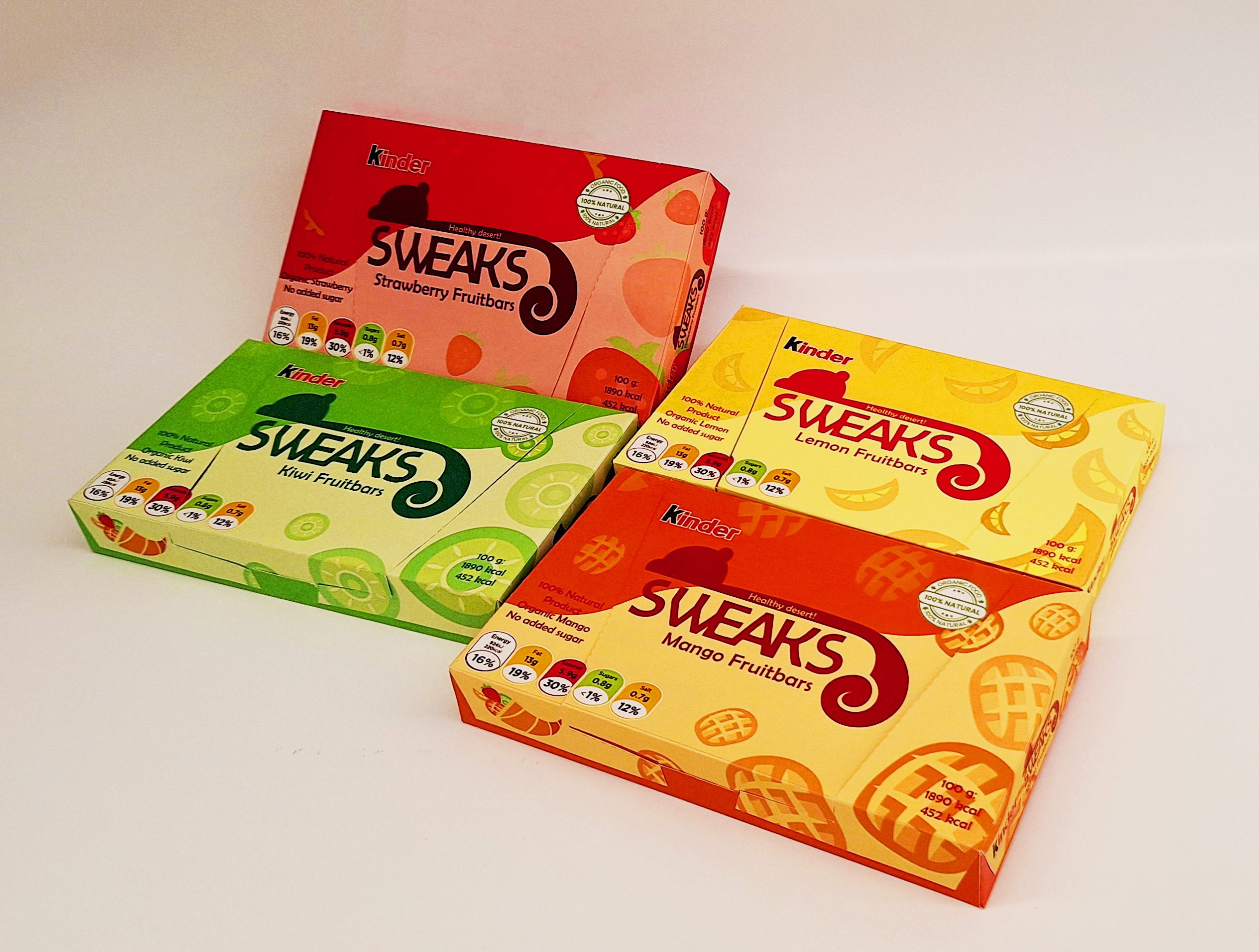
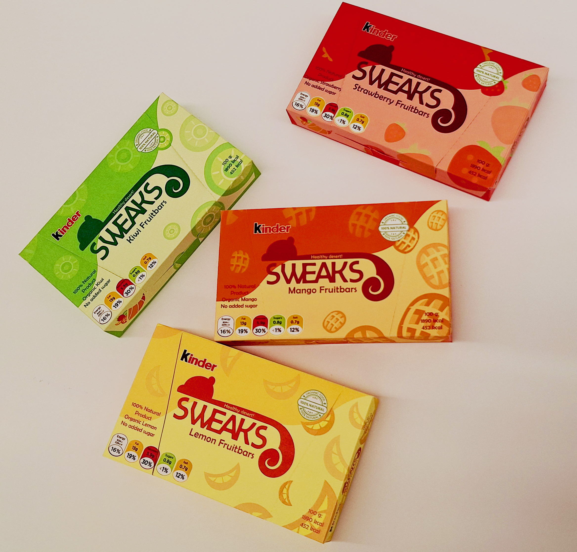
For this project, the goal was to create a fun colorful design for a healthy kid’s snack, specifically fruit bars.
Focusing on four different flavours (Mango ; Lemon ; Kiwi ; Strawberry) a different colour palette was used for each box.
The boxes contain four fruit bars each, therefore they are made to be able to close and open to keep the storage of them easier in the home.
The logo and name are inspired by squirrels because the little critters would appeal to children, their inclusion influenced by cereal brands that use mascots in their marketing.
Most healthy snacks for kids try to appeal to their parents by making their packaging more informative rather than fun. I decided to combine this informative aspect with the colourful design that other brands of candy have so that the sweets would look more appealing to the children themselves.

 Derrick Lin
 43oz
43oz vitoramockup
 Oksana
 KOS
KOS Hui Hua
 Rana Elkady
 Modern Theory
 Eclectic M
 Katya Slobodskaia
 Evgenia Beresneva
 CreativeWise
 宏洛图品牌设计HONGLT
 erandy
 Abbas Sayyed
 Ollie
Ollie Moço Wine Branding
 khadijaaljifri
 Abdulrahman Taha
 Juana Sarabia
 Mohammed Nasr Sharfi