

Packaging Redesign for Mortar Product Series
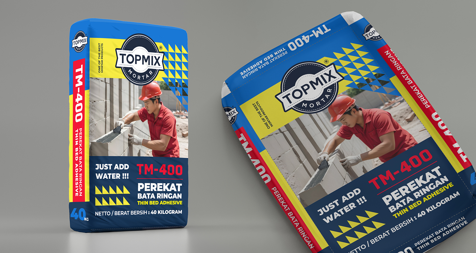
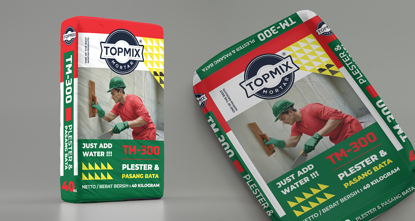
This project is a packaging remake for TOPMIX Mortar, focusing on two product variants: TM-400 Thin Bed Adhesive and TM-300 Plaster & Brick Installation.
The main goal of this redesign was to transform the old packaging into a more modern, bold, and market-ready visual identity. The previous design already communicated the basic product information, but visually it felt too simple and lacked strong shelf impact. Through this remake, I wanted to create packaging that feels more professional, easier to recognize, and more relevant for today’s construction product market.
For the new design, I focused on improving the overall visual hierarchy, color coding, and product clarity. Each variant was given a stronger color identity to make it easier for customers to differentiate the products at a glance. TM-400 uses a bold blue and red combination to create a strong industrial feel, while TM-300 uses green and red to represent its plaster and brick installation function.
I also added construction worker visuals to show the product application more clearly. This helps the packaging feel more practical, relatable, and easier to understand, especially for customers who want to quickly identify what the product is used for.
The layout was redesigned with a cleaner structure, stronger typography, and more dynamic graphic elements.


 Studio Zak
 Ander Sanchez
 Atipus
 Widarto Impact
 hovski
 Ohmybrand
 CreativeWise
 Rauf Karaev
 Hooperstudio
 La Nube de Ideas
 Modern Theory
 Akim Melnik Design Studio
 preflightcreative
 Seyf El Haq Menouer
 Badraddine Attik
 Samriddhi Ravi
 Alessandro Ammaturo
 Amblr Studio
 vladlenalevit
 Sis Tsarukyan
 monther al omari
 alchimistestudioParis
 designsbysukaina
 About House of Ta
 Amjad Battal