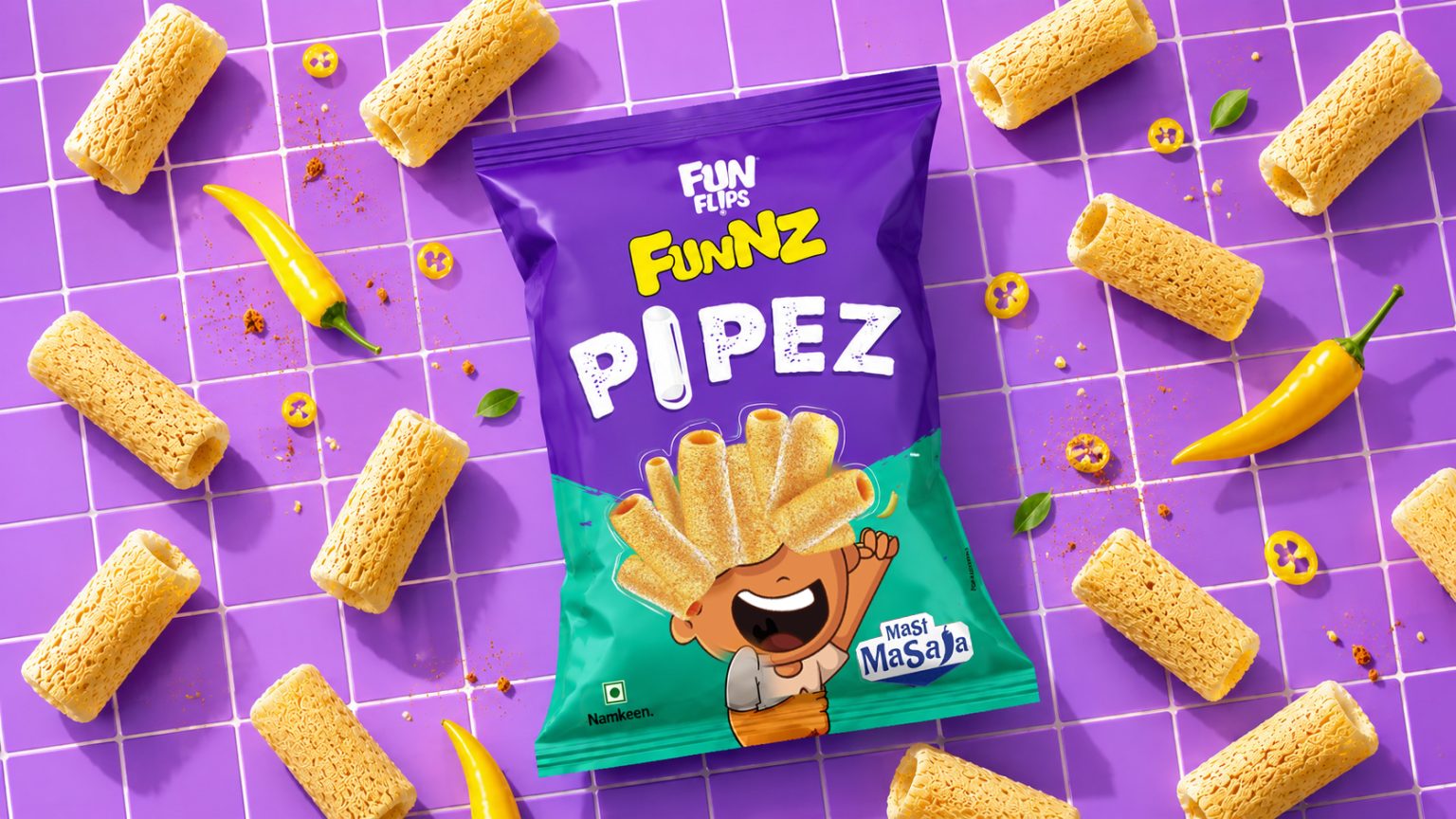

PIPEZ is a fun, youthful, and highly distinctive snack brand created around the unique tubular shape of the product itself. The objective was to build a memorable visual identity that instantly communicates playfulness, crunch, and excitement while standing out on retail shelves.
The logo design draws direct inspiration from the snack’s pipe-like structure. The wordmark features chunky, rounded letterforms that mimic the puffed texture of the product, creating an immediate visual connection between the brand name and the snack. The standout element is the letter “I”, which has been transformed into a snack pipe, making the product an integral part of the brand identity.
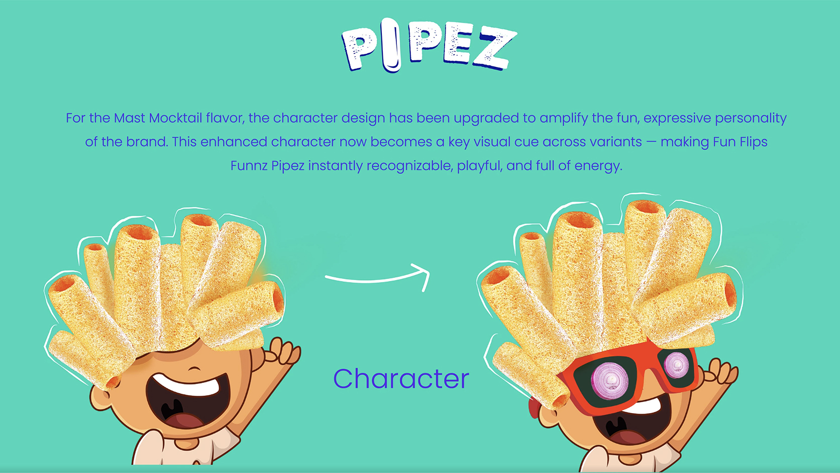
To strengthen the playful personality of the brand, a cheerful mascot was developed using the snack pieces as wild, exaggerated hair. This character adds energy, humor, and strong recall value, helping PIPEZ connect with younger consumers and families alike.
The packaging follows a bold and vibrant design approach, combining bright colors, dynamic movement, floating snack elements, and airy backgrounds to create a sense of fun and lightness. Motion-inspired graphics and product-focused visuals reinforce the crunchy, enjoyable eating experience while maintaining strong shelf visibility.


 Andrea Del Prete
 Le Studio G
 Julia M.
 eliza
eliza B&WGraphicLab
 Opime Studio
 monther al omari
 Akim Melnik Design Studio
 Oksana
 vitoramockup
 Studio Wrapd.
 CJMartins
 Carreto Concepts Design Studio
 LogoSayLove
 Koolbrand
 Jeremiah Haastrup
 Creative Branding Agency
 Expand Buzz
 estudioe
 Heramb Arora