

Horse creates collaboration edition packaging for DASH and Pink Lady
The London design studio marries two distinctive brand personalities to bring the unique partnership to life.
Award-winning design studio Horse has created the packaging for a new collaboration between DASH Water and Pink Lady Apples, bringing together two brands united by a shared commitment to quality, sustainability, and doing things differently.
The new DASH Pink Lady Apple can marks the latest chapter in a creative partnership stretching back to the very beginning of the DASH brand. Horse has worked alongside the B-Corp — made famous for its use of wonky fruit and sustainability credentials — for over five years, shaping the drinks brand across packaging, campaigns, and wider advertising.
“Having helped build DASH from the beginning, it’s been incredibly rewarding to continue evolving the brand as it grows,” said Sarah Pidgeon, creative director and co-founder at Horse.
“This collaboration with Pink Lady Apples was an amazing fit from a design perspective. We have two brands with strong values, one relatively new, the other an iconic and much-loved brand, and both with distinctive personalities. Our role was to bring those identities together to create something that felt commercially strong, creatively distinctive, and completely authentic to both partners.”
The design
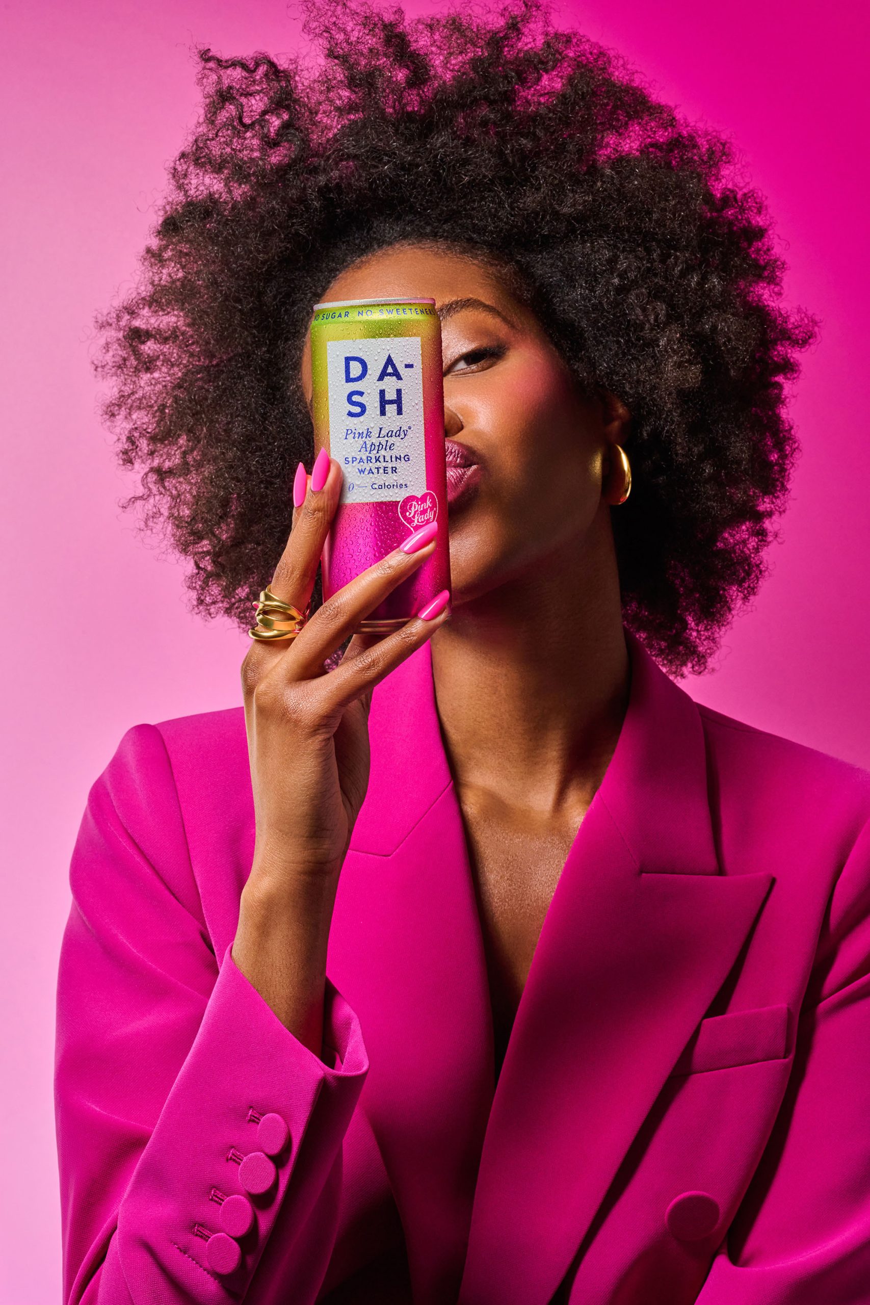
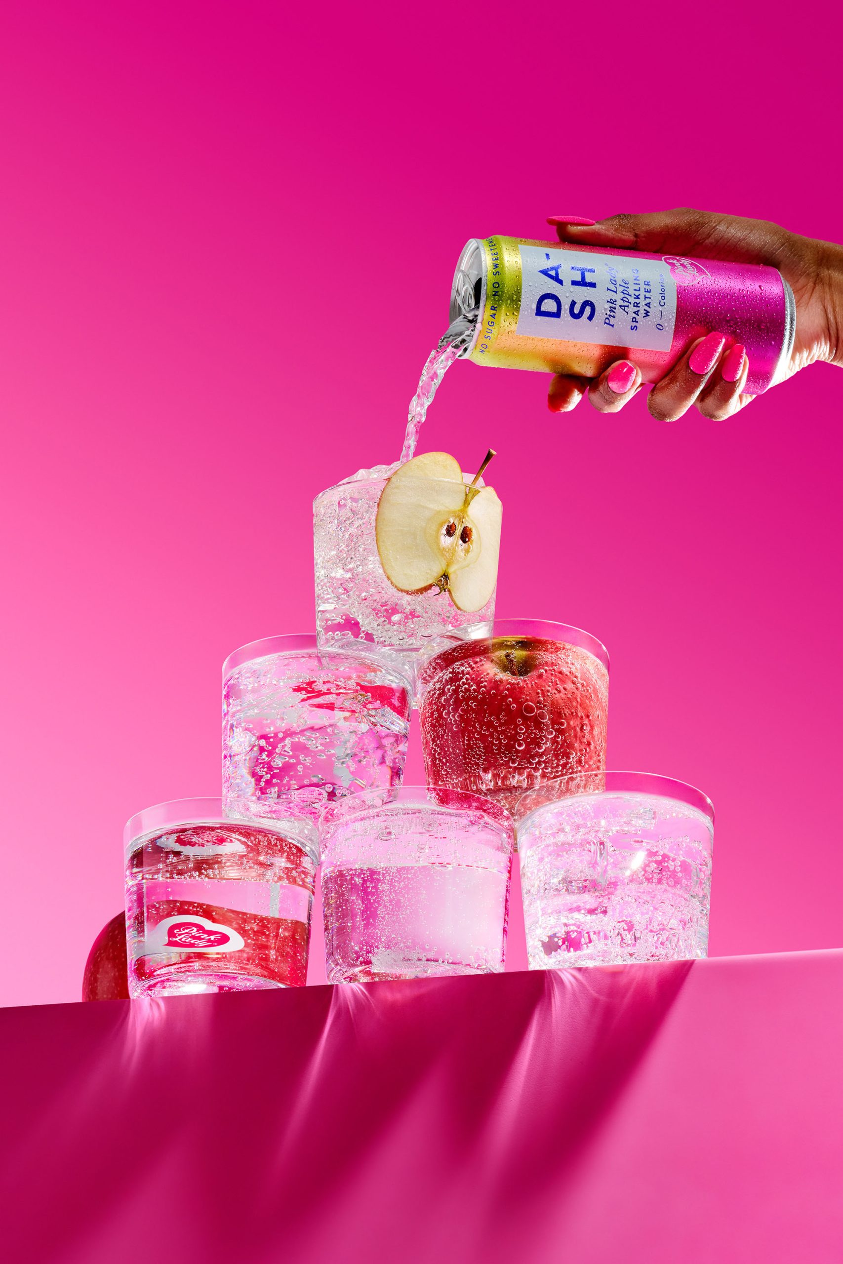
Horse made the bold decision to remove the painterly dash marks that have become a signature of the core drinks range, allowing a metallic gradient running from green to pink to take centre stage — a direct reference to the skin of a Pink Lady apple. As a final touch, the flowing Pink Lady heart branding was then applied as a distinctive seal of quality and taste, recognisable as the iconic apple stickers familiar to consumers everywhere.
“We wanted the can to look really eye-catching and unique in people’s hands this summer,” said Ian Firth, creative director and co-founder at Horse. “The design needed to convey all the energy, fizz, and vibrancy of the new flavour, with all the style DASH has become synonymous with. By stripping back the familiar marks, we could let both the gradient and the Pink Lady branding really shine.”
A cultural moment
For DASH, the launch carries meaning beyond a new flavour. “In an uncertain world people gravitate towards what feels culturally familiar; the things they’ve loved for years, that feel real and nostalgic,” said Jack Scott, co-founder of DASH Water.
“Pink Lady apples have been a staple in the UK since the 90s. They’re instantly recognisable, consistently crisp, and loved by millions. Now DASH is giving that legacy a modern, sparkling twist.
“Horse has played a brilliant role in bringing that spirit to life through its design. The team has been part of our journey since day one and truly understand the heart and soul of our brand. Design-wise, we’ve tried something new and bold here that has pushed us in exciting directions, but it’s been achieved while staying true to who we are.”
Curator’s Insight
What makes this collaboration work visually is restraint. By pulling back a signature element of the DASH identity, Horse created space for something new to emerge without either brand losing its footing. The metallic gradient reads immediately as the product itself, which is a harder trick to pull off than it looks. The Pink Lady heart lands as a co-sign rather than a takeover, keeping the hierarchy between the two brands balanced and legible. It’s a good reminder that the most effective co-branded packaging often comes down to knowing what to take away, not what to add.




 IDEOLOGO
 Eva Chistyakova
 Open Strategy & Design
 cem kutlu
 monther al omari
 Bonsanco Creative Studio
 Confetti Design Studio
 古戈品牌
古戈品牌 Rare Ideas
 Studio Pistache
 Studio Tumpic/Prenc
 Atiq Alam
 bachir bachchar
 Akshita Agarwal
 Carreto Concepts Design Studio
 Hollóka Grafikai Műhely / Graphic Design Studio
 Arsen Avetisyan
 Derrick Lin
 Axiniya Knyazeva
 Hadi Samir
 Furt Goods