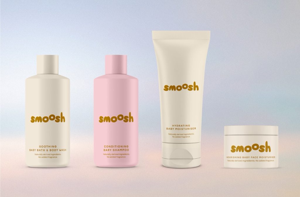

LULACREATES reimagines baby skincare for the social media generation with Smoosh
Female-led branding studio LULACREATES has created the visual identity and packaging for Smoosh, a new premium baby skincare brand designed to bridge the gap between clinically proven formulations and the aesthetic expectations of modern parents.
Founded by former Boots and babycare brand specialists Sophie and Victoria, Smoosh is entering the market with ambitions to challenge category conventions with naturally derived, sensitive skin formulations and a digital-first approach to branding and community building.
LULACREATES was brought in to develop a visual identity, packaging system, logo and brand guidelines that could position Smoosh as a serious challenger in a sector often dominated by either heritage clinical brands or cartoon-led children’s products.
Founder and creative director Louise O’Kane explains that the project was about identifying a genuine white space. “Modern parents are more ingredient-conscious than ever,” she says. “They’ll spend hours researching formulations, reading reviews and investing in products that genuinely work, but visually, the category hasn’t evolved at the same pace.”
Category research revealed a market split between instantly recognisable but clinical-looking legacy brands and playful, child-focused competitors built around bright colours and cartoon illustrations. While both approaches communicate different kinds of trust, few products combine premium formulation credentials with a contemporary lifestyle aesthetic.
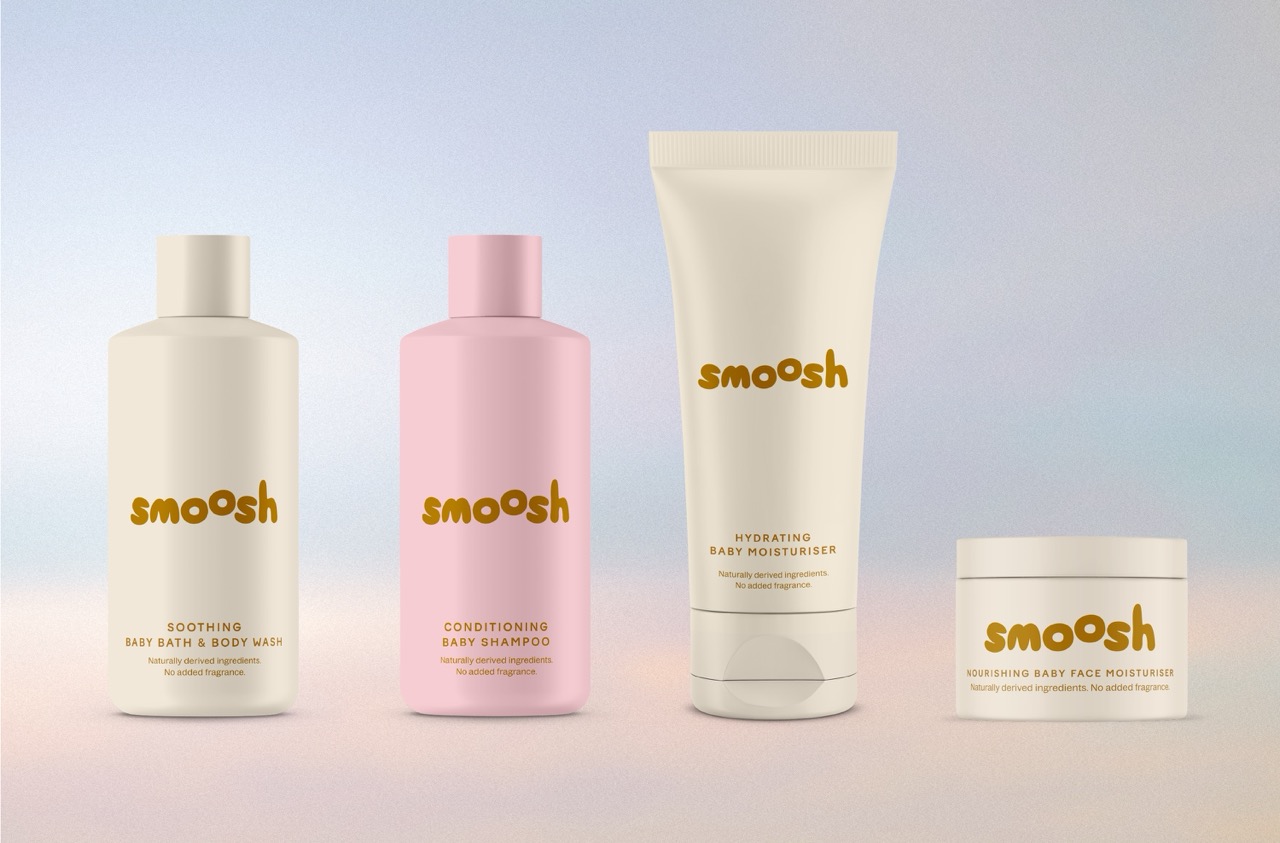
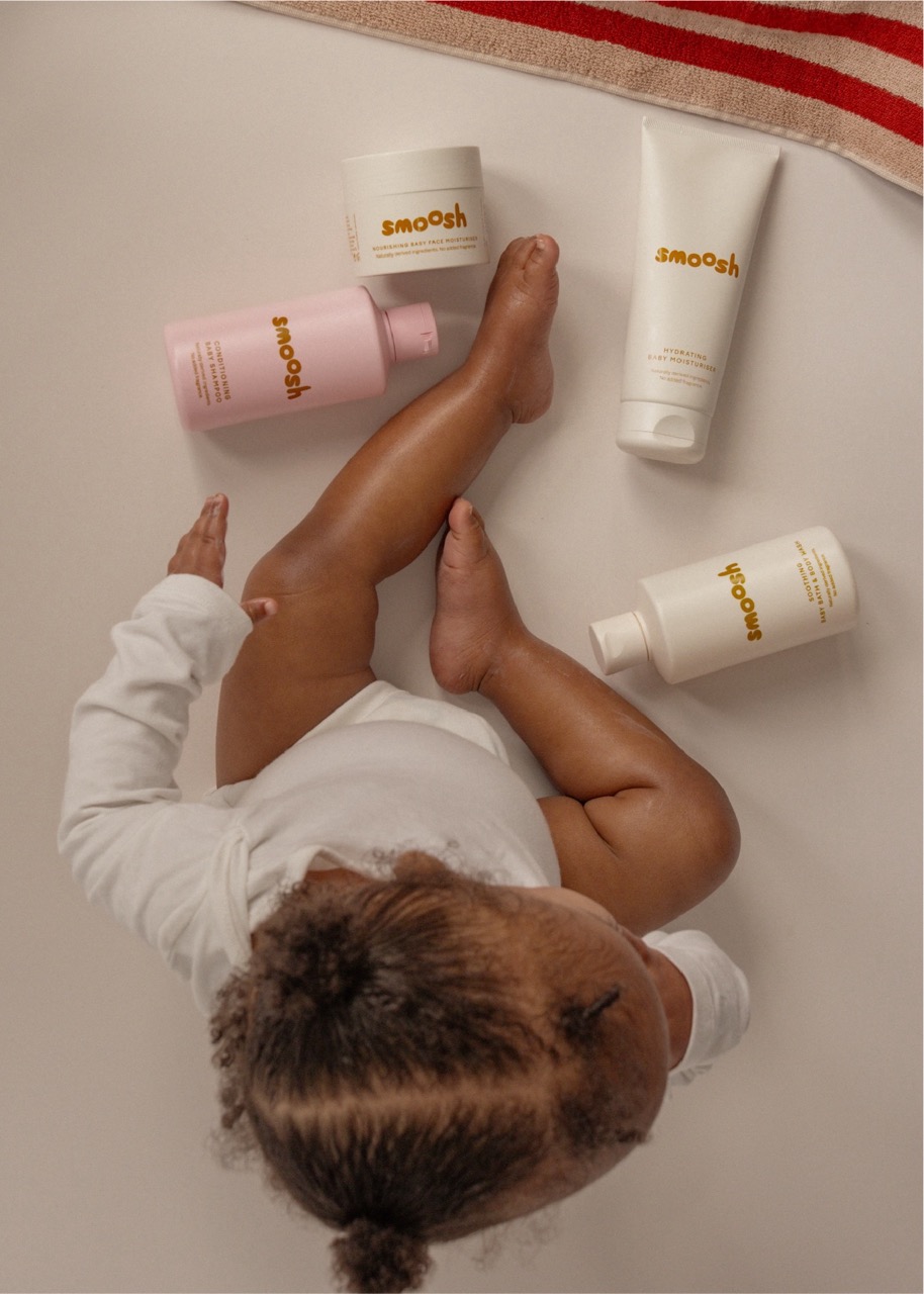
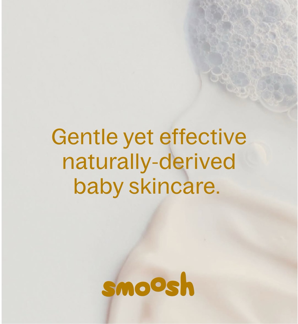
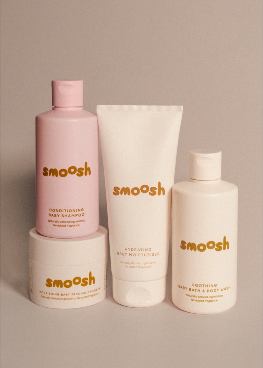
Smoosh does just that with its elevated yet uncomplicated brand identity, characterised by soft, tactile and fluid visuals that feel at home in the babycare aisle. The custom-drawn logo features rounded lowercase typography and a floating ‘o’, inspired by bubbles, movement and the softness of baby skin. Organic curves and subtle distortions were incorporated to bring a sense of lightness while leaving room for future motion and digital applications.
Working within production constraints, including a tightly controlled palette and limited print colours, LULACREATES developed a modern system centred around an ochre yellow accent paired with softer complementary tones. Packaging colours were differentiated across products, making it easier for parents to grab the right bottle during bath time.
The wider identity draws inspiration from developments in the premium skincare and beauty sectors, where consumers increasingly expect products to balance efficacy with desirability.
“Consumers are becoming hyper-aware of ingredients and formulations, so aesthetic value needs to also signal trust,” says Louise. “We wanted to create something worthy of a beautifully curated bathroom shelf while still feeling authentic to the realities of parenthood.”
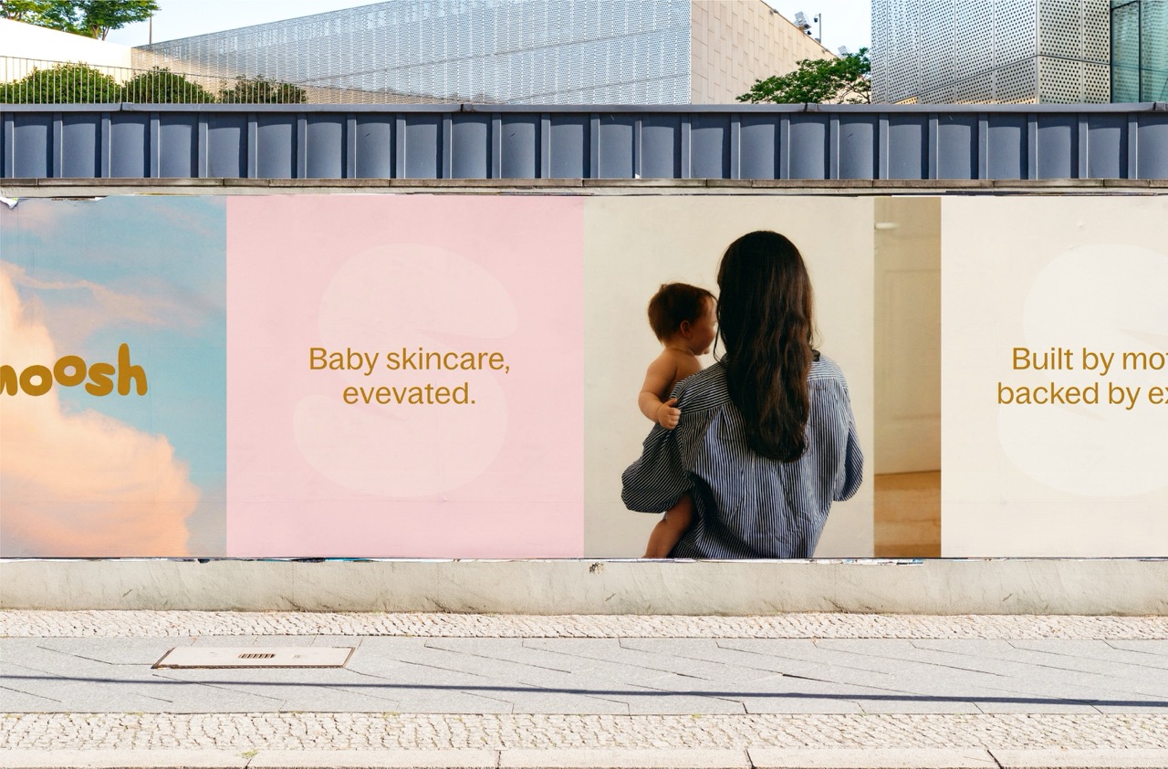
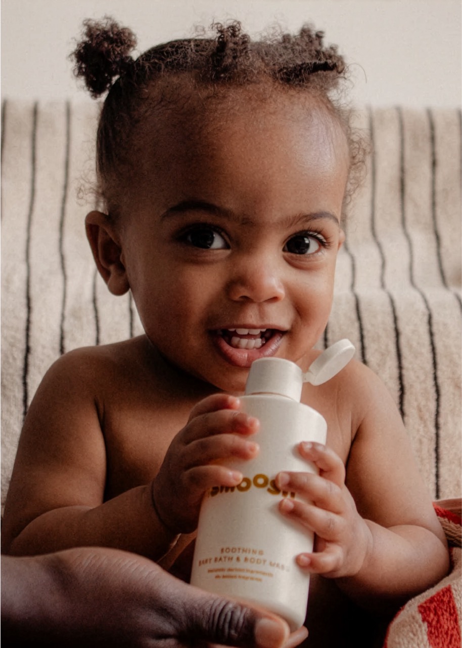
Social media was central to the project from the outset. As a digital-first business, Smoosh needed an identity capable of living both on shelf and in the feeds of creators, parents and online communities.
“There are very few baby skincare brands that feel native to today’s digital culture,” Louise explains. “This had to be tactile, shareable and instantly recognisable online as well as in retail.”
Since launch, Smoosh has generated significant influencer engagement and retailer interest, with major stockist conversations already underway.
As more female-founded and challenger brands enter established categories, projects like Smoosh demonstrate how thoughtful branding can create space for something genuinely different. Instead of relying on cartoon clichés or purely clinical cues, the identity points towards a future where premium formulations, design and community are equally important parts of building trust.


 Derrick Lin
 Axiniya Knyazeva
 Hadi Samir
 Atiq Alam
 Furt Goods
 宏洛图品牌设计HONGLT
 Ampersand Creative
 Modern Theory
 Palashcc
 neo creative studio
 Anshuman
 Archi Jain
 DESIGN CONCEPTS
 Shapers Studio
 jamajkajakub
 tamara barakat