
DeBeukelaer – Decor On Ice
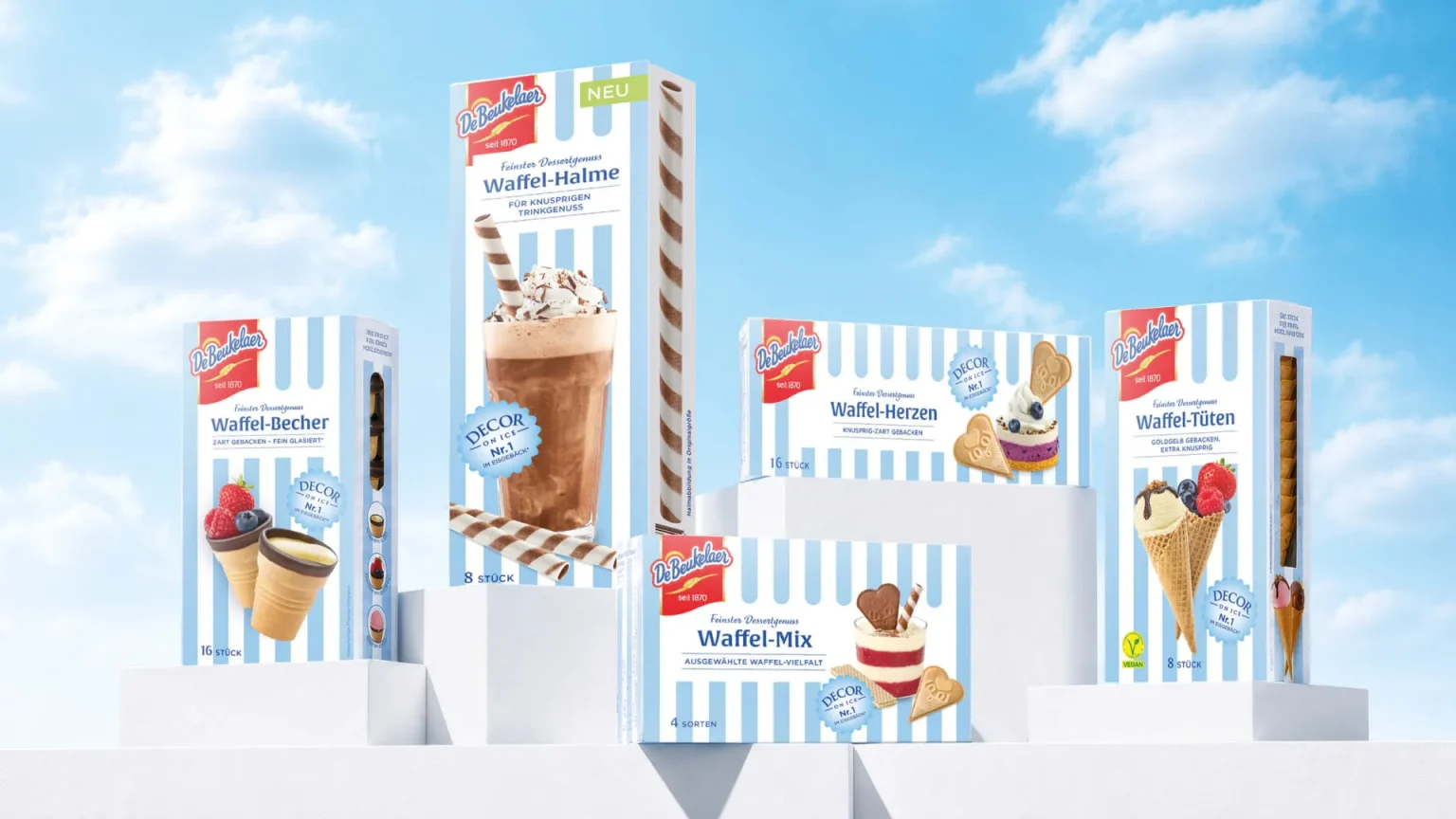
DeBeukelaer’s classic waffle cups have been given a refreshed packaging design that transforms a familiar dessert favourite into a brighter and more emotionally engaging brand experience. The redesign connects the product’s long-standing reputation for quality with a contemporary look built around enjoyment, creativity and carefree summer moments.
The German packaging design agency MILK. was commissioned to modernise the range while preserving its established character. The task was to increase shelf visibility, strengthen the role of the DeBeukelaer masterbrand and position the waffle creations more confidently within the premium dessert category.
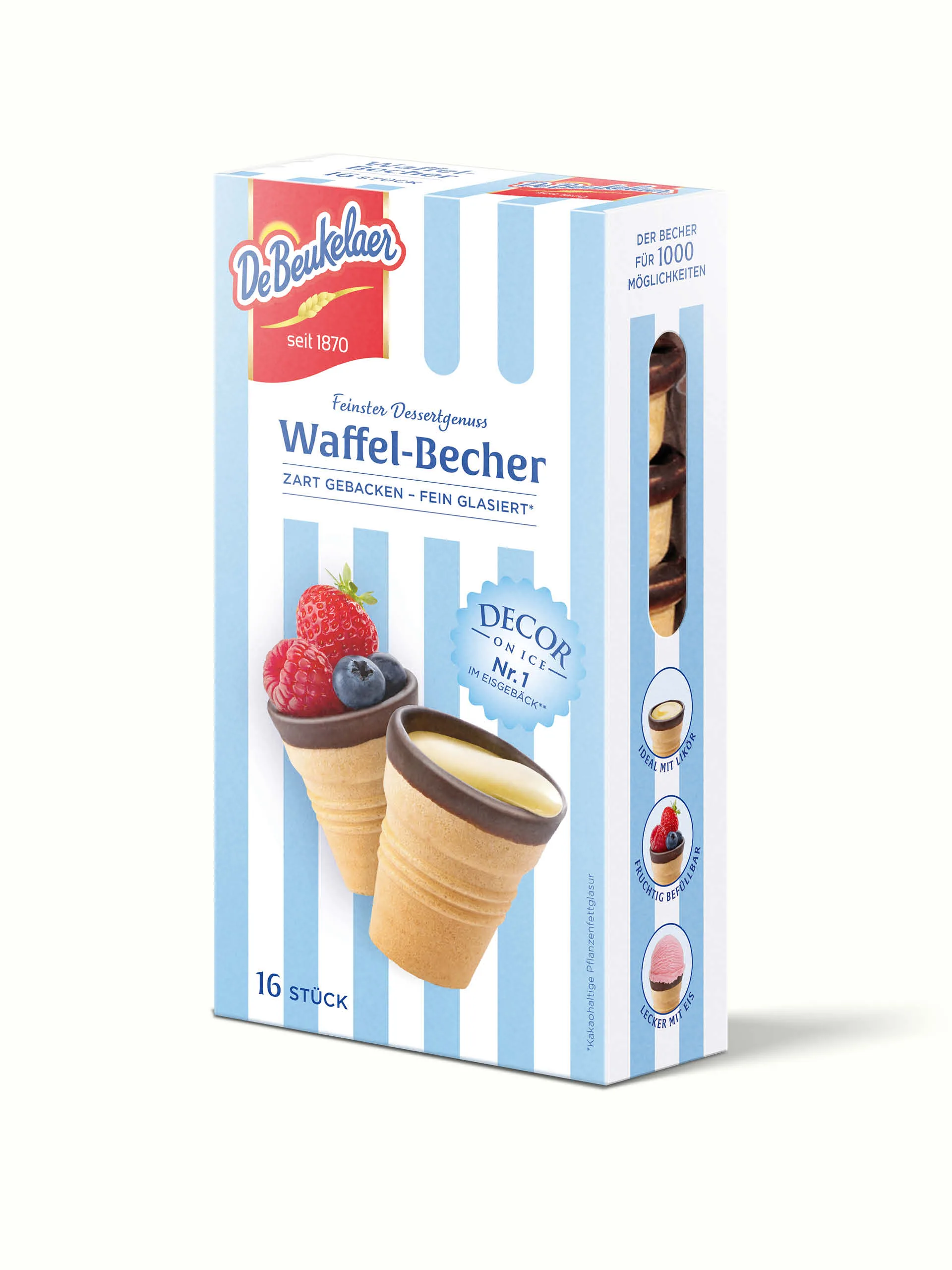
The new design language replaces the previously cool, uniform light-blue background with distinctive pastel-blue and white stripes. Inspired by traditional ice cream parlours, beach umbrellas and summer textiles, the pattern brings lightness, movement and instant recognition to the packaging. An enlarged red DeBeukelaer logo, a clean white product area and refined contemporary typography create a clear and confident visual hierarchy.
Detailed product imagery places indulgence at the centre of the design. Crisp wafer textures, delicate cocoa coatings, creamy ice cream and vibrant berries communicate taste and quality at first glance. Additional serving suggestions on the side panels demonstrate the product’s versatility—from classic ice cream desserts and fruit-filled creations to more sophisticated combinations with liqueur.
Placed side by side, the striped packs form a distinctive and harmonious brand block with strong impact at the point of sale. The result is a flexible packaging system that feels familiar yet fresh, appeals to both loyal customers and a younger audience, and creates a strong foundation for future products and line extensions.


 IDEOLOGO
 Eva Chistyakova
 Open Strategy & Design
 cem kutlu
 monther al omari
 Bonsanco Creative Studio
 Confetti Design Studio
 古戈品牌
古戈品牌 Rare Ideas
 Studio Pistache
 Studio Tumpic/Prenc
 Atiq Alam
 bachir bachchar
 Akshita Agarwal
 Carreto Concepts Design Studio
 Hollóka Grafikai Műhely / Graphic Design Studio
 Arsen Avetisyan
 Derrick Lin
 Axiniya Knyazeva
 Hadi Samir
 Furt Goods