
A family-owned honey company lacked a cohesive and professional brand identity. Although their products are high-quality and locally made, the business appears small-scale and inconsistent in presentation, which limits its ability to attract new customers, expand into retail, and compete with established honey brands.
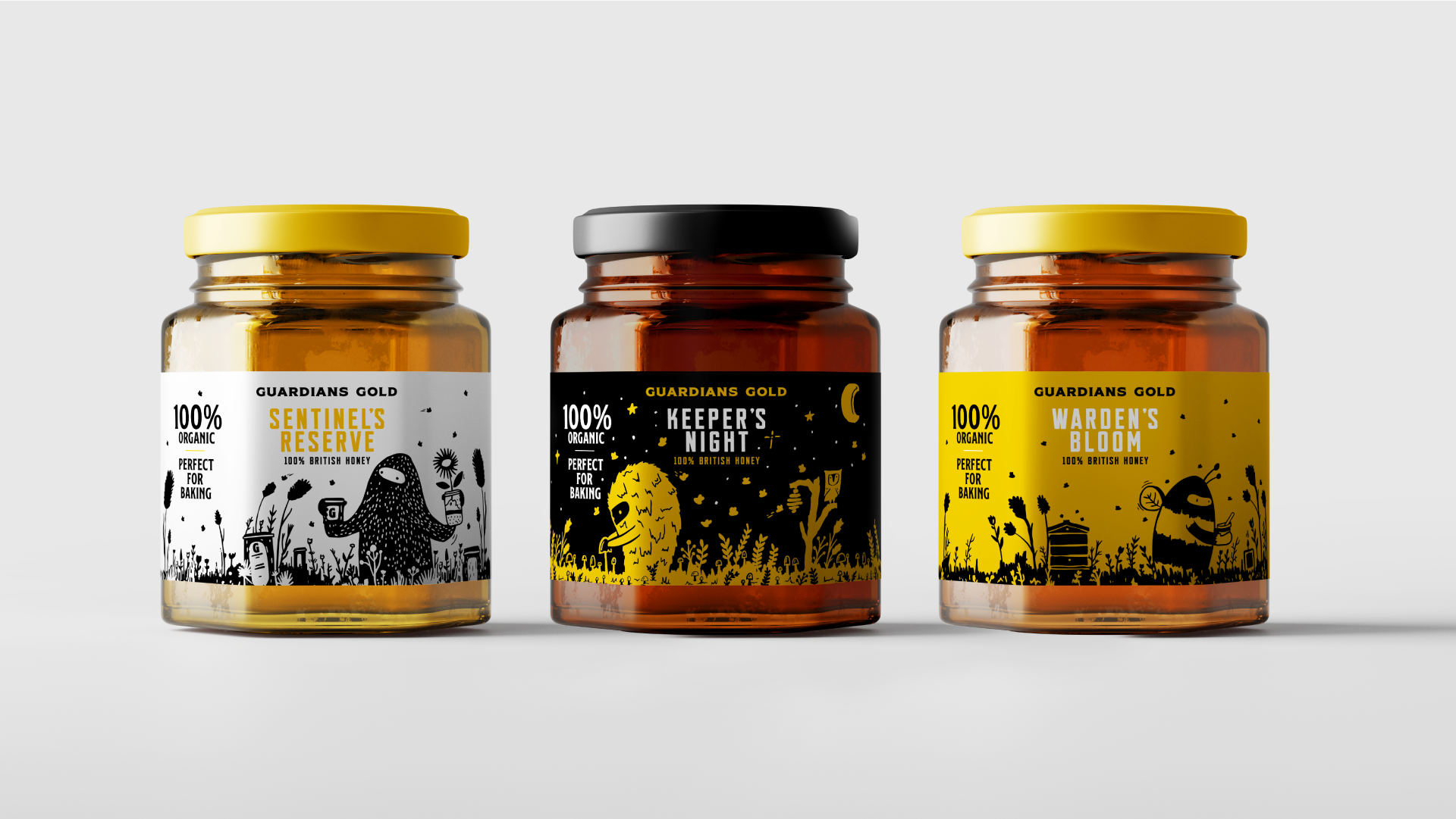
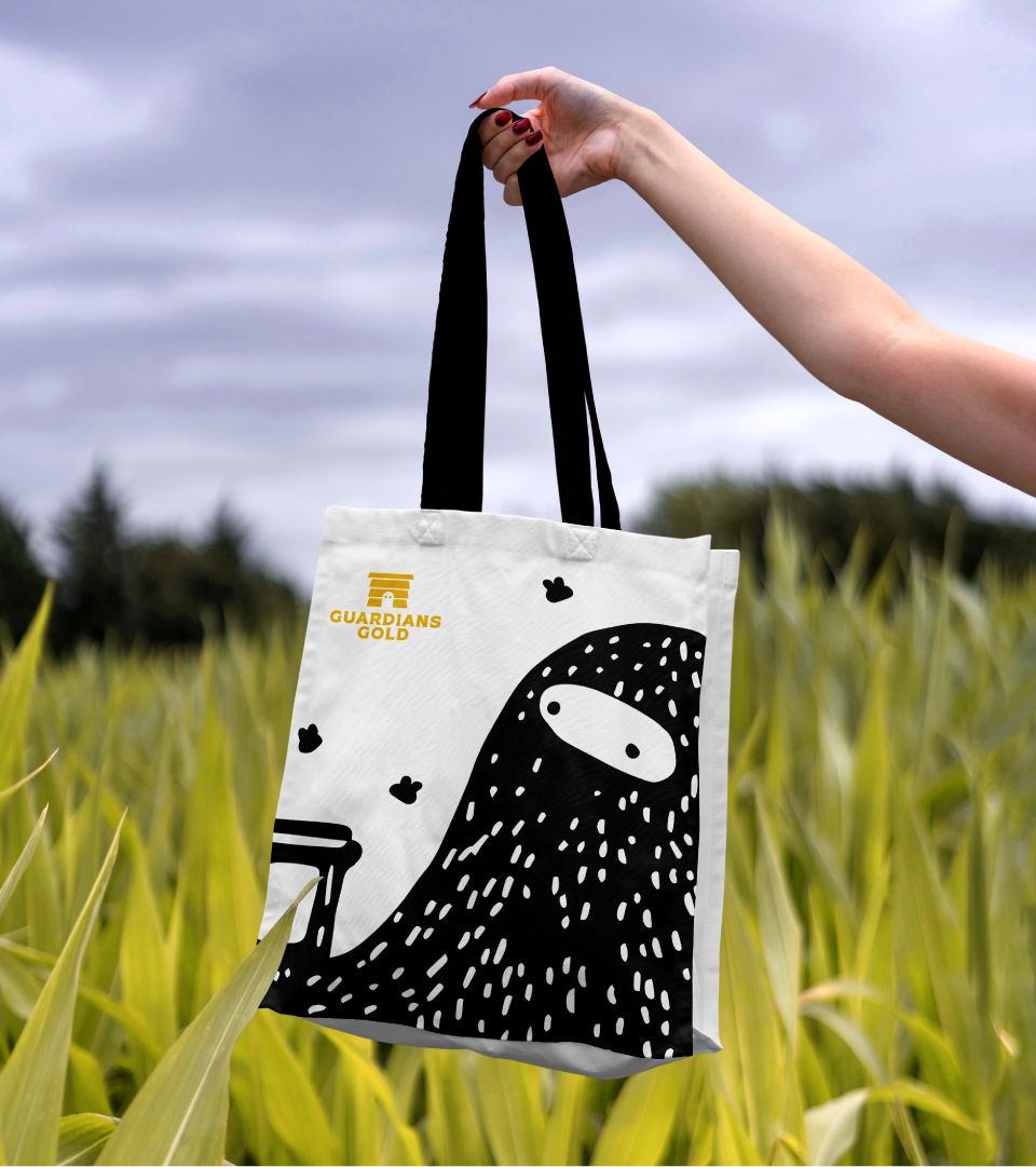
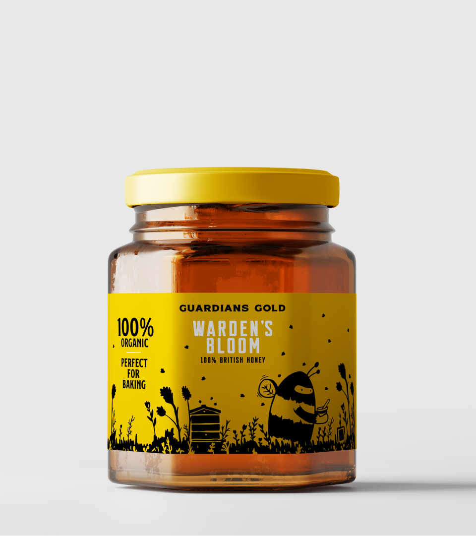
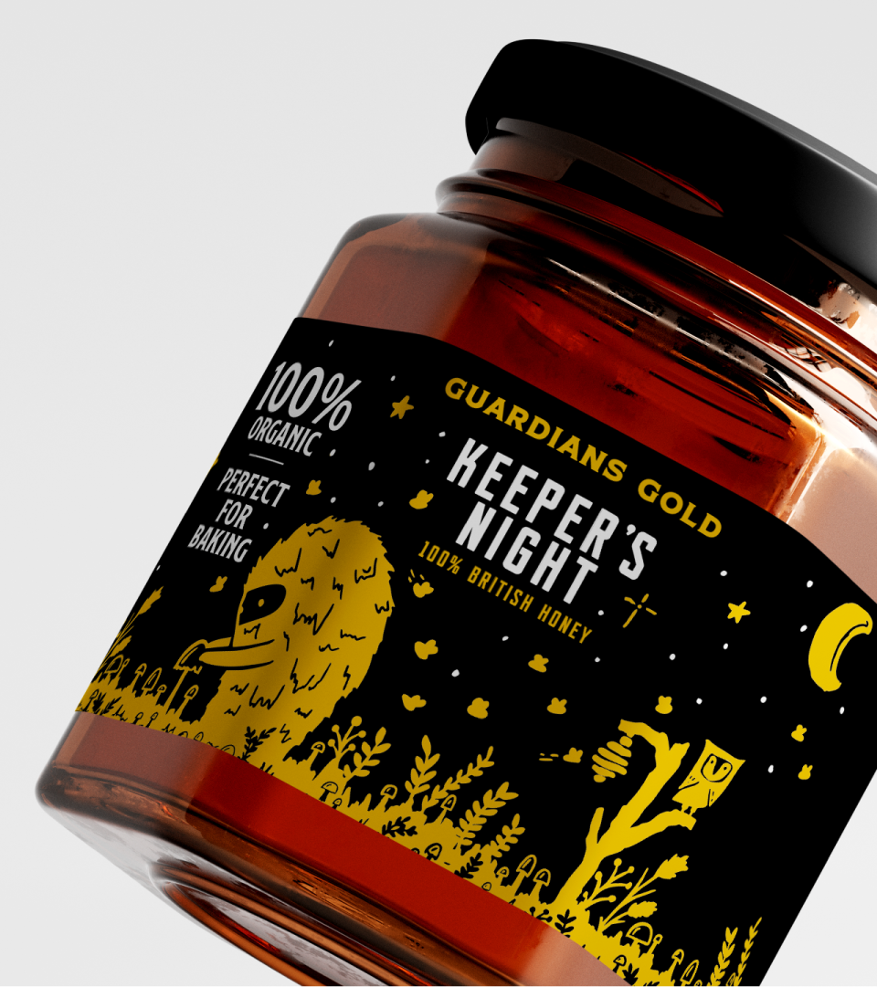
Knowing that the brand needed longevity and personality, the updated brand identity combines the story of the family; the children seeing their parents as the “Guardians of the bees” with stripped back, utilitarian typography and hand drawn illustrations to allow the brand to stand alone in it’s sector.
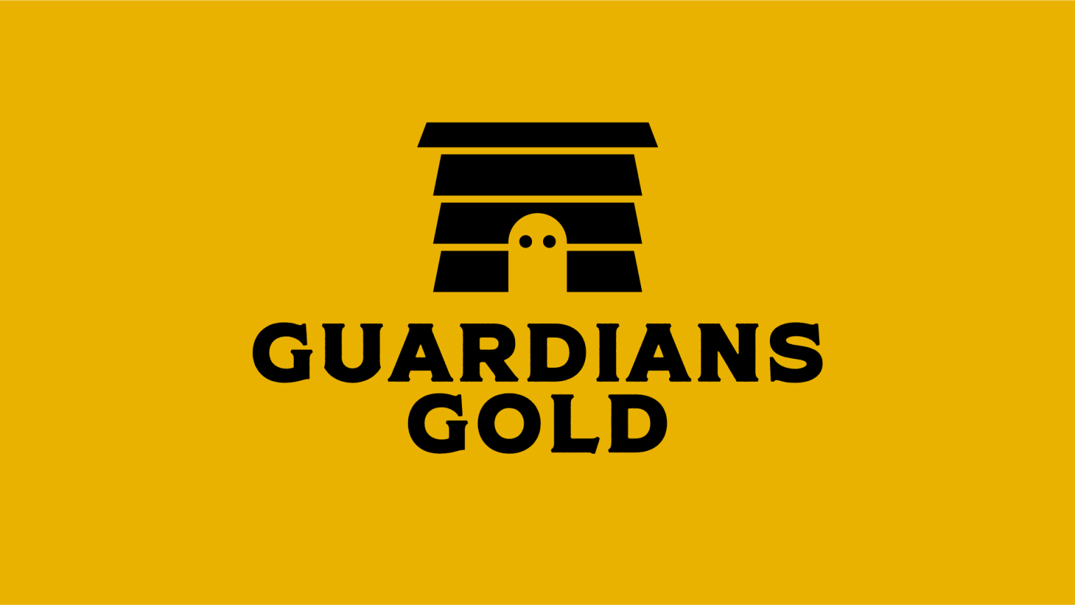
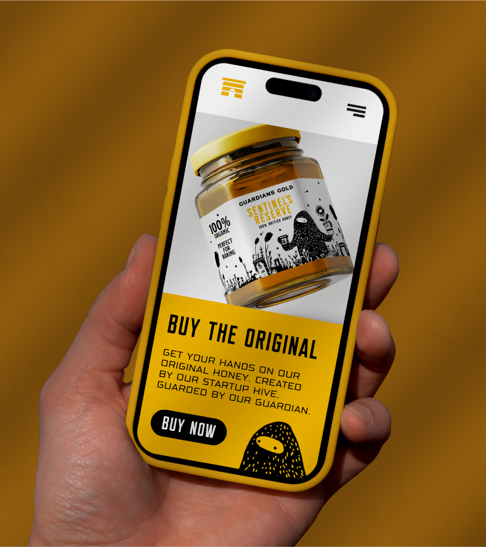
A simple colour palette allows for contrast on shelf. The new logo integrates both the beehive and guardian into the logomark whilst allowing the type to anchor it.






 Derrick Lin
 Biaa
Biaa Petitmoulin Studio
 White Bear Studio
 Eva Chistyakova
 monther al omari
 Atipus
 alchimistestudioParis
 oneandother
 bloomburo
 helocrene
 Shapers Studio
 Denver Design
 Aidearte
 andrew.huerta
 softmachine
 airobtq
 Buzz & Co.
 Ruby
Ruby themythographer
 IDNB Inc.
 viktorflr
 Zenpack