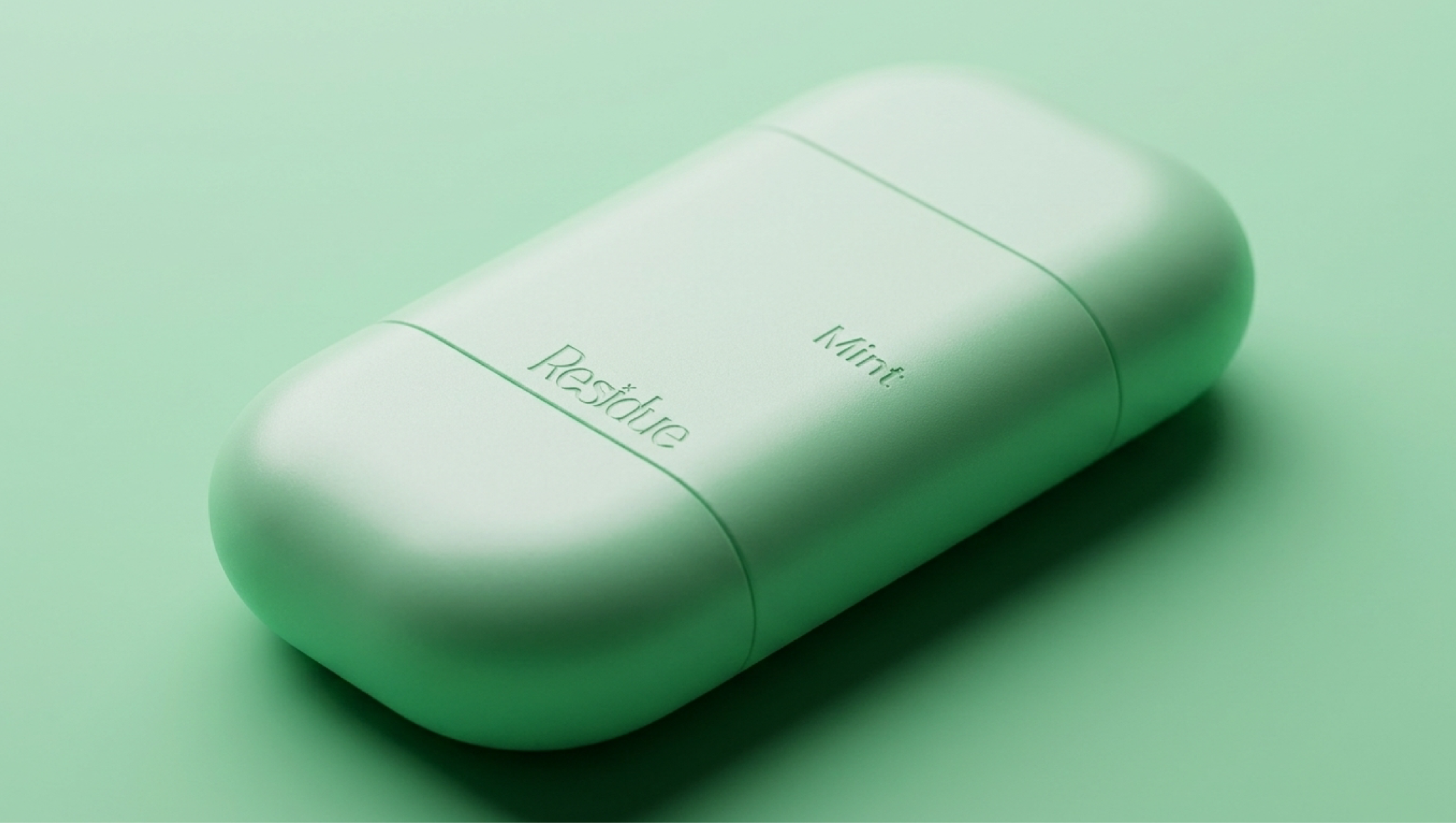

Most deodorants packaging are white plastic, clinical, big logos, ingredients screaming from every angle. Residue wanted to change that. A natural deodorant brand built around four words fresh, clean, modern, and natural and a clear mission to step away from the “boring drugstore stick” to something that feels more like skincare than pharmacy. Residue is a natural deodorant brand that has already shown folks will care about how the product looks, not just what’s inside. It wasn’t about out-naturalizing them, but bringing a sharper, more minimal point of view to a crowded and increasingly similar-looking shelf.
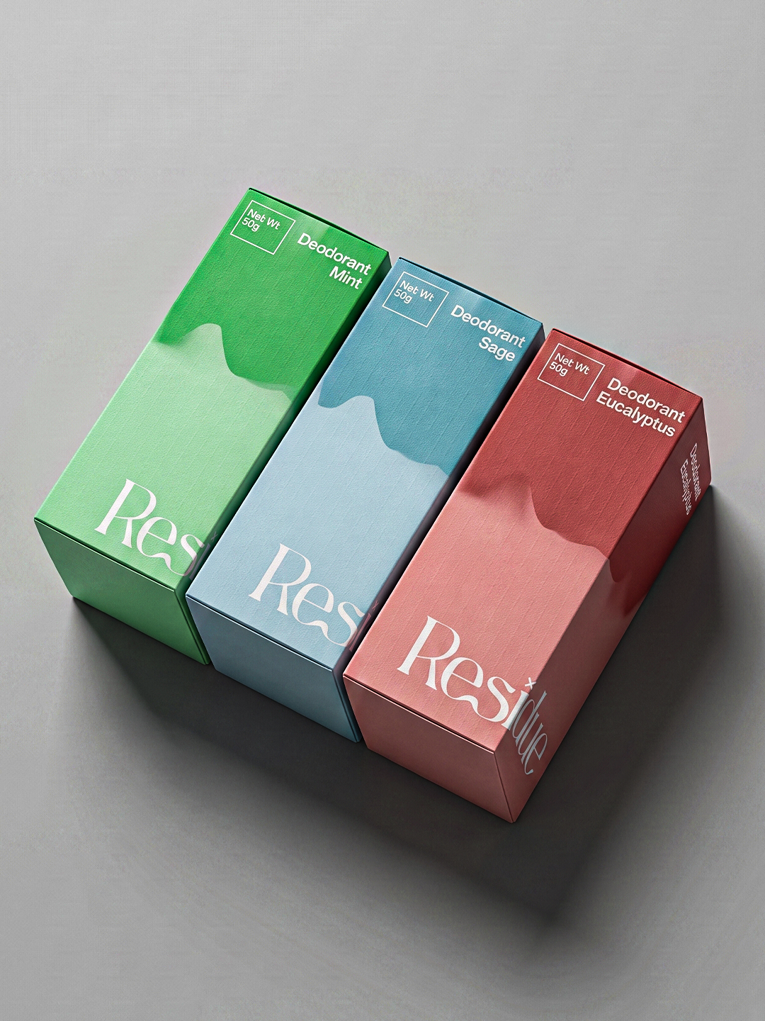
Visual Identity The design language is more clinical-minimal than soft organic a conscious departure from the pastel, botanical clichés that dominate the “clean beauty” space: Matte finishes all around, avoiding the glossy, over-produced feel of mass-market deodorant Grotesk typography for a structured, modern, slightly technical edge. More lab label than lifestyle brand A muted palette that allows the four scent SKUs to pop without competing with the brand mark The Architecture of Scent Residue starts with four SKUs, each scent given its own identity within a consistent system designed so the range reads as a family on the shelf while each variant is distinct enough to have its own personality.
Packaging materials The system was built across two formats stick and roll on with specs developed to hold up structurally while keeping the matte, pared-back aesthetic consistent across both.
 Derrick Lin
 salutifg
 ADStudio
 WeAreDepot
 Manuvila
 Yellow Umbrella Creative
 Toka
Toka Studio Zak
 Atiq Alam
 monther al omari
 Modern Theory
 Sirka Agency
 DESIGN CONCEPTS
 Eva Chistyakova
 Puigdemont Roca
 marianaaworks
 bloomburo
 andreamarinnn
 Alina
Alina Saadmost
 Bruhken
 Maruf Nishat
 Richest Branding Pvt. Ltd.
 Sophiagdotcom
 saifullahmaslool
 Up-Brands