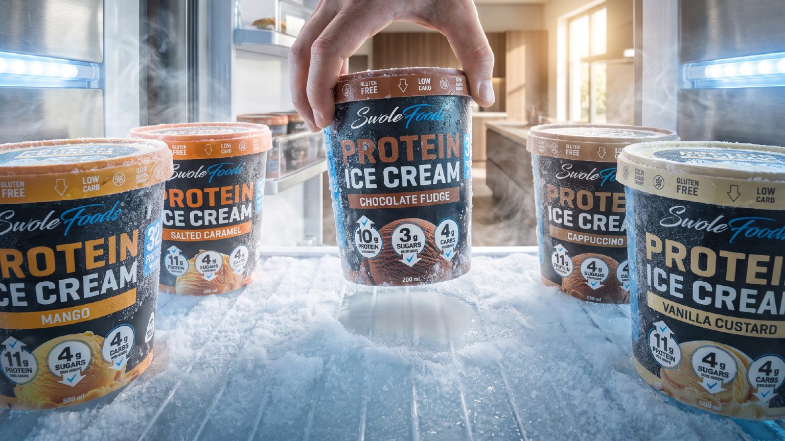

SwoleFoods is a premium protein ice cream brand developed for consumers who want the enjoyment of traditional ice cream without compromising their fitness goals. Positioned at the intersection of wellness and indulgence, the brand needed a visual identity that would immediately communicate performance while preserving the emotional appeal of a premium dessert.
The challenge was to create packaging capable of standing out in the frozen aisle, simplifying nutritional communication, and building a recognizable brand system across multiple flavors. Since the project was developed as a concept, realistic CGI visualizations were also created to demonstrate how the brand would perform across retail, digital marketing, and advertising.
CONCEPT
Most protein foods rely on clinical, sterile aesthetics that often sacrifice appetite appeal. The design direction for SwoleFoods explores a different balance, combining the visual richness of premium ice cream with the confidence and clarity expected from a high-performance nutrition brand.
The objective was to make the product look equally indulgent and functional, allowing consumers to instantly recognize both the flavor and the nutritional value from a distance.
SOLUTION
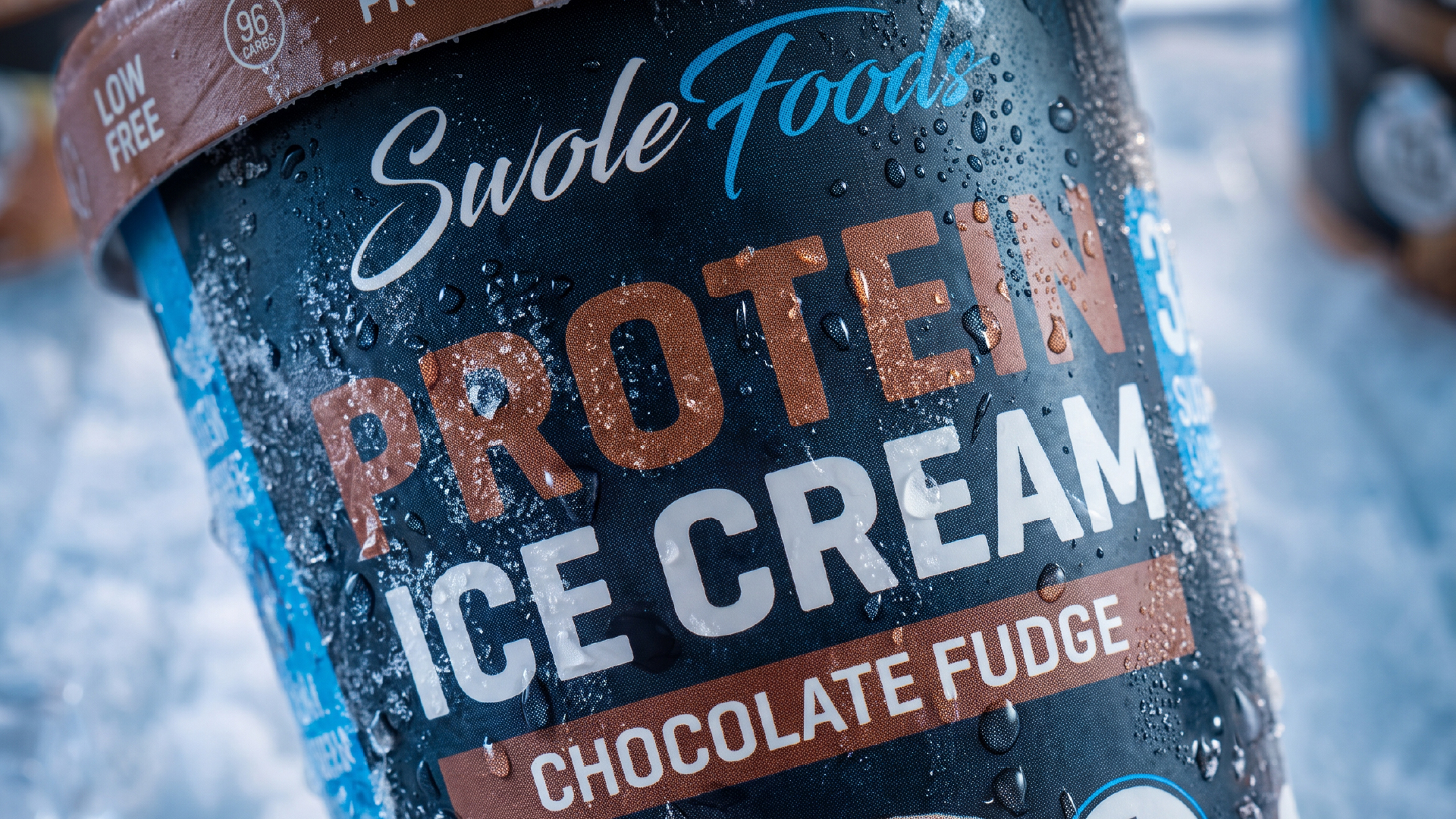
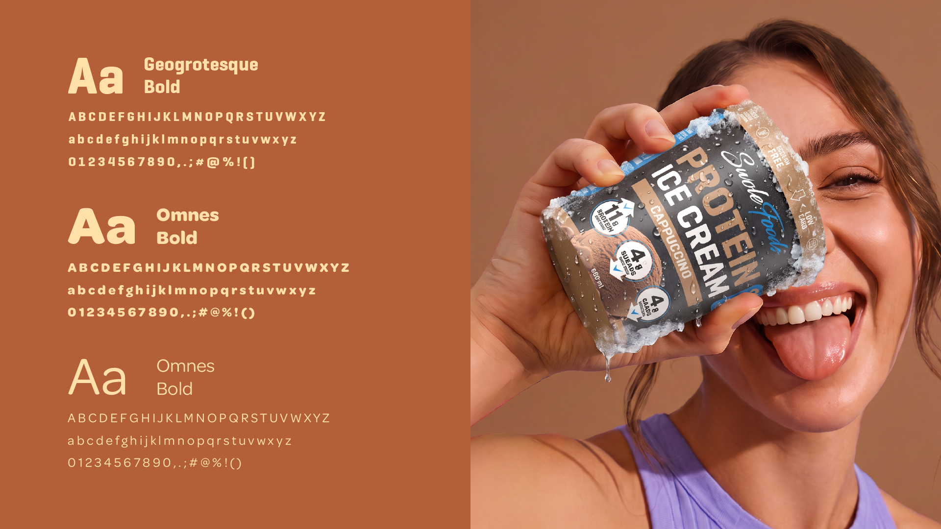
The identity was built around a bold typographic system that gives maximum shelf visibility while keeping the product hierarchy clean and easy to scan.
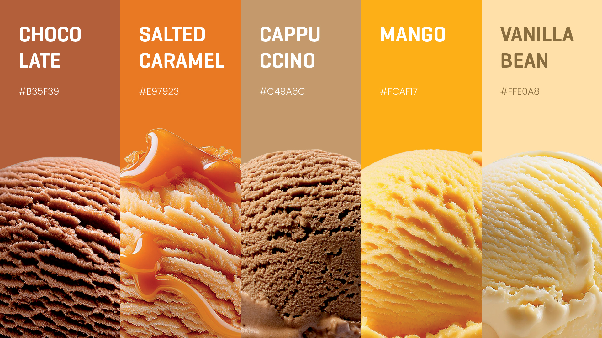
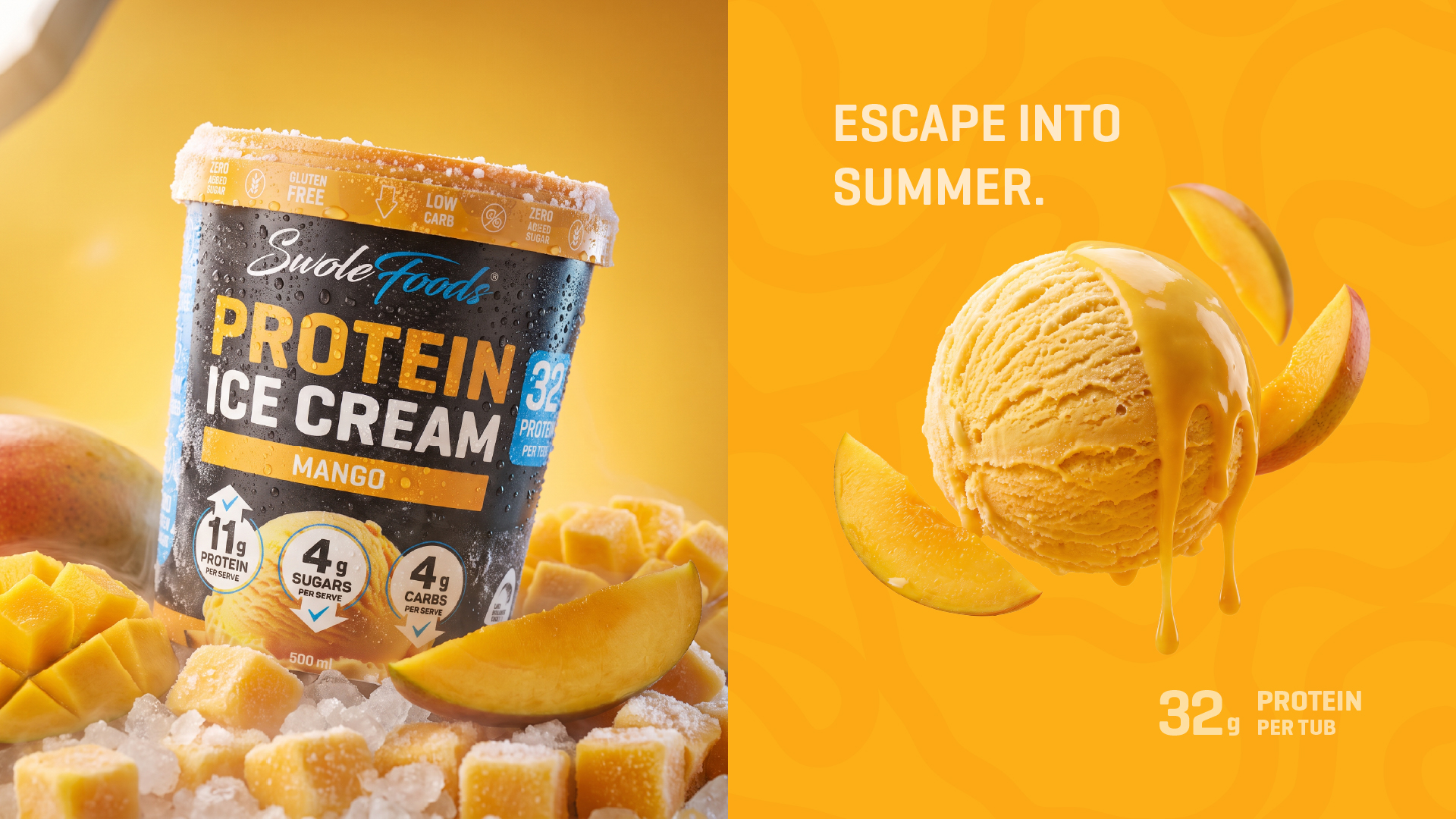
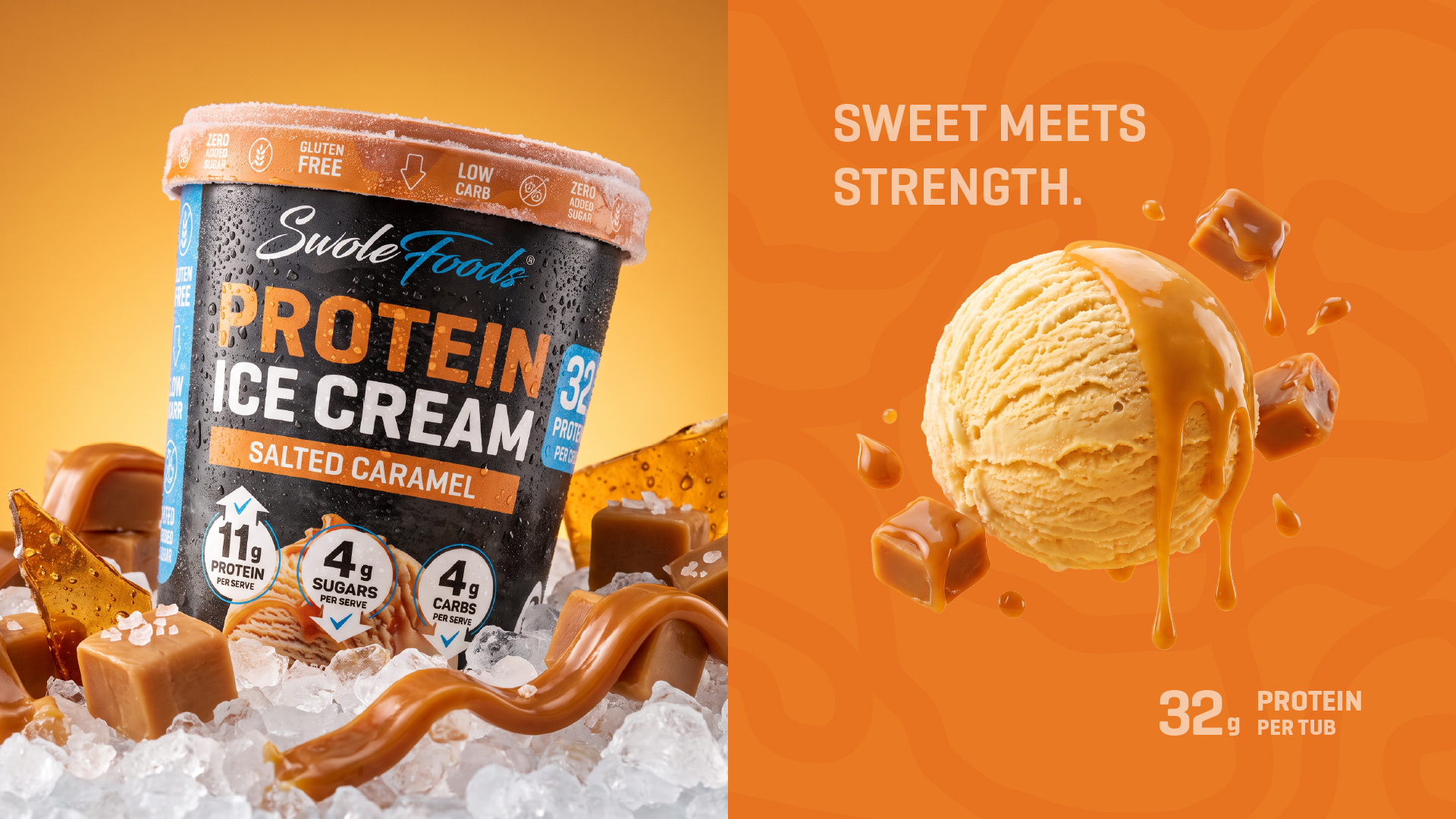
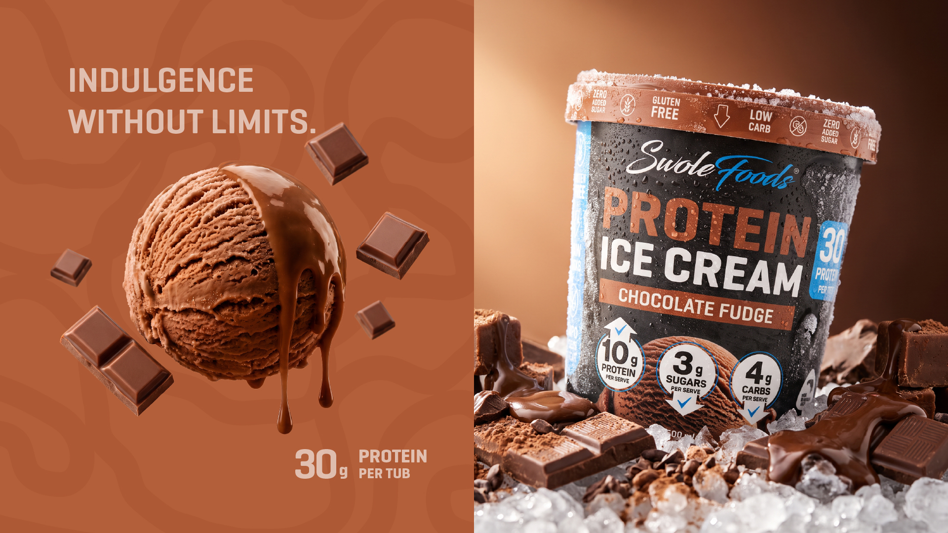
Each flavor is distinguished through its own dedicated color palette inspired by its key ingredient, creating immediate recognition while maintaining a consistent brand architecture.
Nutritional benefits such as protein content, low carbohydrates, gluten-free formulation, and zero added sugar are presented using a simplified badge system that reinforces the product’s performance positioning without overwhelming the front panel.
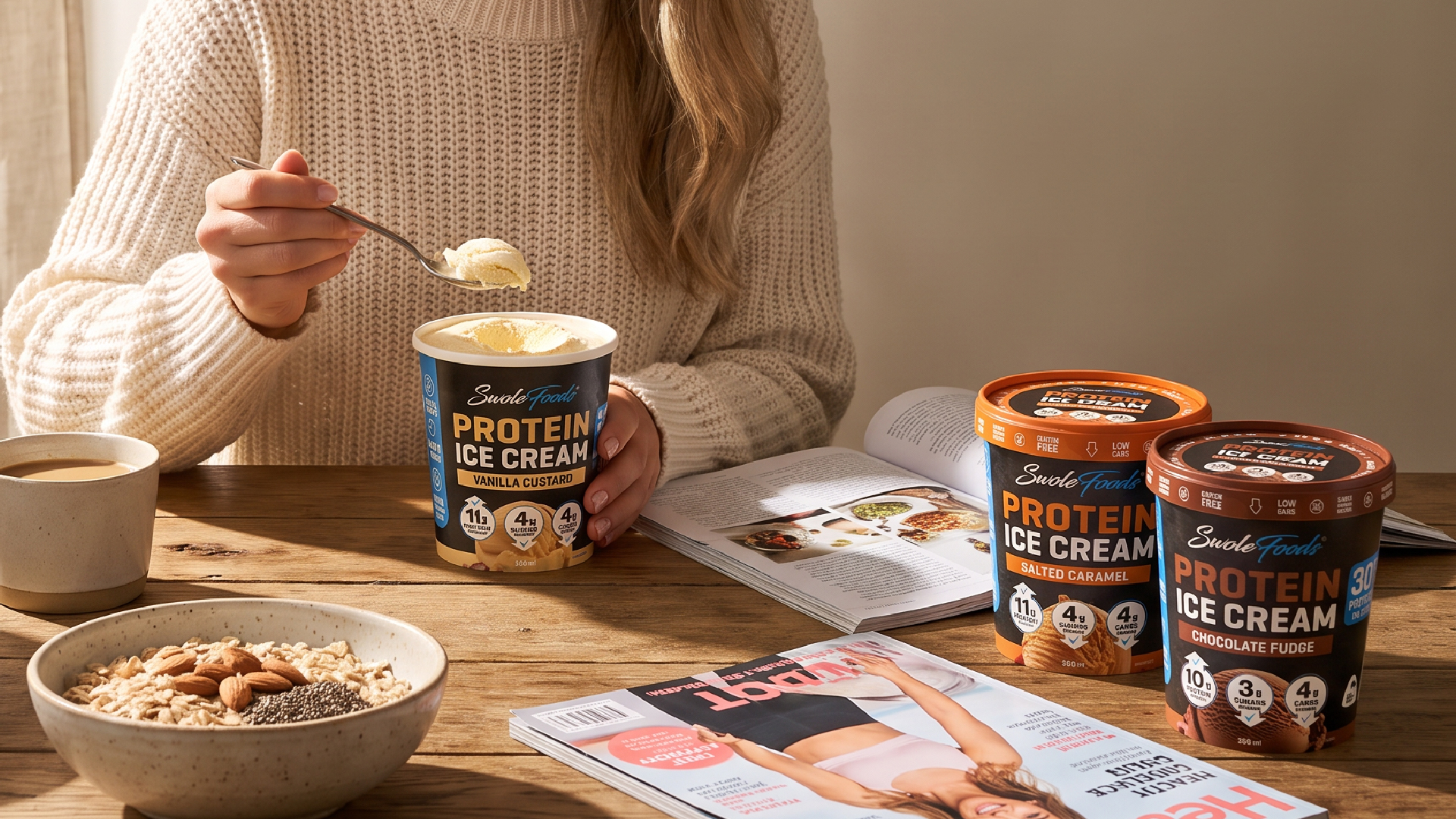
To extend the identity beyond packaging, highly detailed CGI product renders and lifestyle scenes were created, showcasing the product in realistic frozen environments while highlighting ingredient quality, texture, and freshness.
DESIGN DETAILS
The visual language combines bold condensed typography, warm flavor-driven color palettes, premium photography-inspired CGI, realistic frozen textures, and ingredient-focused storytelling.
Every design decision was made to improve shelf visibility, strengthen brand recognition, and create an identity that feels modern, energetic, and premium while remaining approachable for everyday consumers.
RESULT
The final outcome is a complete packaging system for five distinct flavors that maintains strong visual consistency while giving each product its own personality.
The project demonstrates how strategic branding, packaging design, and CGI visualization can transform a functional nutrition product into a premium consumer experience. The resulting identity is adaptable across retail packaging, e-commerce, social media, advertising campaigns, and future product extensions.

 agarcia studio
 Wynand88
 Eva Chistyakova
 Maria Bukhtilova
 estudiomarciano
 monther al omari
 Thirst
 Maruf Nishat
 Gray Matter Studio
 Julia Jay
 Modern Theory
 Furt Goods
 Fluid
Fluid alchimistestudioParis
 Ancora
 Mostafa Abdelmawla
 MewKittyDraw
 Studio Shala
 43oz
43oz Lucid mk2
 Atiq Alam
 IDEOLOGO
 Open Strategy & Design