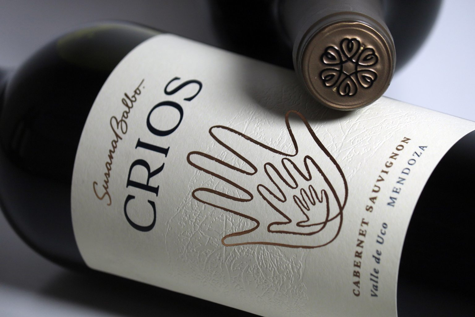

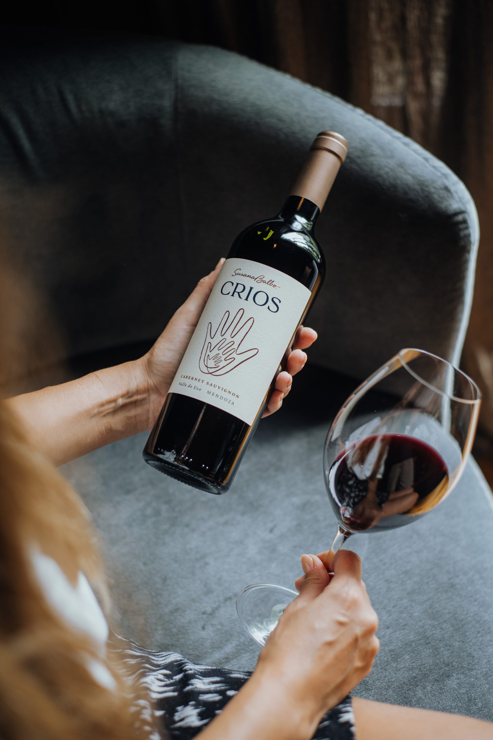
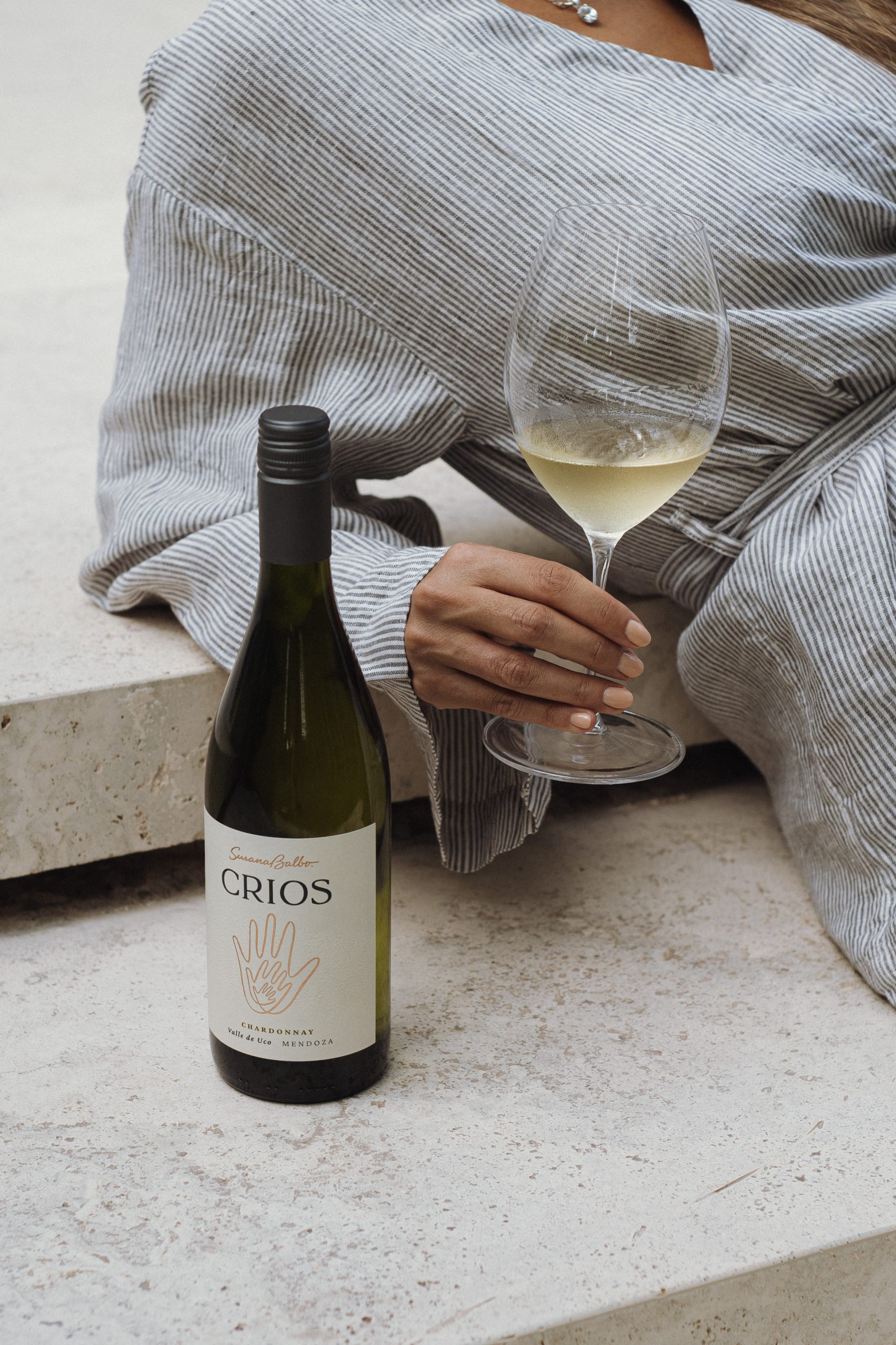
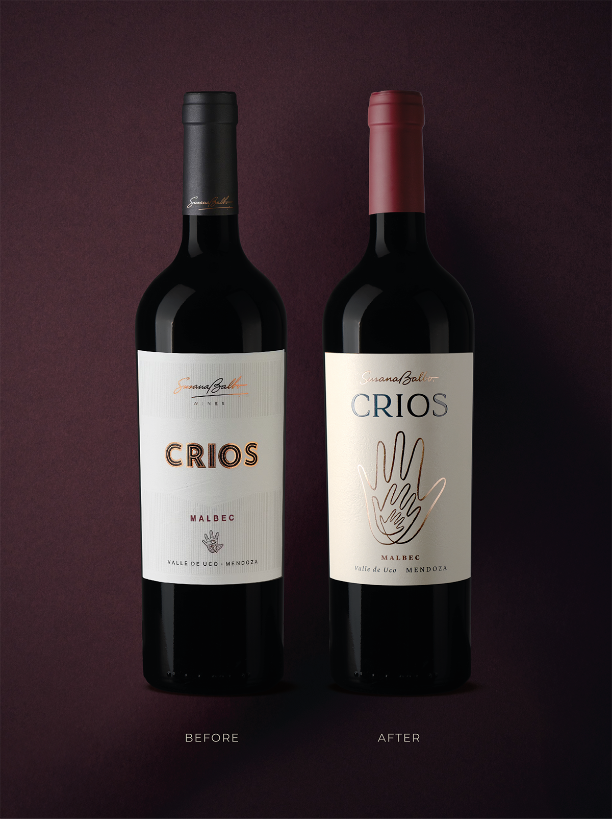
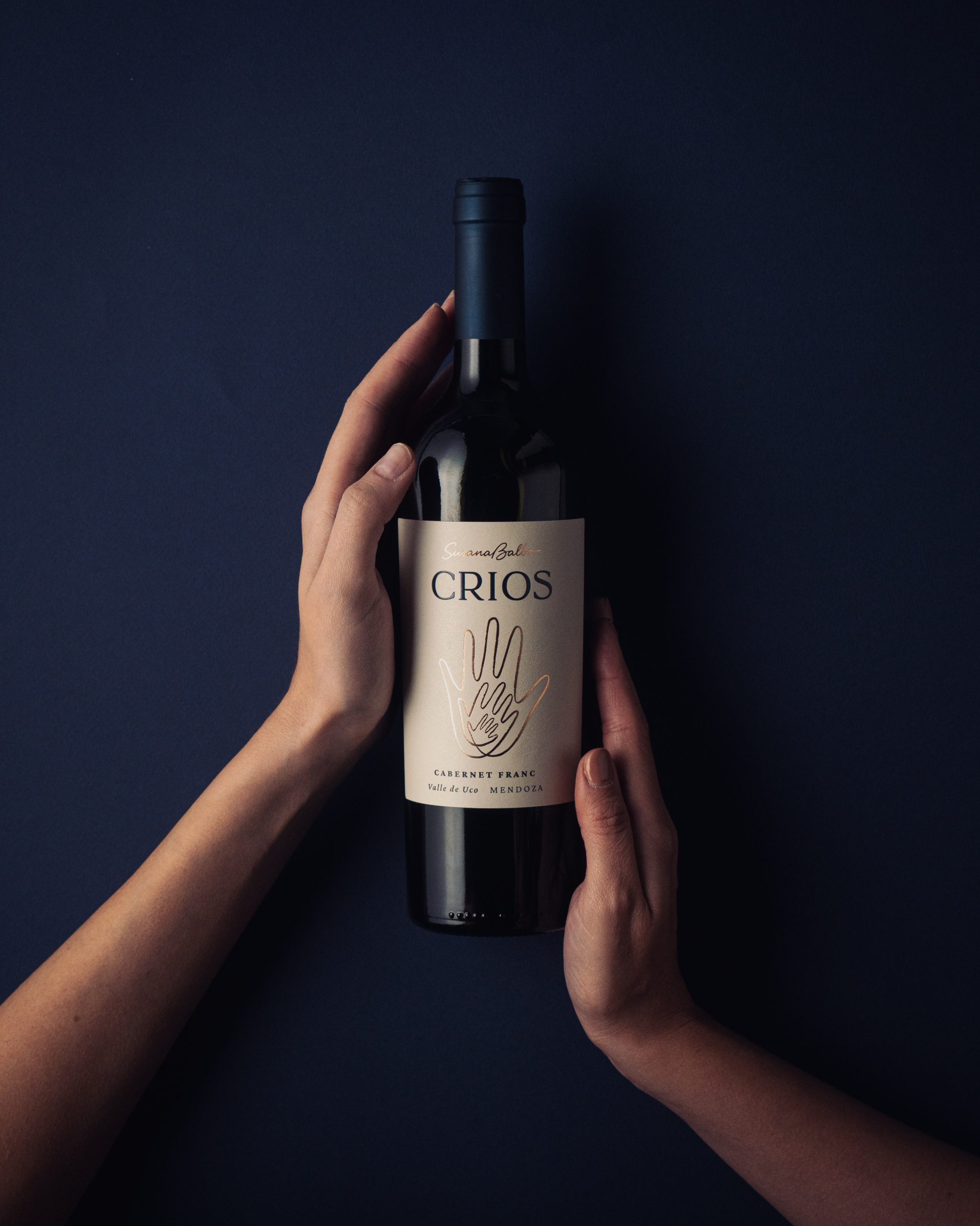
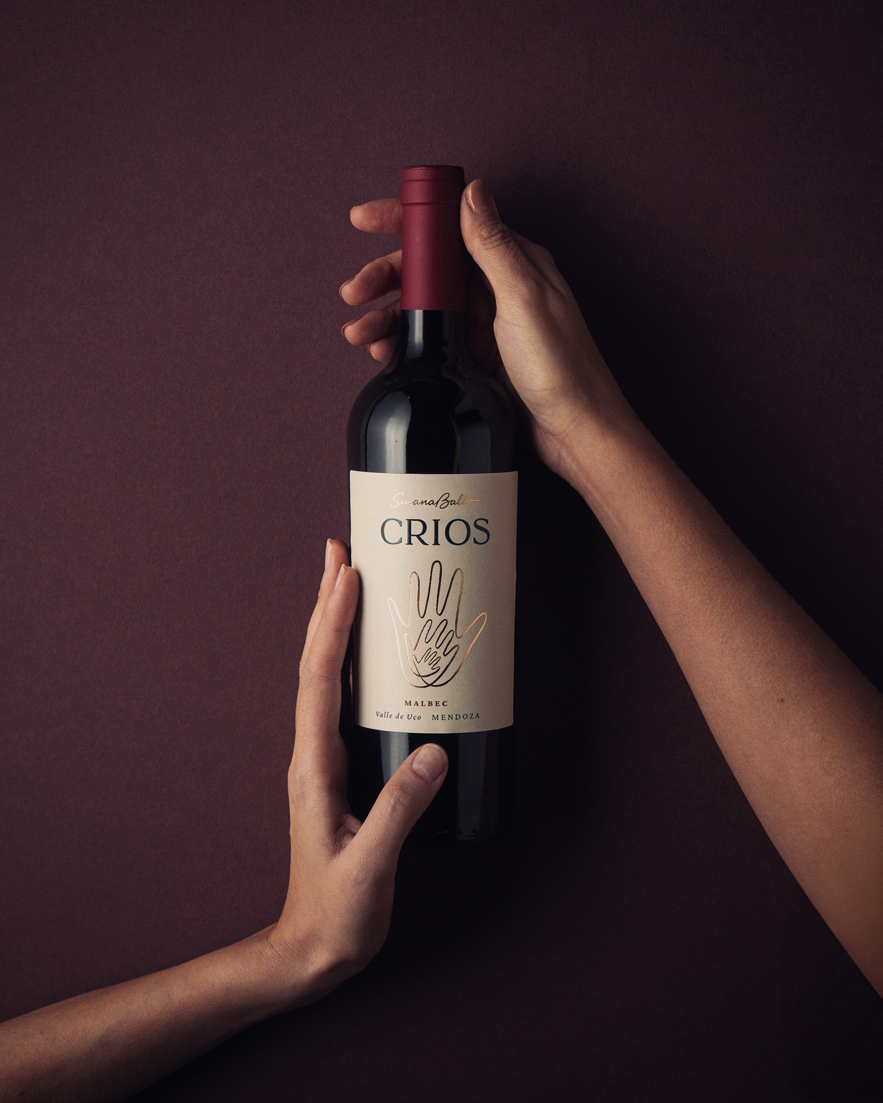
Crios Redesign – The identity draws on the symbolic language of hands—the hands that cultivate the land, make the wine, nurture, and create—recasting them as the defining element of the label.
The redesign reconnects the brand with its origins through a contemporary visual language.
Three interwoven hands become a symbol of continuity, collaboration, and shared knowledge. Embossed details introduce a tactile dimension, reinforcing the relationship between the object and the landscape from which it comes. Organic forms, refined linework, and a restrained aesthetic create a label that feels both timeless and contemporary.






 Derrick Lin
 43oz
43oz vitoramockup
 Oksana
 KOS
KOS Hui Hua
 Rana Elkady
 Modern Theory
 Eclectic M
 Katya Slobodskaia
 Evgenia Beresneva
 CreativeWise
 宏洛图品牌设计HONGLT
 erandy
 Abbas Sayyed
 Ollie
Ollie Moço Wine Branding
 khadijaaljifri
 Abdulrahman Taha
 Juana Sarabia
 Mohammed Nasr Sharfi