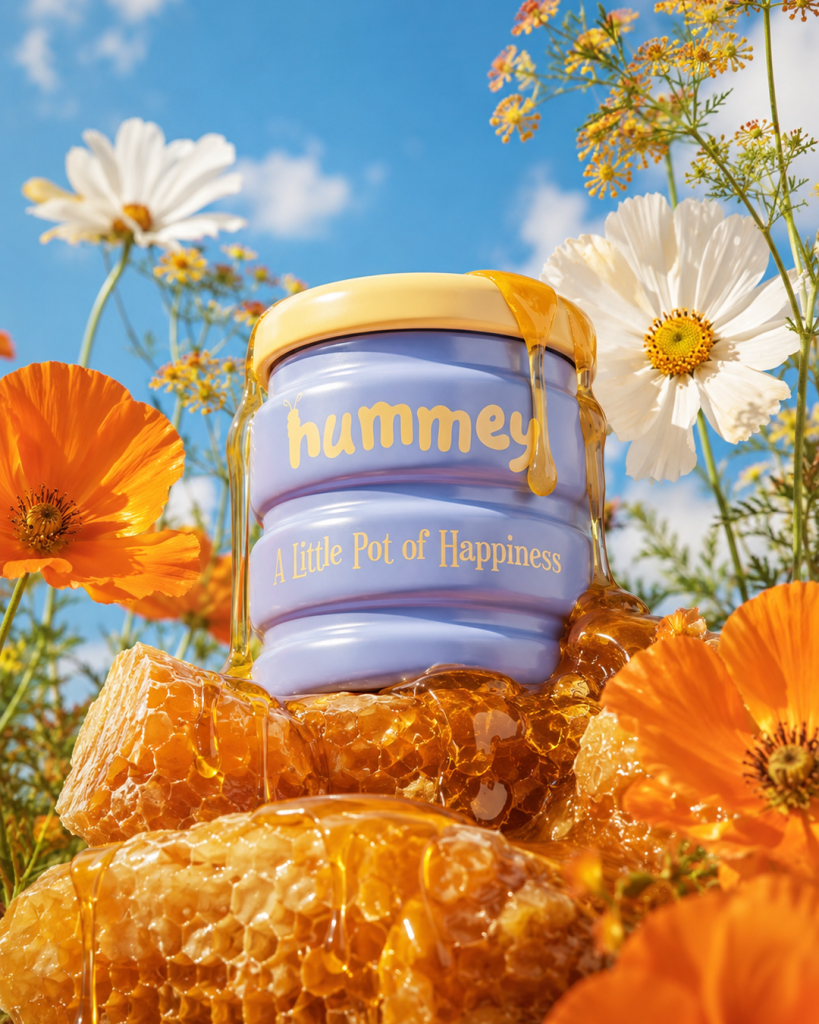

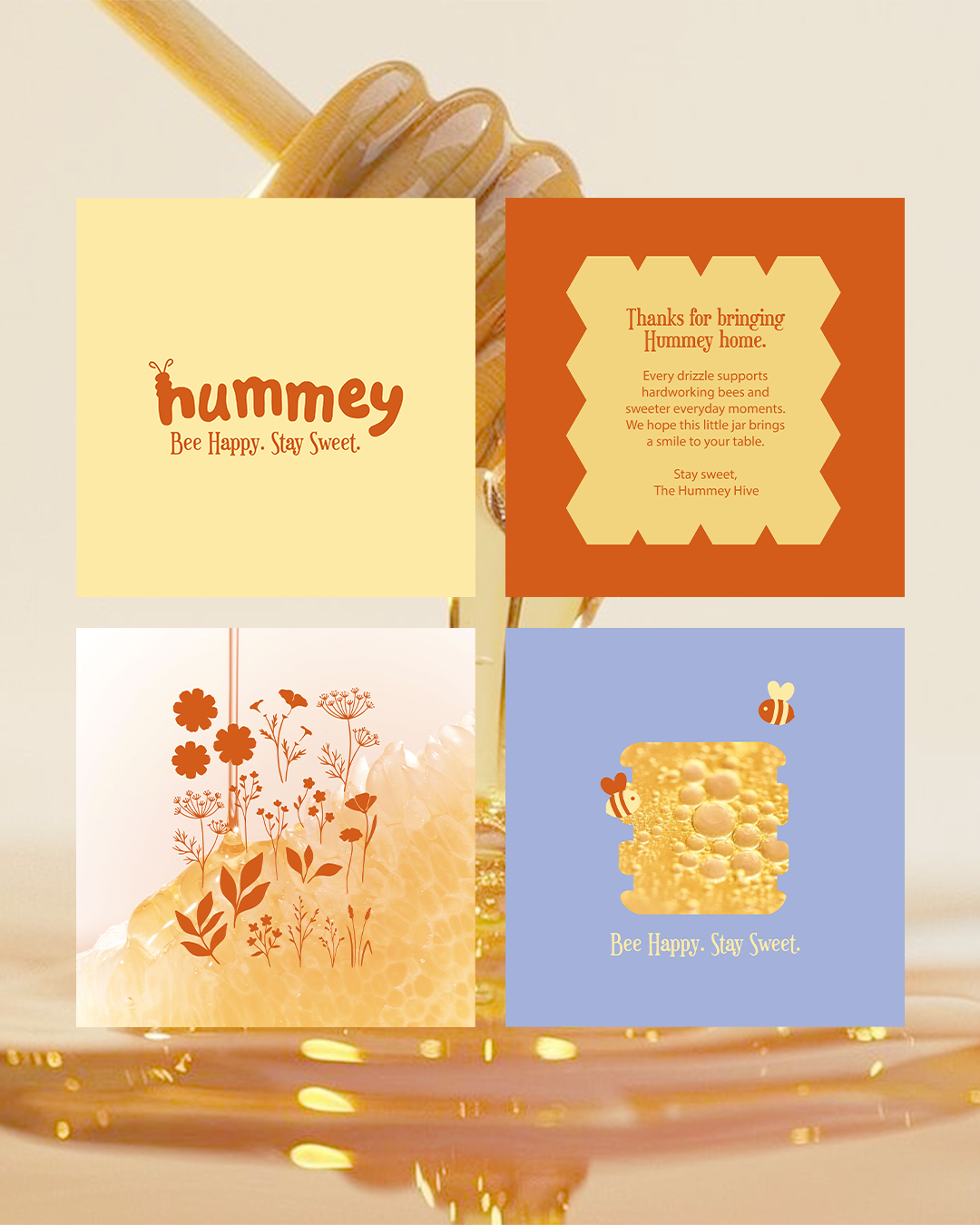
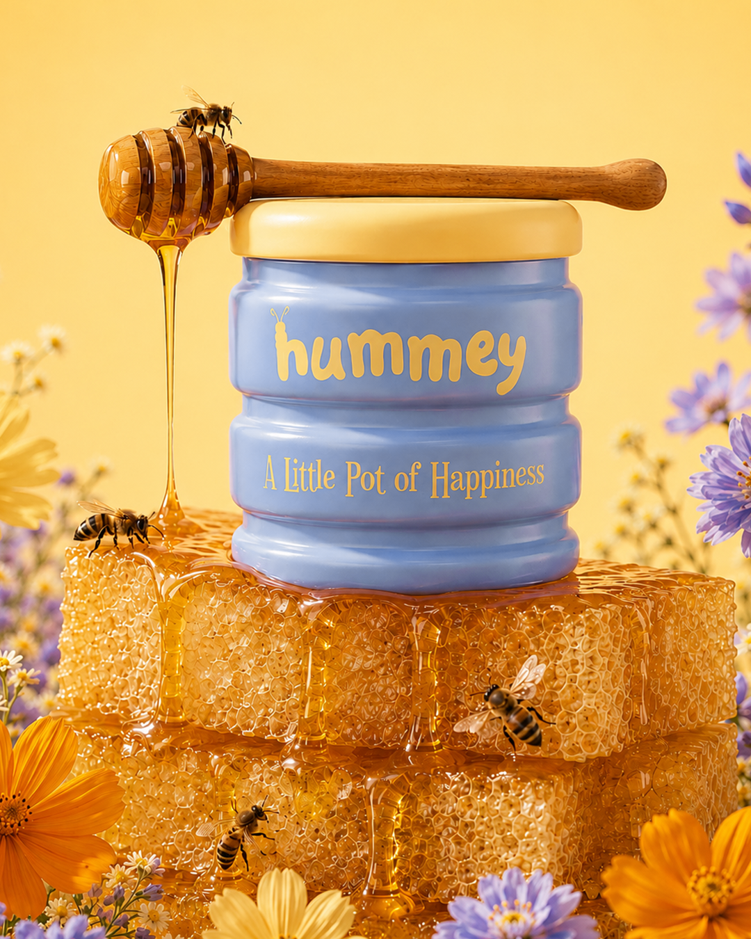
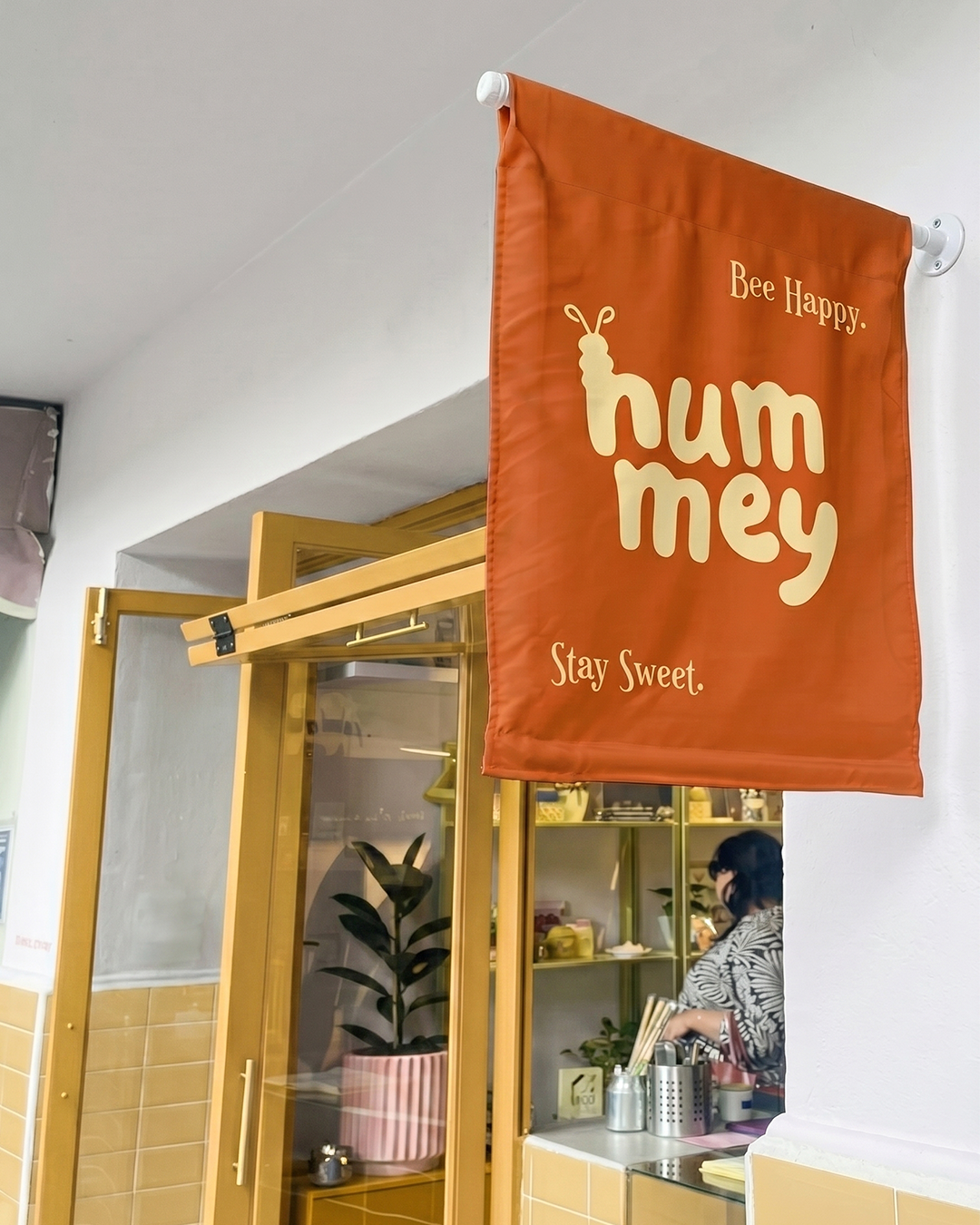
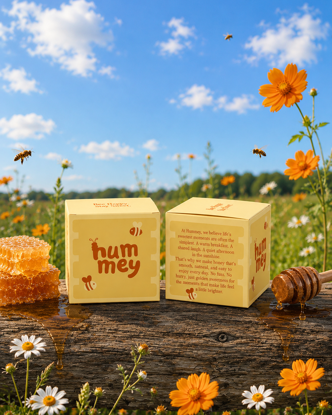
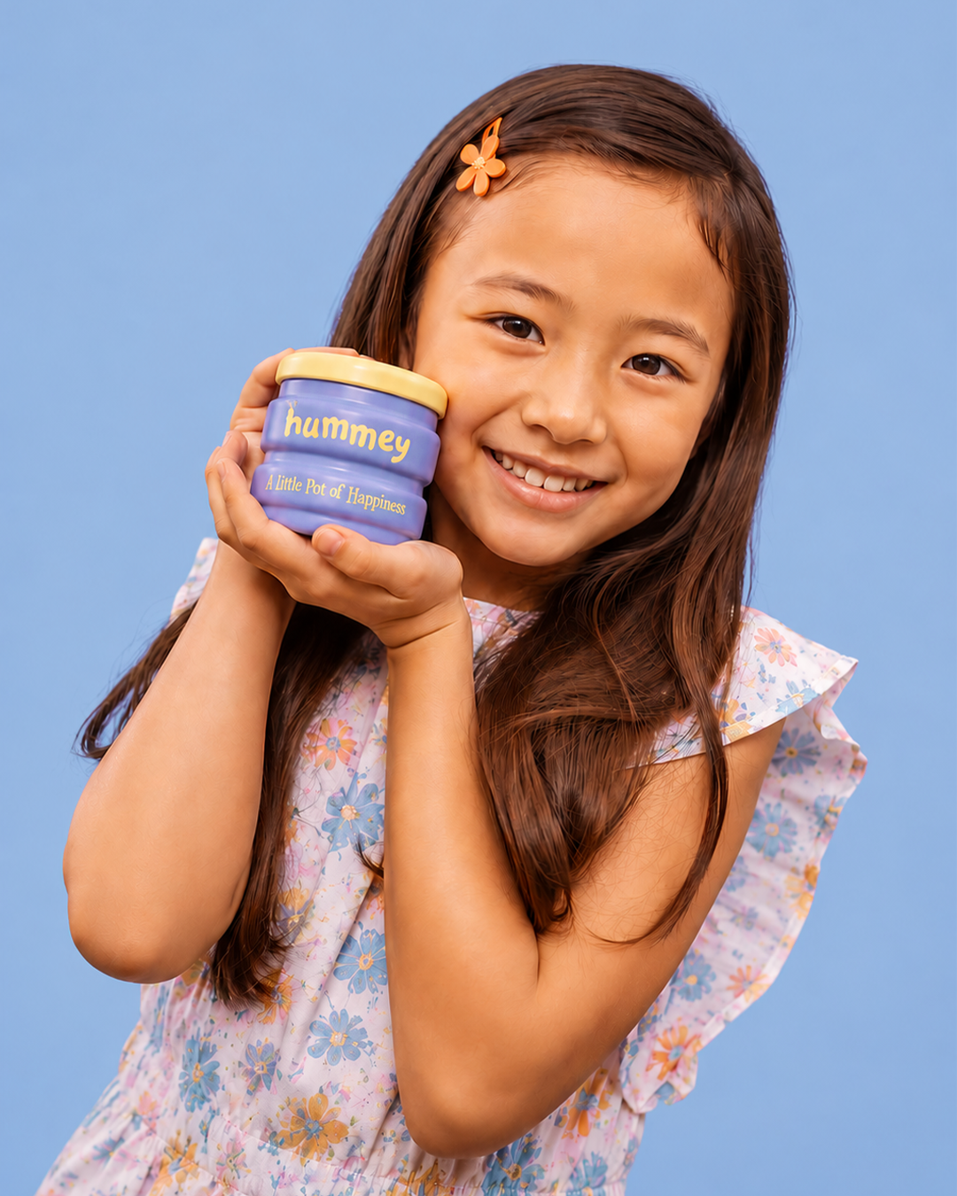
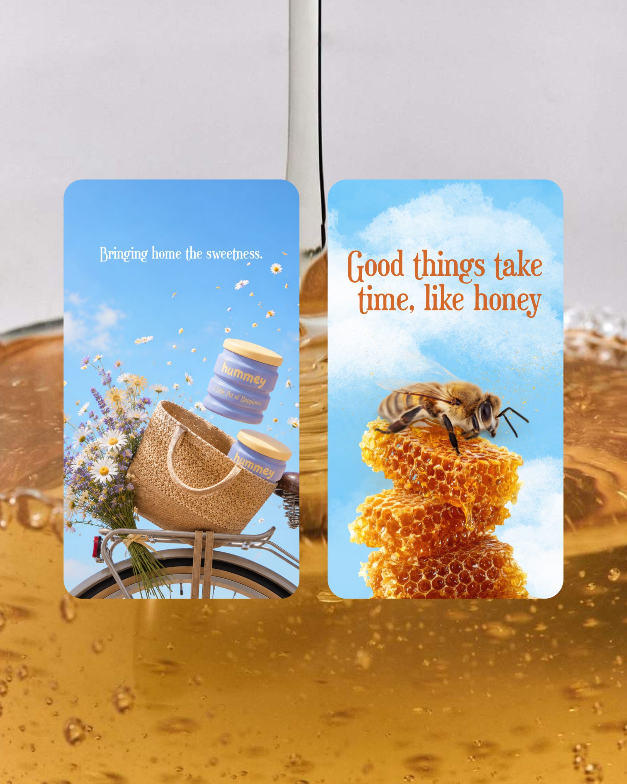
Hummey is a honey brand designed to bring a little warmth and sweetness to everyday moments. Inspired by the simple joy of honey, the identity combines a soft, comforting palette with playful illustrations, handcrafted details, and a distinctive honey-dipper-inspired jar silhouette. The packaging was designed to feel wholesome, approachable, and full of character, while the wider brand world extends across mini honey jars, gift boxes, totes, keychains, and a playful retail experience. Every touchpoint was created to make Hummey feel less like a product and more like a little world of warmth, joy, and togetherness.
Curator’s Insight
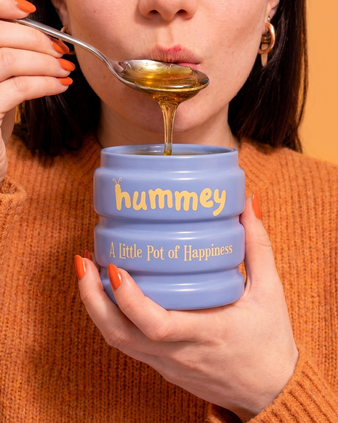
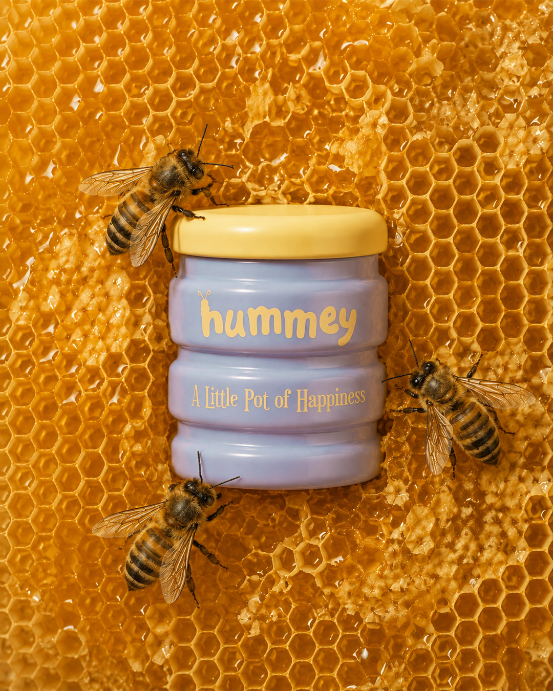
The challenge with a honey brand is that the category has already claimed its visual shorthand. Warm ambers, kraft textures, rustic type, the same drip motif repeated until it stops meaning anything. Hummey’s most interesting decision is refusing that palette. Swapping the expected honey-gold body for a periwinkle ceramic jar breaks the category pattern without breaking the association, since the lid and the honey itself still carry the warmth the eye is looking for.
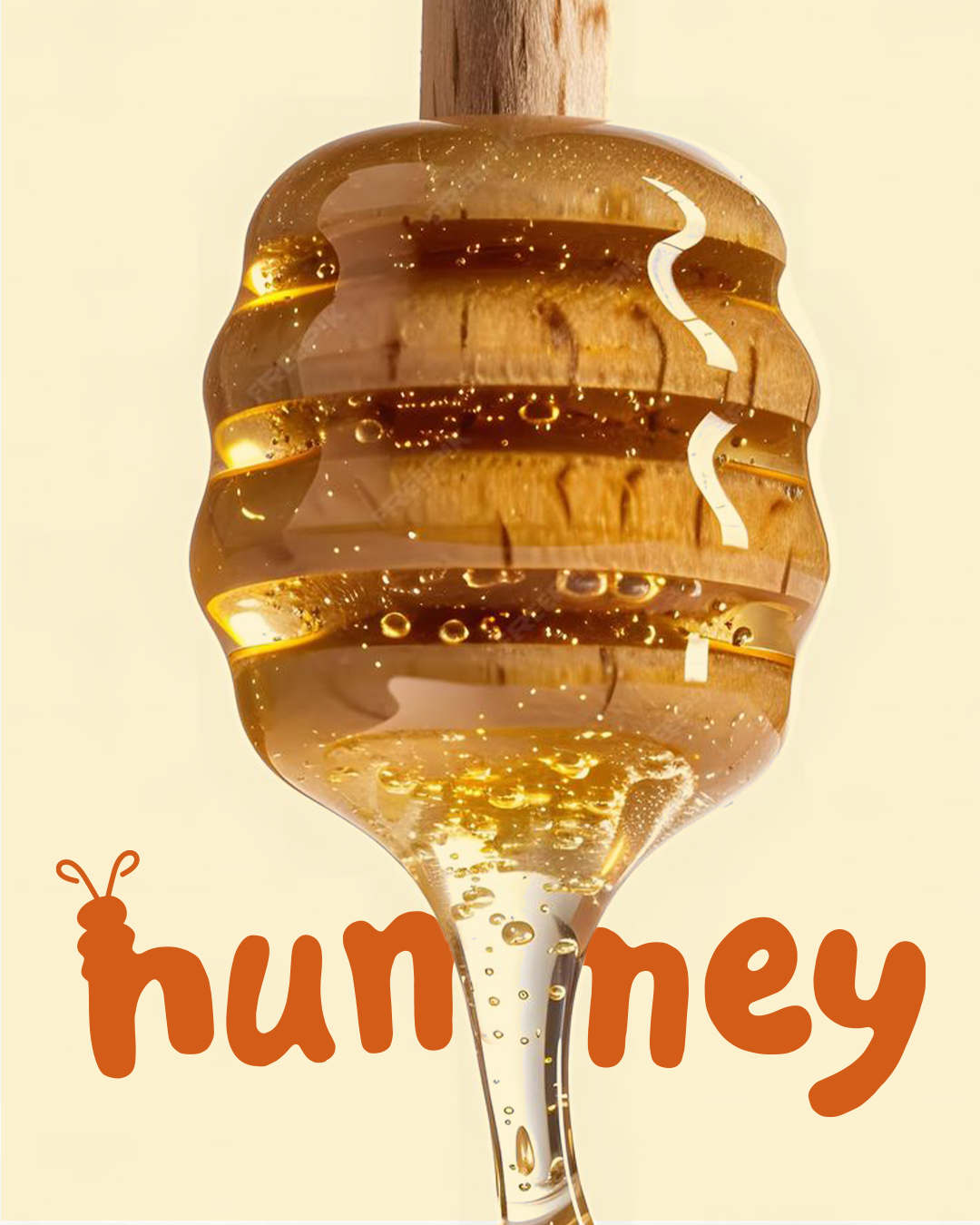
The jar’s ribbed, stacked form is doing double duty too. It reads as a drip caught mid-fall, but it also gives the object a tactile, huggable quality more associated with kitchenware than food packaging, which shifts the whole product from “condiment” to “object you’d want sitting on a counter.” Even the wordmark participates in this world-building. The small antennae detail on the “h” is easy to miss, but it means the logotype itself is quietly illustrating the bee behind the brand rather than relying on a separate mascot or icon to do that job.
The transferable principle here is that character doesn’t require literal illustration. A single well-placed detail in the type, paired with a color choice that trades category convention for emotional tone, can carry more brand personality than an explicit graphic ever would.





 Biaa
Biaa Derrick Lin
 Axiniya Knyazeva
 Hadi Samir
 Atiq Alam
 Furt Goods
 宏洛图品牌设计HONGLT
 Ampersand Creative
 Modern Theory
 Palashcc
 neo creative studio
 Anshuman
 Archi Jain
 DESIGN CONCEPTS
 Shapers Studio
 jamajkajakub
 tamara barakat