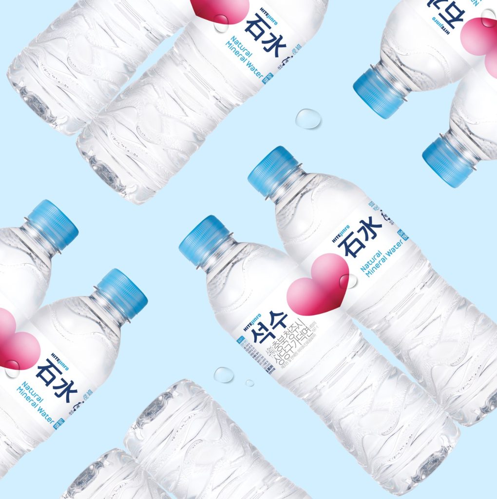

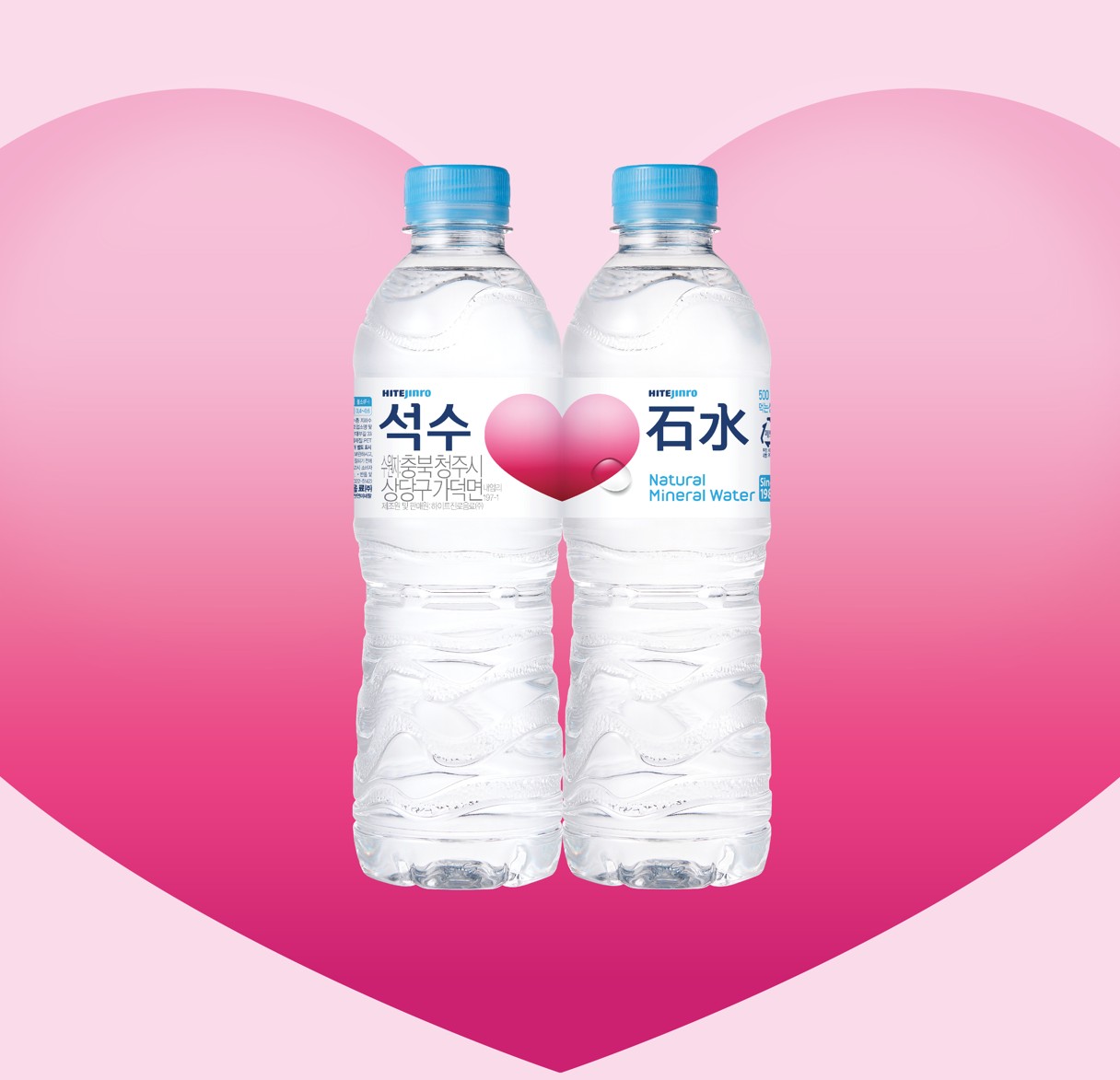
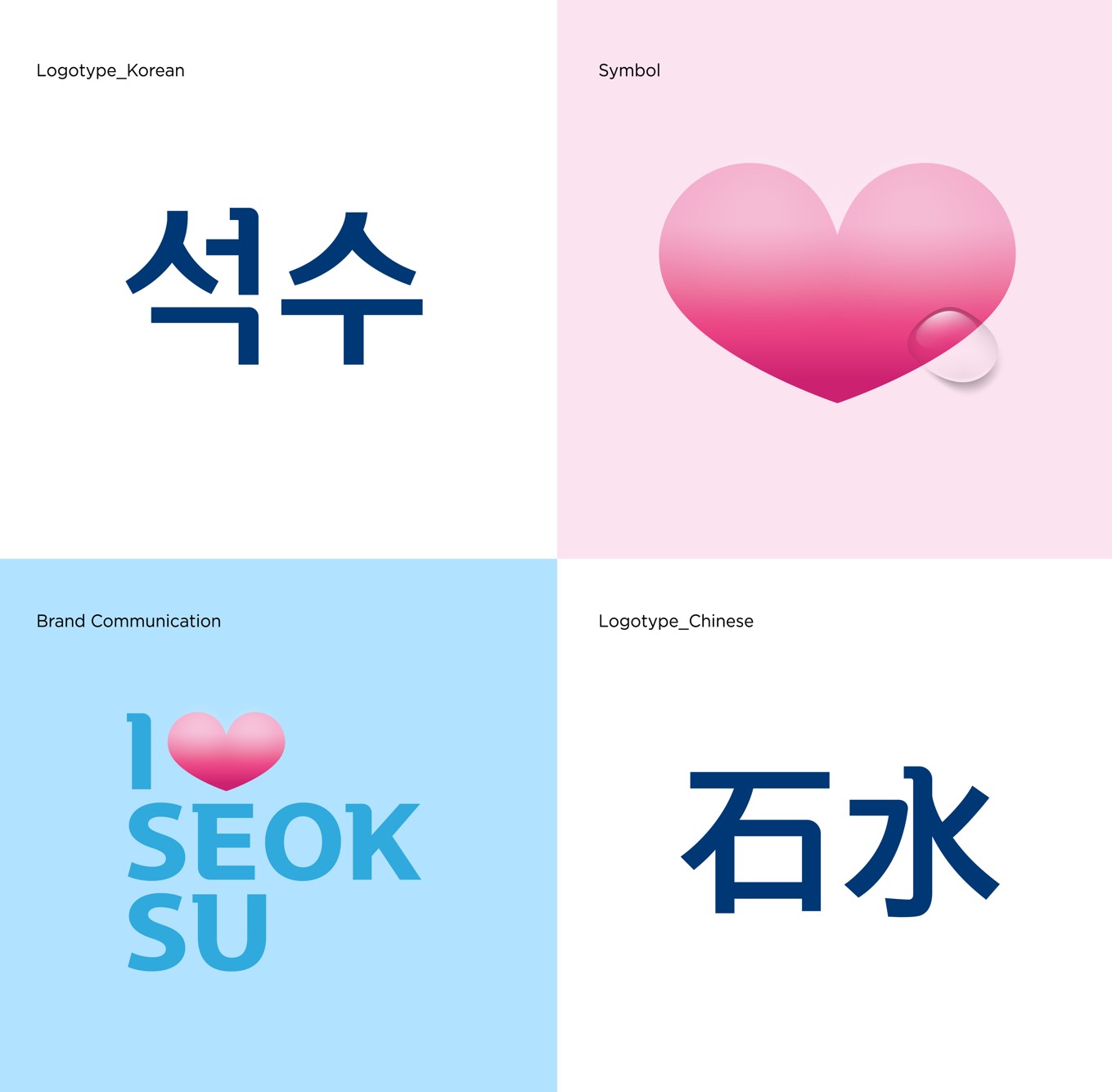
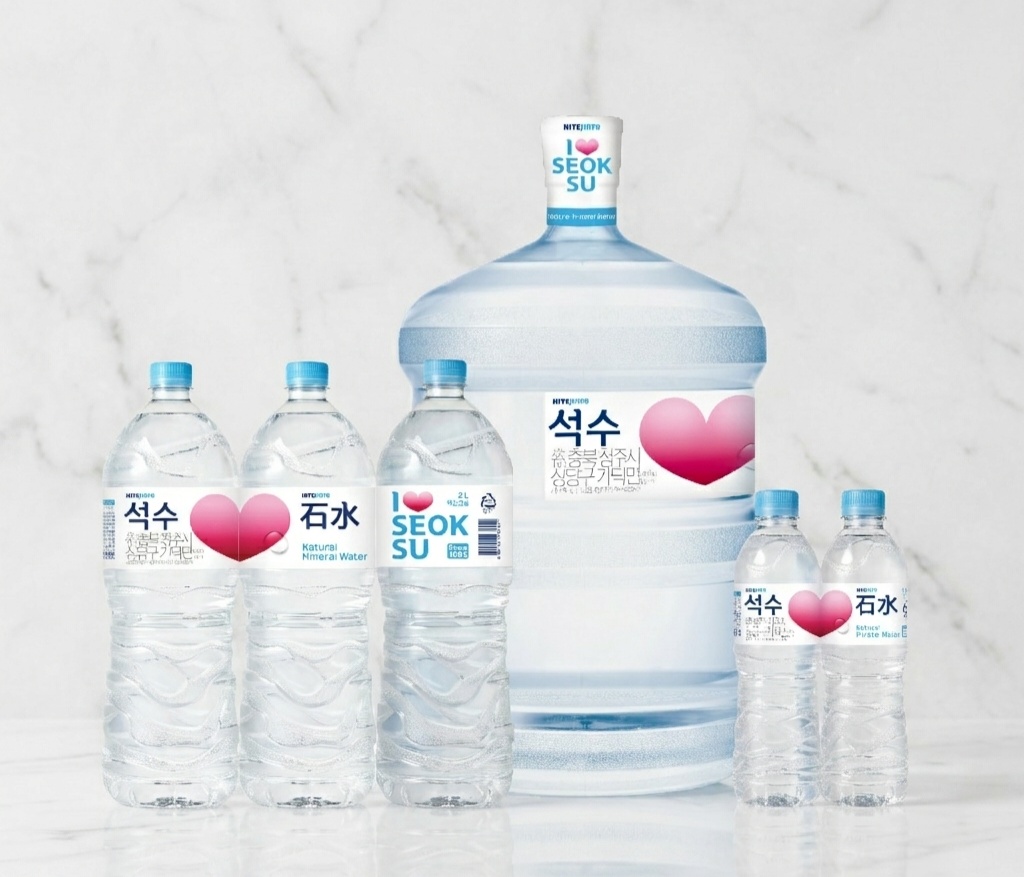
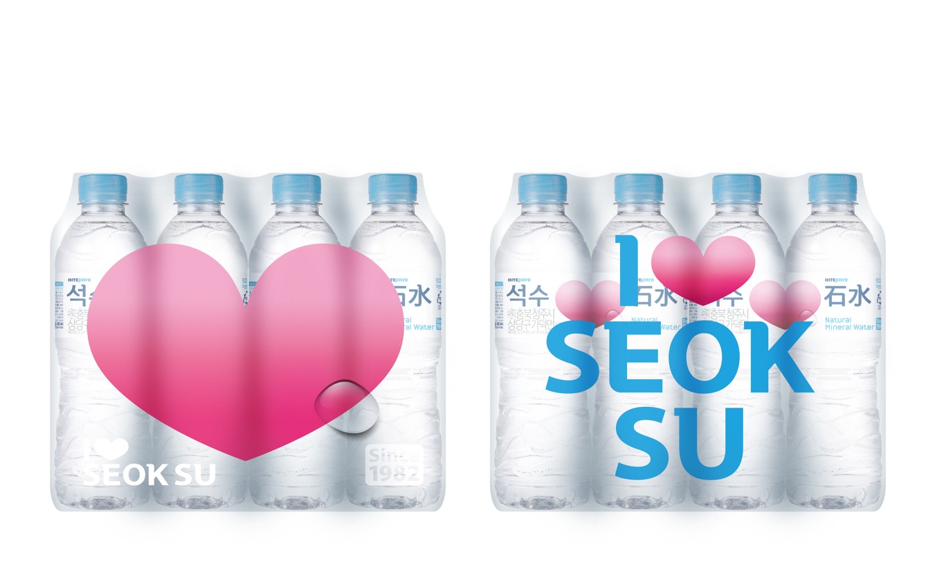
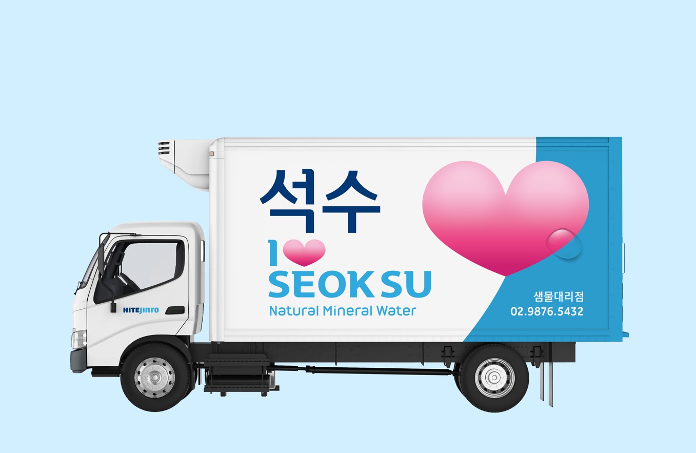
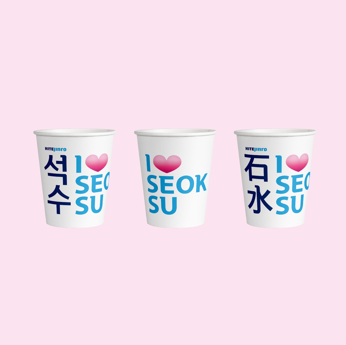
Celebrating the 37th anniversary of the launch of “Seoksu,” the Korea’s first bottled spring water, the brand has been completely renewed. The importance of water to protect the family’s health was set under the concept of <Water of Love>, adding to the emotional feeling by placing the pink heart symbol as the key visual. It also combined the birth year ‘1982’ with the sophisticated Chinese character logo of the existing brand color, blue, to enhance the delivering power of concept message by strengthening the soft image while maintaining the history and legitimacy of “Seoksu.” In addition, visual communication design was developed so that consumers could feel “Seoksu” as a newer and young brand in the consumers’ touch-points, strengthening brand experience at the brand Newness level.

 agarcia studio
 Wynand88
 Eva Chistyakova
 Maria Bukhtilova
 estudiomarciano
 monther al omari
 Thirst
 Maruf Nishat
 Gray Matter Studio
 Julia Jay
 Modern Theory
 Furt Goods
 Fluid
Fluid alchimistestudioParis
 Ancora
 Mostafa Abdelmawla
 MewKittyDraw
 Studio Shala
 43oz
43oz Lucid mk2
 Atiq Alam
 IDEOLOGO
 Open Strategy & Design