

San Capri is a botanical iced tea brand inspired by wild blooms, sun-soaked days, and the beauty of keeping things a little unexpected.
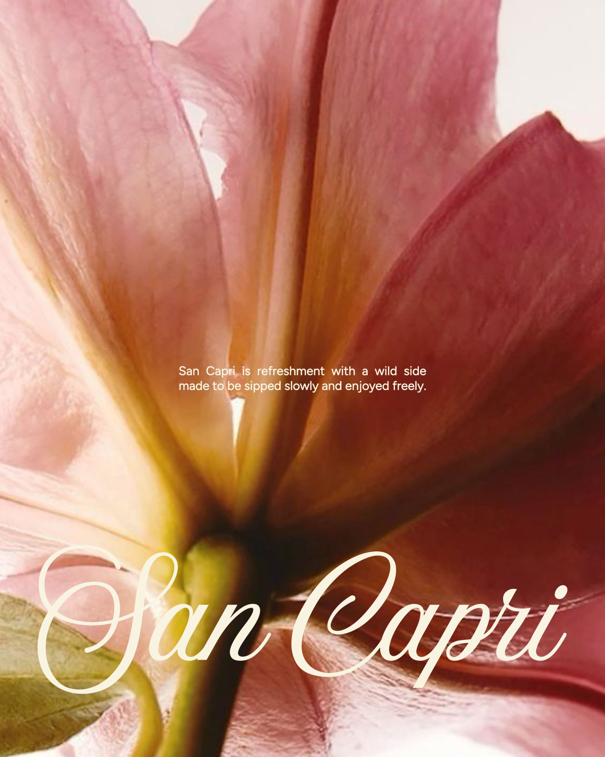
The visual identity brings a playful, expressive personality to the category through bold typography, hand-drawn botanical illustrations, and a vibrant palette of pinks, burgundy, and warm neutrals. Each flavour is given its own floral character, creating a collection that feels distinctive while remaining cohesive.
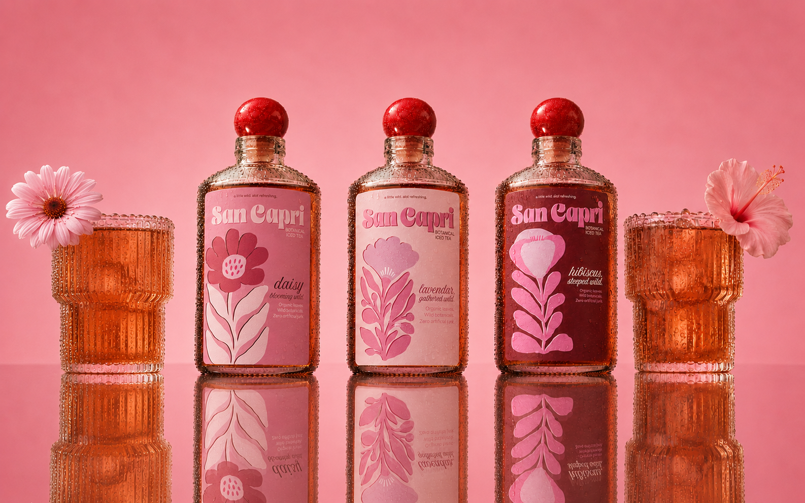
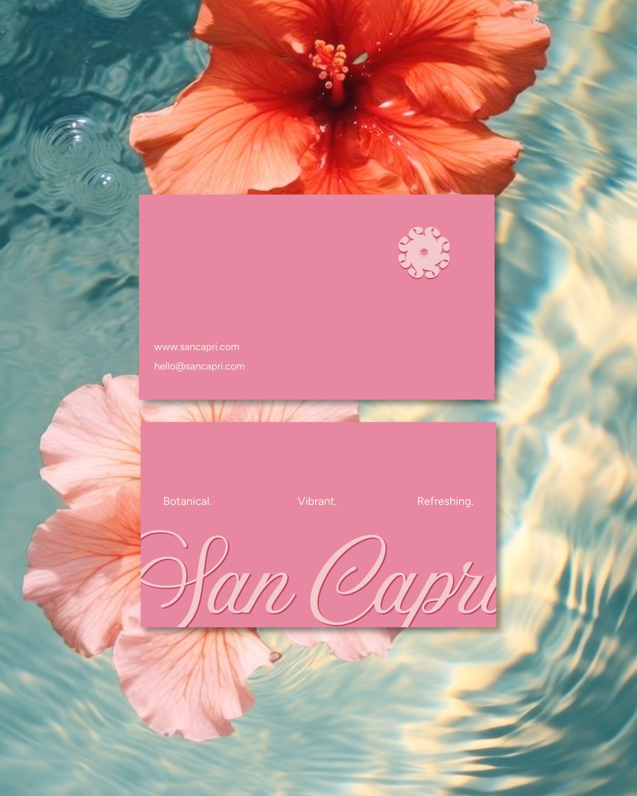
The packaging pairs a sculptural bottle with illustrated labels that make the botanicals the hero. Supporting applications extend the identity into a playful summer world, from posters and printed collateral to relaxed picnic-inspired scenes.
Curator’s Insight
The clearest design decision here is the flavor system built entirely through illustration rather than color-blocking alone. Each botanical (hibiscus, lavender, daisy) is drawn as its own linear composition, stem and petals rendered in flat, overlapping tones of a single hue family. That constraint (one flower, one palette, one gesture) is what keeps a genuinely varied product range from splintering into unrelated bottles on a shelf.
The bubble-lettered wordmark does a lot of quiet work too. Its rounded, slightly inflated forms echo the ball-shaped bottle closure, so the logotype and the glass silhouette end up speaking the same visual language even though one is typographic and the other structural. That kind of cross-referencing between 2D mark and 3D form is easy to skip and hard to unsee once it’s there.
Worth noting as well is the restraint in the copywriting: the lowercase, faux-typo tagline treatment (“a little wild, alot refreshing”) signals informality without tipping into gimmick, since it appears only once per label rather than repeating the joke across every panel.





 Biaa
Biaa sophioc
 Marta Wasilewska
 House of Thought
 Krithika Chakkaravarthy
 Reema
Reema Oksana
 Palashcc
 KoverCsengeAgnes
 Carreto Concepts Design Studio
 Viktoriia Graber
 Sealburger
 Farah Haddad
 Sami Asaad
 Modern Theory
 PLUSDESIGbd
 Ayanna
 Flow Creative
 jonathanag90
 Creative Platform
 alchimistestudioParis
 Eman AlGhasra
 andreamarinnn