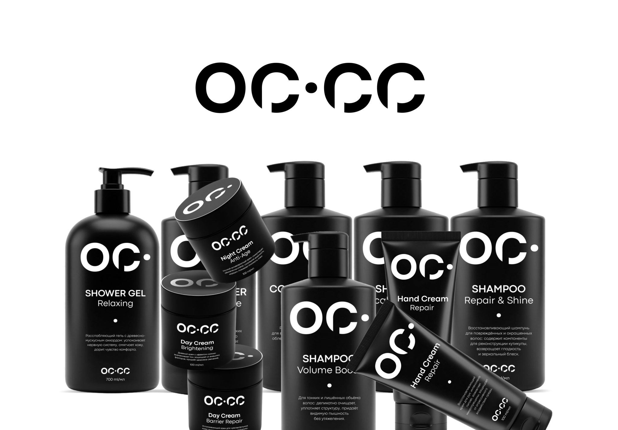

OC.CC and OS.SS Cosmetics Brand
The logo is designed in a minimalist style against a solid black background, creating a strong contrast with the white geometric typeface and reinforcing the brand’s premium positioning. The composition is divided into two conceptual groups: the full abbreviations, OC.CC and OS.SS, appear on the left, while their shortened forms, OC. and OS., appear on the right. This visually communicates the idea of variations within the product range or different product formats.
The typeface is a grotesque sans serif with distinctive custom details. Certain parts of the letters are deliberately fragmented or truncated, particularly in the C and S, giving the typography a contemporary, technological character while preserving readability. The dots separating the abbreviations act as rhythmic accents and strengthen the sense of a carefully considered structure.
The meanings behind the names—derived from opulent, meaning “luxurious,” and essence, meaning “the core” or “essence”—are effectively supported by the visual language. The restrained forms and monochrome palette evoke an expensive, refined product that places emphasis on its contents rather than excessive decoration.
This identity would fit naturally within the positioning of skincare and haircare products, including anti-ageing and intensive-treatment ranges designed for different age groups.






 sophioc
 Marta Wasilewska
 House of Thought
 Krithika Chakkaravarthy
 Reema
Reema Palashcc
 KoverCsengeAgnes
 Carreto Concepts Design Studio
 Viktoriia Graber
 Sealburger
 Farah Haddad
 Sami Asaad
 Modern Theory
 PLUSDESIGbd
 Ayanna
 Flow Creative
 jonathanag90
 Creative Platform
 alchimistestudioParis
 Eman AlGhasra
 andreamarinnn
 ccc
ccc Natasha Alimova
 Heramb Arora
 Denis Ulianov