Curator's PicksSubmit a projectShare your work

Explore by Country

AfghanistanAfricaAlbaniaAlgeriaAmerican SamoaAndorraAngolaAnguillaAntarcticaArgentinaArmeniaAsiaAustraliaAustriaAzerbaijanBahamasBahrainBangladeshBarbadosBelarusBelgiumBeninBoliviaBosnia and HerzegovinaBotswanaBrazilBritish Indian Ocean TerritoryBrunei DarussalamBulgariaCambodiaCameroonCanadaChileChinaChristmas IslandColombiaCosta RicaCote D'ivoireCroatiaCubaCyprusCzech RepublicDemocratic People's Republic of KoreaDenmarkDominican RepublicEcuadorEgyptEl SalvadorEstoniaEthiopiaEuropeFijiFinlandFranceFrench GuianaFrench Southern TerritoriesGeorgiaGermanyGhanaGlobalGreeceGuadeloupeGuatemalaGuyanaHaitiHondurasHong KongHungaryIcelandIndiaIndonesiaIranIraqIrelandIsraelItalyJamaicaJapanJordanKazakhstanKenyaKuwaitKyrgyzstanLatviaLebanonLibyaLithuaniaLuxembourgMacedoniaMadagascarMalaysiaMaldivesMaliMaltaMarshall IslandsMauritiusMexicoMoldovaMonacoMongoliaMontenegroMoroccoMyanmarNepalNetherlandsNew CaledoniaNew ZealandNicaraguaNigeriaNorth AmericaNorwayOceaniaOmanPakistanPalestiniaPanamaPapua New GuineaParaguayPeruPhilippinesPolandPortugalPuerto RicoQatarRepublic of KoreaRepublic of KosovoRomaniaRussian FederationSan MarinoSao Tome and PrincipeSaudi ArabiaSenegalSerbiaSeychellesSingaporeSlovakiaSloveniaSomaliaSouth AfricaSouth AmericaSpainSri LankaSudanSwazilandSwedenSwitzerlandSyrian Arab RepublicTaiwanTajikistanThailandTrinidad and TobagoTunisiaTurkeyTurkmenistanUgandaUkraineUnited Arab EmiratesUnited KingdomUnited StatesUnited States Minor Outlying IslandsUruguayUzbekistanVanuatuVenezuelaViet NamVirgin Islands, U.S.YemenZambiaZimbabwe

Materials

Browse all

Gusto di Tempo

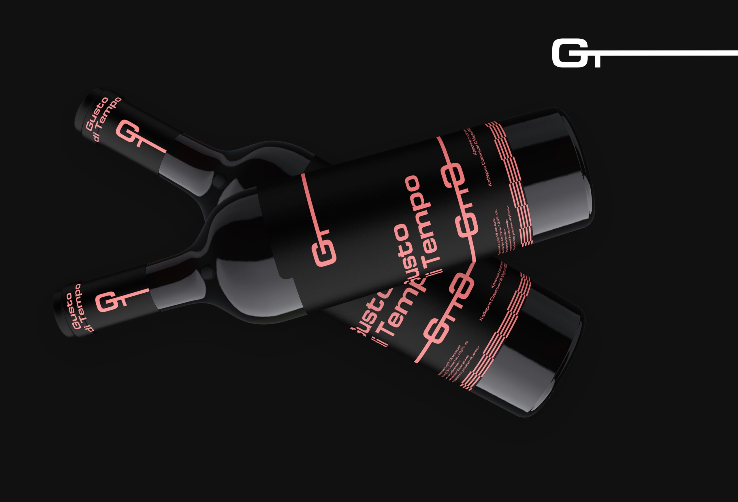
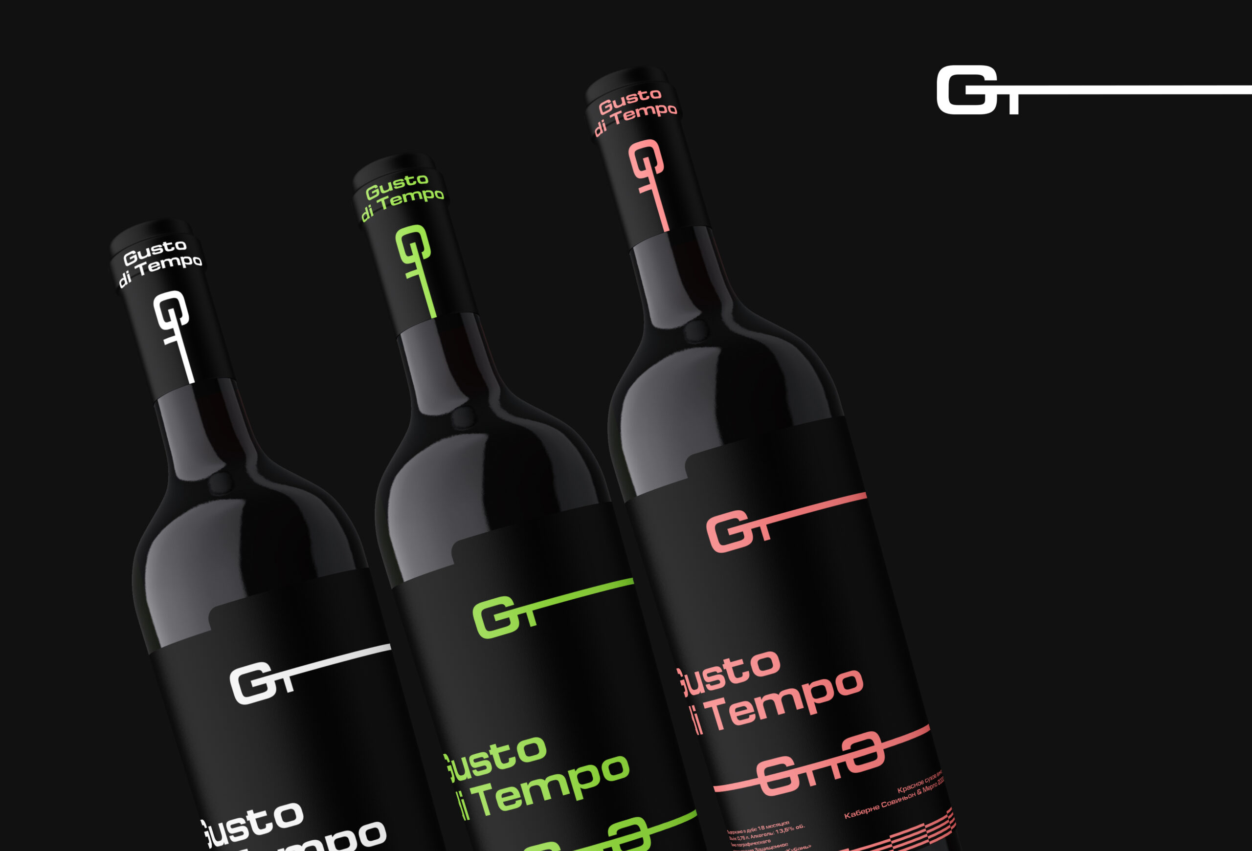
The Gusto di Tempo wine packaging design is an ode to modern minimalism, where expressiveness is born from restraint. The bottles’ clean silhouettes against a deep black background seem to float in space, emphasizing the product’s premium nature. The minimalist forms and lack of unnecessary details focus attention on the essentials—the brand and its character.

The design style balances futurism with classic elegance. It is based on a minimalist identity: black dominates, and the mood is set by contrasting color accents—cool white, vibrant lime, and warm rose-red. These shades not only distinguish the different lines but also create a rhythmic visual dialogue: lines, strokes, and variations of the “GT” logo tie the elements together into a unified composition.

The typography is clean, geometric, and sans serif: it is instantly readable and looks contemporary. The logo itself, complemented by a horizontal line, acts as a graphic anchor—it’s easily recognizable even in a smaller form, for example, on the neck of a bottle. Minor technical details (grape variety, strength, aging period) are deliberately relegated to the bottom and set in a discreet font: they’re there for informational purposes, but don’t interfere with the overall aesthetic.


Gusto di Tempo, wine packaging design by Oksana, Russian Federation. Image 1 of 6.Gusto di Tempo, wine packaging design by Oksana, Russian Federation. Image 2 of 6.Gusto di Tempo, wine packaging design by Oksana, Russian Federation. Image 3 of 6.Gusto di Tempo, wine packaging design by Oksana, Russian Federation. Image 4 of 6.Gusto di Tempo, wine packaging design by Oksana, Russian Federation. Image 5 of 6.Gusto di Tempo, wine packaging design by Oksana, Russian Federation. Image 6 of 6.

Comments

0 comments