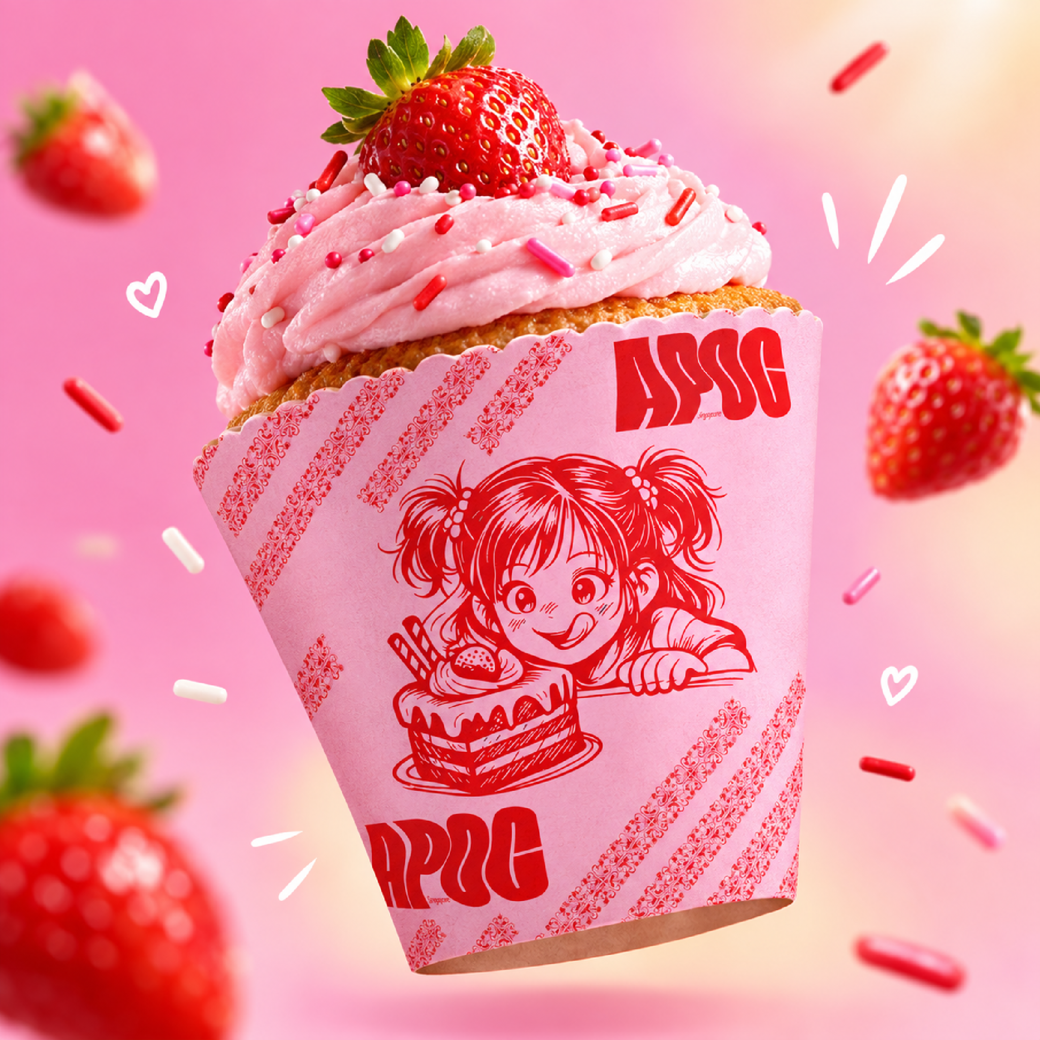

I wanted to build a visual identity for APOC that feels energetic, playful, and instantly recognizable. The core concept leans into a youthful, manga-inspired vibe—capturing that nostalgic feeling of excitement when you’re about to dig into a fresh piece of strawberry cake.
Design & Visual Breakdown
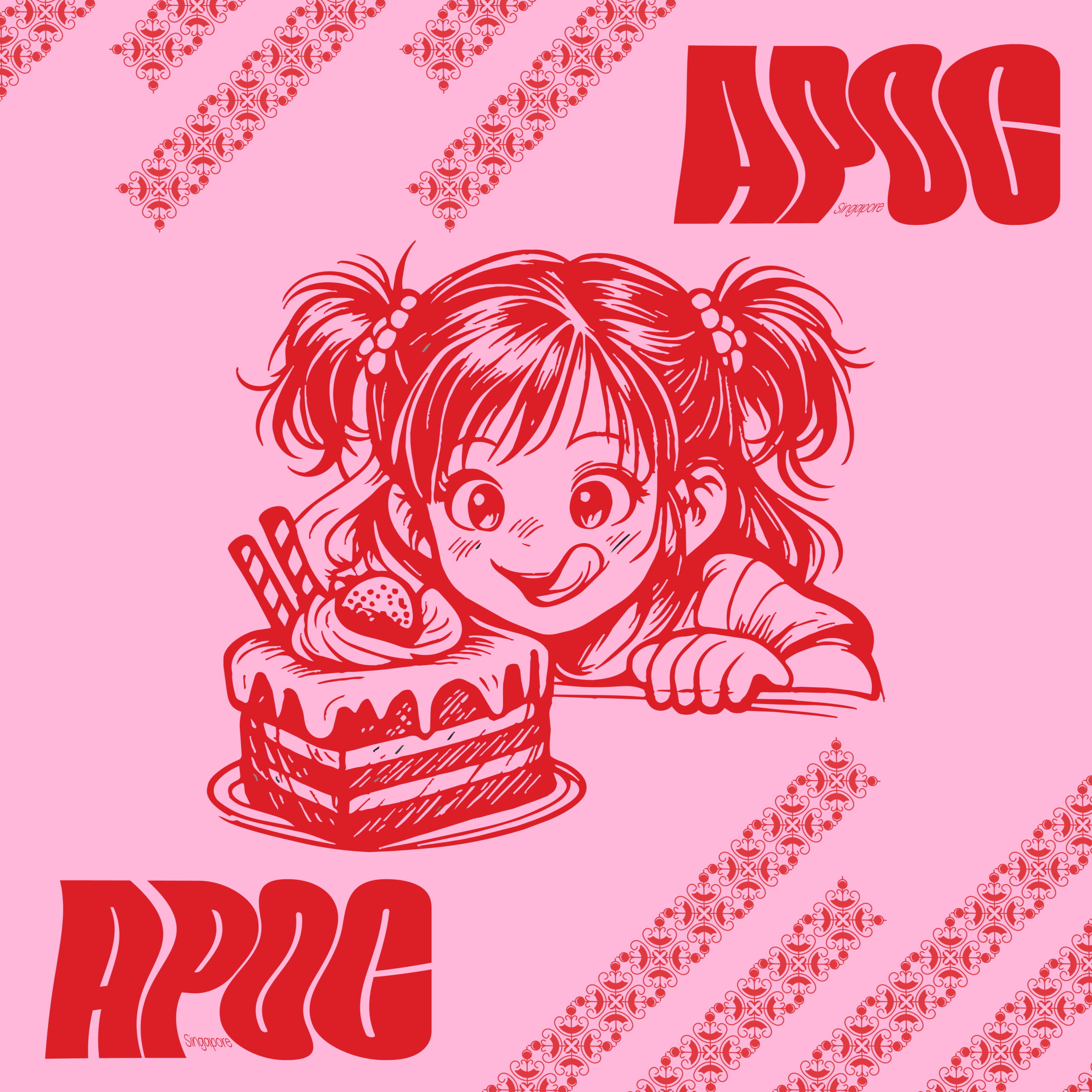
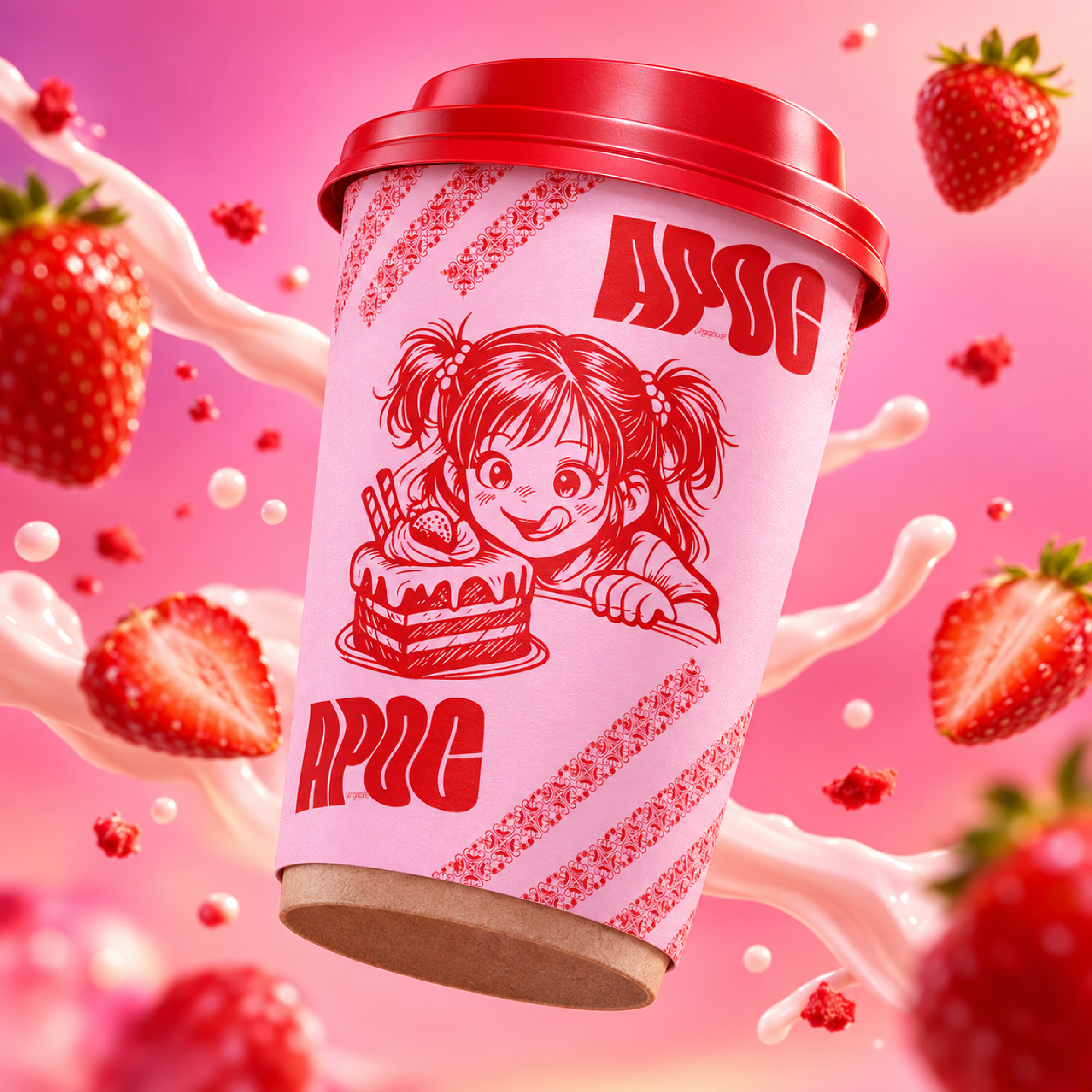
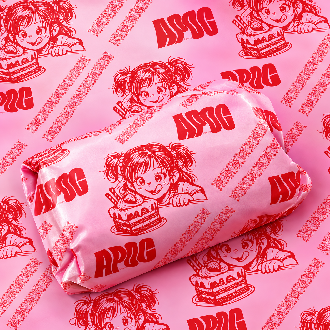
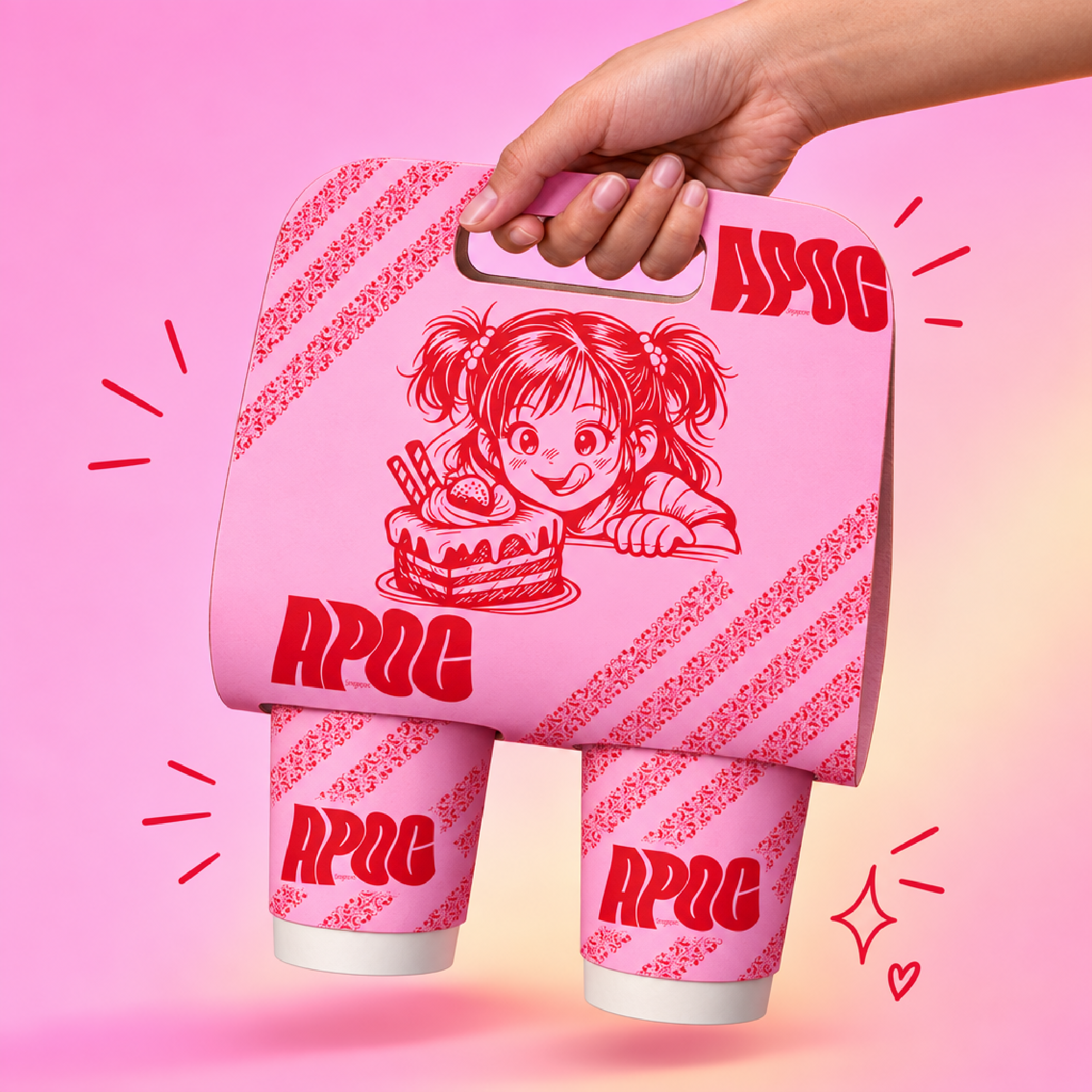
Centered around a custom hand-drawn character illustration featuring a wide-eyed anime/manga girl eyeing a cake. It gives the brand a distinct, friendly personality right on the front of the cup and print collateral.
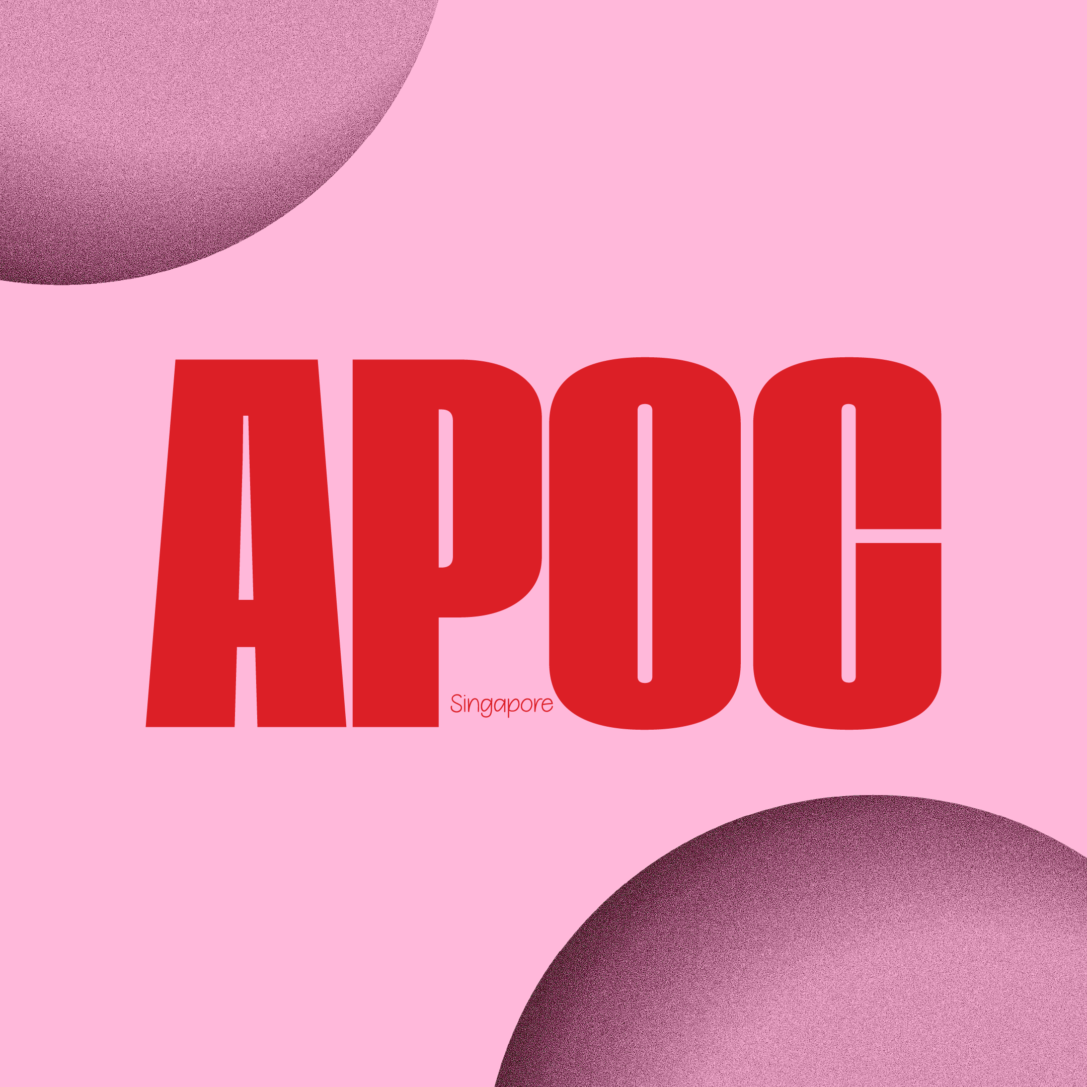
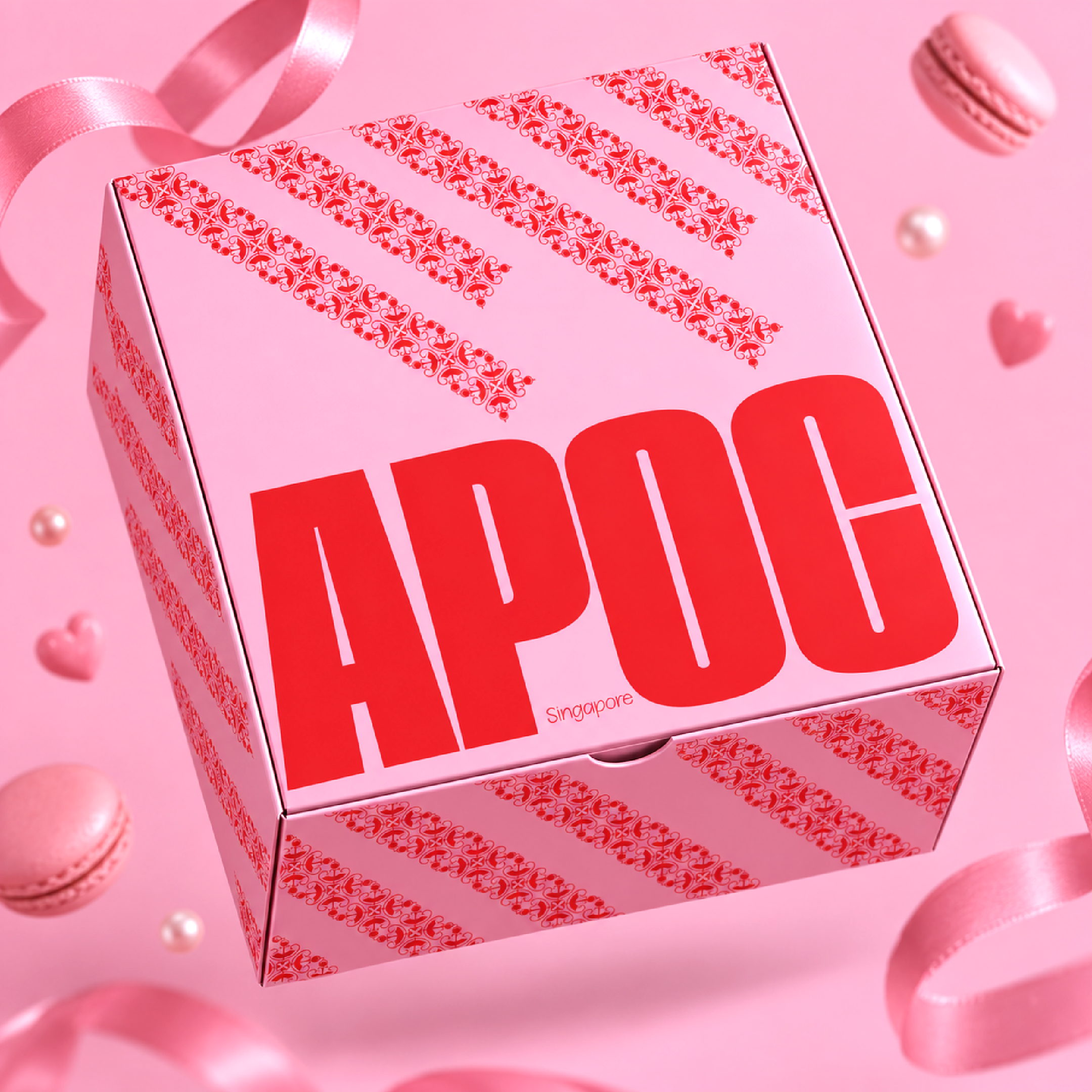
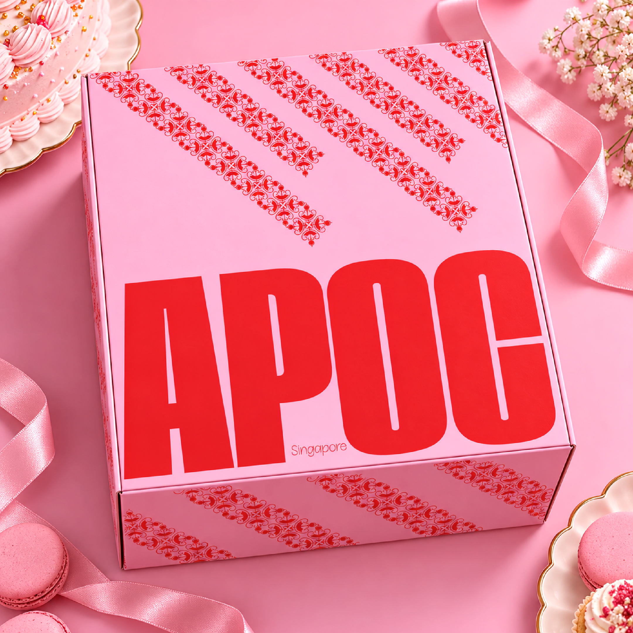
Used a ultra-heavy, stylized block typeface for the “APOC” wordmark. The thick red lettering creates a solid contrast against the soft pink backgrounds, making the logo pop from across the room.
Developed a repeat diagonal typography tape pattern running across the packaging edges. It ties the takeaway cup and bakery box together while giving the layout a modern street-style edge.
Kept the palette focused on high-contrast shades of strawberry red and creamy bubblegum pink. It immediately signals flavor, indulgence, and fun.


 agarcia studio
 Wynand88
 Eva Chistyakova
 Maria Bukhtilova
 estudiomarciano
 monther al omari
 Thirst
 Maruf Nishat
 Gray Matter Studio
 Julia Jay
 Modern Theory
 Furt Goods
 Fluid
Fluid alchimistestudioParis
 Ancora
 Mostafa Abdelmawla
 MewKittyDraw
 Studio Shala
 43oz
43oz Lucid mk2
 IDEOLOGO
 Open Strategy & Design
 cem kutlu