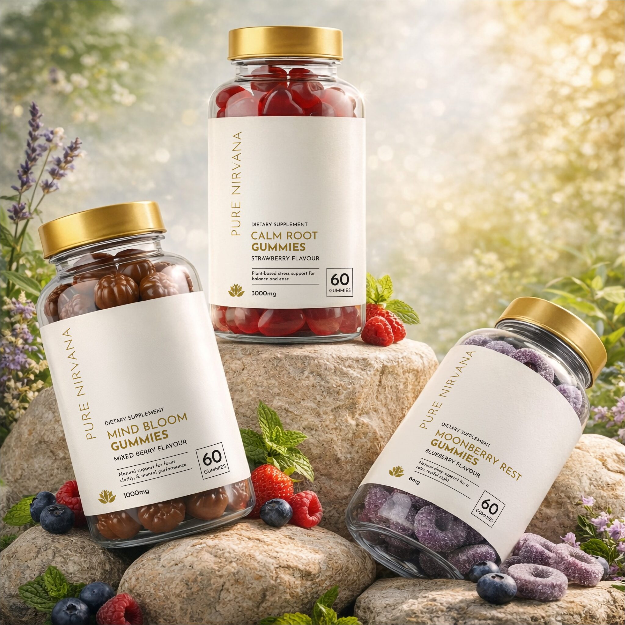

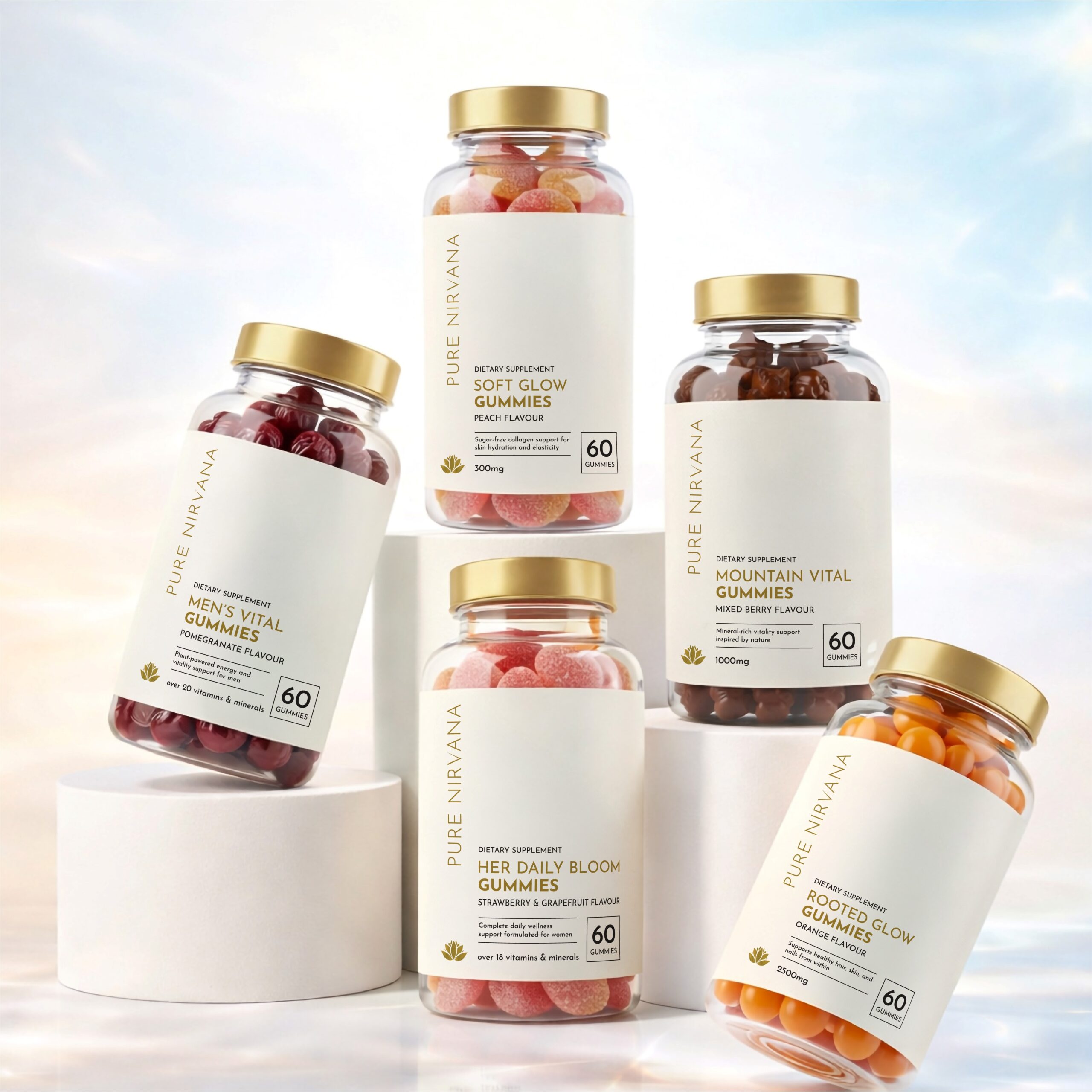
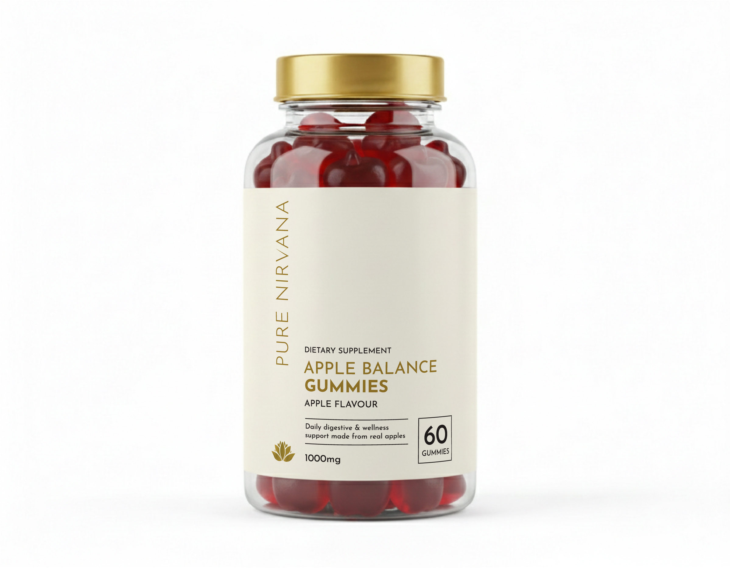
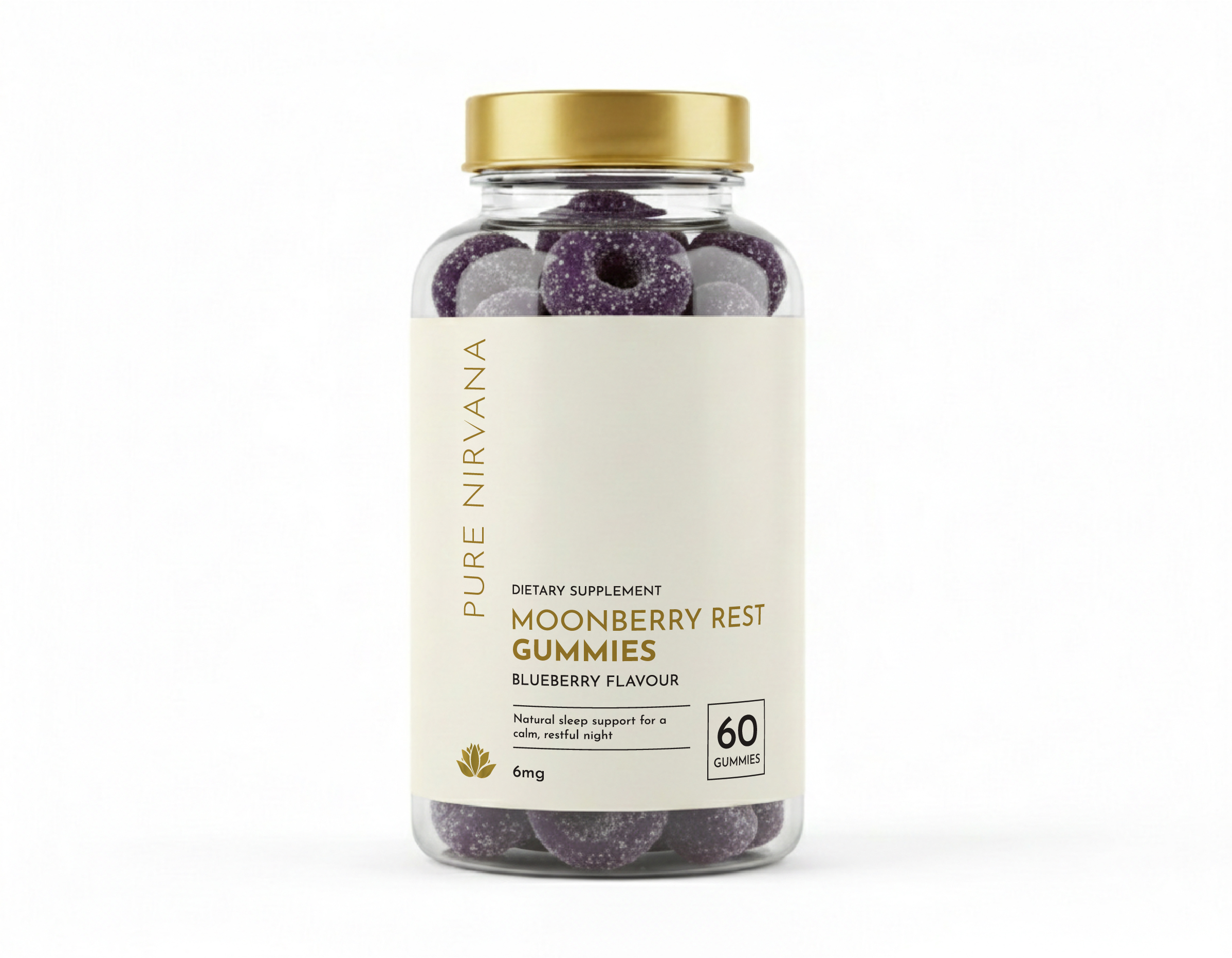
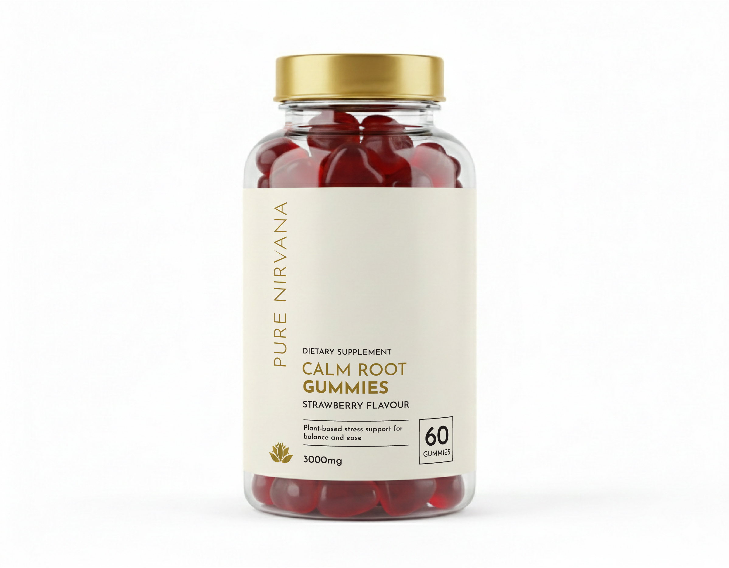
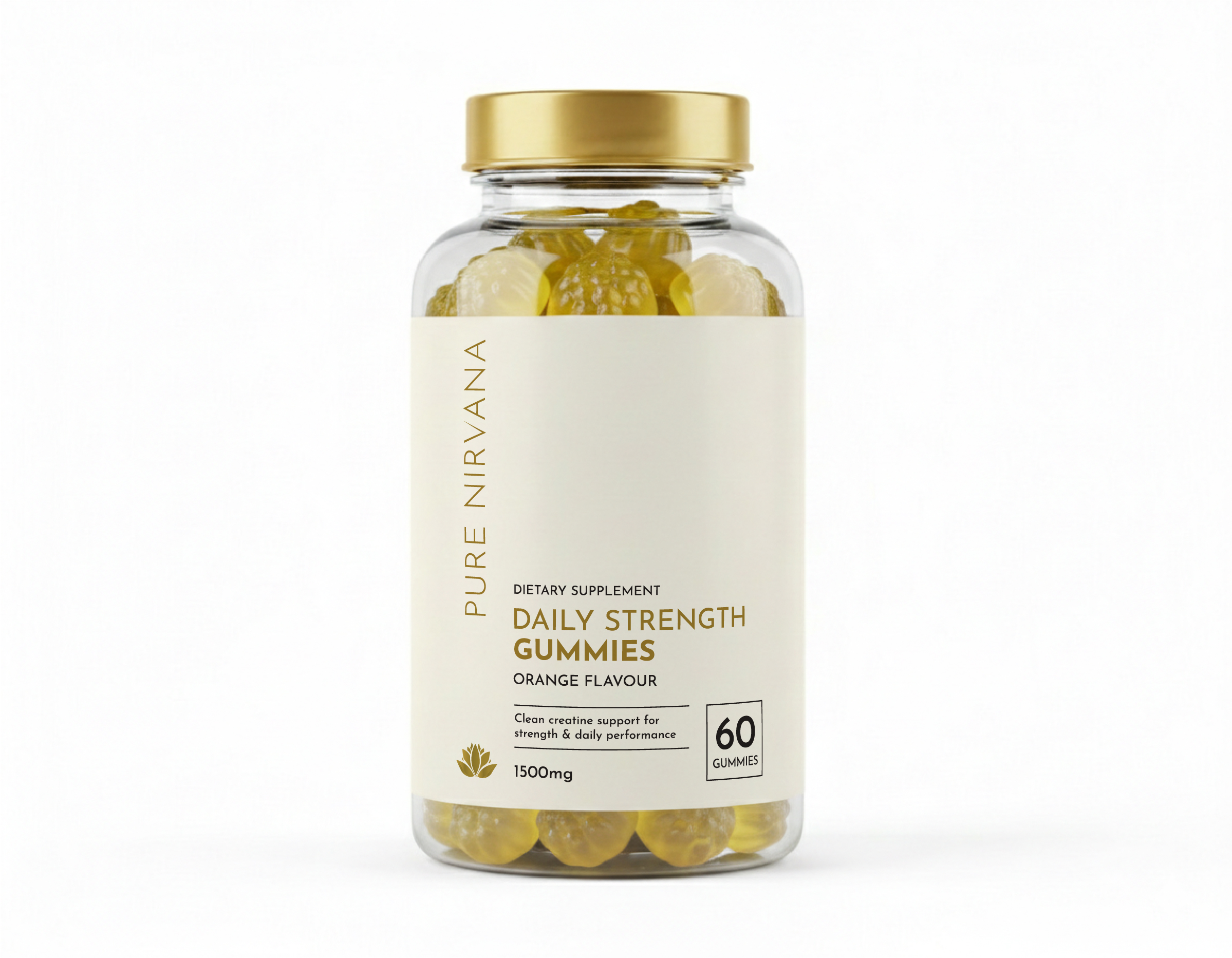
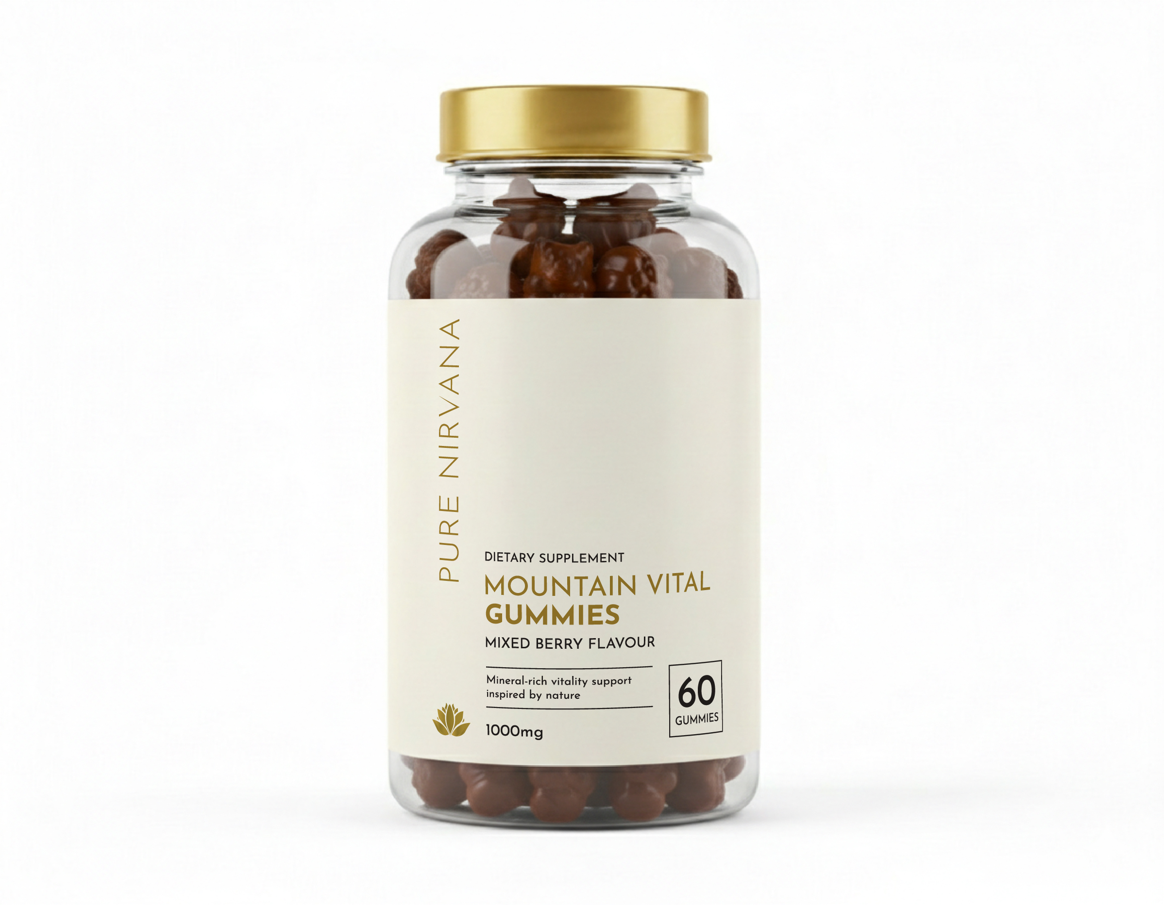
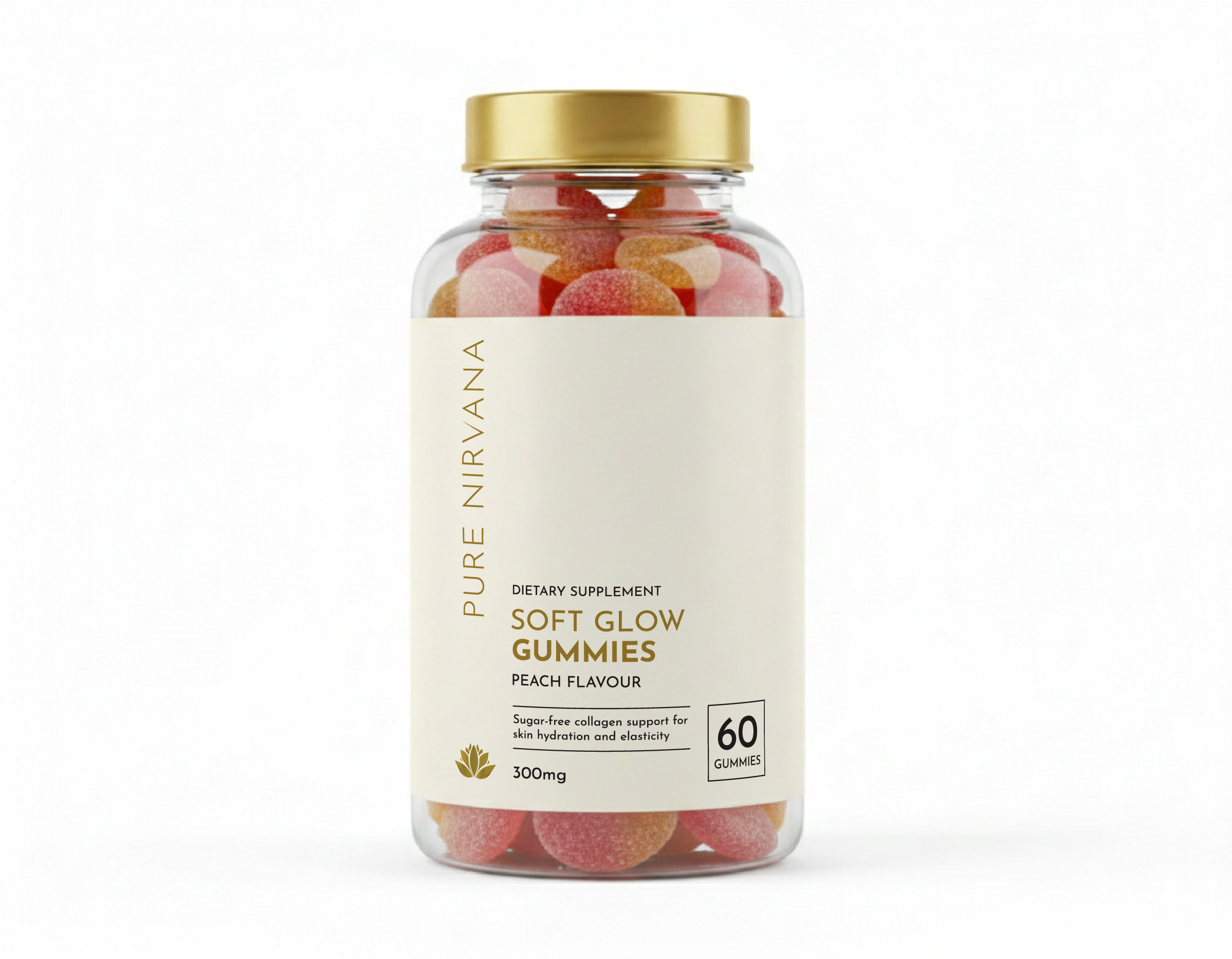
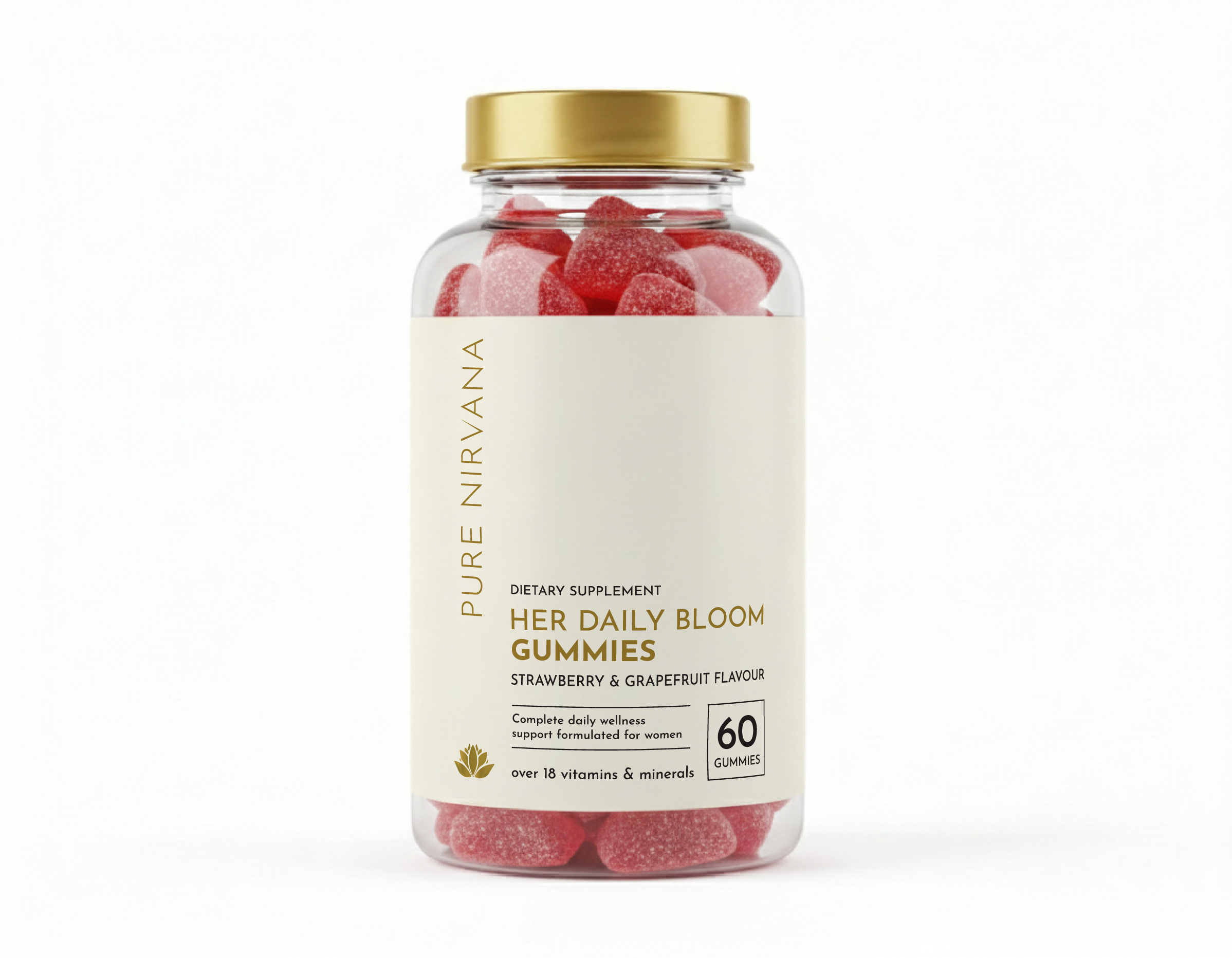
I wanted to create a packaging lineup for Pure Nirvana that brings a sense of calm, clean elegance to the supplement shelf. Instead of clinical or overly loud designs, the goal was a modern apothecary vibe—something that looks beautiful sitting on your counter while clearly communicating health benefits at a glance.
Design & Layout Breakdown
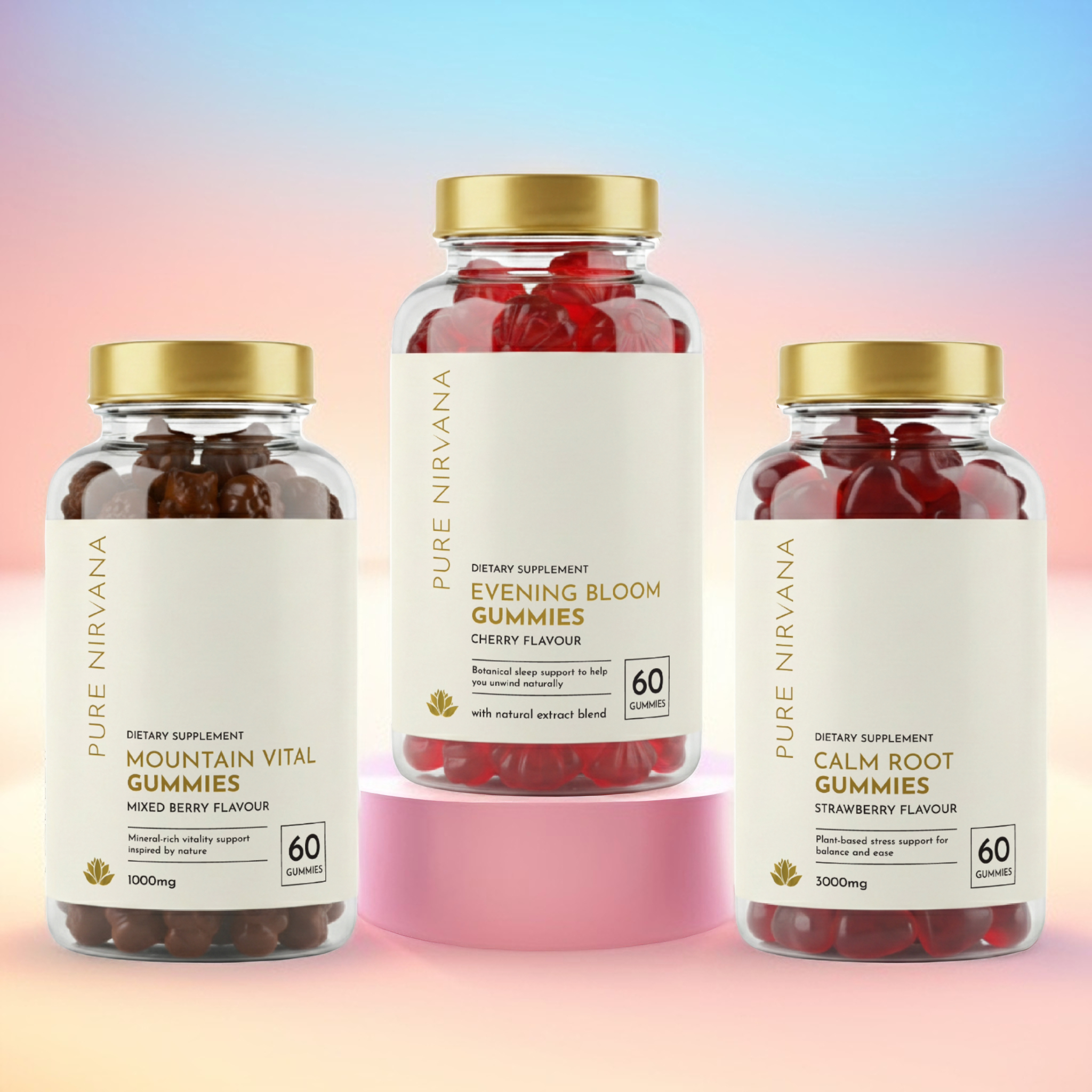
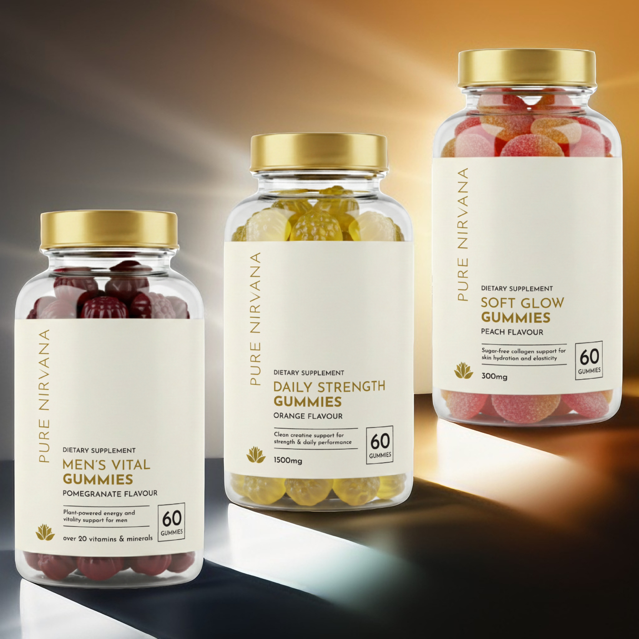
- Clear glass jars topped with brushed gold caps were chosen to highlight the natural textures and rich colors of the gummies inside.
- Vertical side-margin typography for the brand name “PURE NIRVANA” creates a distinct, modern framing element along the left edge.
- Off-white matte labels paired with clean sans-serif type keep product names, flavor notes, and dosage information easy to read.
- A dedicated corner badge cleanly highlights key product metrics like the 60-gummy count without cluttering the main text layout.
- Color-coded bottom accent stripes match each specific product variant and flavor, creating a cohesive look across the entire lineup.





 Derrick Lin
 Biaa
Biaa Petitmoulin Studio
 White Bear Studio
 Eva Chistyakova
 monther al omari
 Atipus
 alchimistestudioParis
 oneandother
 bloomburo
 helocrene
 Shapers Studio
 Denver Design
 Aidearte
 andrew.huerta
 softmachine
 airobtq
 Buzz & Co.
 Ruby
Ruby themythographer
 IDNB Inc.
 viktorflr
 Zenpack