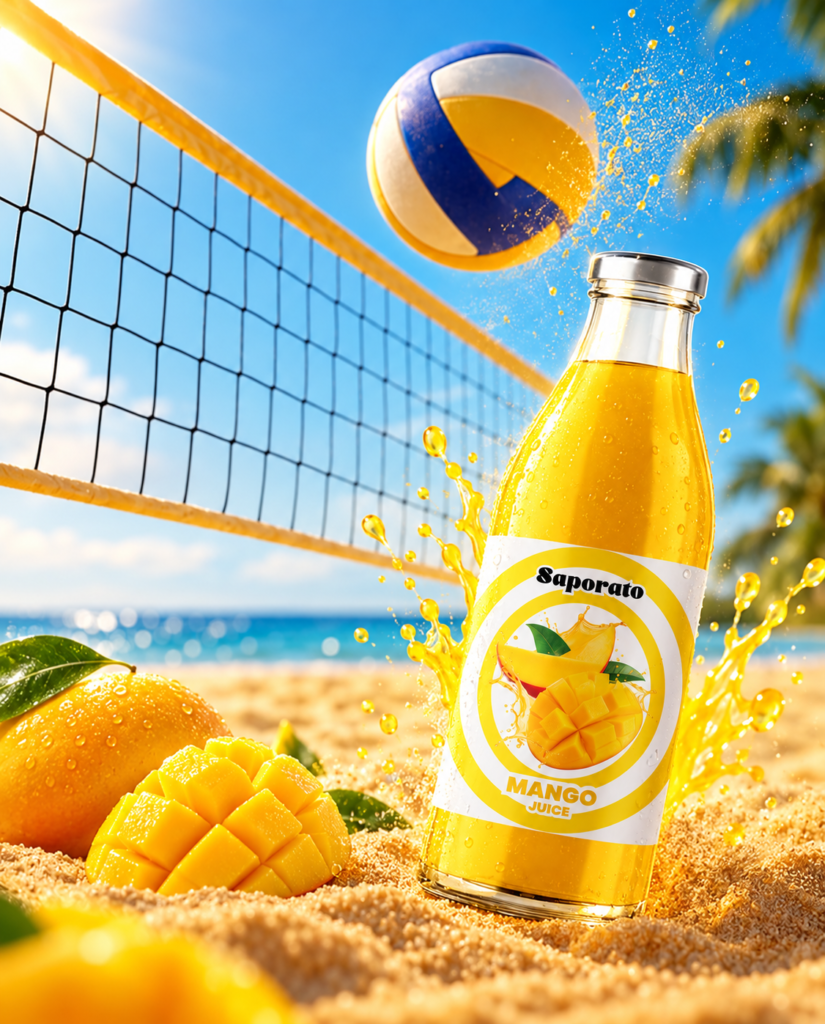

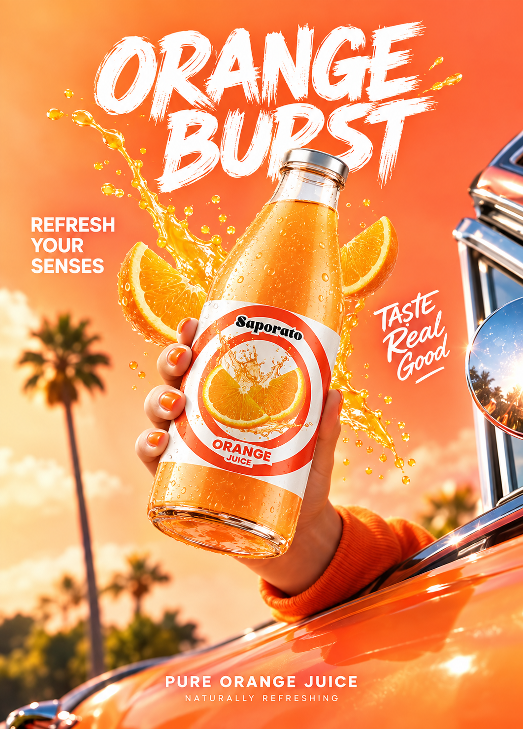
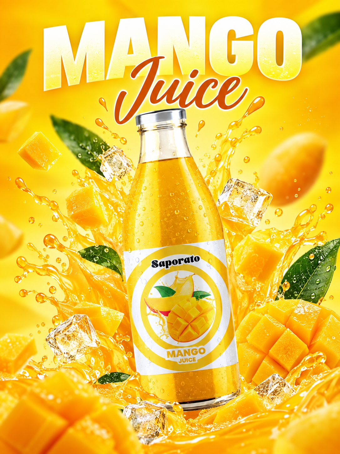
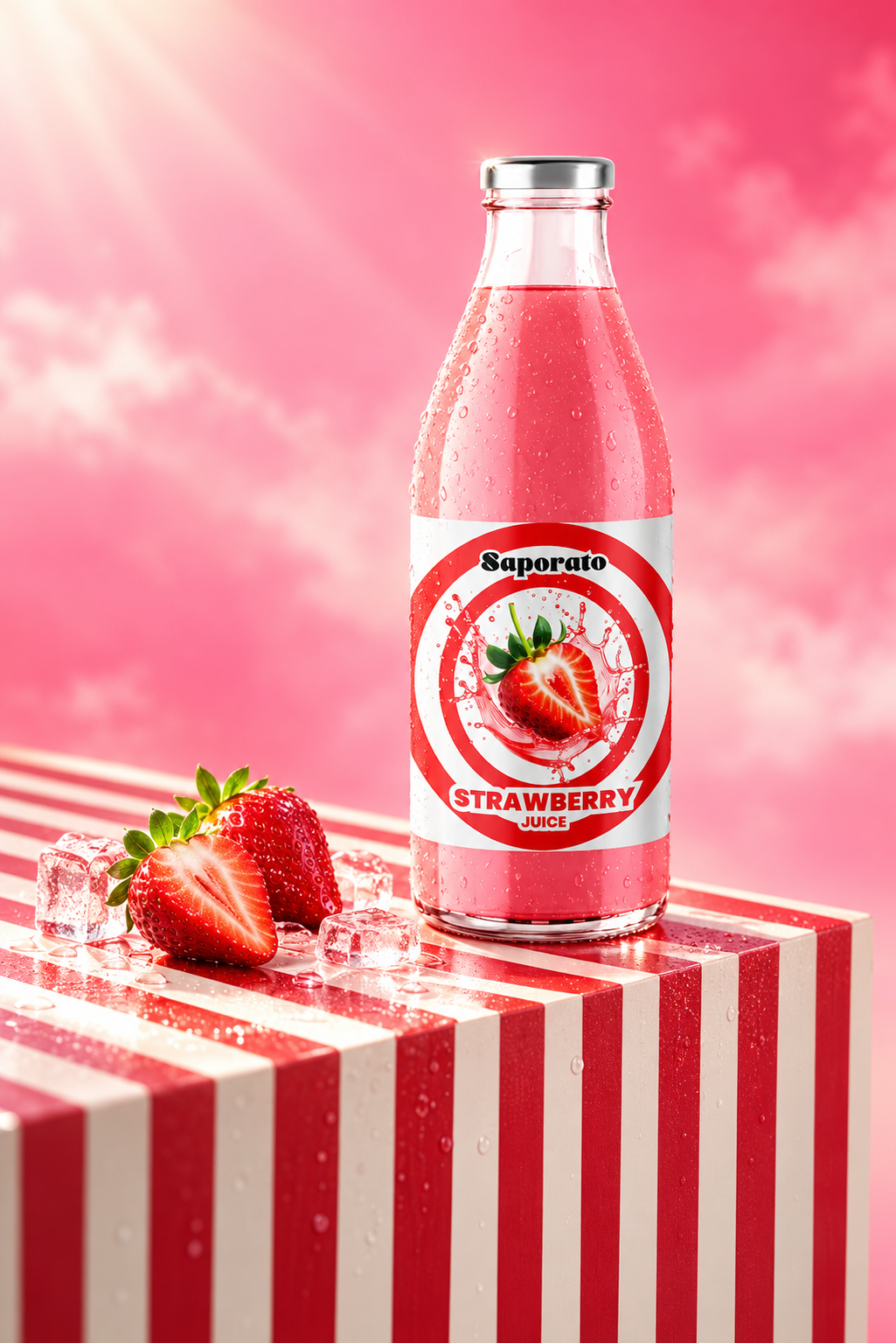
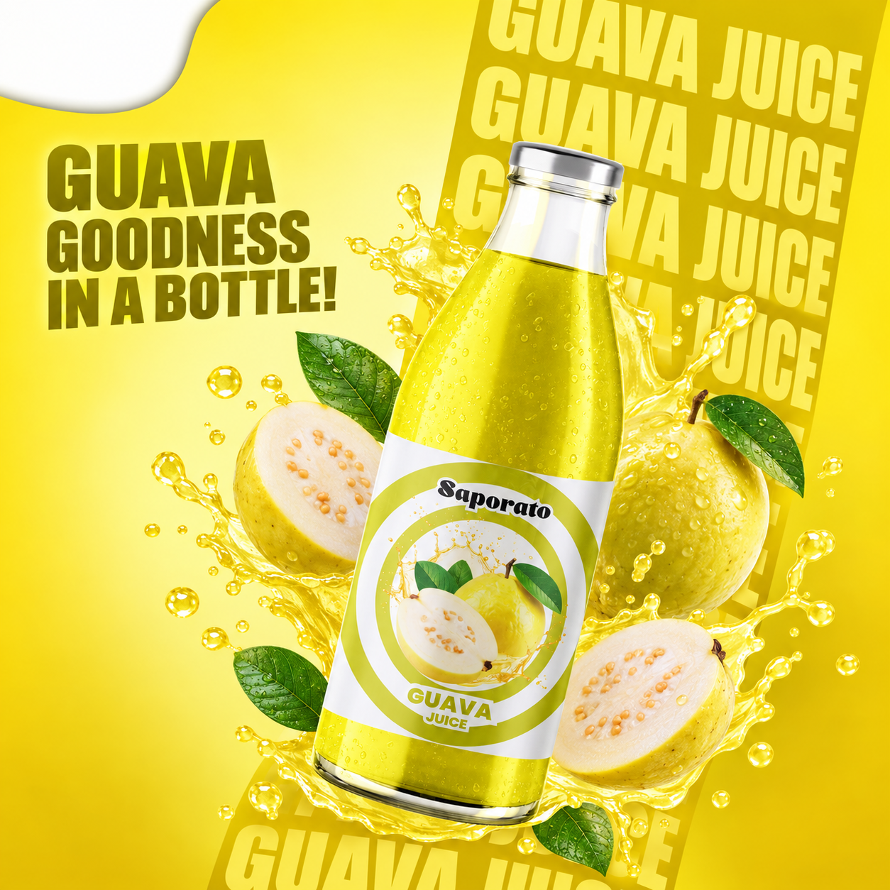
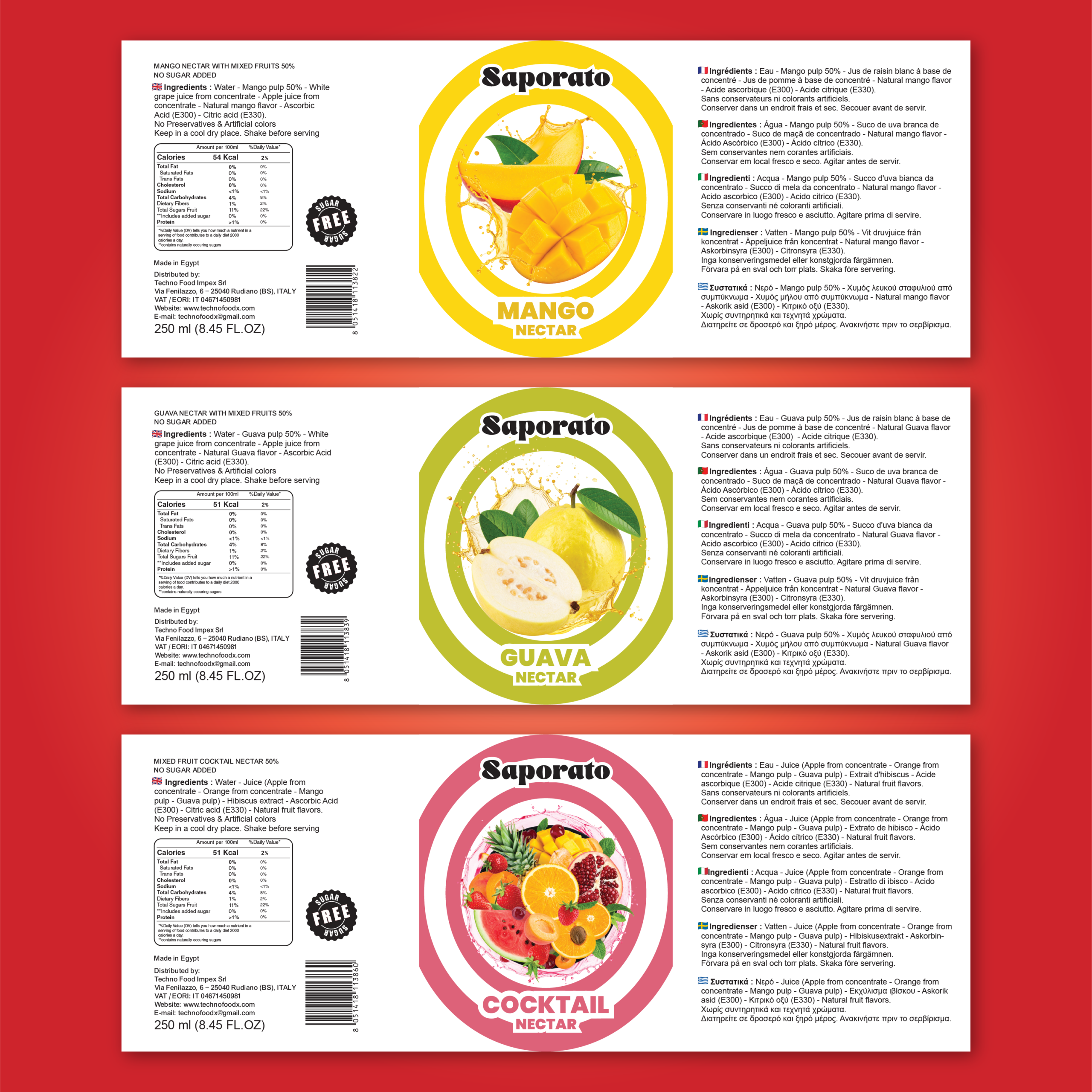
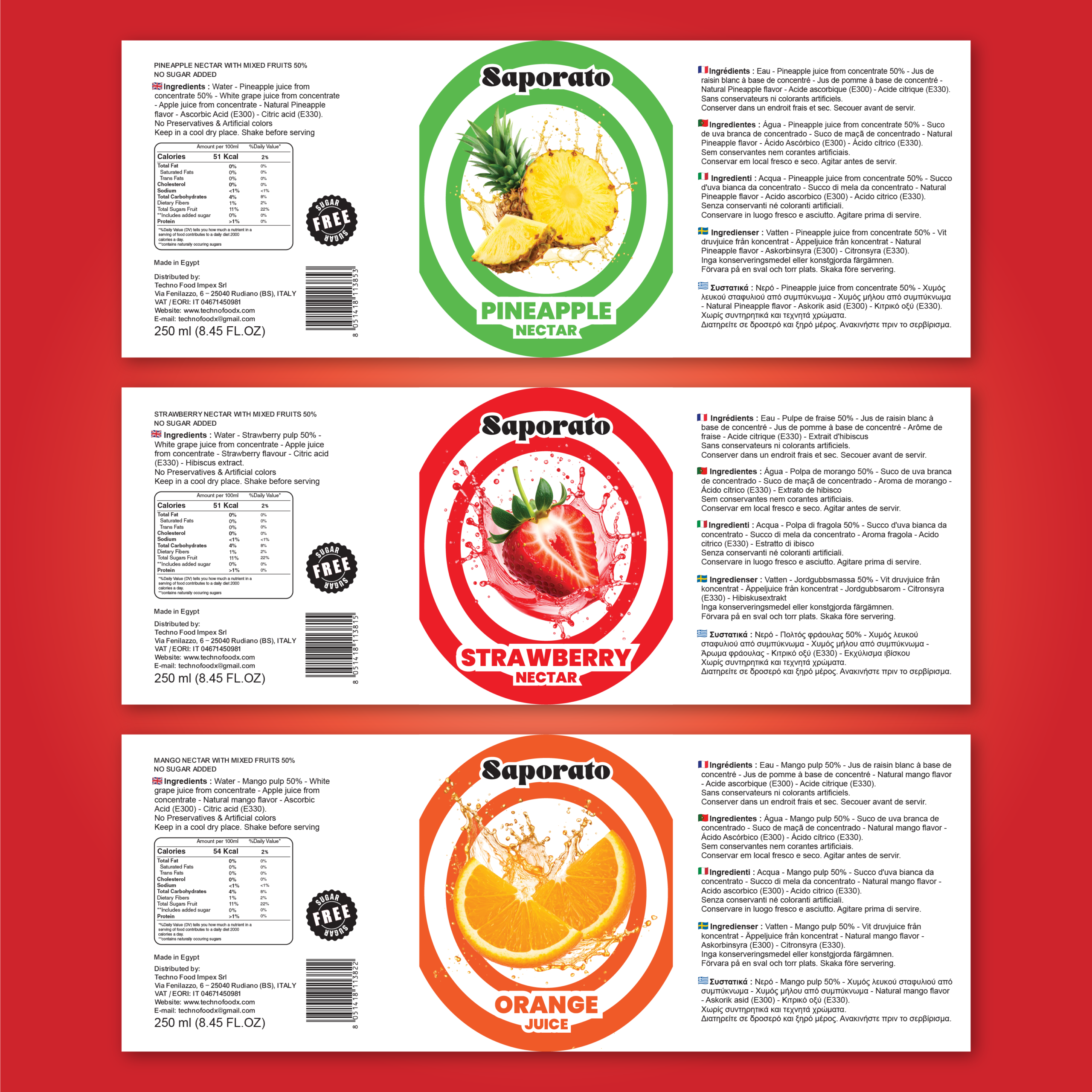
I set out to create a vibrant, sun-drenched visual identity for Saporito that celebrates the pure essence of real fruit. The goal was to build a cohesive lineup of clear glass bottles where bright, flavor-focused color palettes immediately grab attention and evoke a feeling of instant refreshment.
Design & Layout Details
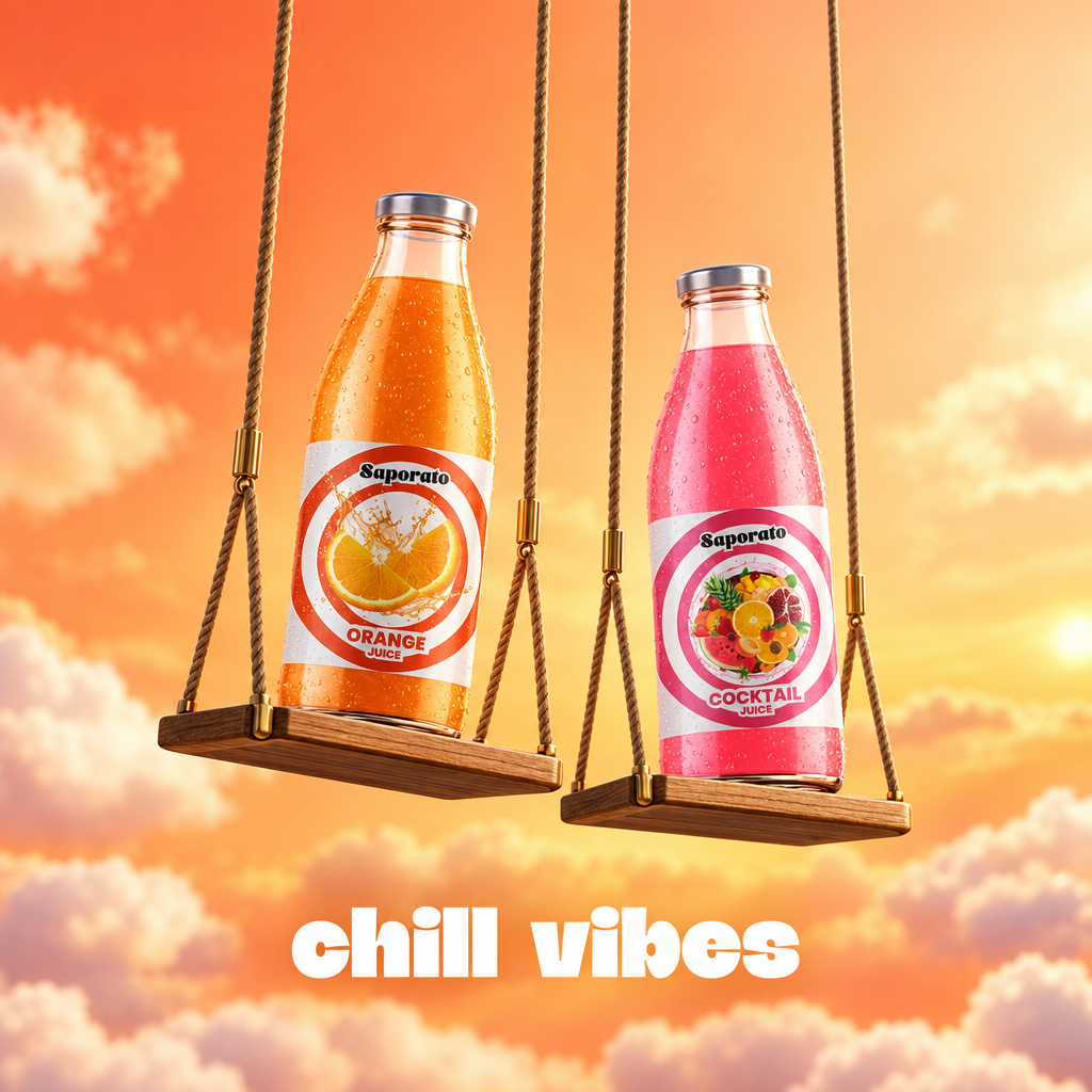
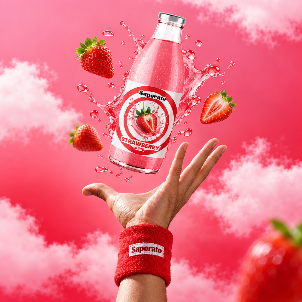
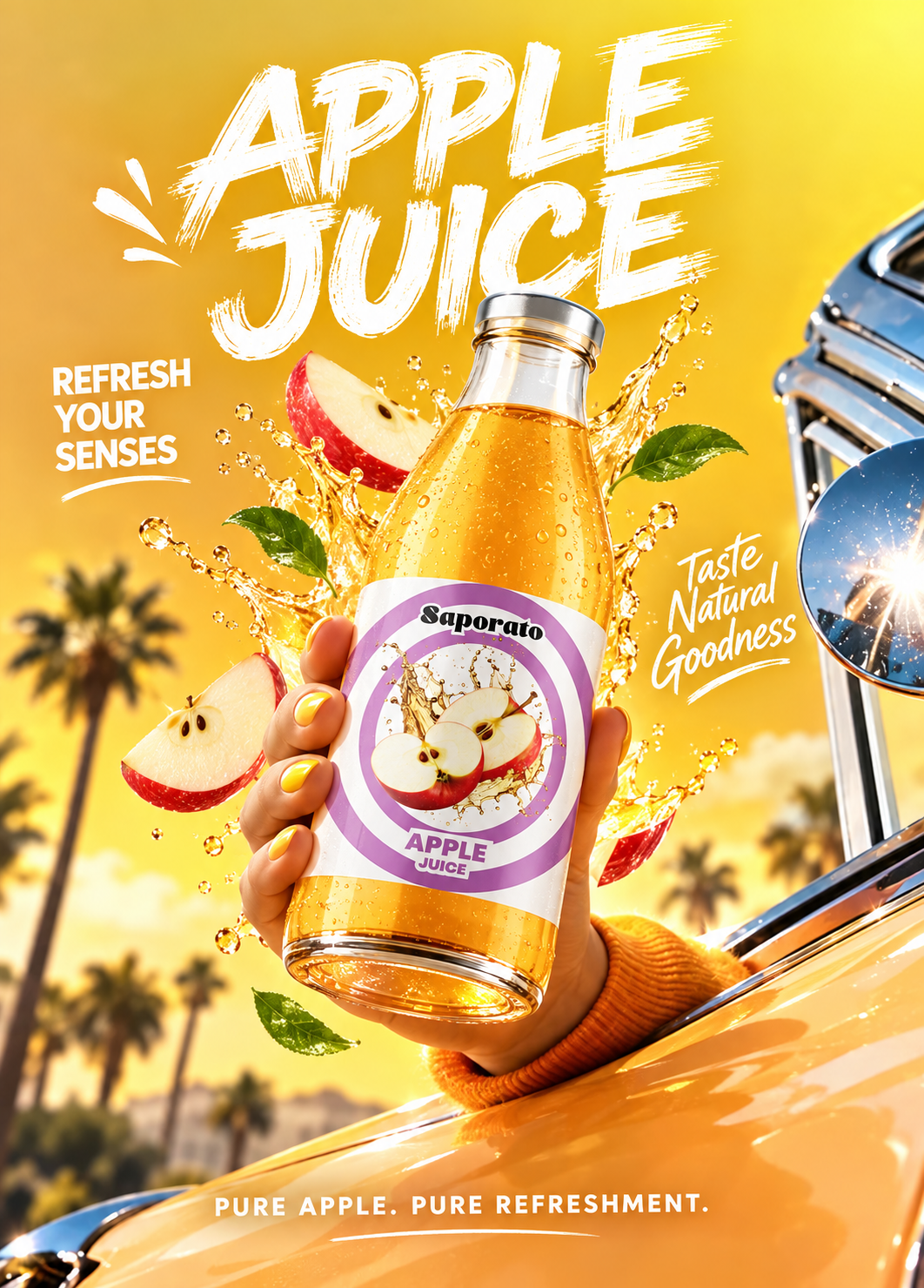
- Clear glass bottles showcase the natural shade and texture of each liquid, creating an appetizing foundation for the label.
- A circular target badge anchors the center of each bottle, locking in the brand mark alongside clean fruit illustrations and flavor titles.
- Bold repeating background typography spells out each flavor name in tone-on-tone lettering, giving the grid presentation a pop-art visual flow.
- Vibrant gradient backdrops tailor a distinct color identity to every fruit variant—from sunny yellow for Mango to electric pink for Strawberry.
- Clean silver cap accents and unified label proportions maintain brand harmony across all eight flavors in the range.



 Derrick Lin
 Axiniya Knyazeva
 Hadi Samir
 Furt Goods
 宏洛图品牌设计HONGLT
 Ampersand Creative
 Modern Theory
 Palashcc
 neo creative studio
 Valérie Colace
 Anshuman
 Archi Jain
 DESIGN CONCEPTS
 Shapers Studio
 jamajkajakub
 tamara barakat
 VincoStudio
 lisakaplina
 CreativeWise
 alchimistestudioParis
 Adriana Adamo
 tauqueer