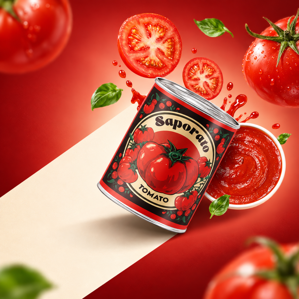

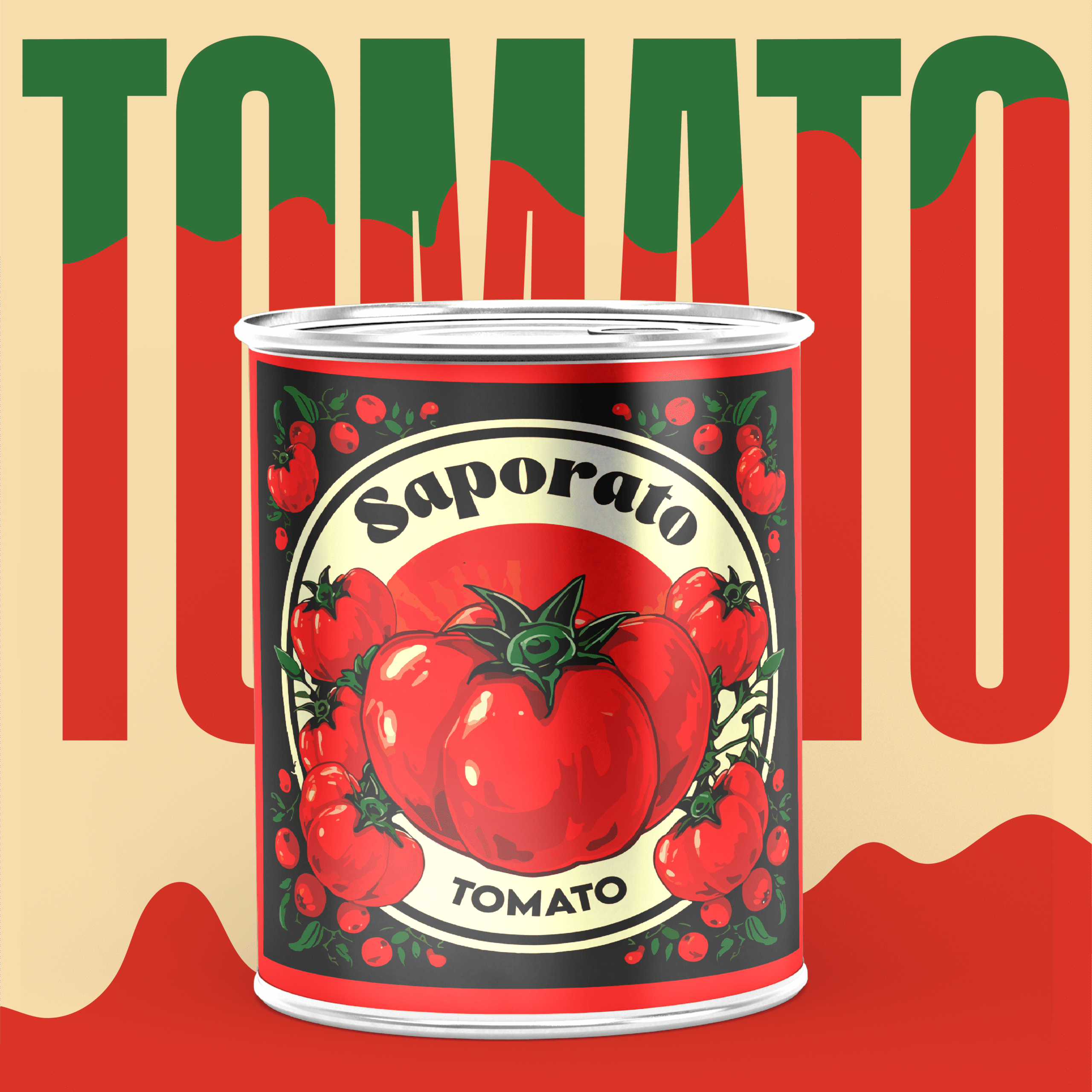
Inspired by the vibrant flavors of Italy and the timeless tradition of authentic tomato cooking, SAPORATO is a conceptual packaging design for an Italian-style tomato paste brand. The project brings together expressive illustration, bold typography, and a rich visual identity to create a distinctive and appetizing shelf presence.
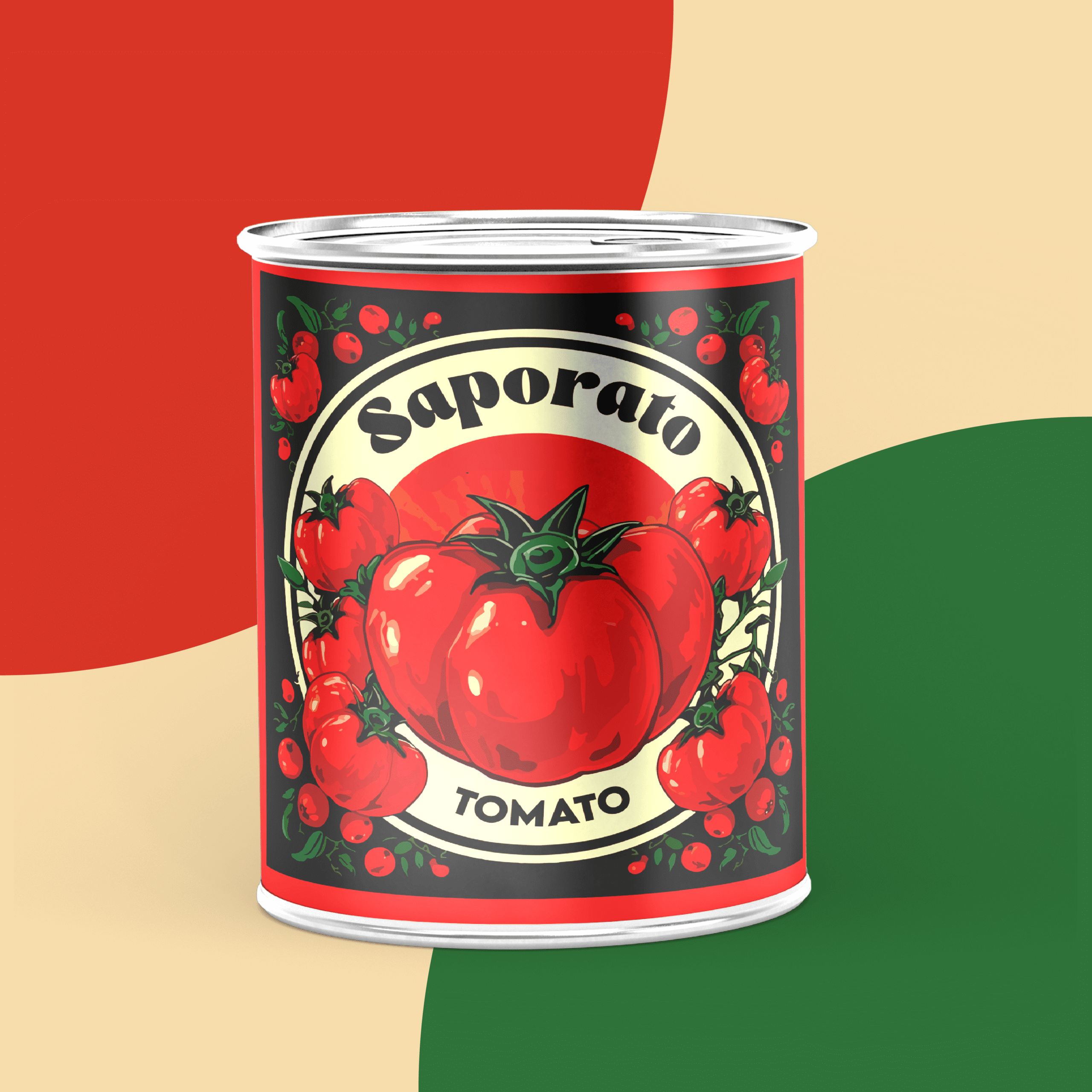
At the heart of the design is a striking, hand-illustrated tomato motif, surrounded by playful botanical elements that celebrate the freshness and natural character of tomatoes. A vibrant red, deep green, and warm cream color palette creates a strong visual connection to the ingredients while evoking the warmth and charm of Italian food culture.
The packaging combines a nostalgic, artisanal aesthetic with a contemporary approach to layout and visual communication. A custom-inspired logotype, decorative framing, and carefully structured information hierarchy give the product a recognizable personality across the front and back labels.
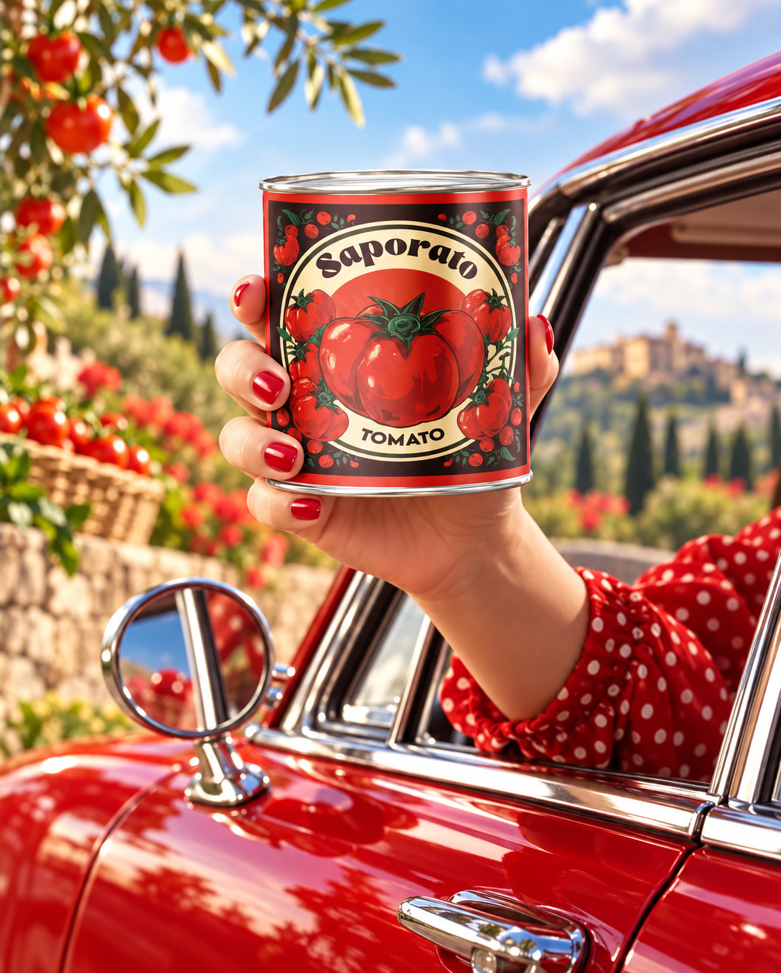
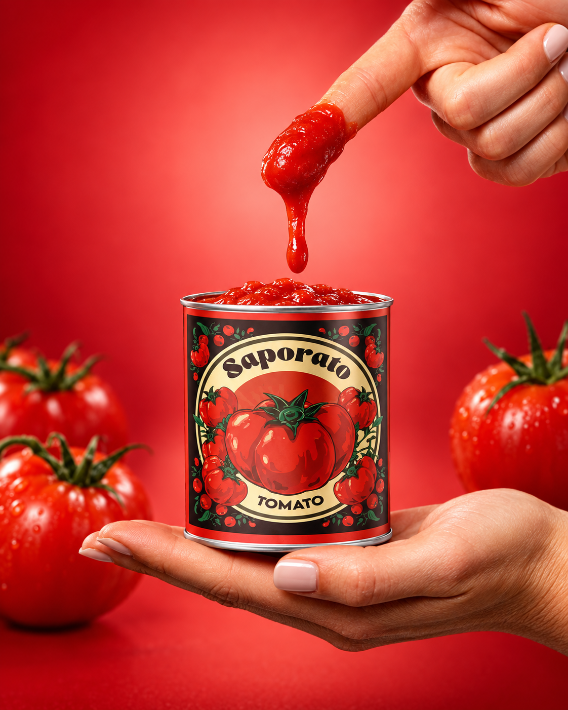
Designed with both shelf appeal and brand consistency in mind, the concept extends beyond the packaging itself into lifestyle-focused product imagery and advertising applications, presenting SAPORATO as a flavorful, approachable, and memorable addition to the modern kitchen.
SAPORATO is a celebration of good ingredients, Italian-inspired food culture, and the joy of bringing people together through food.



 agarcia studio
 Wynand88
 Eva Chistyakova
 Maria Bukhtilova
 estudiomarciano
 monther al omari
 Thirst
 Maruf Nishat
 Gray Matter Studio
 Julia Jay
 Modern Theory
 Furt Goods
 Fluid
Fluid alchimistestudioParis
 Ancora
 Mostafa Abdelmawla
 MewKittyDraw
 Studio Shala
 43oz
43oz Lucid mk2
 IDEOLOGO
 Open Strategy & Design
 cem kutlu