
ABOUT
Banam is Europe’s first banana water, made from 100% bananas and nothing else. It offers natural hydration with naturally occurring functional benefits, but entering an increasingly crowded functional drinks category meant it needed to feel like more than just another wellness drink.
The brief was to create a distinctive brand and packaging world that would make banana water feel fresh, desirable and easy to understand, while bringing a genuine connection to Thailand, which inspired the product.
The starting point was the simplest truth about the product: 100% bananas. This became the big creative idea behind the brand and gave us permission to go a little bananas with the design.
CONCEPT
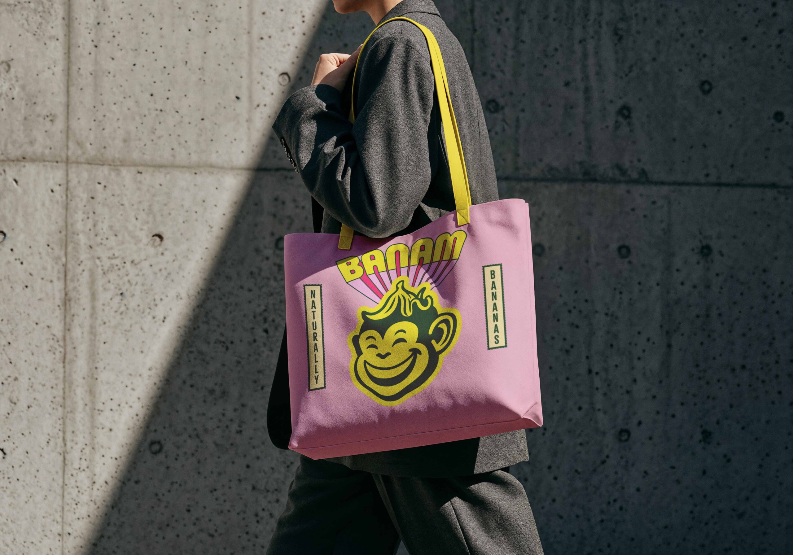
We named the brand Banam, combining the ‘ba’ from banana with ‘naam’, the Thai word for water. The name connects what the product is with where it comes from and set the tone for the identity that followed.
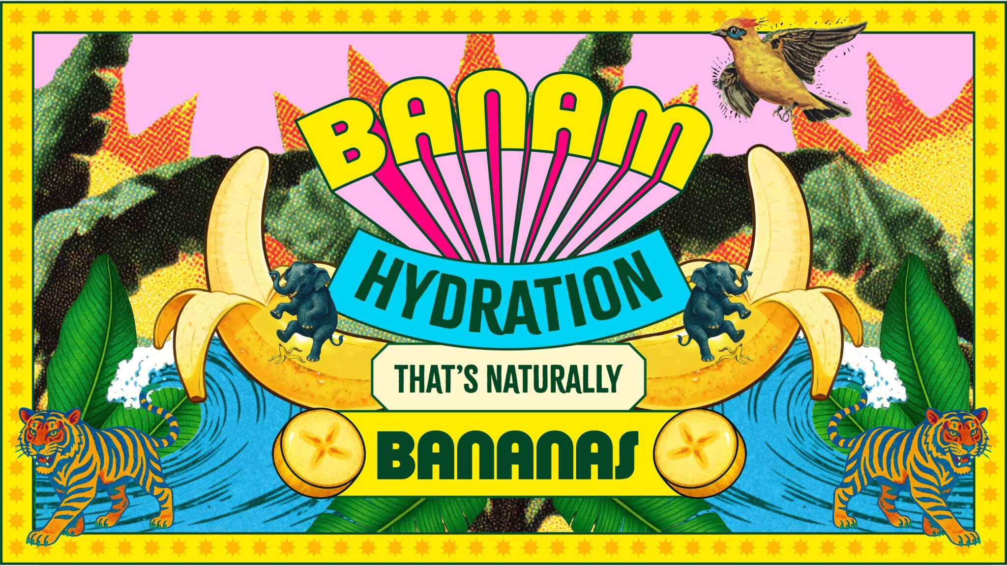
The visual world takes inspiration from the colour, energy and spirit of Thailand, brought to life through vibrant colour, expressive illustration and punchy typography.
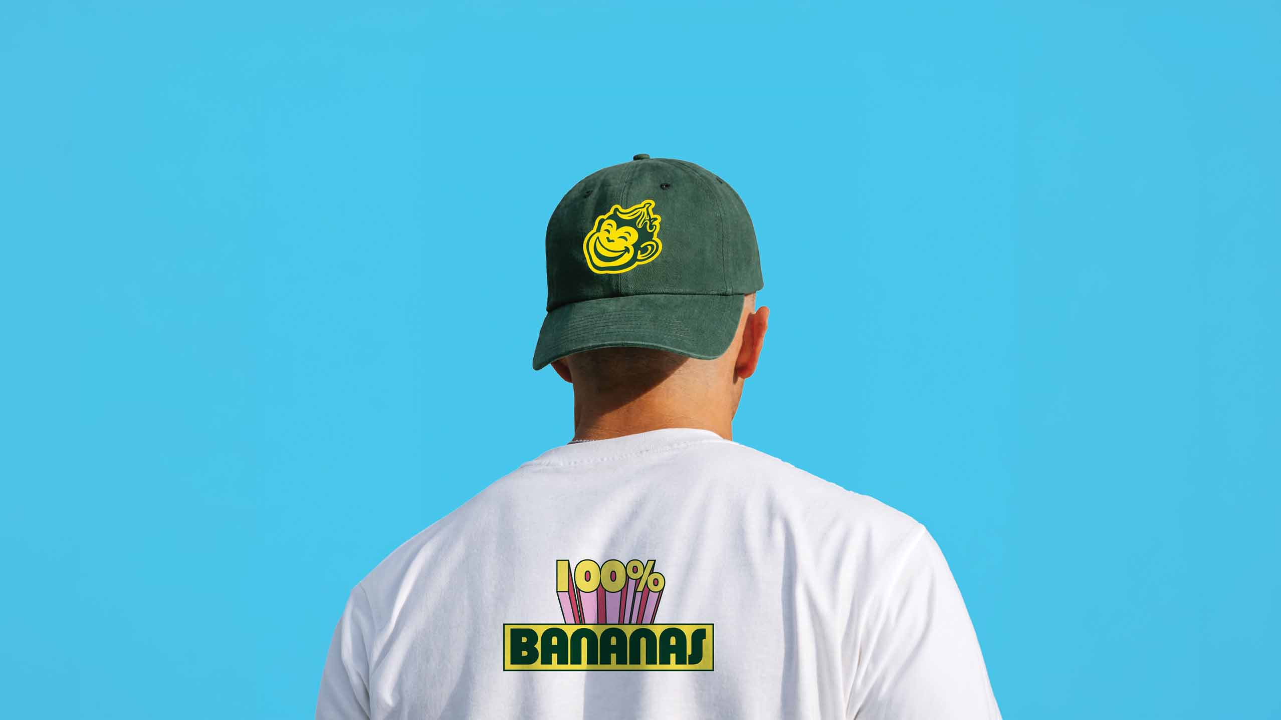
At the heart of the identity is Banam’s monkey mascot. Look a little closer and you’ll spot that its smile is made from bananas, a small detail that adds a bit of fun and rewards a second look.
PACKAGING SOLUTION
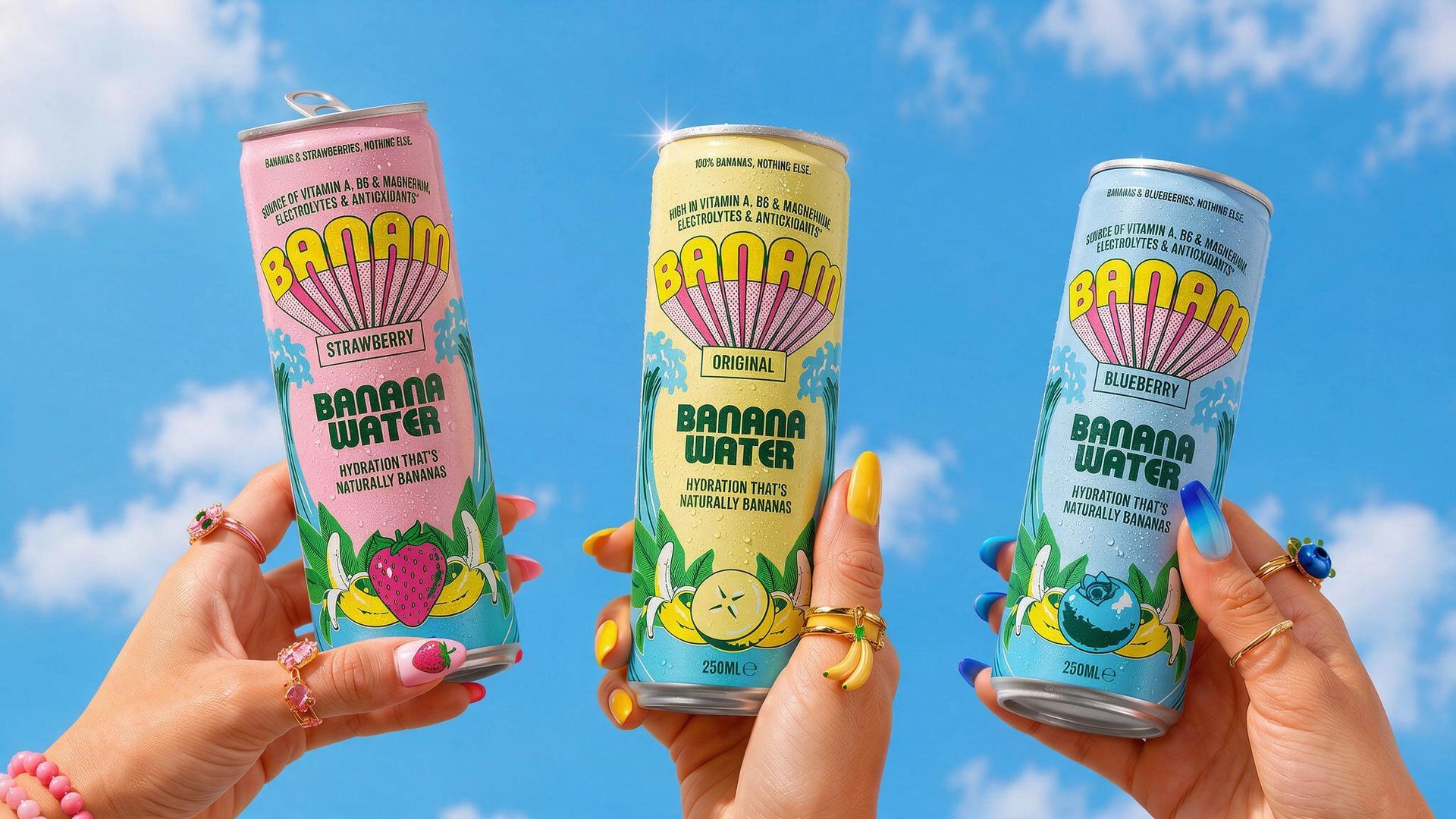
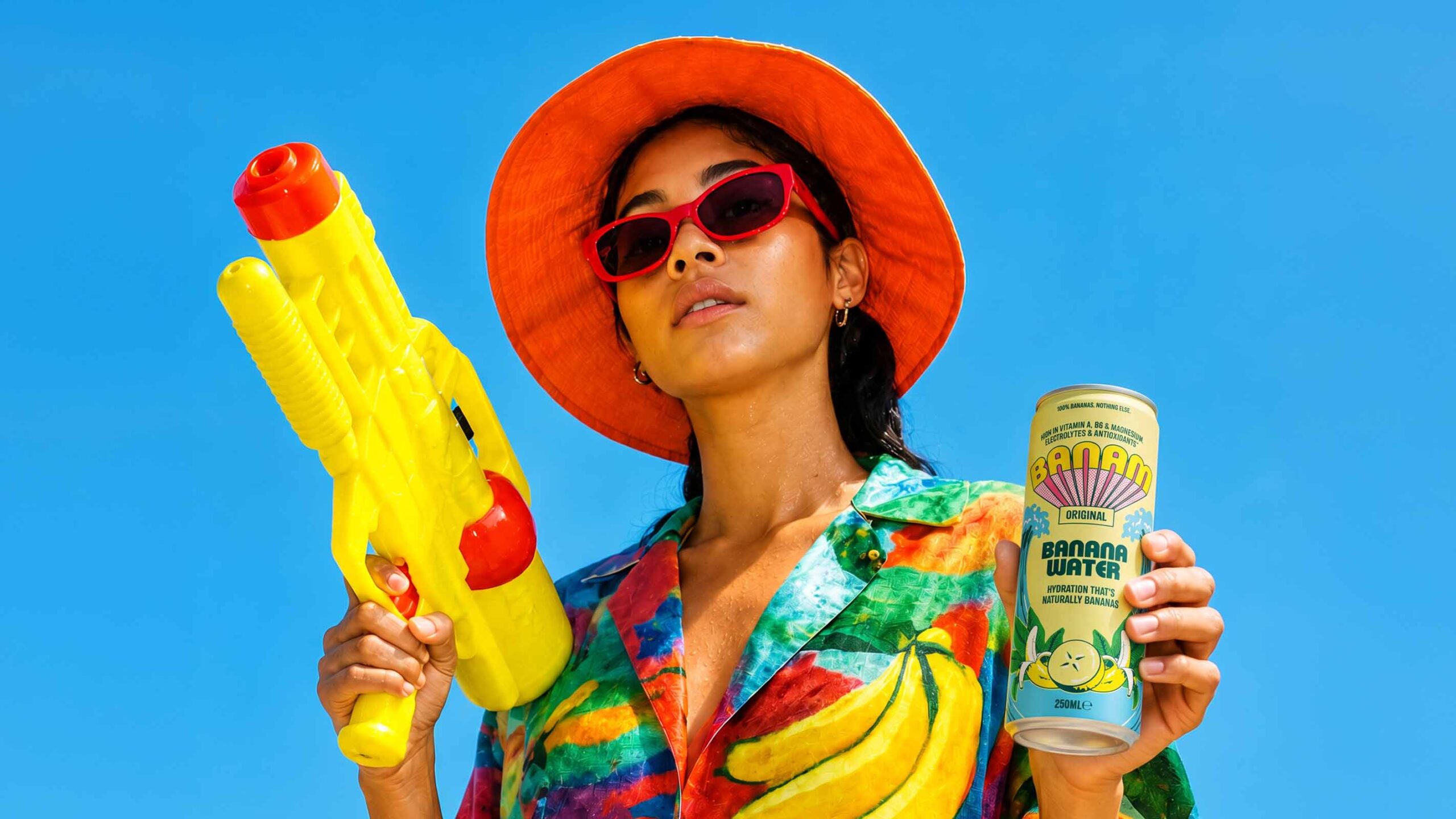
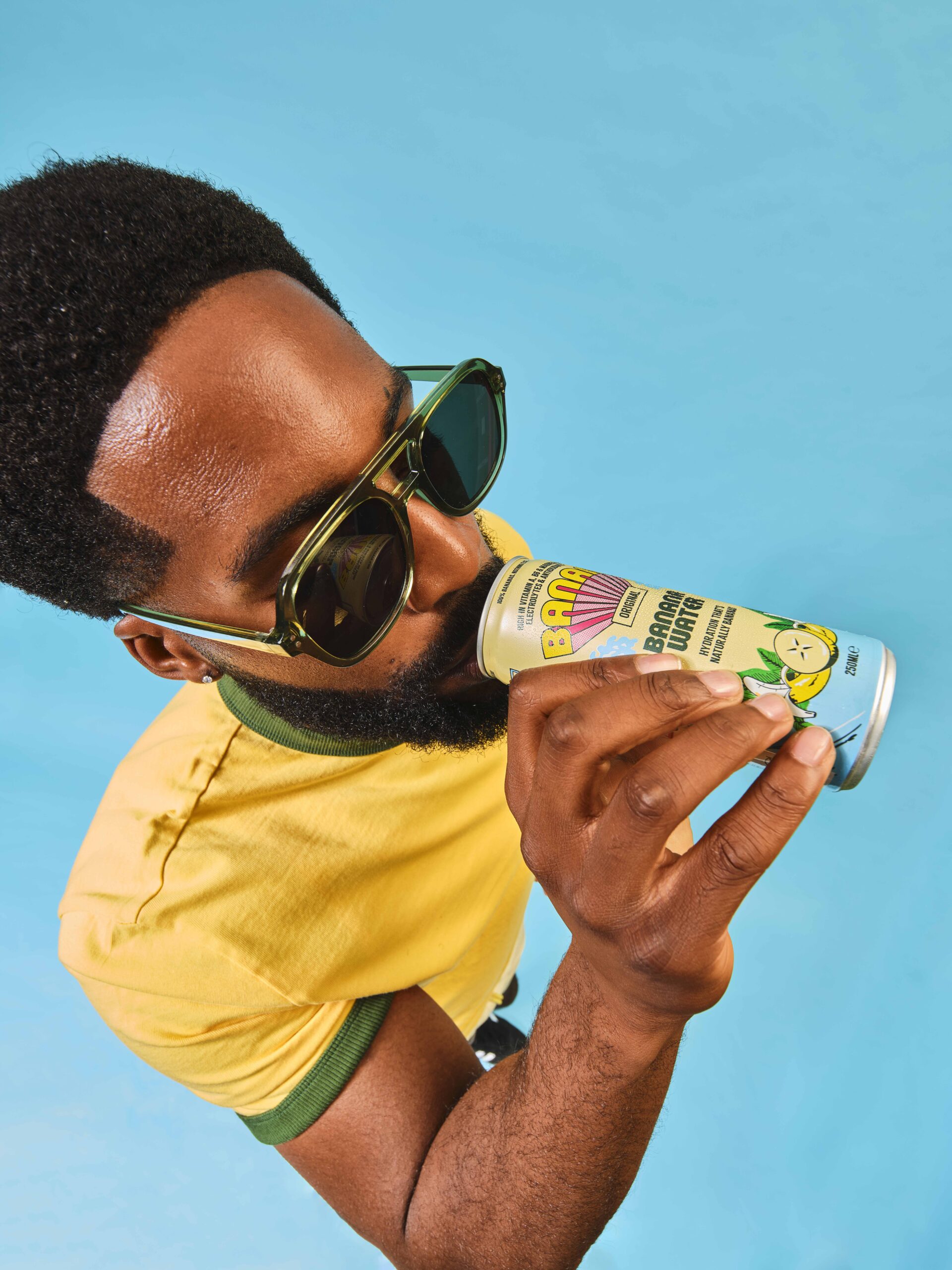
As banana water is a completely new proposition for many consumers, the packaging needed to make the product clear at first glance. ‘Banana Water’ sits front and centre on the cans, while the illustrations and colour bring appetite appeal and communicate the fresh, natural character of the drink.
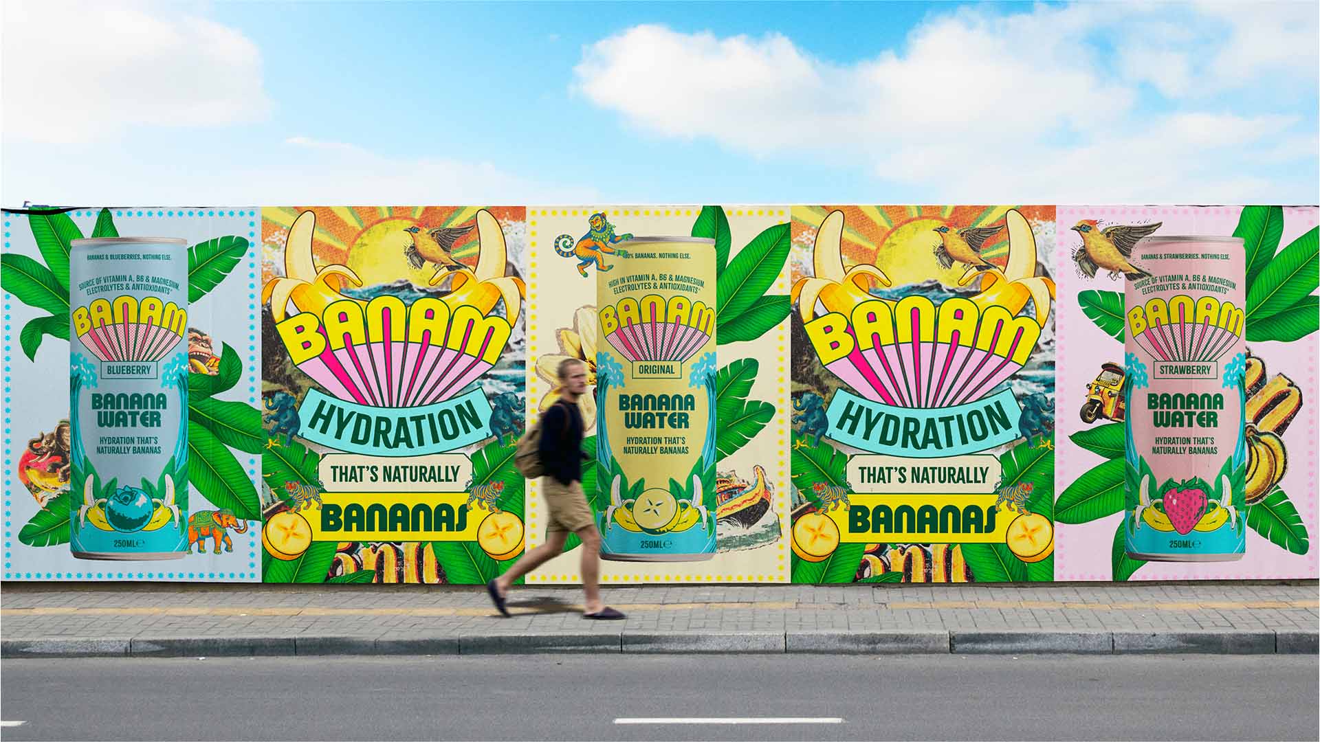
Each flavour has its own distinctive colourway, making the range easy to navigate while giving each variant its own personality. Together, the cans create a strong, colourful presence on shelf and make the range instantly recognisable.
The cartons extend the same playful world across the wider range, using bold messaging, vibrant colour and the monkey mascot to build recognition beyond the individual can.
DESIGN APPROACH
Rather than following the familiar visual language of functional drinks – clean, clinical and heavily focused on performance – Banam takes a more expressive approach.
The product proposition is simple, so we used the packaging to give the brand more personality. Bold typography, vibrant colour and playful illustration create a distinctive shelf presence, while clear product communication keeps the packaging easy to understand.
The result is a functional drink that feels less like a typical wellness product and more like a brand people can connect with.
WHAT MAKES IT UNIQUE
The idea of ‘100% bananas’ runs through the whole identity, from the name and monkey mascot to the bold illustrations and flavour colourways.
The packaging turns a simple product truth into a playful visual world, giving Banam a distinctive personality while keeping the product itself front and centre.
RESULT
Banam launches with a packaging identity designed to stand apart from the conventional functional drinks category. The range combines clear communication with a playful, distinctive visual world, giving each flavour its own identity while creating a cohesive presence across the full range.
Curator’s Insight
Pastel cans can easily drift into sweet and forgettable, and Banam avoids that with a few controlled choices. A deep green carries all the secondary type, giving each soft ground the same strong anchor and keeping “Banana Water” readable from a distance. The halftone fan behind the wordmark recalls vintage resort signage and pop print, lending a new category the feel of something already established. Everything stays fixed across the range except the ground colour and the fruit emblem at the base, so flavour becomes the only variable to read. For an unfamiliar category, borrowing a familiar visual era can build trust faster than inventing a new one.




 Derrick Lin
 salutifg
 ADStudio
 WeAreDepot
 Manuvila
 Yellow Umbrella Creative
 Toka
Toka Studio Zak
 Atiq Alam
 monther al omari
 Modern Theory
 Sirka Agency
 DESIGN CONCEPTS
 Eva Chistyakova
 Puigdemont Roca
 marianaaworks
 bloomburo
 andreamarinnn
 Alina
Alina Saadmost
 Bruhken
 Maruf Nishat
 Richest Branding Pvt. Ltd.
 Sophiagdotcom
 saifullahmaslool
 Up-Brands