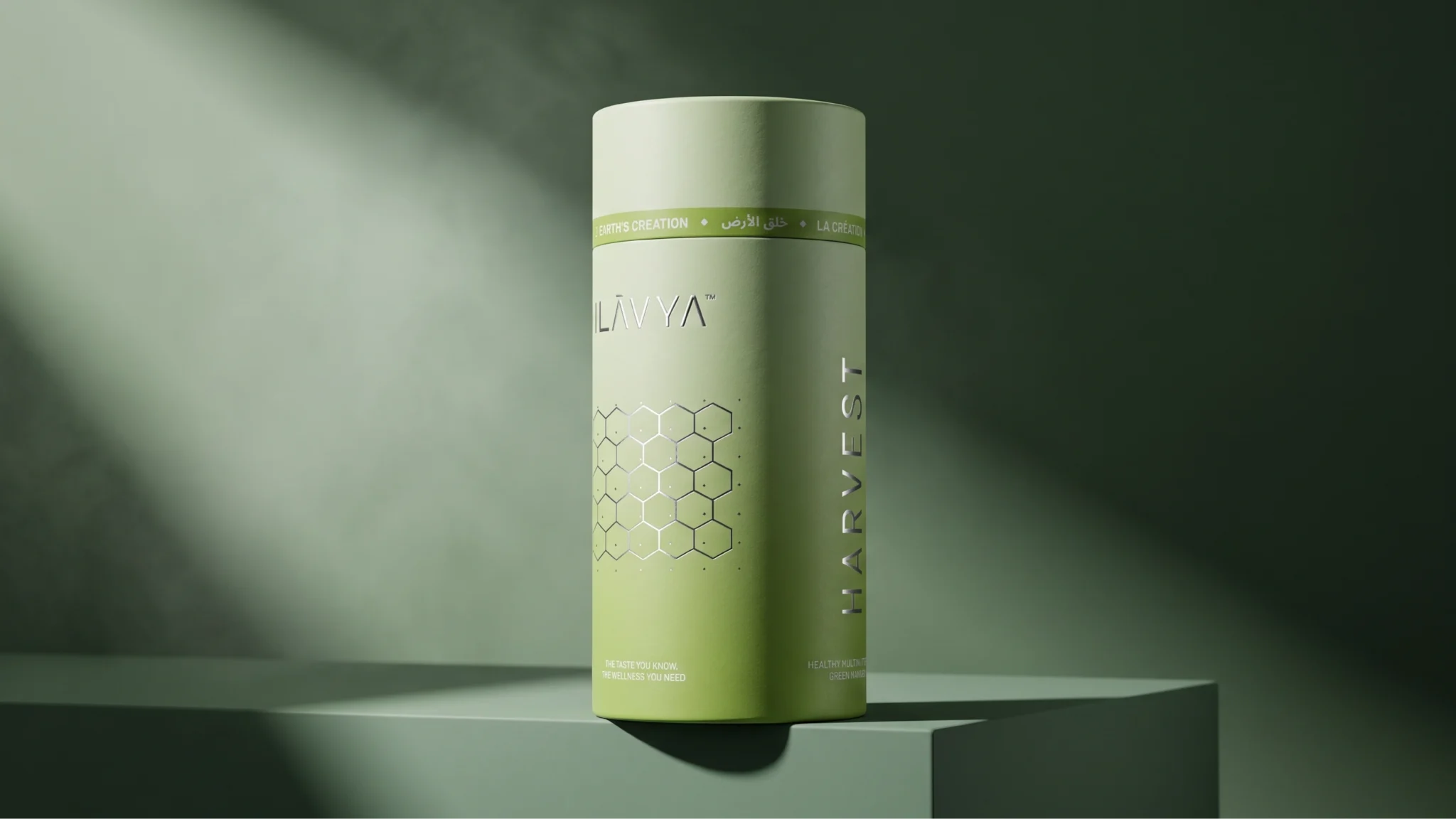

Ilavya is a premium wellness brand inspired by the purity of nature and the idea of Earth’s Creation. Polaris Designs developed the brand identity and packaging with a simple objective — to make natural wellness feel contemporary, refined and deeply rooted.
The visual identity began with a logo designed to feel elegant, distinctive and timeless. From there, we developed a complete visual language that could translate consistently across the brand.
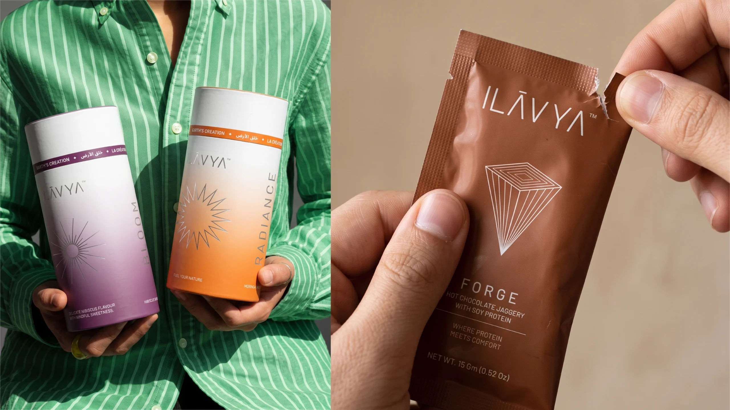
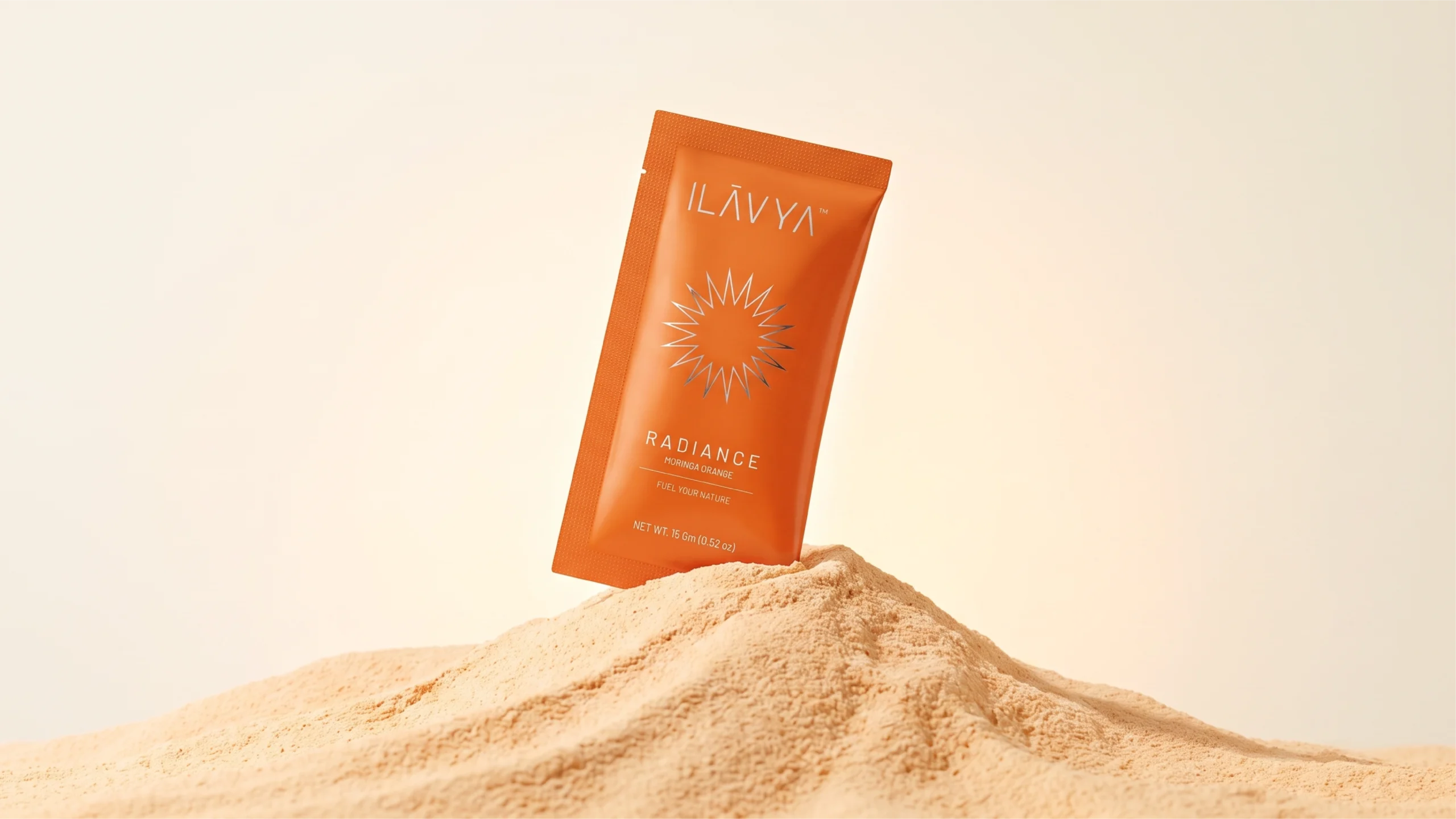
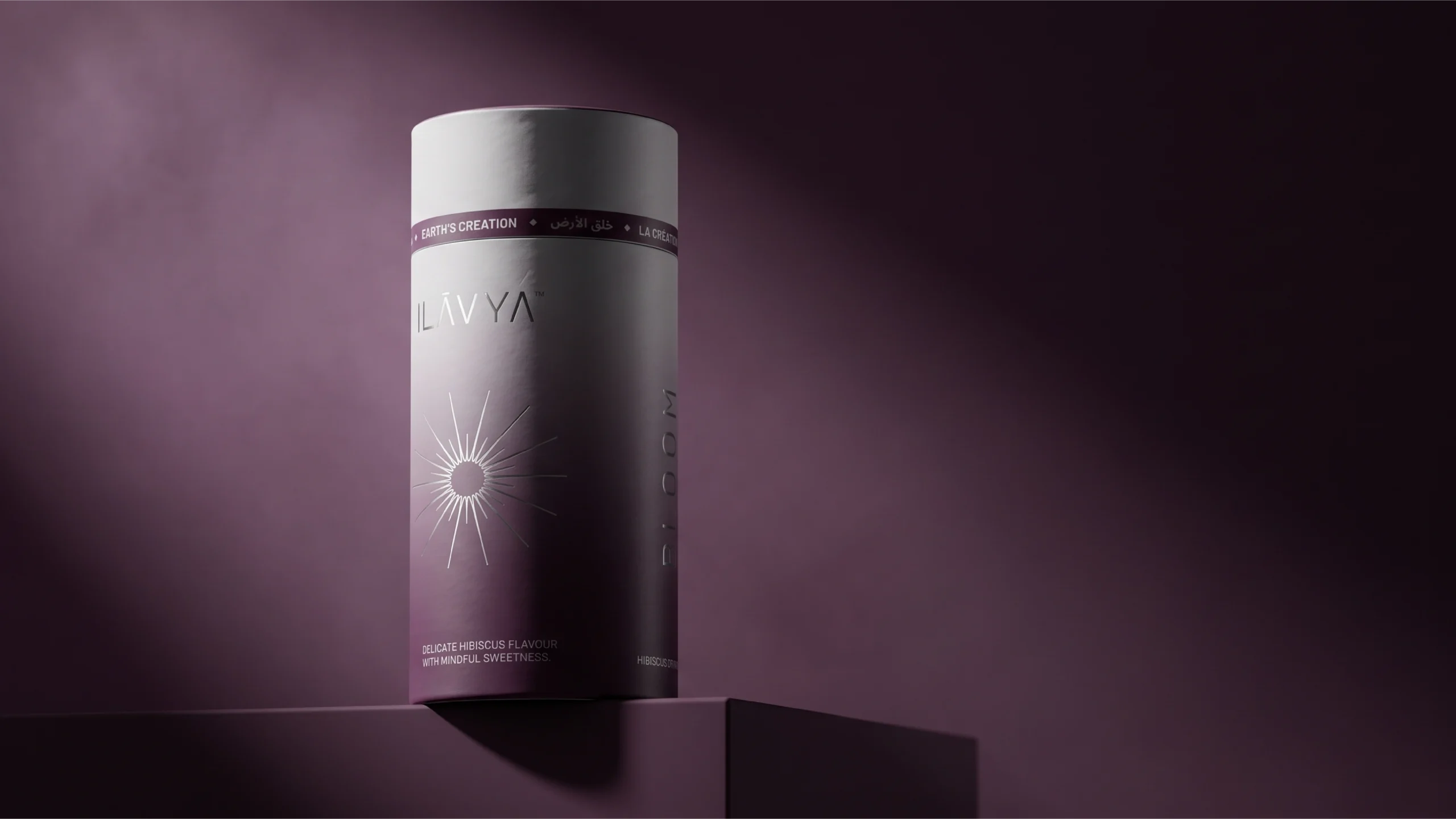
For the packaging, we moved away from generic wellness aesthetics and created individual illustrations for each product, inspired by its natural character and ingredients. Subtle gradients were introduced to give every product its own identity while keeping the complete range visually connected.
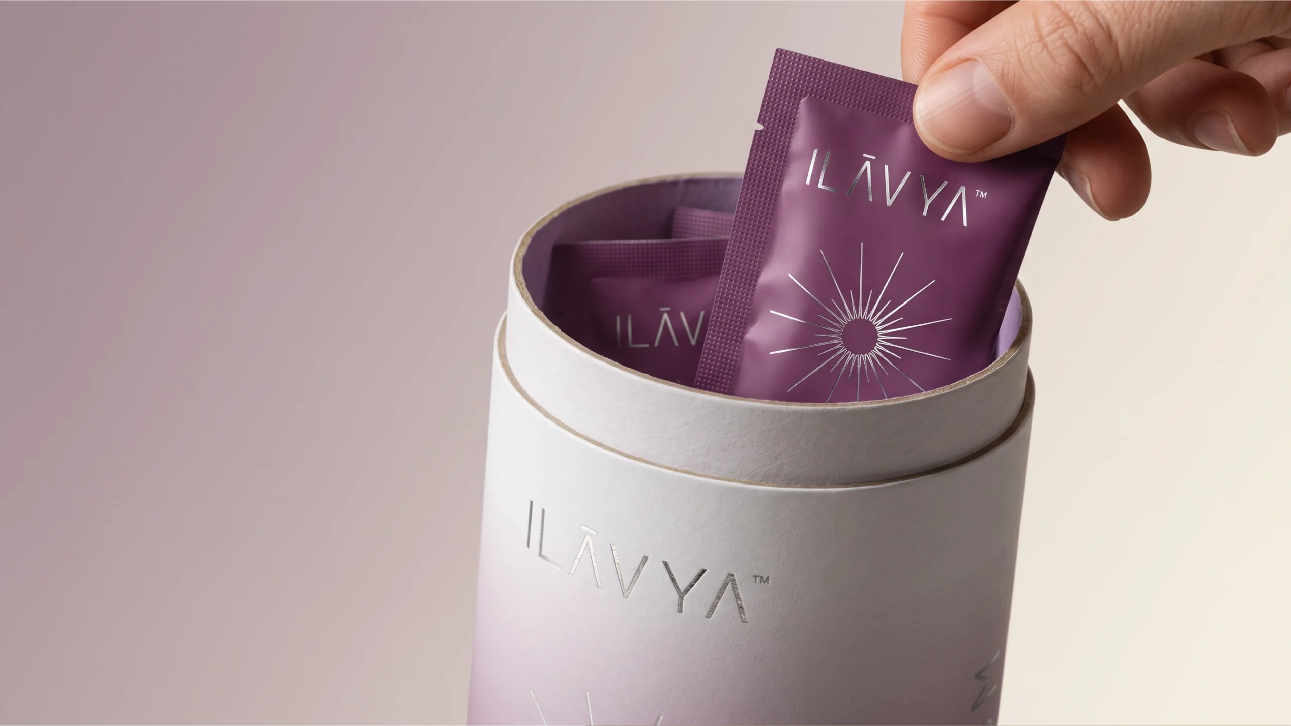
The packaging uses a clean layout with generous negative space, allowing the illustrations, typography and product information to work together without feeling crowded. Silver foiling on key elements adds a refined tactile quality, creating a balance between natural simplicity and premium appeal.
The system was developed across different formats, including sachets and cylindrical packs, while maintaining a consistent brand language throughout.
The result is a visual identity that brings together nature and refinement, tradition and modernity — creating a distinctive and contemporary presence for Ilavya within the wellness space.
Brand Identity · Logo Design · Packaging · Illustration · Art Direction · Visual Language
Designed by Polaris Designs






 monther al omari
 Ximena Ureta Design Studio.
 vitoramockup
 Up-Brands
 Sophiagdotcom
 Peter said
 ayeidadezigns
 Tancybox
 宏洛图品牌设计HONGLT
 Modern Theory
 Dozen Agency
 Atiq Alam
 Olio Studio
 Ruchi S. Joshi
 mmdesign
 awaiskhadim
 Octasoft
 United Creatives Studio
 Kingdom & Sparrow
 Anastasia Bakhmatskaya
 CreativeWise
 Great and Golden