Veil Of Veda
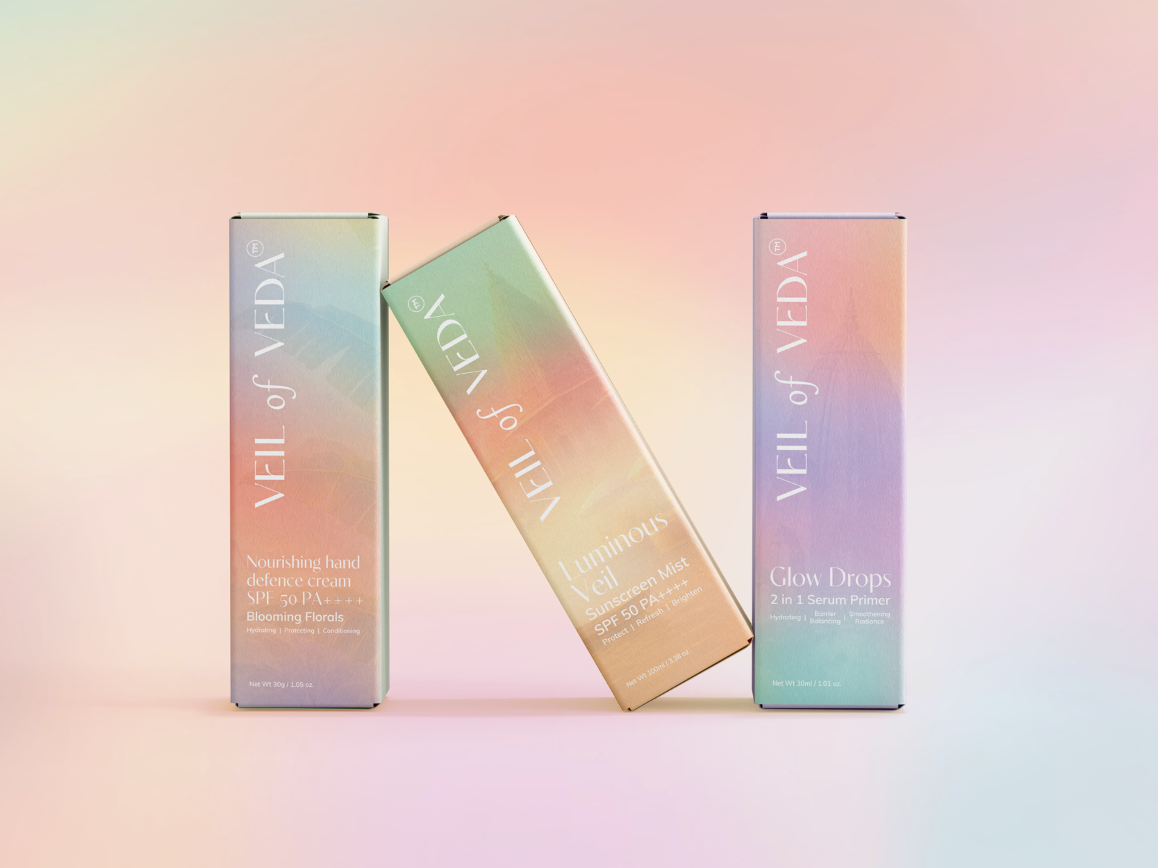
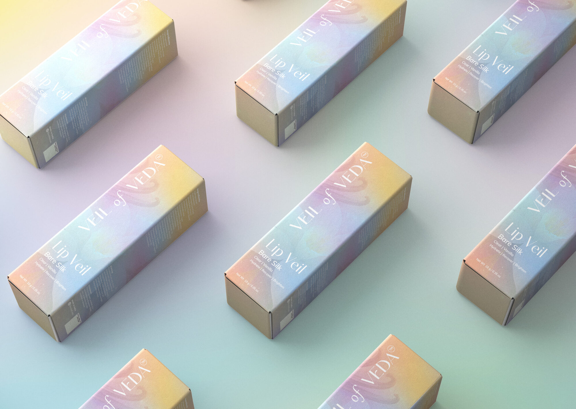
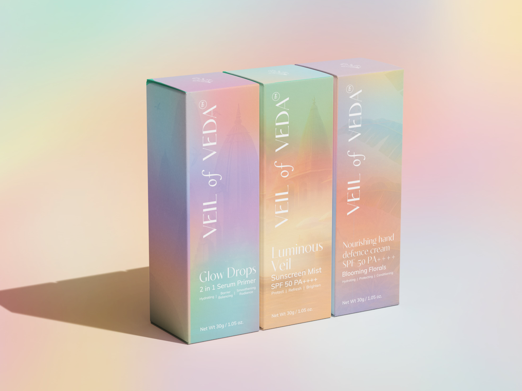
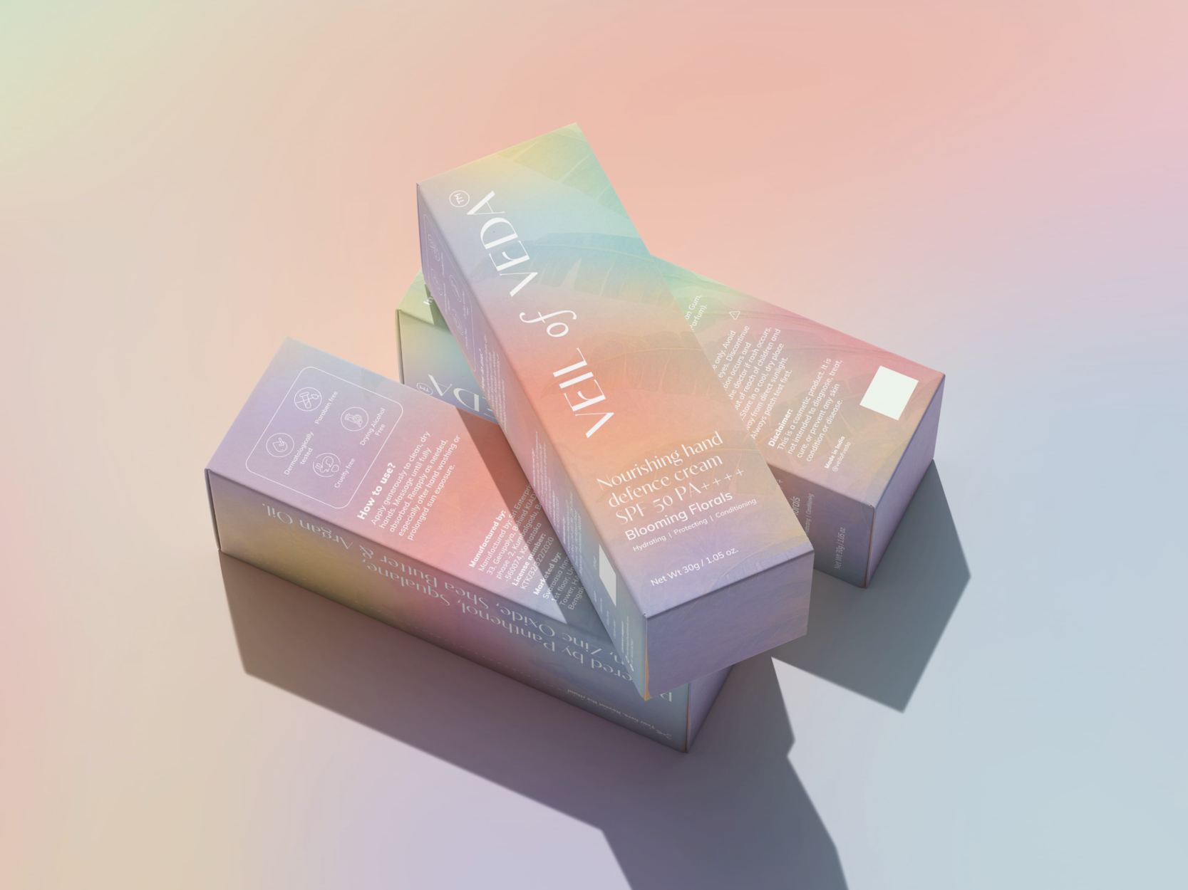
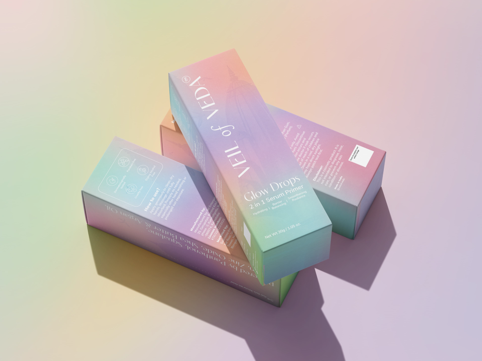
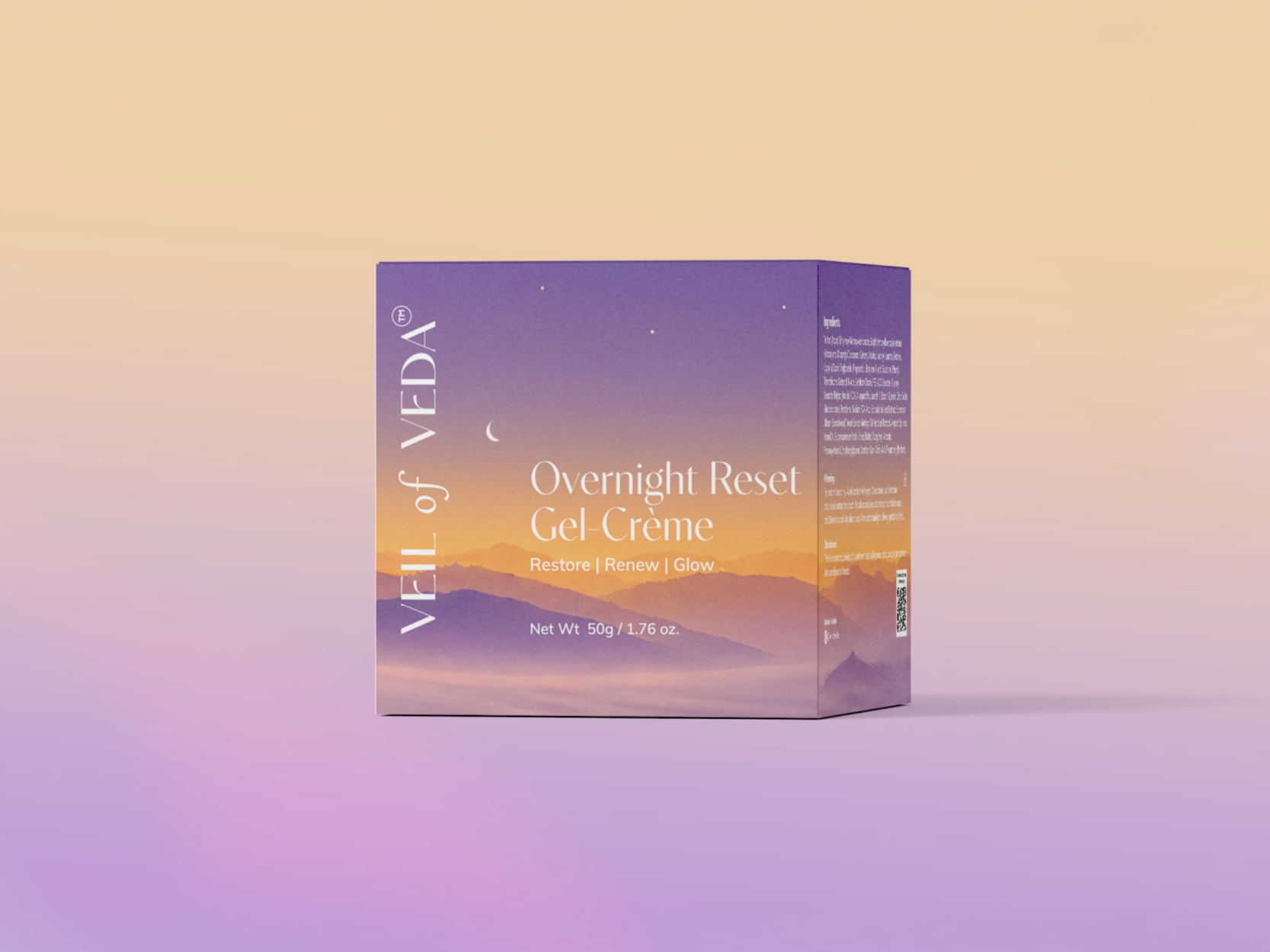
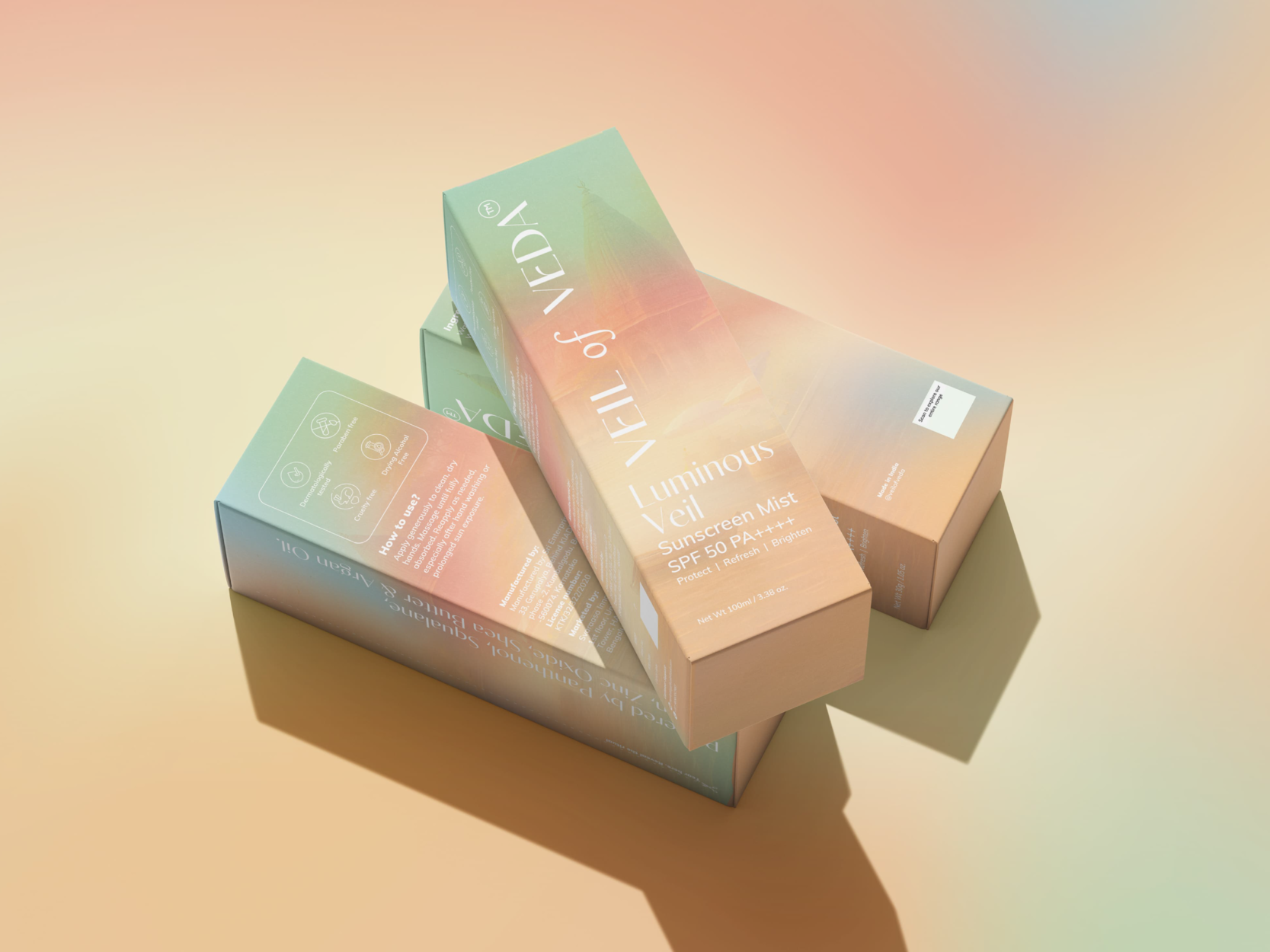
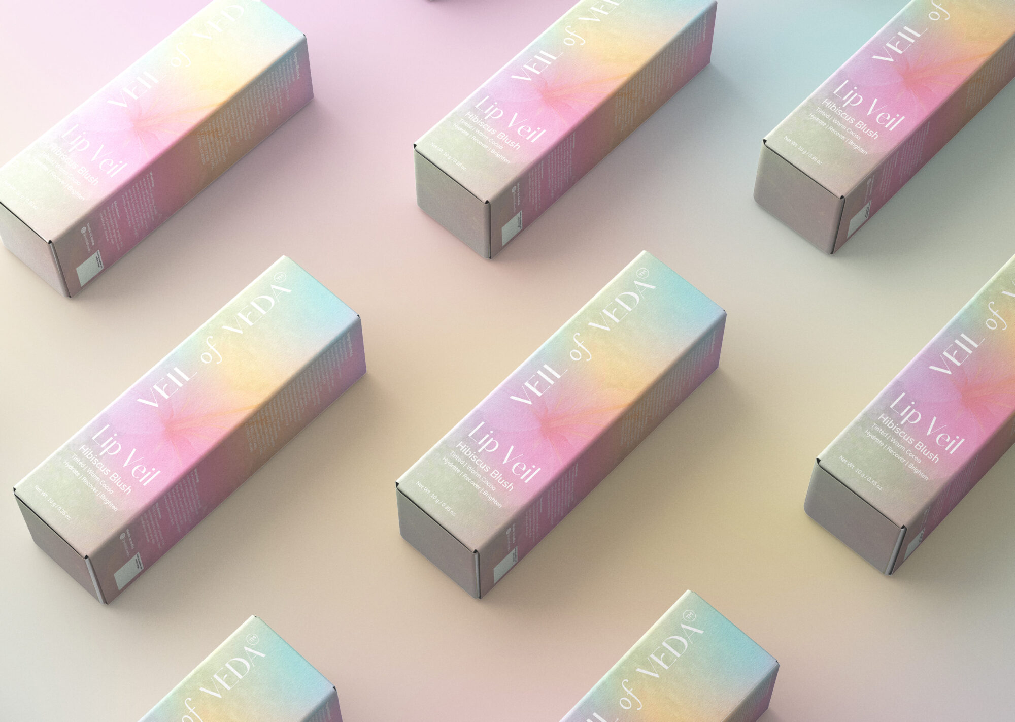
For Veil of Veda, I wanted to create packaging that felt as gentle, refreshing and beautiful as the experience the brand wanted to offer. The idea was to move towards something soft and dreamy, using a blend of pastel colours that flow naturally into one another. Each colour combination was carefully brought together to give the packaging a light, almost cloud-like feeling, without making it look too playful or overwhelming. I also wanted the entire product range to feel connected, while allowing each product to have its own little personality through its colour variations. The typography was kept clean and elegant, with the brand name running vertically to create a distinct visual identity. Subtle background details add a little depth and character, while the simple layout allows the product information to remain clear and easy to read. Overall, the intention was to create something that feels effortless yet memorable, something that catches your eye on the shelf but still feels calm, thoughtful and easy to connect with.



Comments
0 commentsLog in to comment or submit projects