

ABOUT THE PROJECT
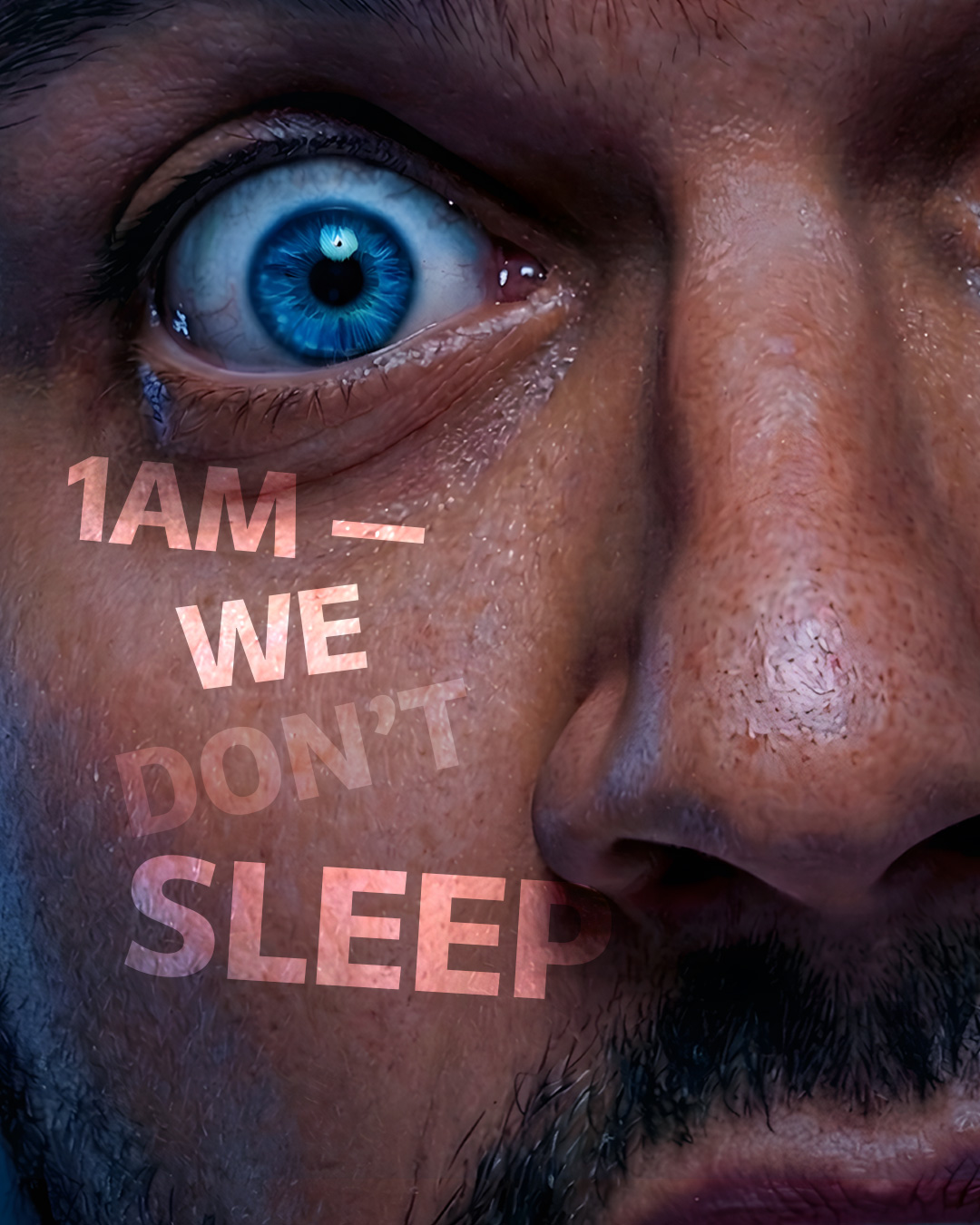
1 AM is a cold coffee brand created for a generation that does its best work when the rest of the world switches off. More than a beverage, the brand represents momentum, ambition, and the late-night mindset of creators, founders, gamers, coders, and dreamers who keep building when everyone else is asleep.
The challenge was to translate this attitude into a packaging identity that could feel distinctive in a crowded ready-to-drink beverage category.
THE CONCEPT
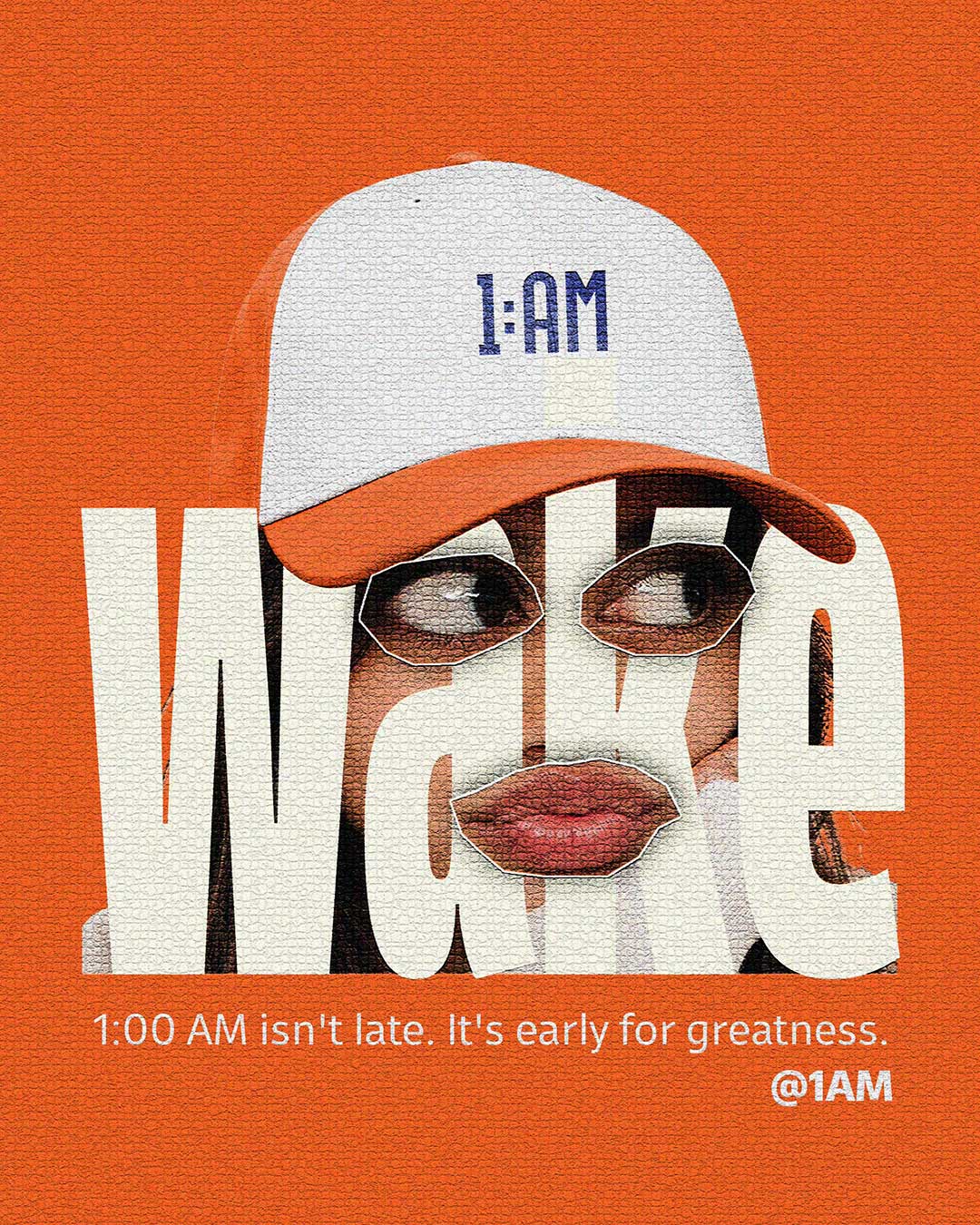
The idea began with a simple thought: 1 AM isn’t just a time. It’s a state of mind.
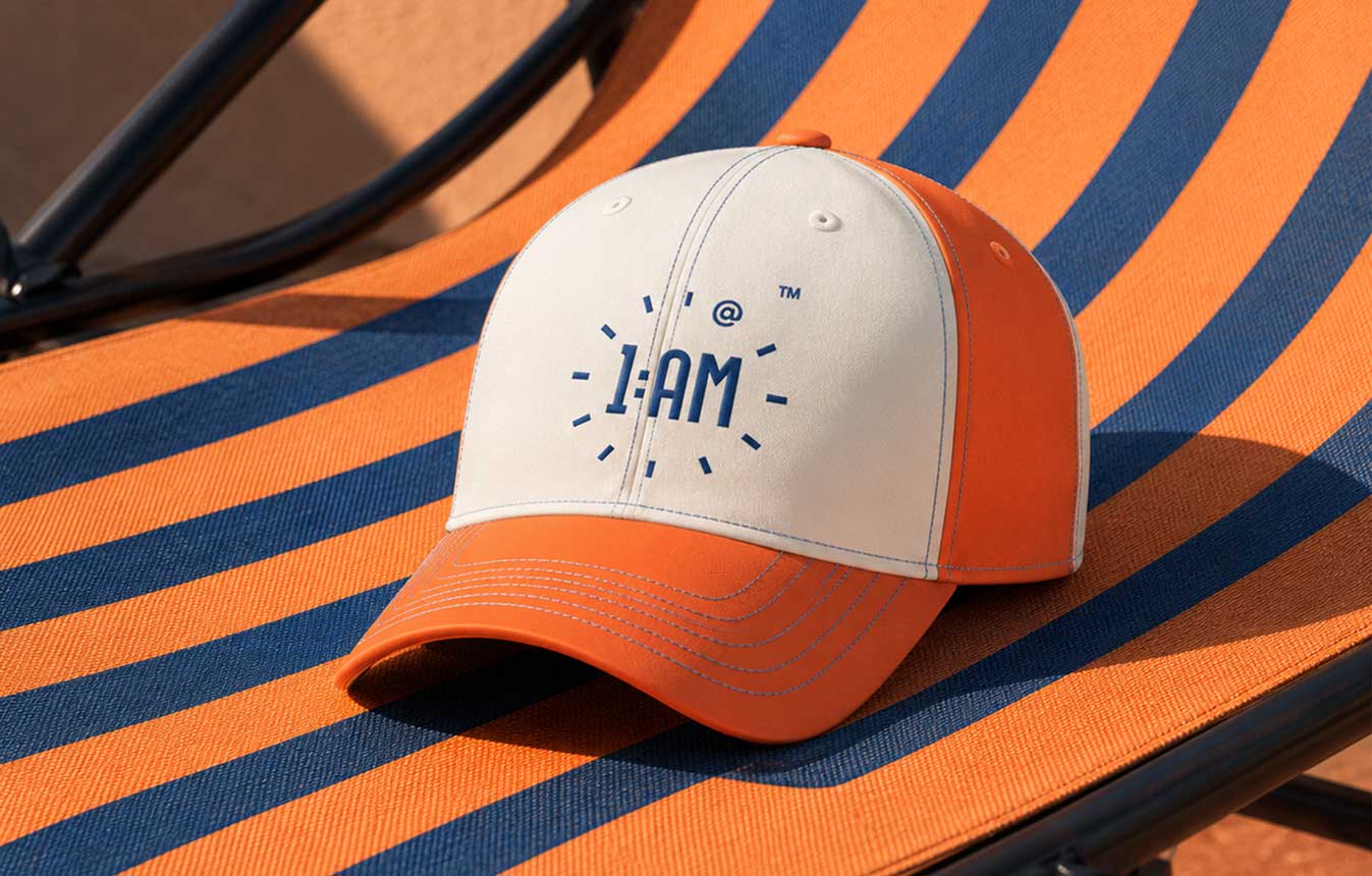
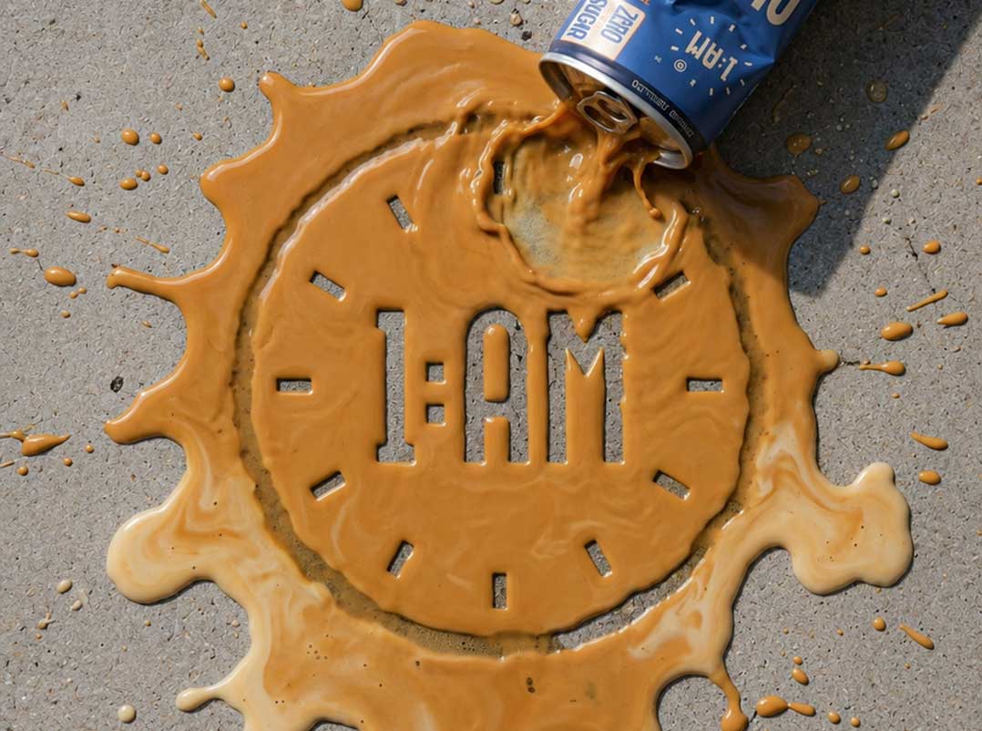
We turned the name itself into the central brand asset. The identity was designed to feel like a timestamp and a statement at the same time. The clock-inspired mark captures multiple ideas in a single visual language: a ticking clock, a spark of inspiration, and a mind switched on.
This thinking became the foundation for the packaging system.
THE PACKAGING SOLUTION
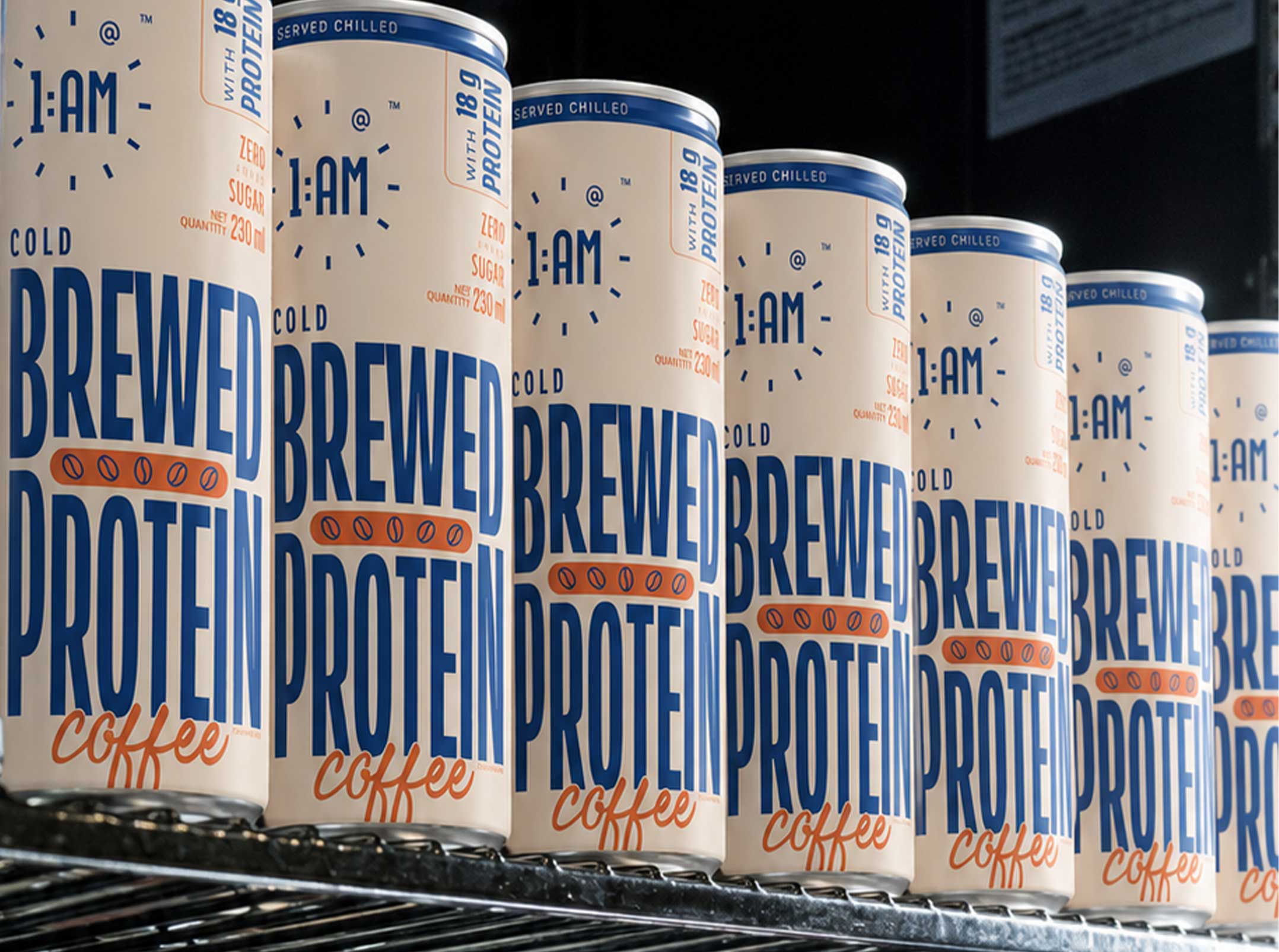
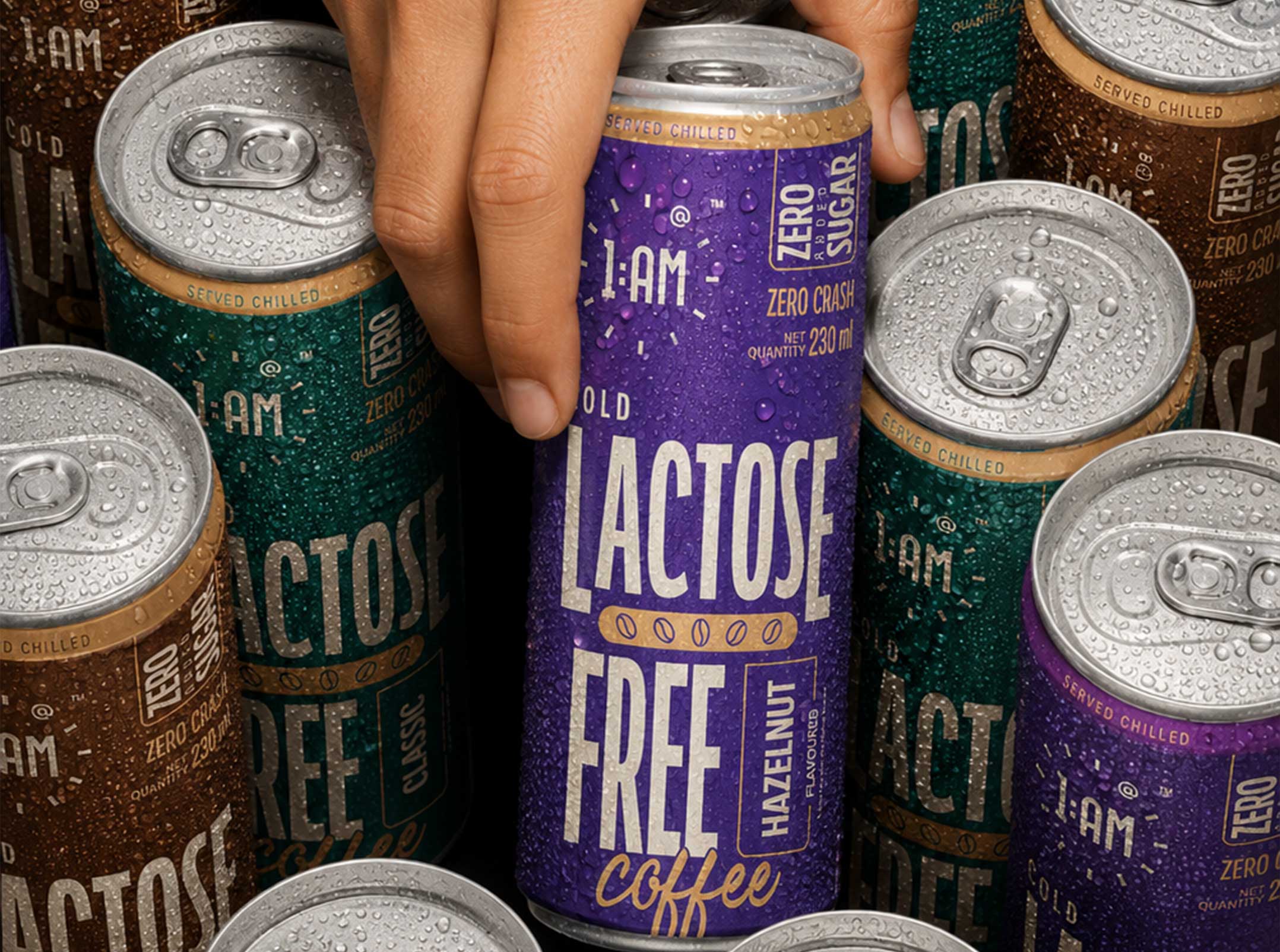
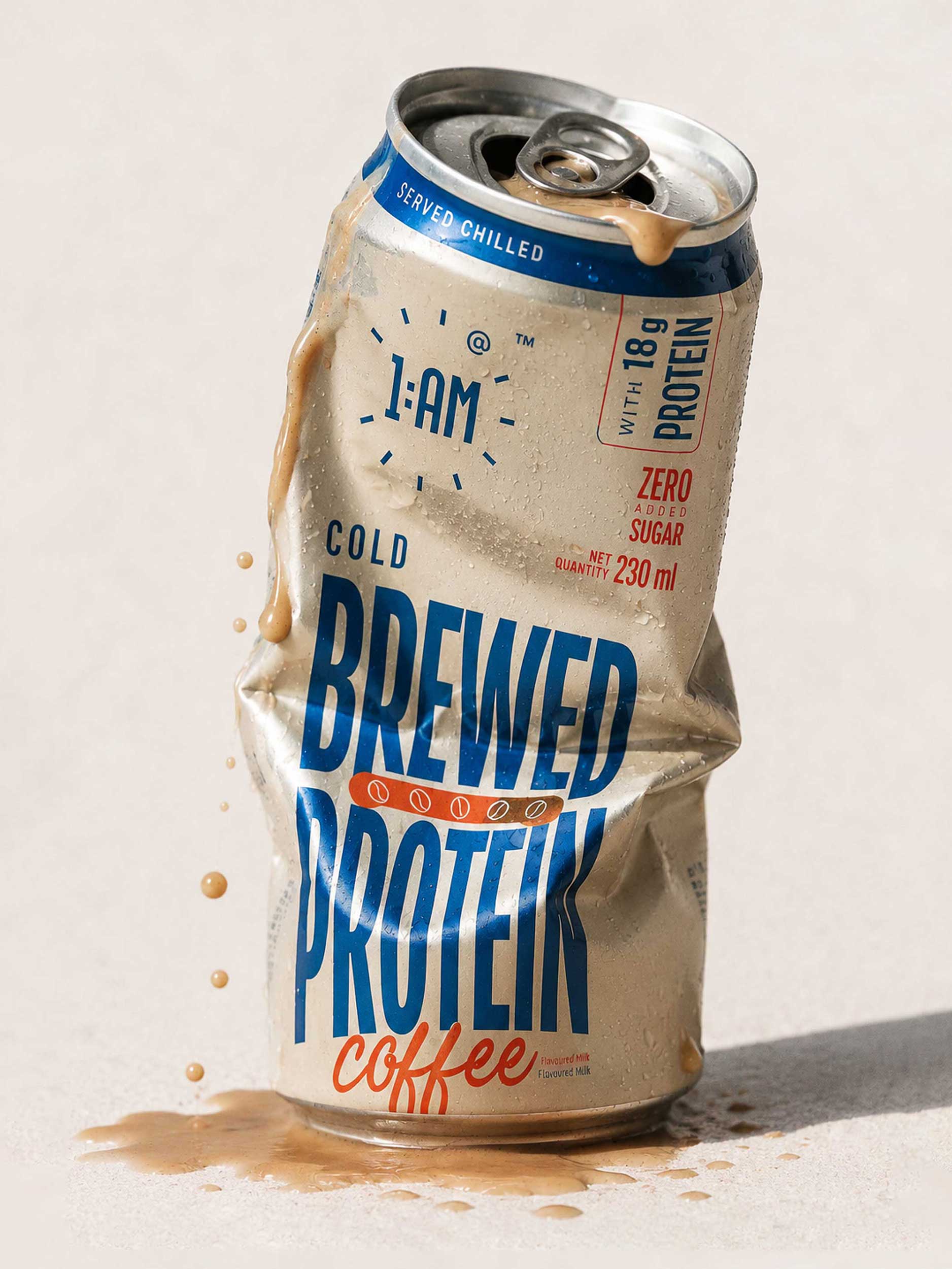
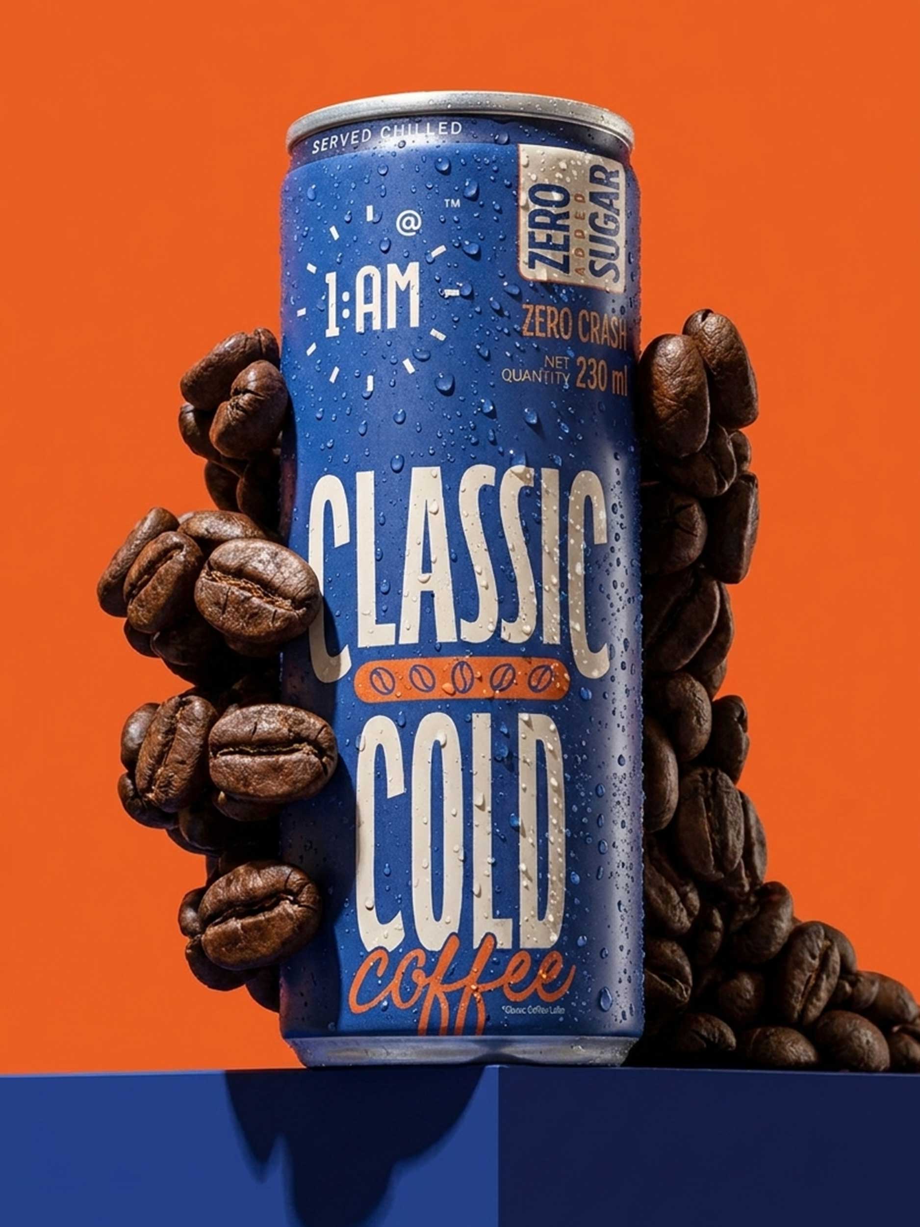
The cans were designed to function like miniature billboards. Instead of filling the pack with unnecessary graphics, we created a deliberately minimal composition built around bold typography, strong contrast, and colour.
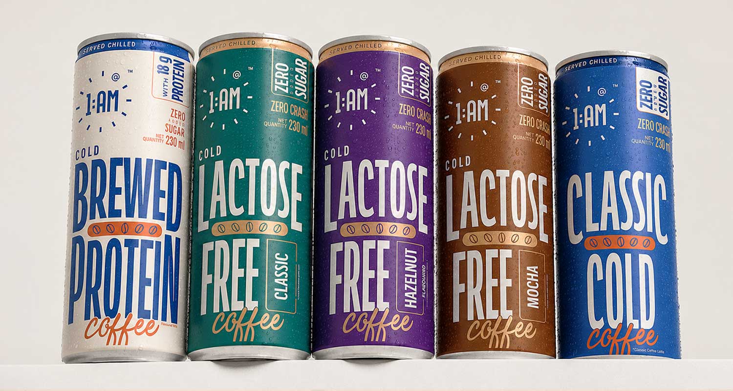
The product name and flavour take centre stage, supported by a clear hierarchy for the format and product claims. Each variant receives its own distinctive colour, giving the range a strong visual personality while maintaining a consistent relationship across the portfolio.
The result is a system that allows every SKU to stand apart while still being immediately recognisable as part of the 1 AM family.
DESIGN APPROACH
Typography became one of the strongest visual tools in the system. Bold, condensed type creates a distinctive urban character and allows the packaging to communicate from a distance.
The colour palette was developed with one objective: win the first glance.
Rather than using colour simply as decoration, we treated it as a recognition system. High-impact colours create contrast on the shelf, differentiate flavours, and give the brand a memorable visual signature.
The restrained graphic language allows the typography and colour to do most of the work, creating a balance between minimalism and high energy.
WHAT MAKES IT UNIQUE
The packaging does not rely on conventional coffee cues to communicate the product. Instead, it builds an identity around the lifestyle and mindset of its audience.
The result is a packaging system where the brand idea, typography, colour, and flavour architecture work together as one visual language.
With five SKUs and zero compromise on identity, the system is designed to be both consistent and flexible, allowing the range to grow without losing its distinctive character.
RESULT
1 AM transforms a familiar cold coffee format into a bold expression of ambition and momentum.
The packaging is minimal but not quiet, colourful but not chaotic, and consistent without making every variant look identical.
Most importantly, the cans were designed to be noticed. On a crowded shelf, the packaging acts as a visual interruption, turning an everyday cold coffee into a badge for the people who keep going after midnight.
1 AM. Brewed for the ones who never switch off.









 Furt Goods
 Atiq Alam
 宏洛图品牌设计HONGLT
 Ampersand Creative
 Modern Theory
 Palashcc
 neo creative studio
 Axiniya Knyazeva
 Valérie Colace
 Anshuman
 Archi Jain
 DESIGN CONCEPTS
 Shapers Studio
 jamajkajakub
 tamara barakat
 Derrick Lin
 VincoStudio
 lisakaplina
 CreativeWise