

Most industrial tool packaging looks the same.
Dark.
Heavy.
Overloaded with information.
And completely forgettable on the shelf.
For the Breyway Tools – X-002 PROLINE Suction Cup Set, the goal was simple:
Create packaging that instantly communicates strength, clarity, and professional reliability — specifically for the German hardware retail market.
🔶 The Challenge
In competitive tool categories, customers decide within seconds.
The packaging needed to:
- Stand out on crowded shelves
- Clearly communicate technical features
- Feel durable and professional
- Align with industrial expectations
🔶 The Strategy
Instead of adding more elements, we focused on hierarchy and impact:
- High-contrast black & yellow industrial color system
- Bold, structured typography for quick readability
- Clean icon-based feature communication
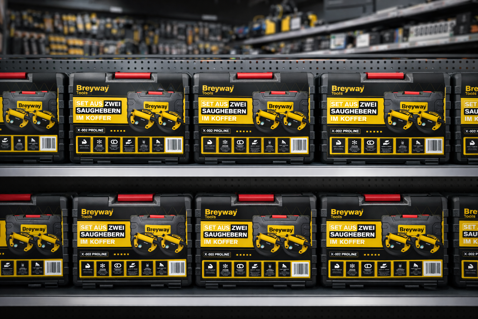
- Strong framing to maximize shelf visibility
- Layout optimized for toolbox-style application
Every detail was built around one core principle:
Clarity creates confidence.
Confidence drives purchase decisions.
🔶 The Execution
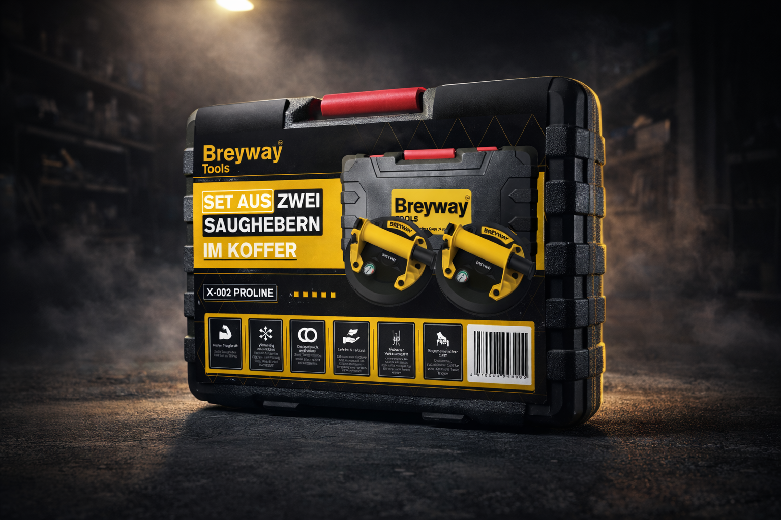
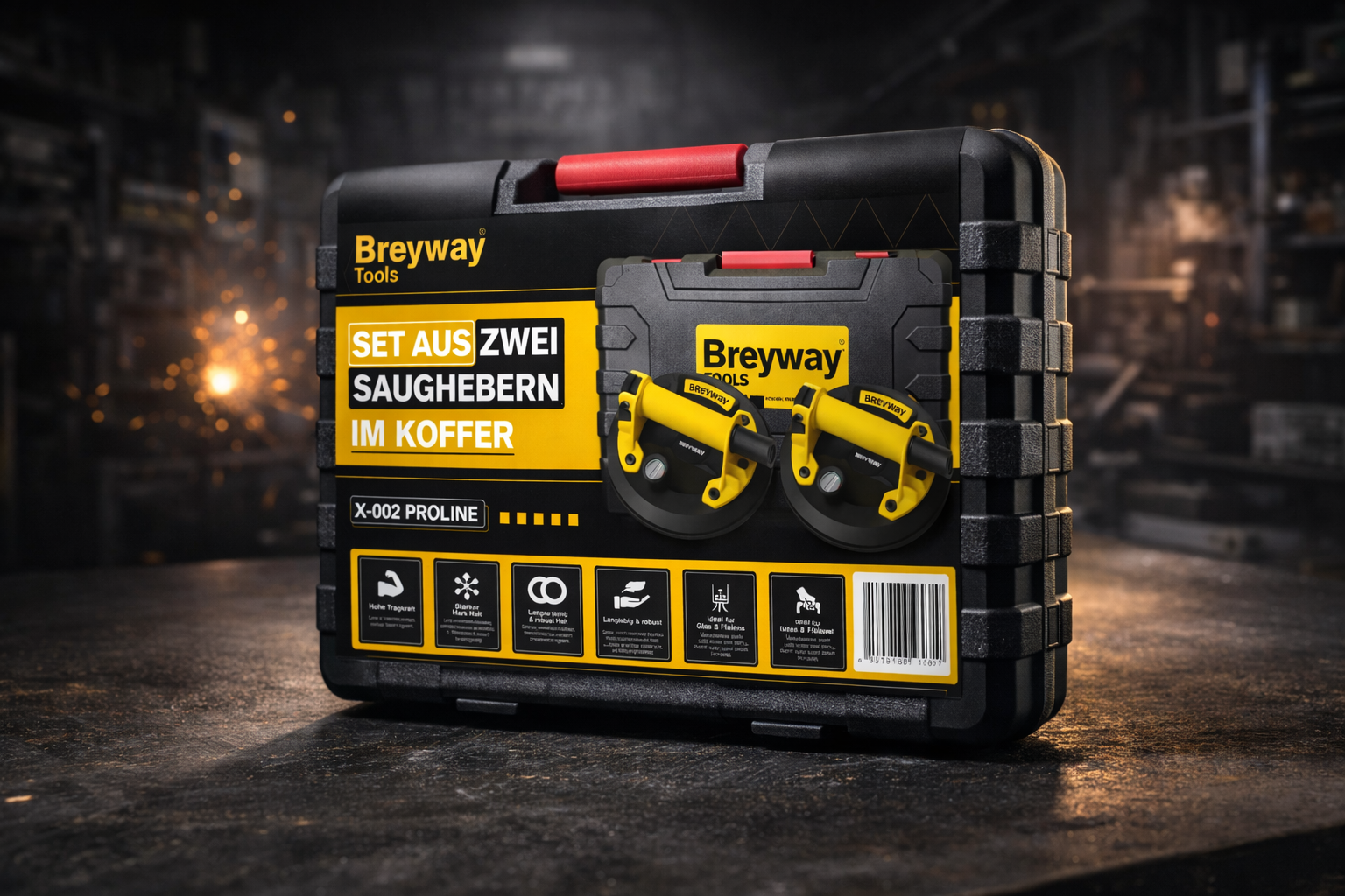
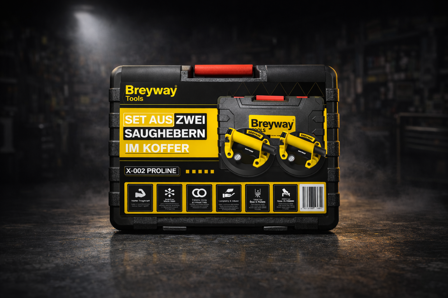
- Complete front & back panel layout
- Structured feature system
- Industrial visual language
- Full dieline development
- Realistic retail and workshop visualization
The result is packaging that feels powerful before the product is even used.
Because in retail — perception sells first.
If you’re launching a physical product and competing on shelves, your packaging is not just design.
It’s positioning.
#PackagingDesign #IndustrialDesign #ProductPackaging #RetailDesign #Branding #ToolPackaging #DielineDesign #GraphicDesign #PackagingDesigner #B2BBranding





 Alessandro Ammaturo
 Amblr Studio
 vladlenalevit
 Sis Tsarukyan
 monther al omari
 alchimistestudioParis
 designsbysukaina
 About House of Ta
 Amjad Battal
 UPRISE
 Maruf Nishat
 Dozen Agency
 neo creative studio
 Muhammad Tawfeeq
 Stefano Bracci
 Widakk Design
 Studio Garces
 宏洛图品牌设计HONGLT
 DN Designs
 BoldCrest
 Oksana