

CHU DU — Packaging Design
1. ABOUT
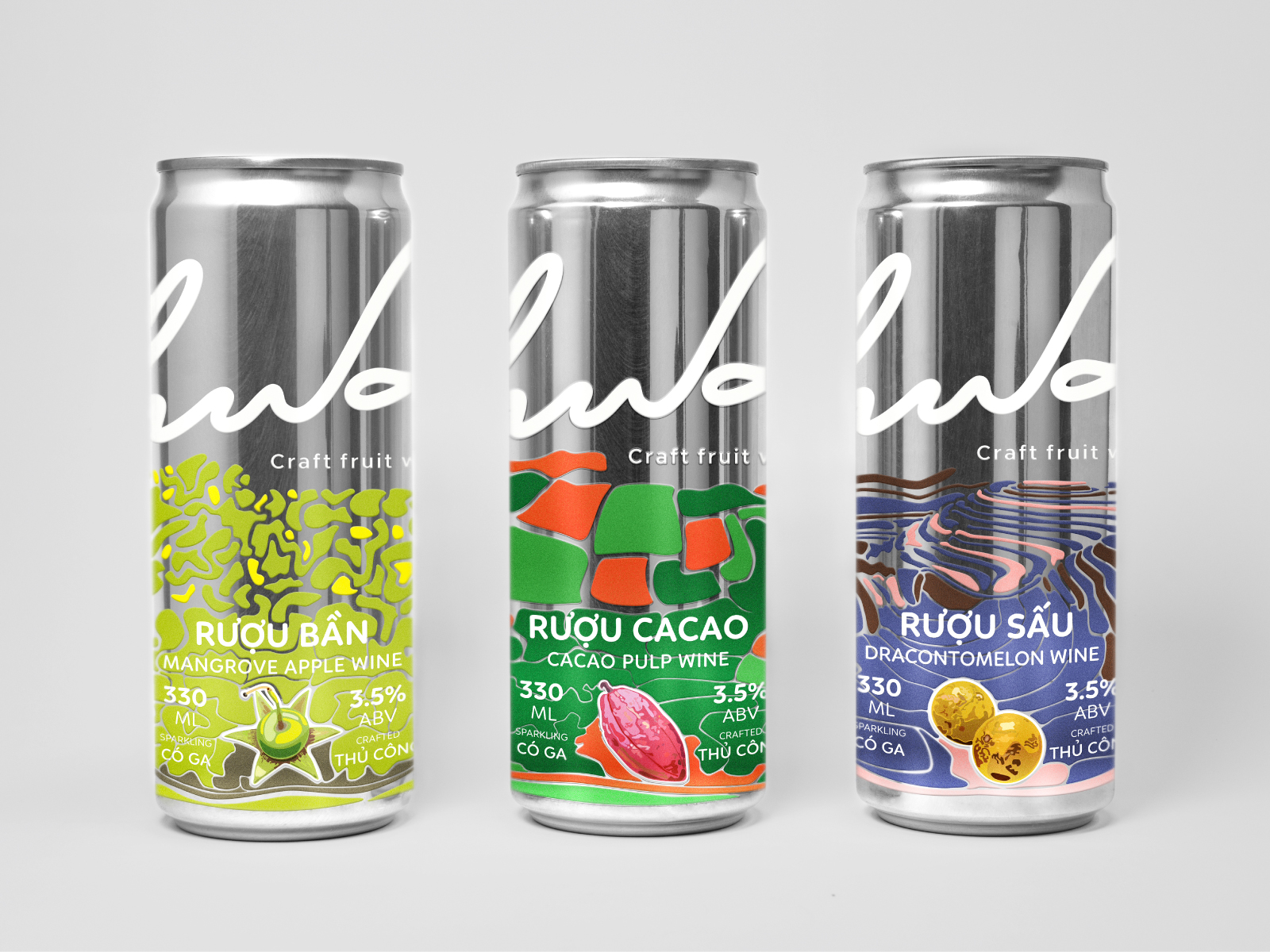
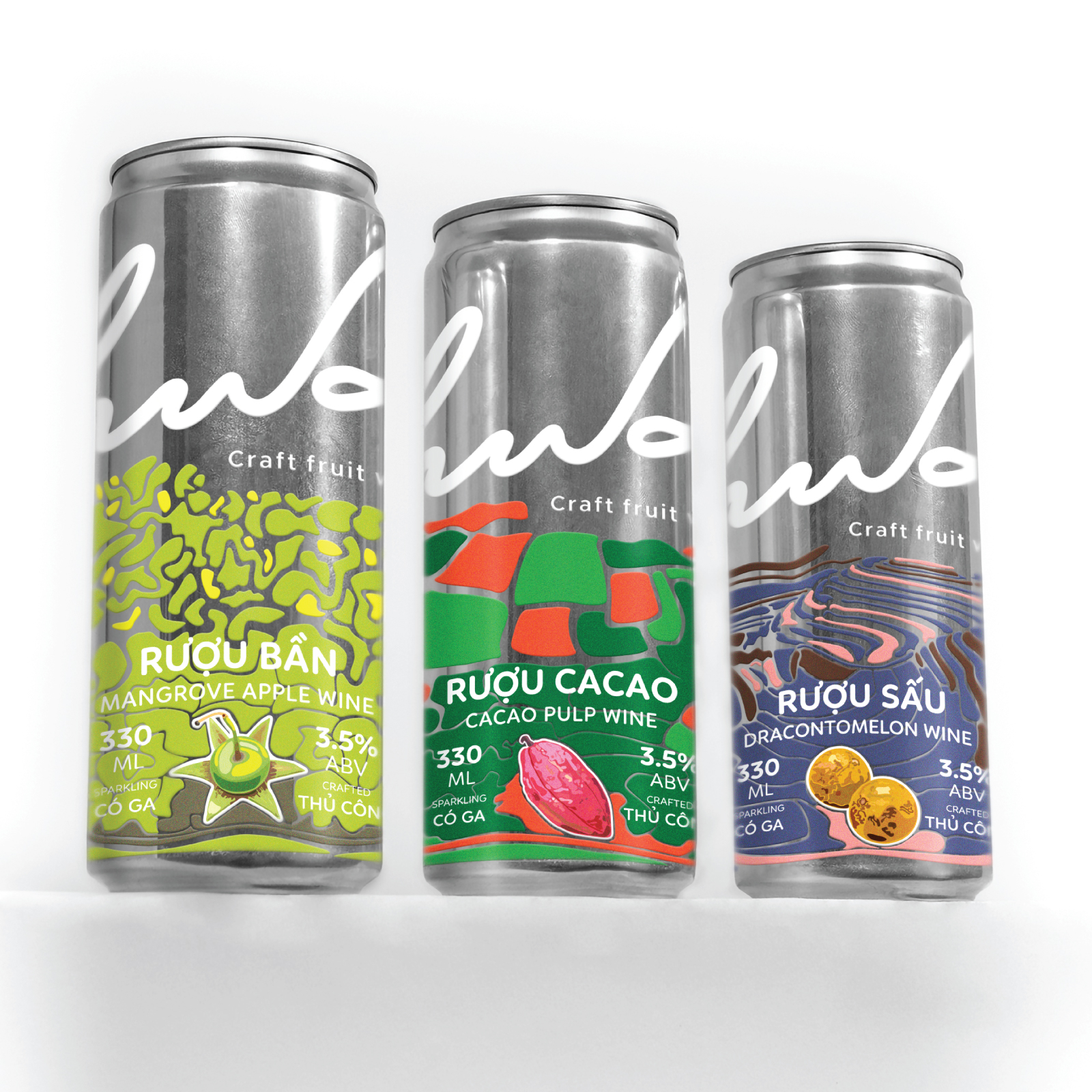
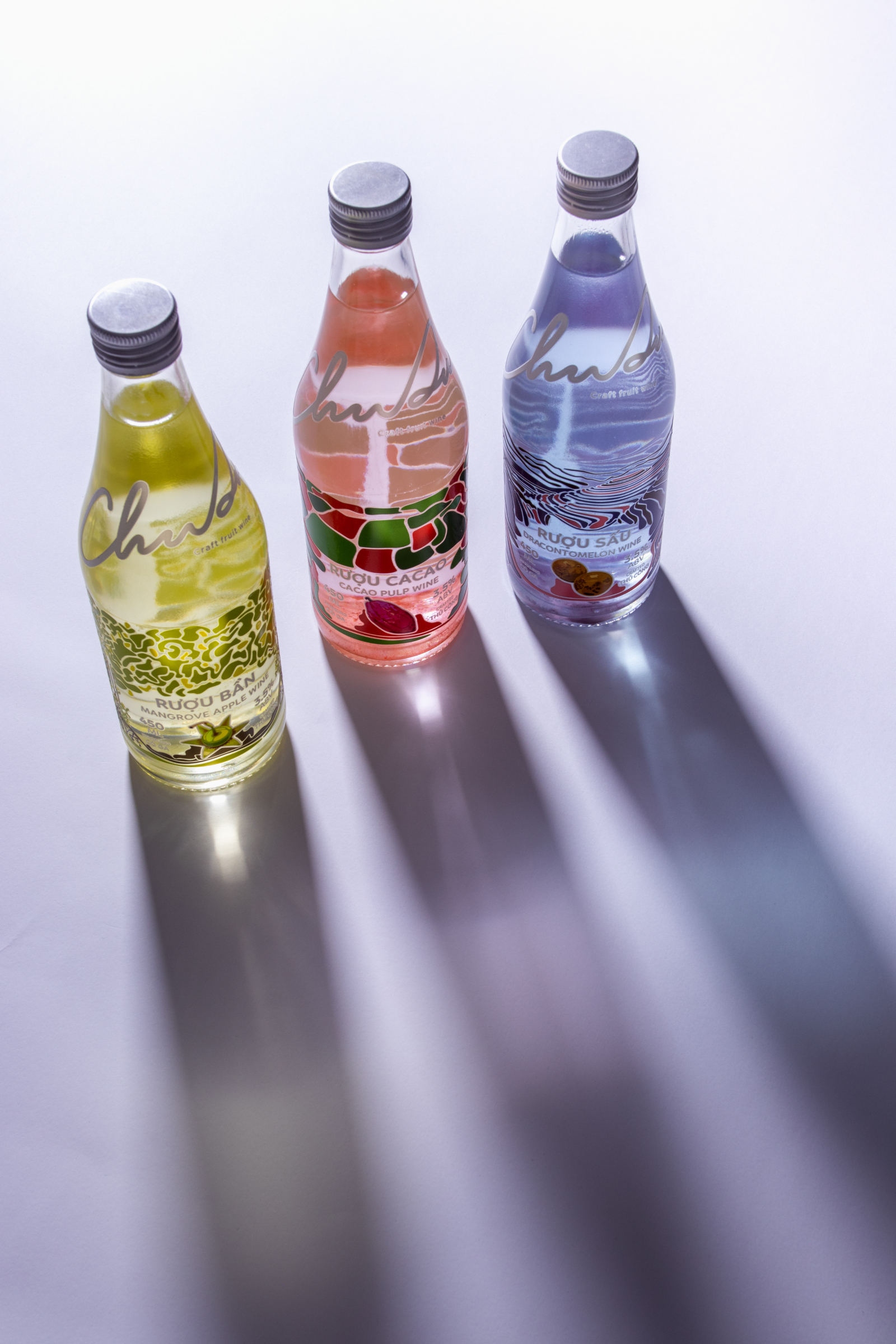
Chu Du is a conceptual craft fruit wine brand developed as a graduation project. Inspired by Vietnamese local produce and the youthful spirit of exploration, the brand proposes a collection of three sparkling, low-ABV fruit wines: Mangrove Apple Wine from the Mekong Delta, Cacao Pulp Wine from the Central Highlands, and Dracontomelon Wine from Northern Vietnam. Each product is specified at 3.5% ABV.
More than introducing distinctive local flavors, Chu Du aims to celebrate the diversity of Vietnamese agricultural produce through the experience of travel and discovery. Targeting young adults, particularly Gen Z and Millennials, the brand embodies a free-spirited lifestyle and a desire to embrace new experiences.
The project focuses on brand identity, packaging, and brand storytelling rather than food science or actual fermentation processes. It explores how the spirit of a journey and the character of different regions can be translated into a meaningful visual experience.
2. CONCEPT — A MAP OF FLAVORS
The central concept of Chu Du is “A Map of Flavors”, inspired by the desire to explore new places and discover the richness of Vietnamese local produce.
The concept is built around a simple insight: people do not travel simply to taste a particular fruit; they travel to experience a place and discover what makes it unique.
Instead of directly illustrating the fruits, Chu Du transforms the geographical features and natural landscapes of their regions into abstract visual maps. Each product represents a destination, while the entire collection tells a continuous story of exploration through three emotional stages.
The journey begins in the Mekong Delta, moves through the Central Highlands, and continues towards Northern Vietnam. Three accent colors — yellow, orange-red, and pink — represent the emotional progression of this journey.
Yellow evokes the bright sunlight of the Mekong Delta, symbolizing a fresh beginning, excitement, and the desire to set off on an adventure.
Orange-red draws inspiration from the red basalt soil of the Central Highlands. It represents a burst of energy, the courage to embrace challenges, and the excitement of discovering unfamiliar experiences along the way.
Pink recalls the glow of a sunset, symbolizing a moment of calm and reflection — taking time to enjoy the journey and appreciate what has been experienced.
Rather than offering a predetermined ending, Chu Du leaves the journey open to personal interpretation. Everyone returns with their own memories, discoveries, and reflections. The brand embraces the belief that new experiences await those who dare to set off, because youth only comes once.
3. SOLUTION
The packaging system translates the concept into three distinct visual identities, each inspired by the geographical characteristics and natural landscapes of its corresponding region.
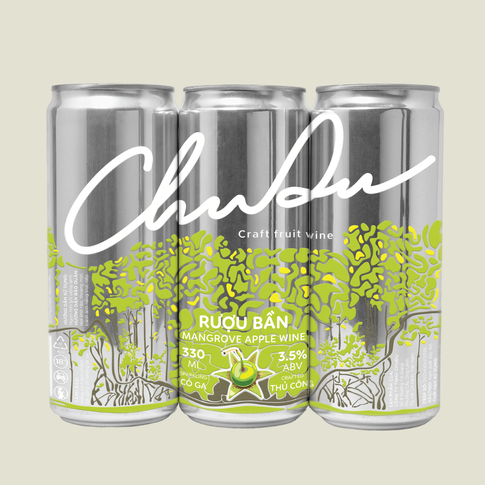
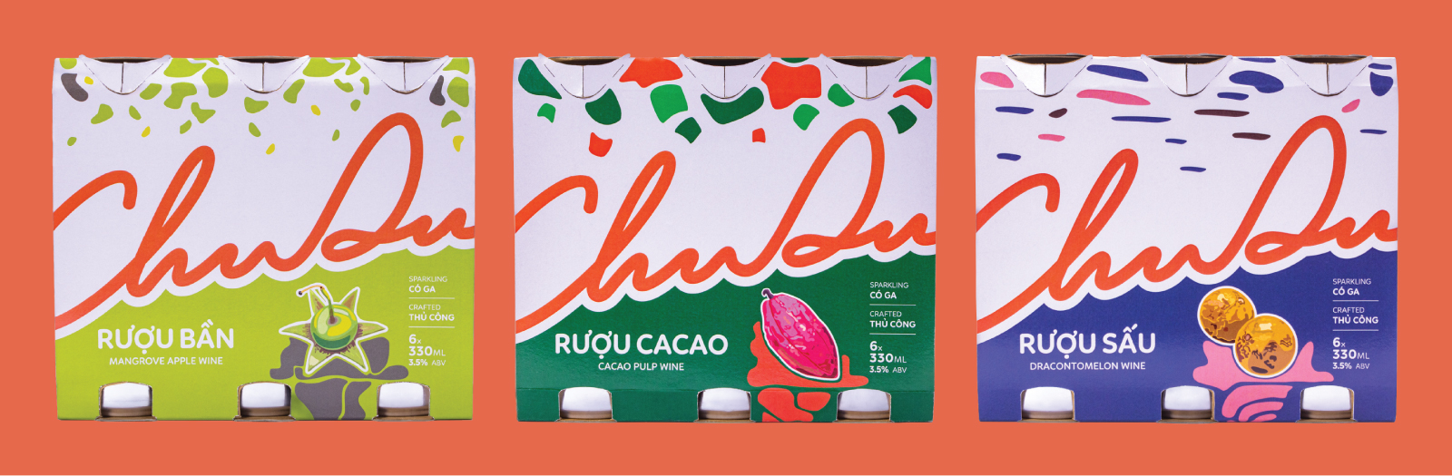
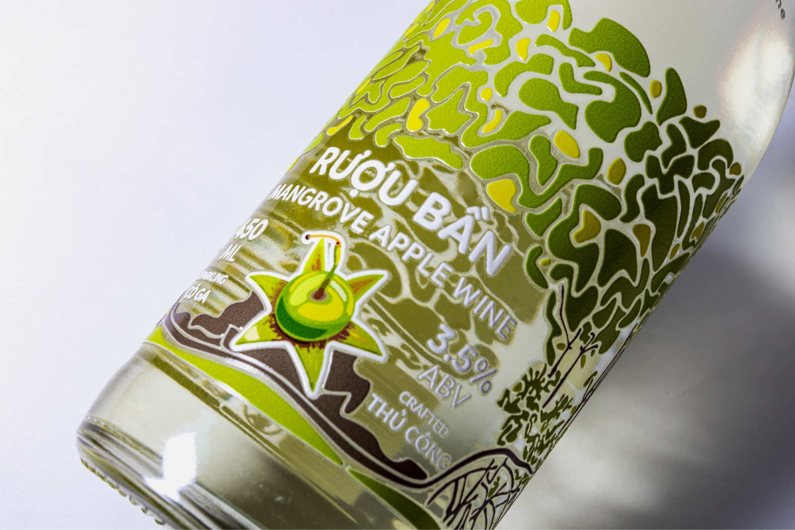
Mangrove Apple Wine draws inspiration from the waterways and mangrove forests of the Mekong Delta, expressed through graphic elements and colors reflecting sunlight, vegetation, and alluvial soil.
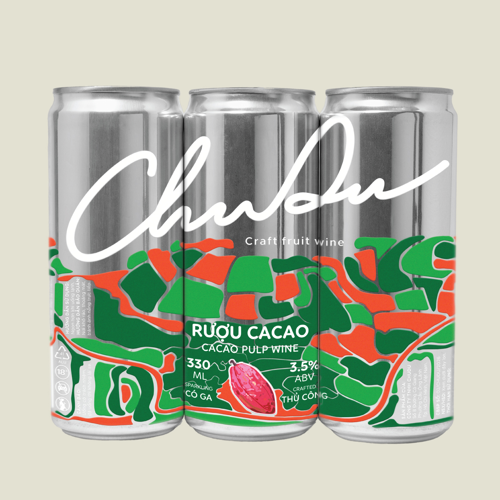
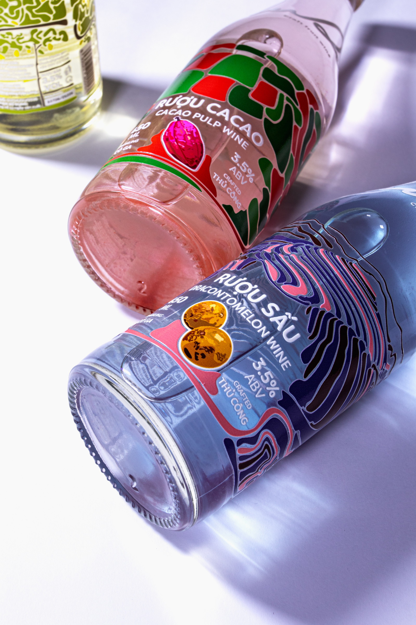
Cacao Pulp Wine takes inspiration from the red basalt soil and forests of the Central Highlands, translating the region’s landscape into bold graphic forms and warm, energetic colors.
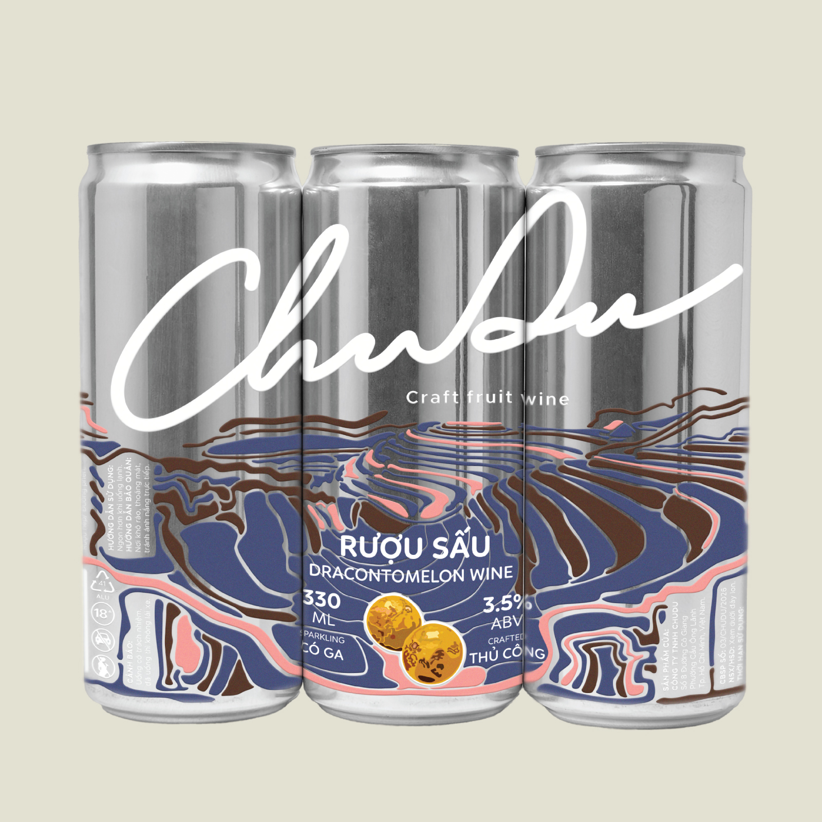
For Dracontomelon Wine, the visual direction draws on the terraced landscapes and hills of Northern Vietnam, using these recognizable natural features to represent the region.
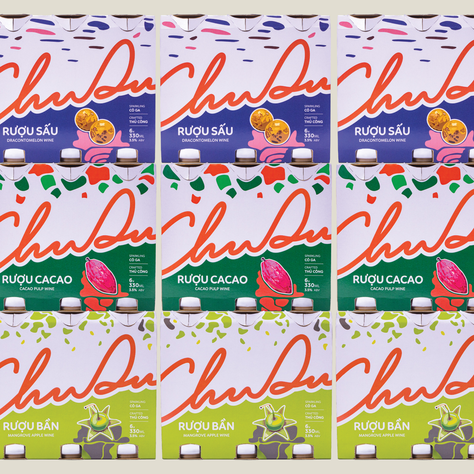
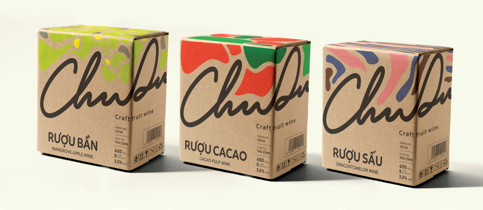
To bring these landscapes into the packaging, the design uses abstract two-dimensional shapes and solid color blocks rather than realistic illustrations. Oversized and cropped typography further strengthens the visual presence, creating a bold and contemporary aesthetic.
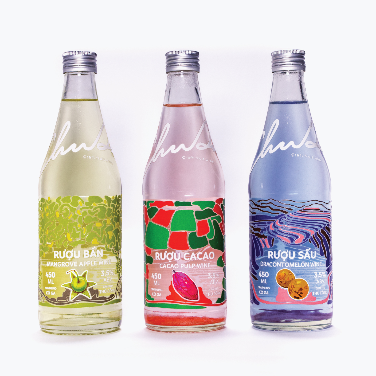
The three products share a consistent graphic system while maintaining their own visual identities through distinct color palettes and landscape-inspired compositions. This system is applied across different packaging formats, including 330 ml aluminium cans, 450 ml glass bottles, six-can multipacks, and six-bottle cartons.
4. DESIGN TECHNIQUES
The visual identity combines a handwritten-style logotype, abstract flat graphics, and oversized typography to express the brand’s free-spirited character.
The Chu Du logo is inspired by the continuous, winding lines of roads, symbolizing movement, exploration, and the desire to keep moving forward.
For the packaging, geographical features are simplified into abstract graphic compositions using solid colors and two-dimensional forms. The design avoids realistic volume and drop shadows, allowing the graphics to remain clear and suitable for raised UV printing.
Typography plays an important role in establishing the visual hierarchy. Linotte Rounded Sans is used for headlines, while Metropolis is selected for body text, balancing a friendly character with clarity and readability.
Raised UV printing was also produced and applied to the physical packaging samples, adding tactile dimension to the otherwise flat graphic compositions.
5. WHAT MAKES THE DESIGN UNIQUE ?
The distinctive feature of Chu Du lies in its approach to storytelling through packaging. Rather than focusing solely on the visual representation of fruits, the design explores the relationship between local ingredients, geographical landscapes, and the emotional experience of travel.
Each product represents not only a regional destination but also a different emotional stage of the journey. Through the progression of yellow, orange-red, and pink, color becomes a storytelling device that connects the three products into one continuous adventure.
This approach allows Chu Du to communicate more than the flavors of Vietnamese local produce. It presents a lifestyle shaped by freedom, curiosity, and the courage to explore the unfamiliar, creating an emotional connection with young consumers.
6. RESULT
The project delivers a cohesive brand identity and packaging system for three conceptual fruit wine products, extending from primary packaging to secondary packaging and supporting brand materials.
Through the concept of “A Map of Flavors”, Chu Du transforms the geographical characteristics of Vietnamese regions into a distinctive visual language, while using color to communicate the emotional journey behind the brand.
The final outcome brings together regional inspiration, contemporary graphic design, and tactile packaging techniques to create a visual storytelling experience that celebrates local produce and the spirit of exploration.
PROJECT NOTE
Chu Du is a hypothetical graduation project and has not been developed as a commercially launched product. The proposed product specifications, including the 3.5% ABV content, are conceptual. The liquid colors are also visual assumptions chosen to support the overall aesthetic direction. The project focuses on brand identity and packaging design rather than actual product formulation or fermentation processes.
CREDITS
Concept & Packaging Design: Huynh Hoai Danh
Photography & Retouch: Huynh Hoai Danh
Design Assistant: Le Truc An
Instructor: Phan Quoc Cuong
Project Type: Graduation Project
University: Saigon Technology University (STU)

 Derrick Lin
 Sophiagdotcom
 Sofia Nikishina
 studionerius
 monther al omari
 Monroe
 KateChachava
 Snob Duck
 宏洛图品牌设计HONGLT
 Studio Six F
 Just Design
 New Century Design
 VIEWPOINT
 Abbydraw Designs Unique Conceptual Branding & Packaging Designing Ideas
 BexNelson
 Vladimir Shmoylov
 Kris
 Agence des Coteaux
 Julia M.
 Rabia zouina
 www.branding.uz
 Diego Alves do Amaral
 studioaslihan
 Minim Brand Design