

ABOUT
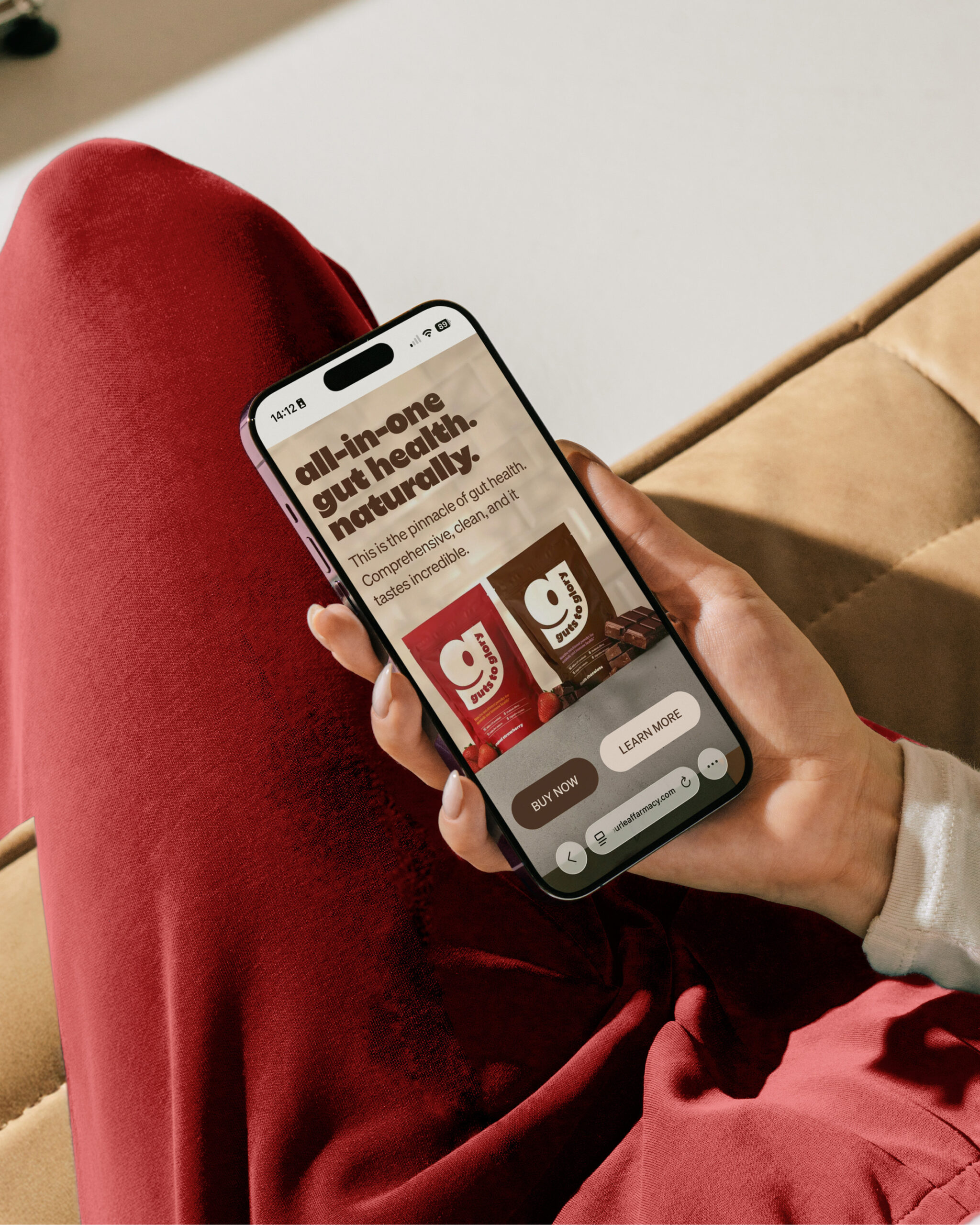
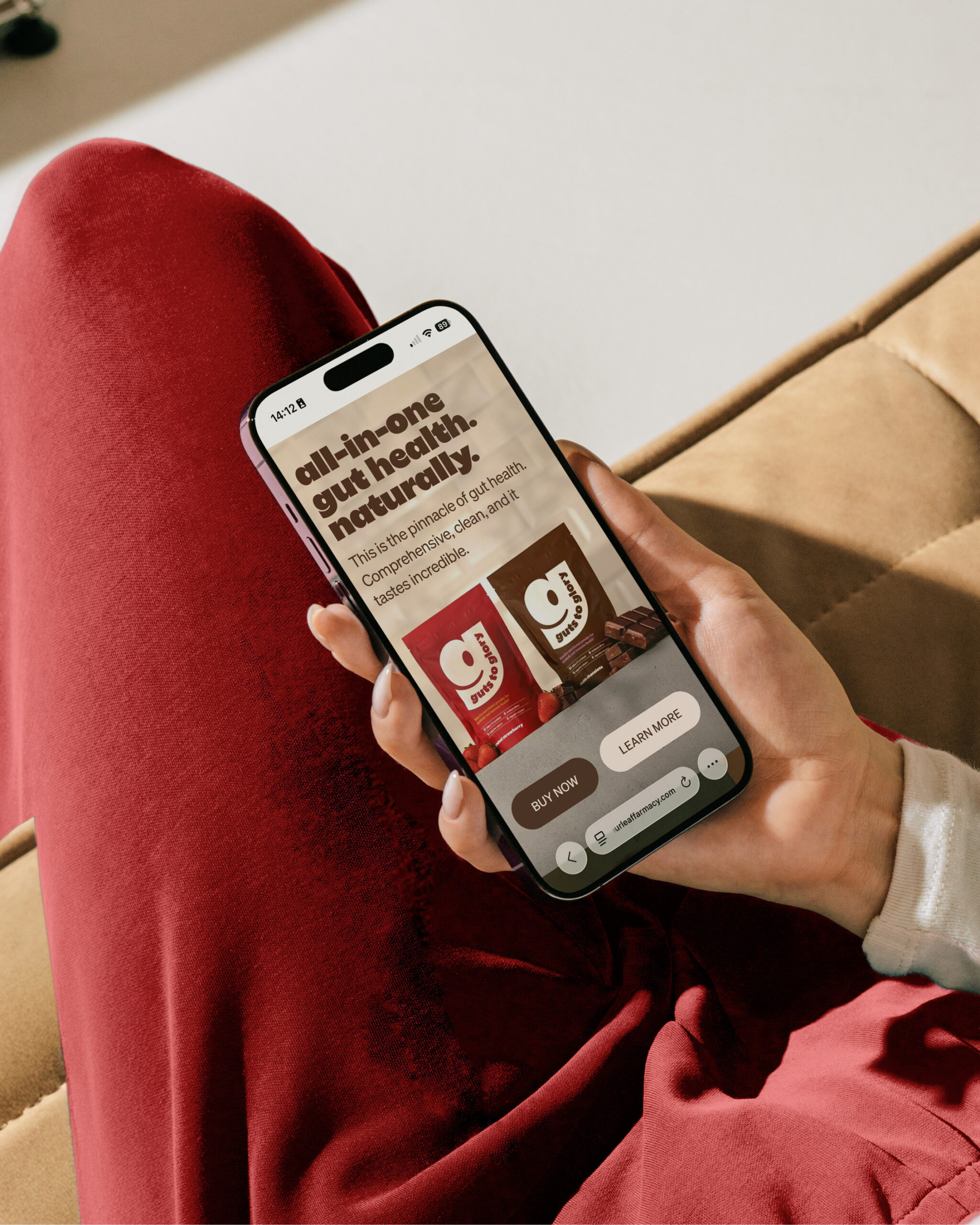
Guts to Glory, from Four Leaf Farmacy, makes gut health powders from 100% whole food ingredients, with no nasties and no fillers. Most gut health brands talk about fixing something that’s broken. Four Leaf Farmacy wanted the opposite: a performance-led brand that moves the category away from repair and towards everyday strength.
CONCEPT
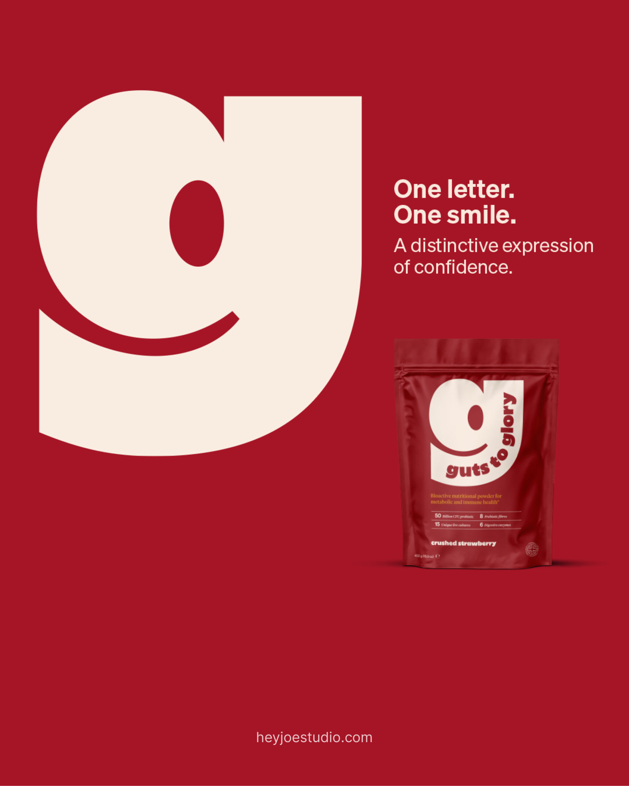
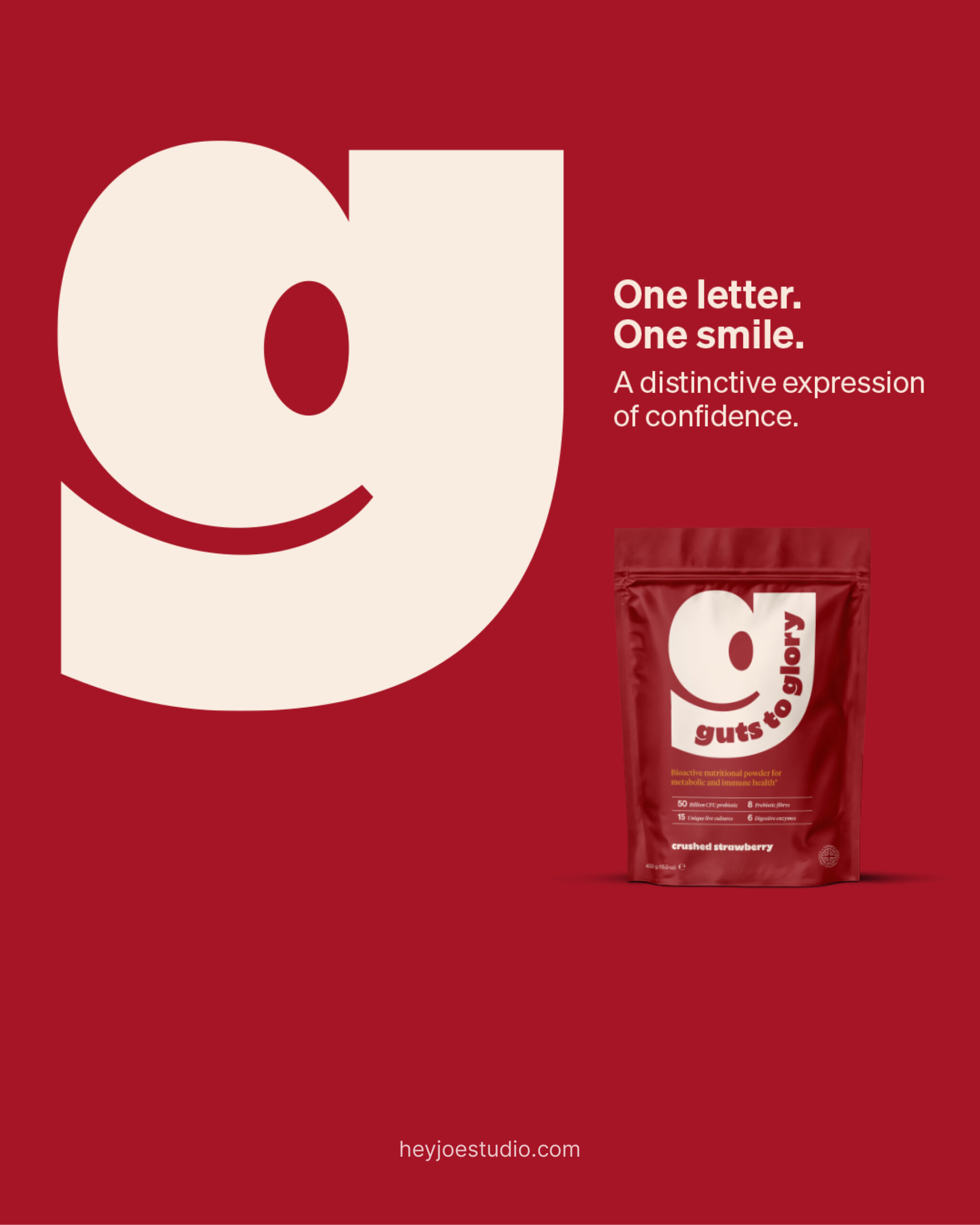
One letter. One smile. One bold move. The identity is built around a confident, smiling “g” that reads instantly as a symbol of gut health and transformation. It takes a category that usually feels clinical and makes it warm, human and impossible to miss on shelf.
SOLUTION
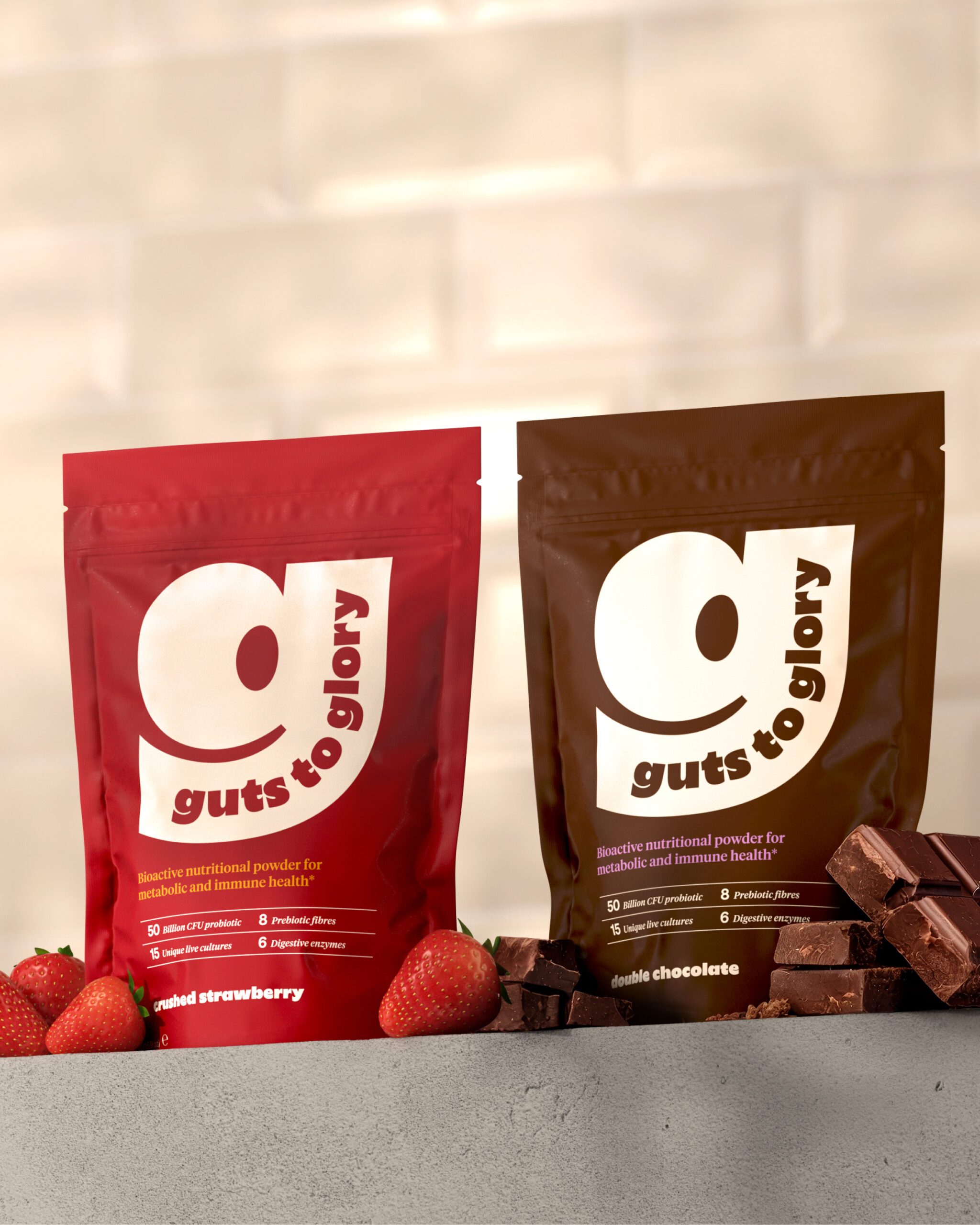
The “g” does a lot of heavy lifting. It’s the logo, the pattern, the pack hero and the social star. Because of that, Four Leaf Farmacy can add new products to the range without starting from scratch.
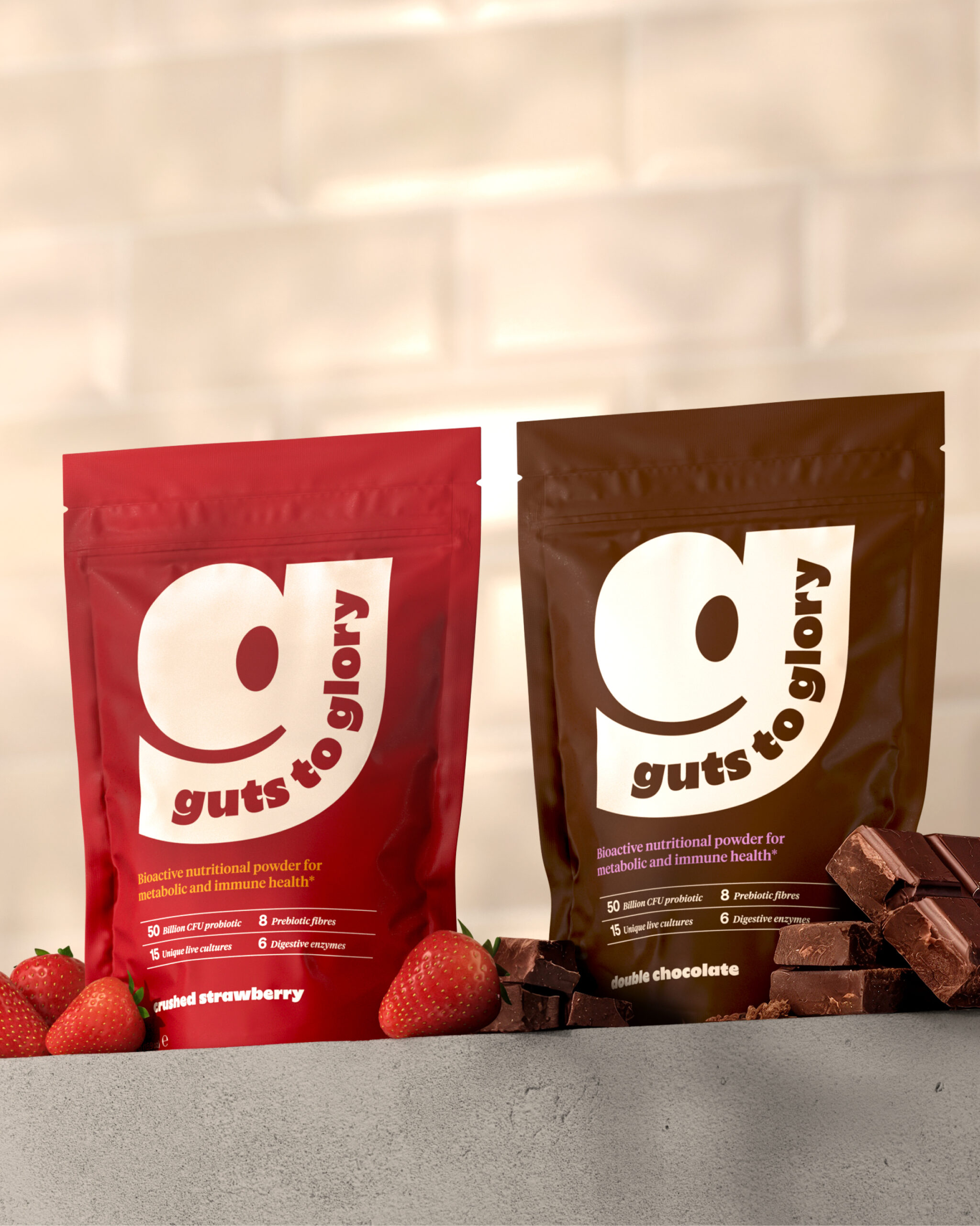
Colour does the flavour work. Crushed Strawberry pairs with Honey Burst, and Double Chocolate pairs with Lavender Lift, a soft nod to familiar confectionery cues. Milky Glow ties the range together, inspired by the milk the powder is mixed with.
TECHNIQUE
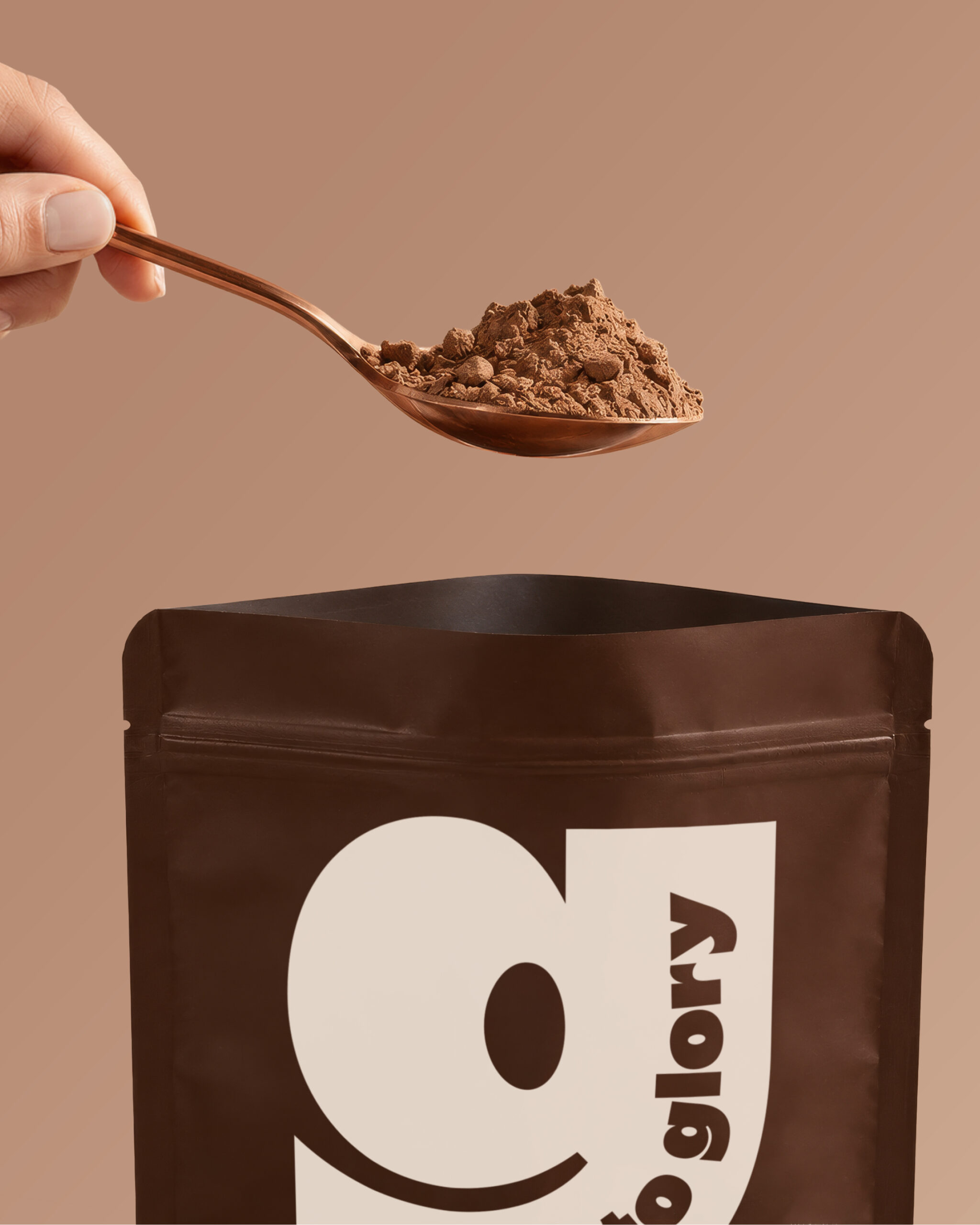
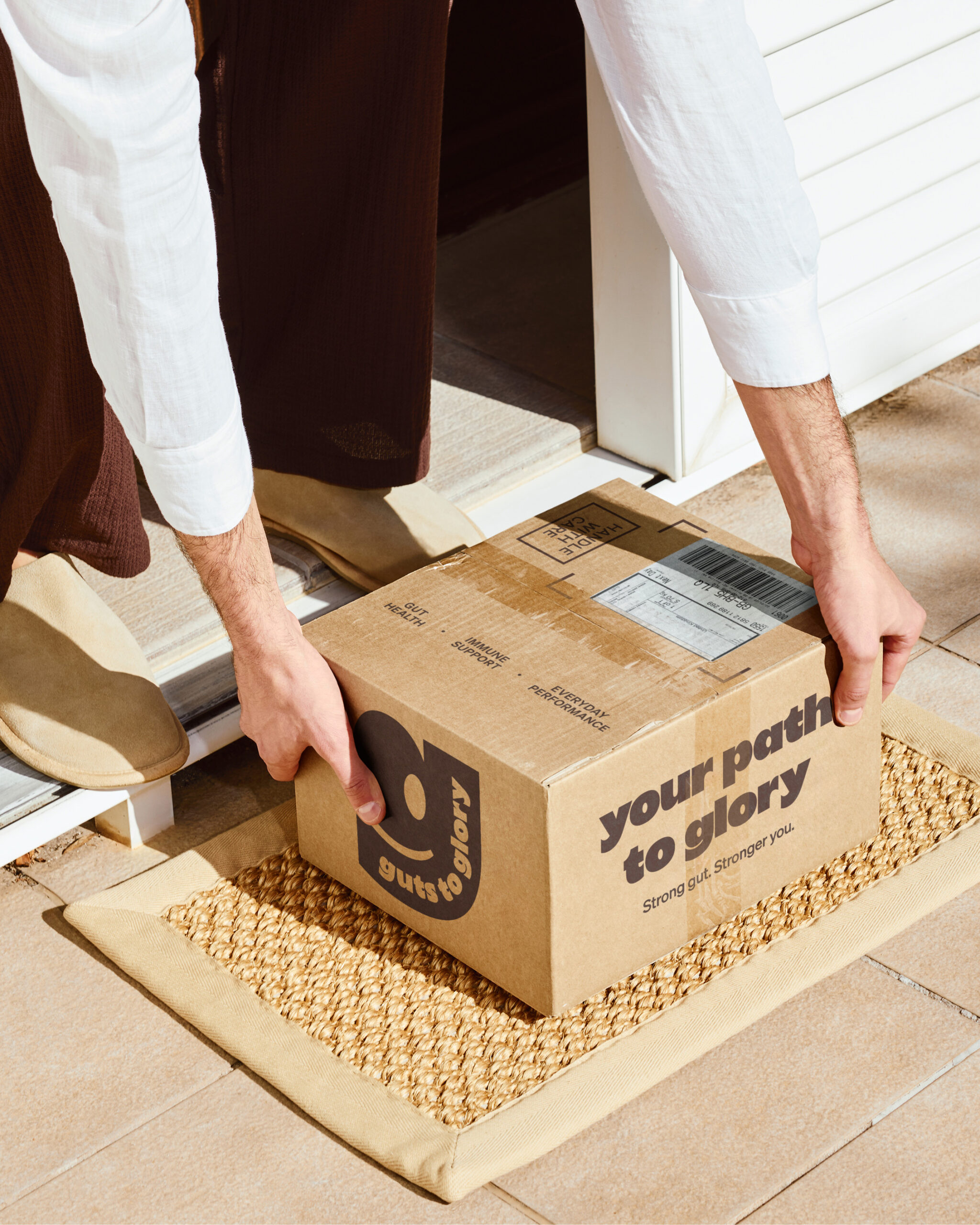
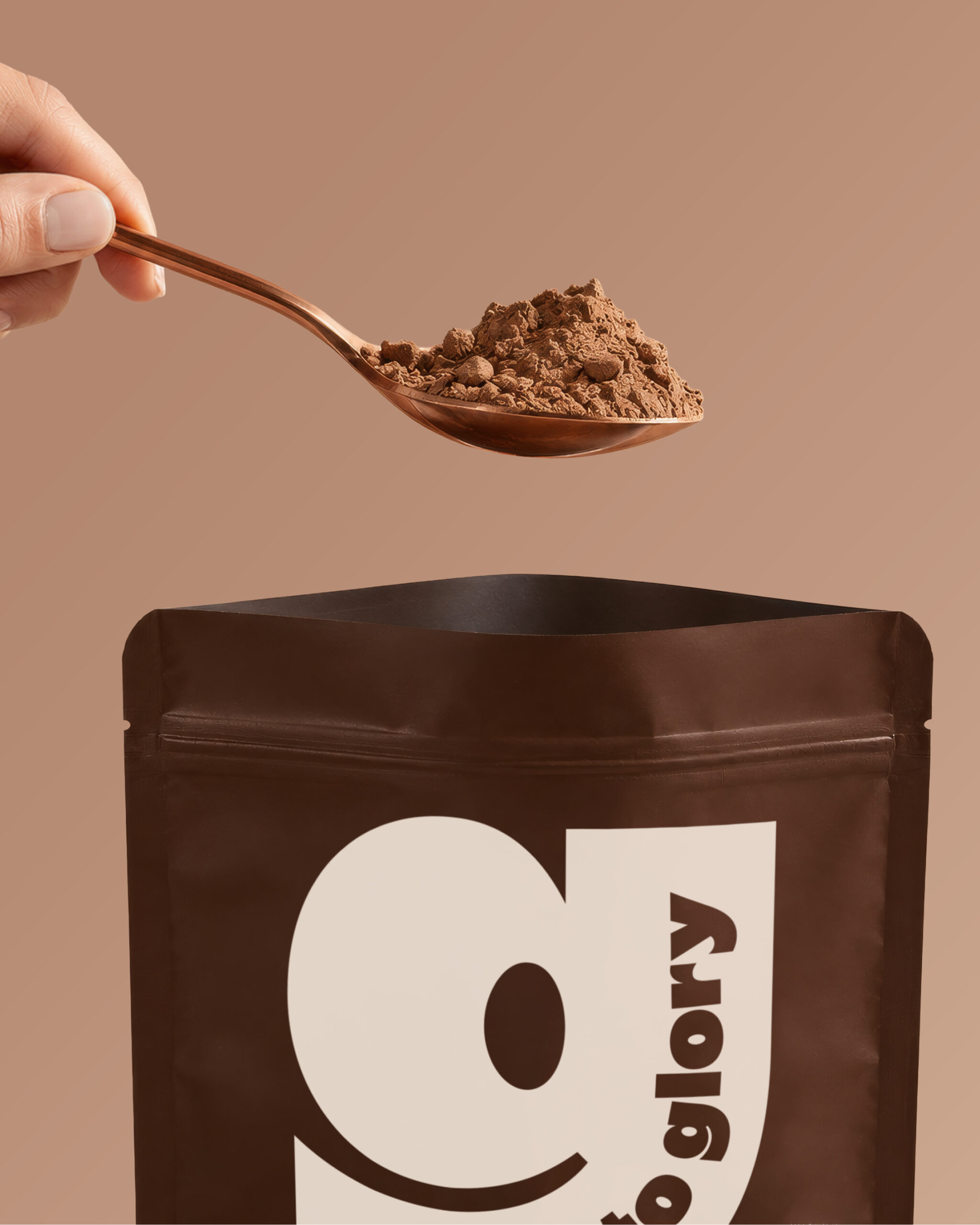
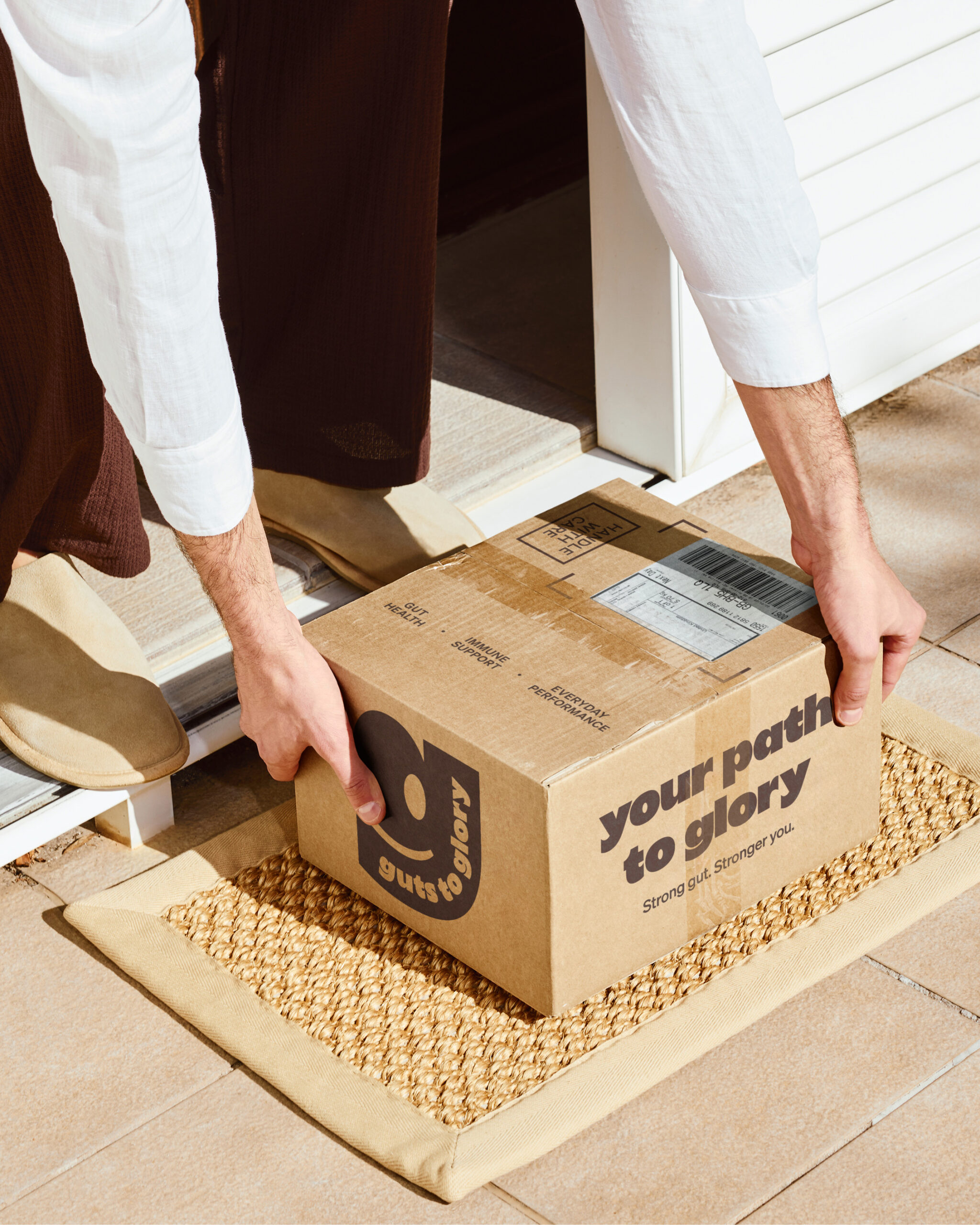
The “g” is drawn with a round bowl and sharp, square-cut edges, so it feels friendly and strong at the same time. Bold typography carries the system across pouches, the direct-to-door shipping box (your path to glory), merchandise, social and motion. That includes an animated “g” that brings the smile to life.
WHAT MAKES IT UNIQUE
Gut health packaging tends to look like medicine. Guts to Glory looks like it’s on your side. A single character holds the whole brand together, so it stays simple on shelf but flexes across every touchpoint.
RESULT
A gut health brand with real personality and a system built to grow. Guts to Glory was shortlisted at the Pentawards 2026.
CREDITS
Brand identity & packaging: Hey Joe Studio, Bournemouth, UK
Client: Four Leaf Farmacy


 Derrick Lin
 Sophiagdotcom
 Sofia Nikishina
 studionerius
 monther al omari
 Monroe
 KateChachava
 Snob Duck
 宏洛图品牌设计HONGLT
 Studio Six F
 Just Design
 New Century Design
 VIEWPOINT
 Abbydraw Designs Unique Conceptual Branding & Packaging Designing Ideas
 BexNelson
 Vladimir Shmoylov
 Kris
 Agence des Coteaux
 Julia M.
 Rabia zouina
 www.branding.uz
 Diego Alves do Amaral
 studioaslihan
 Minim Brand Design