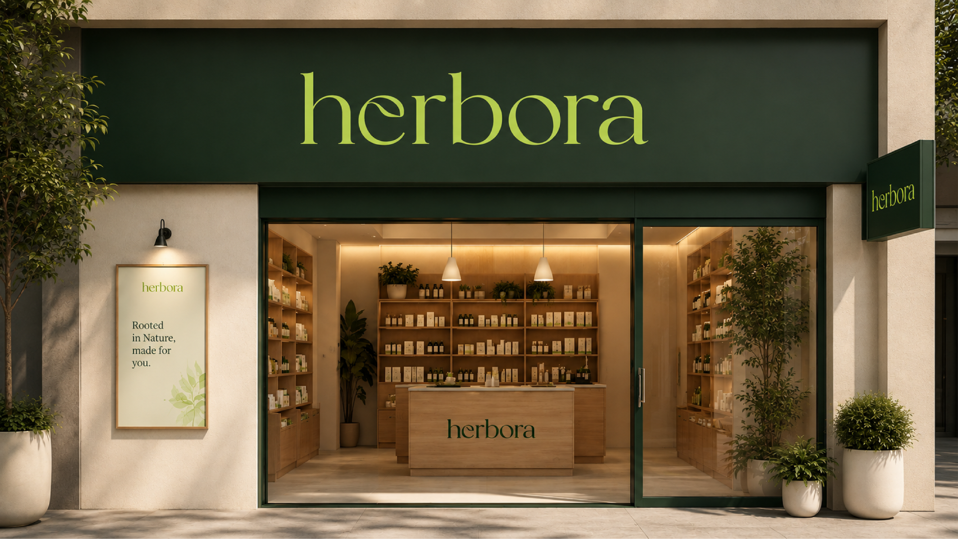

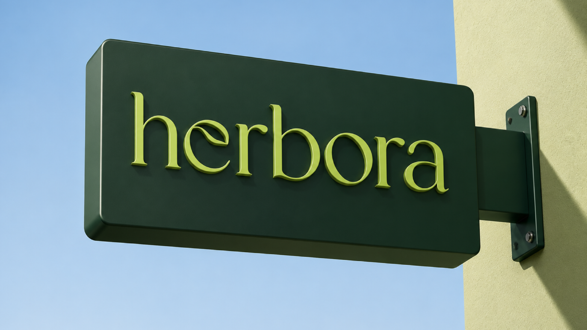
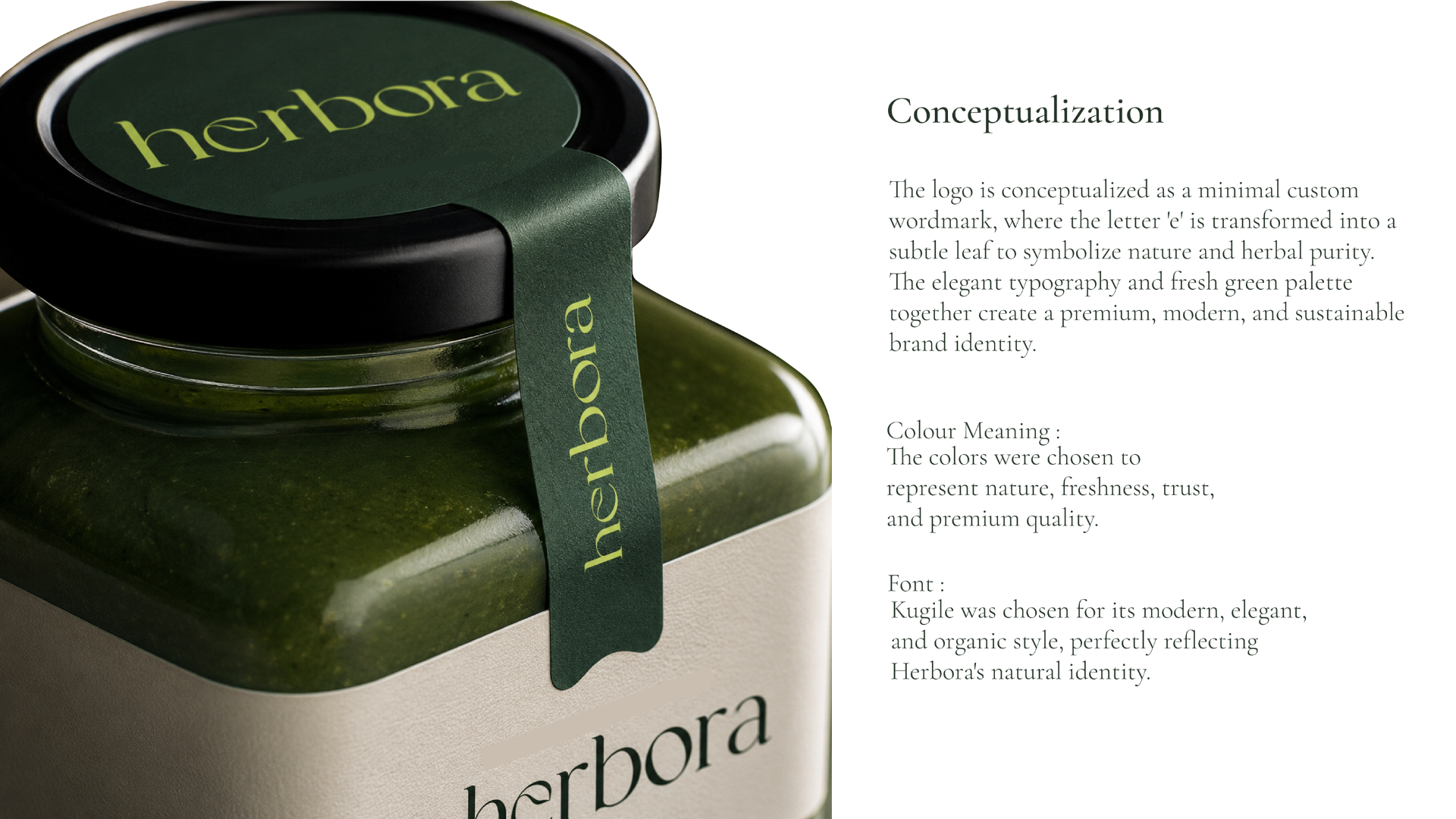
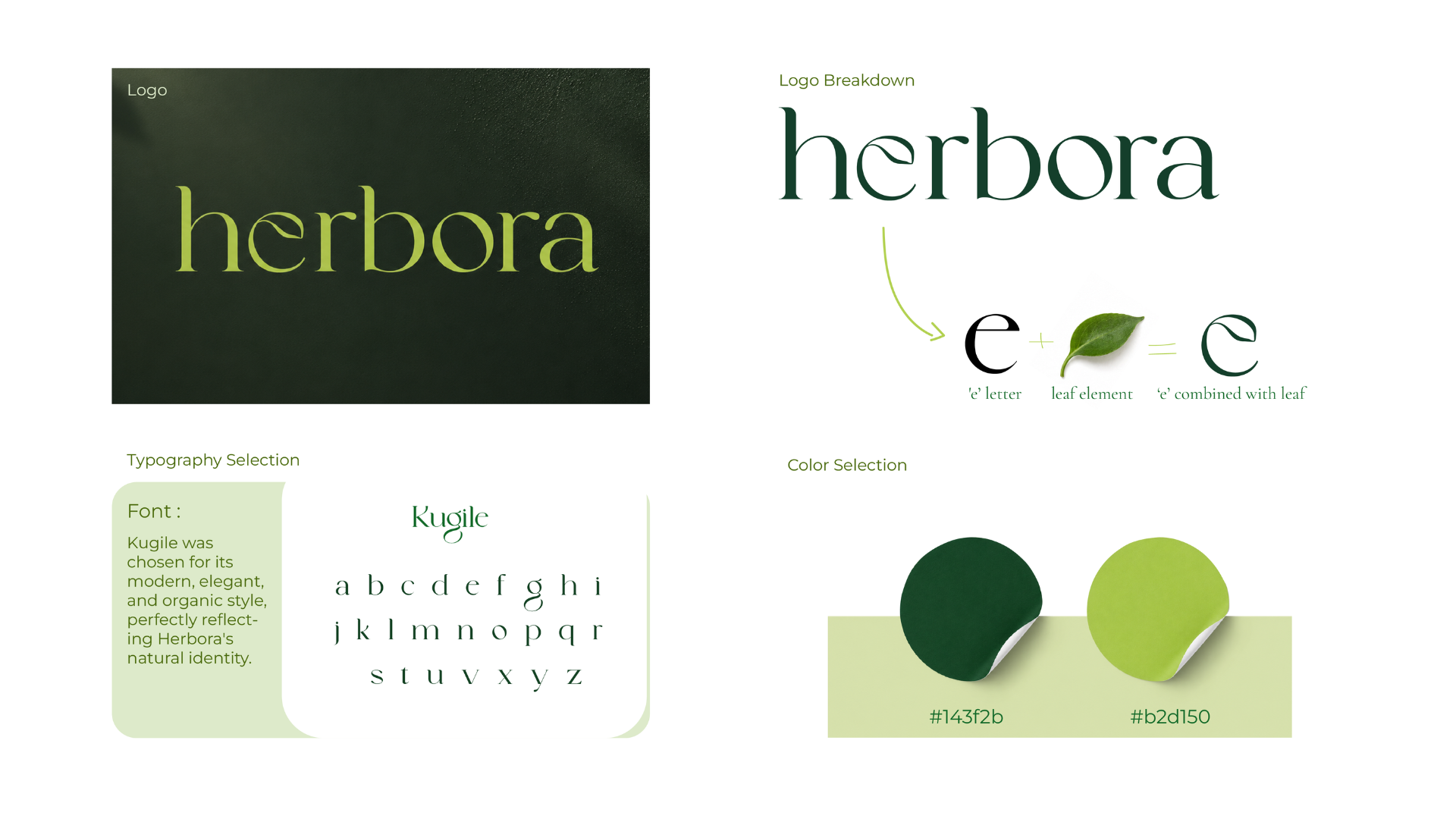
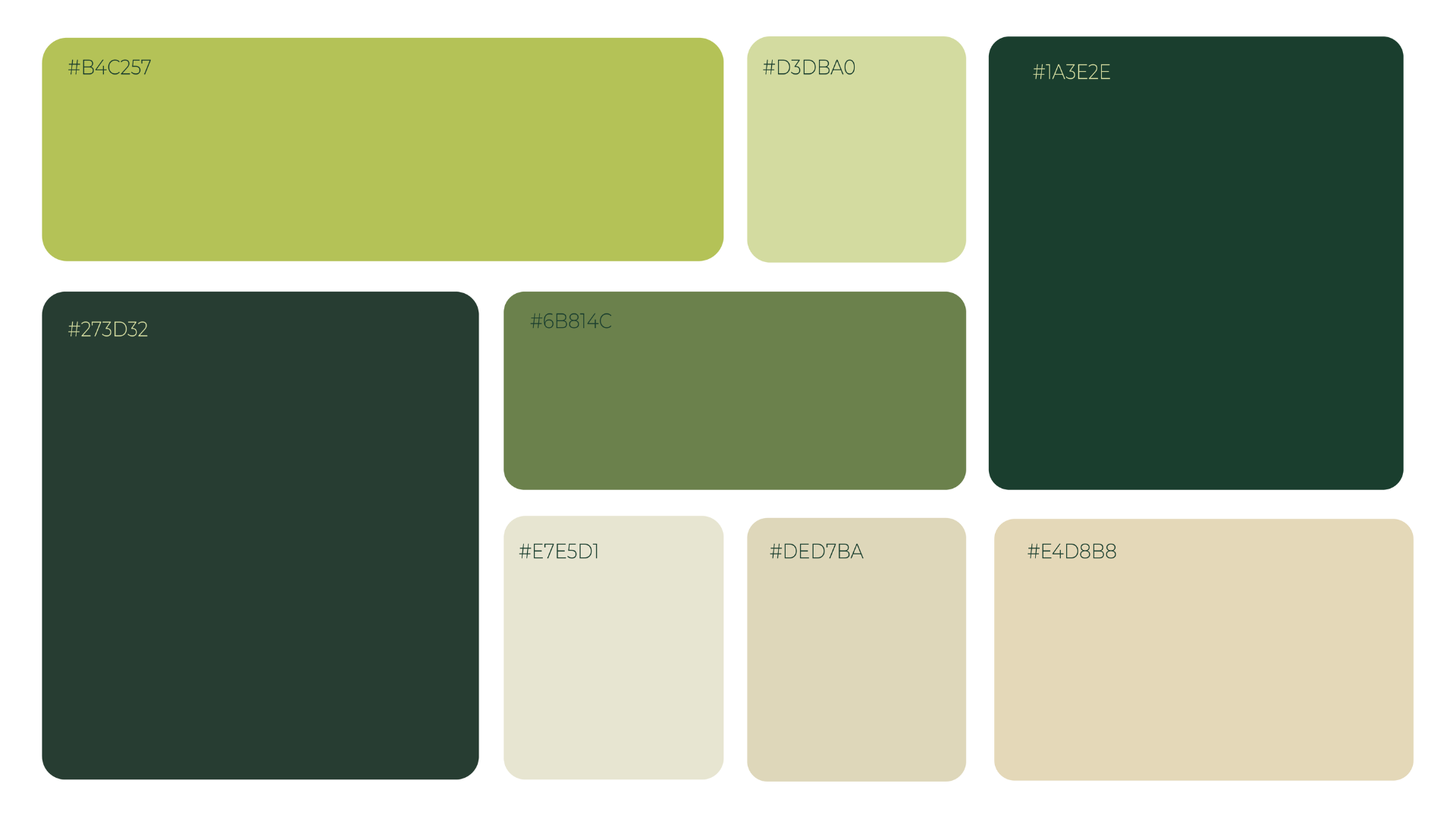
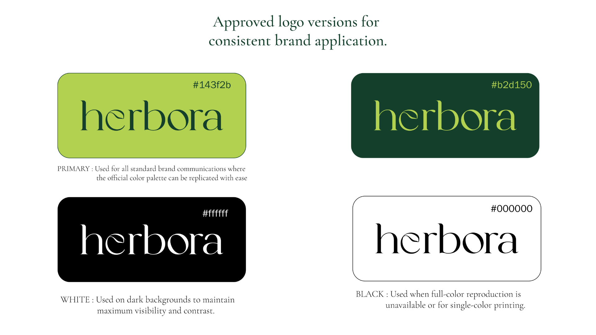
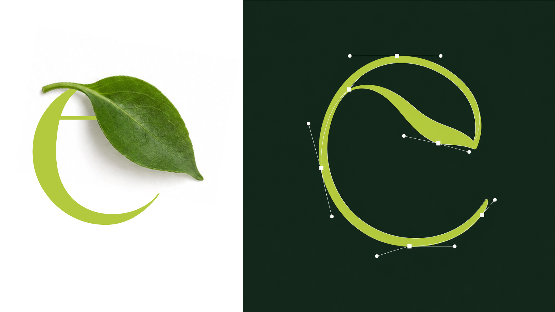
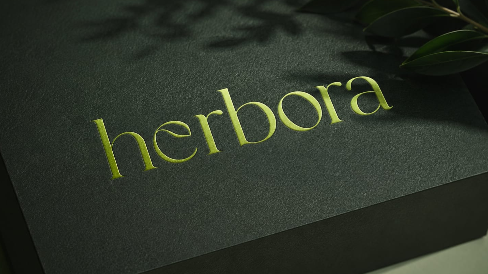
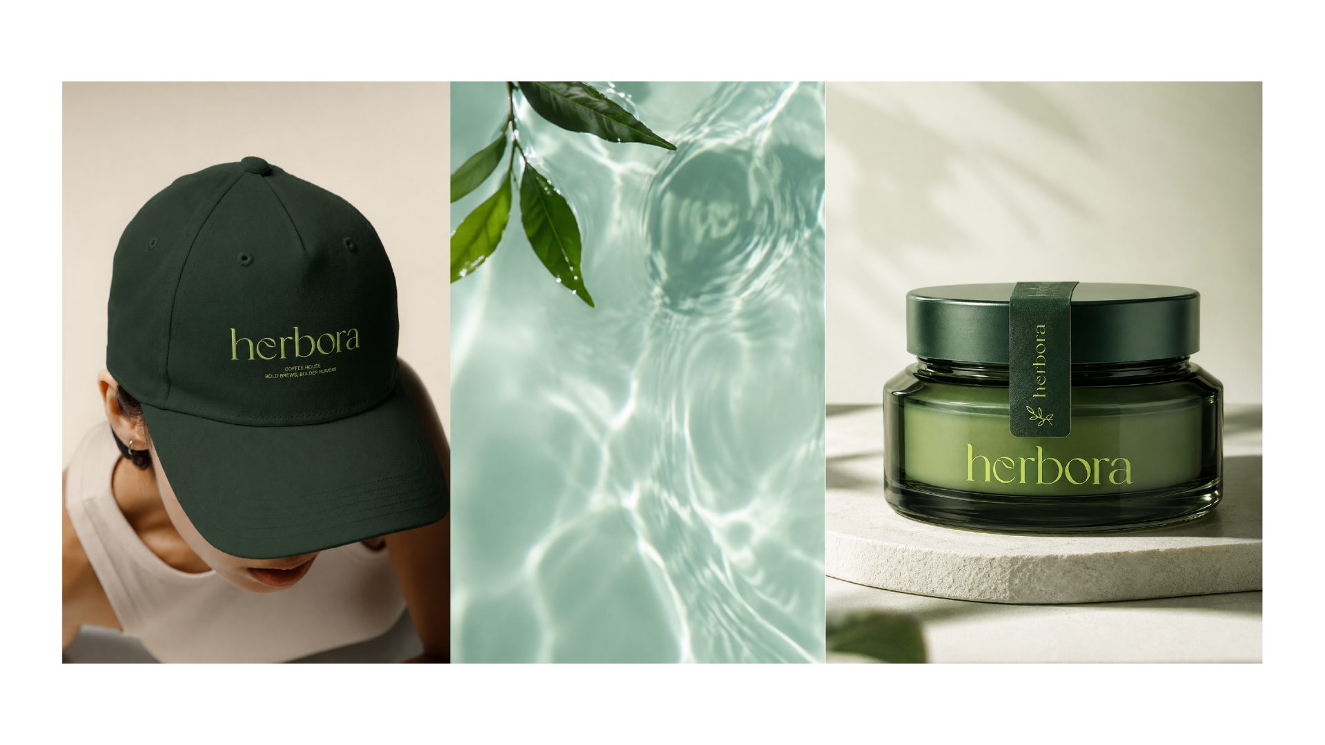
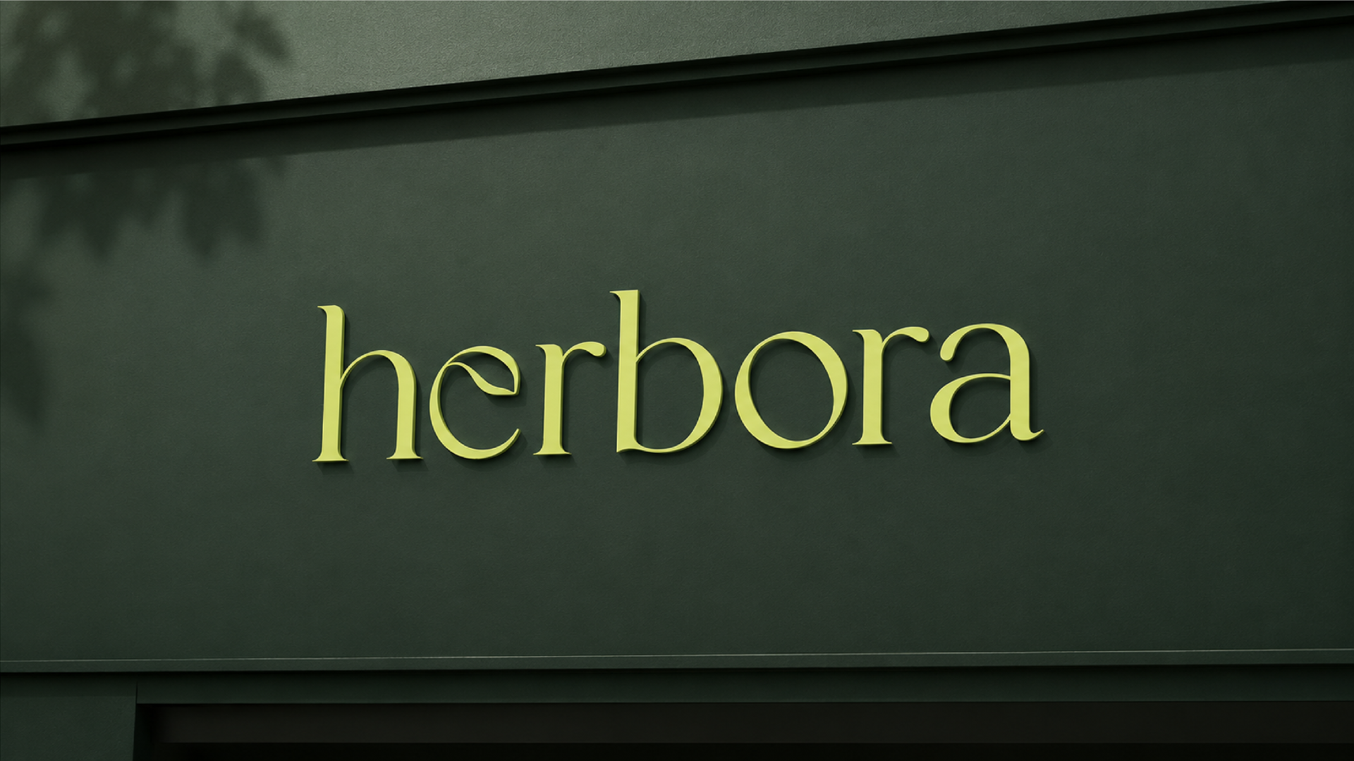
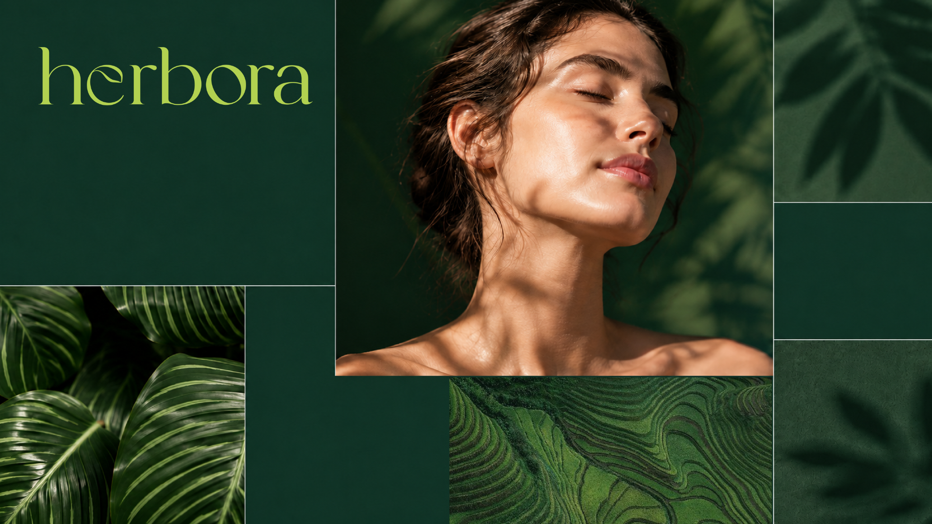
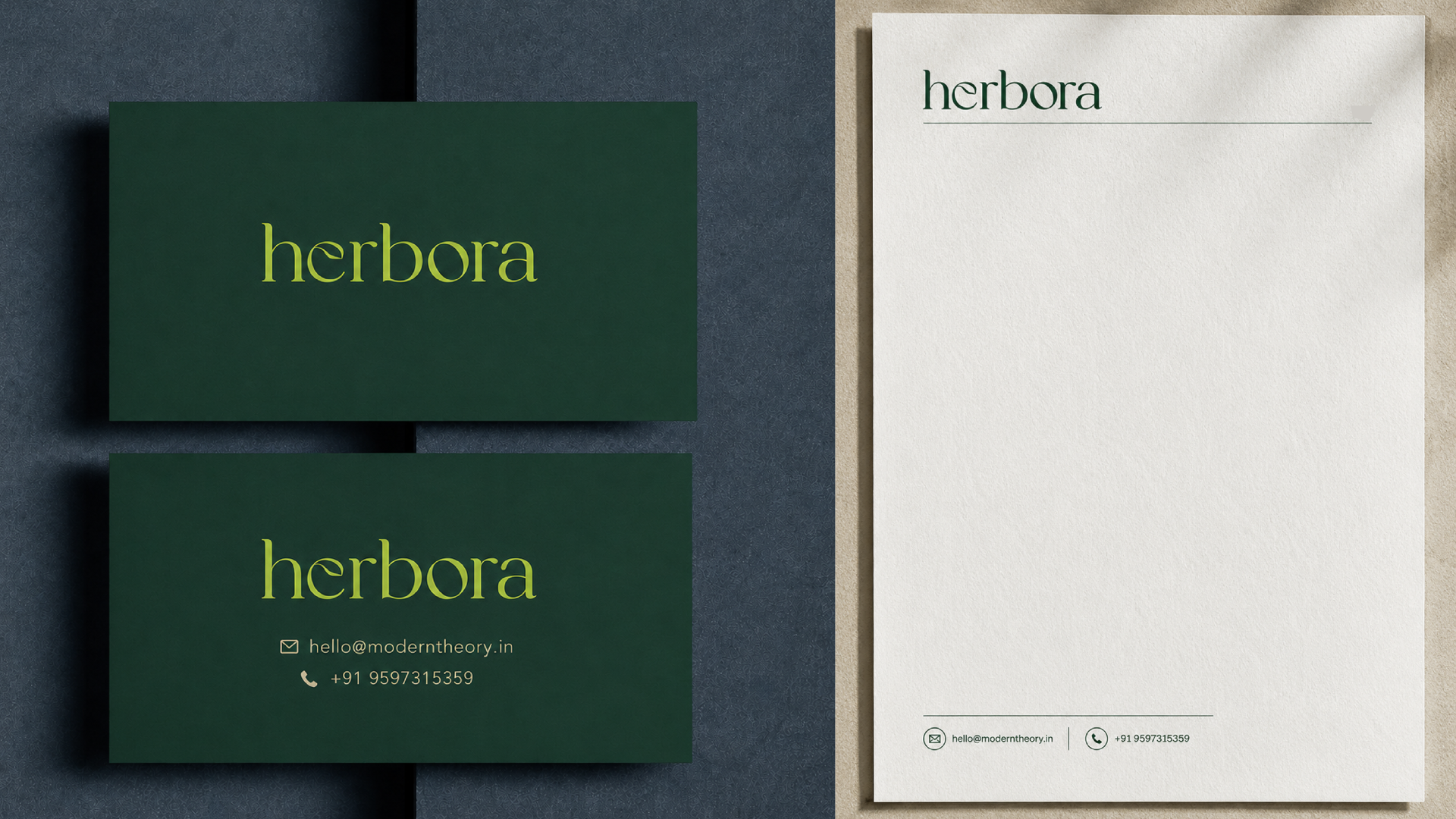
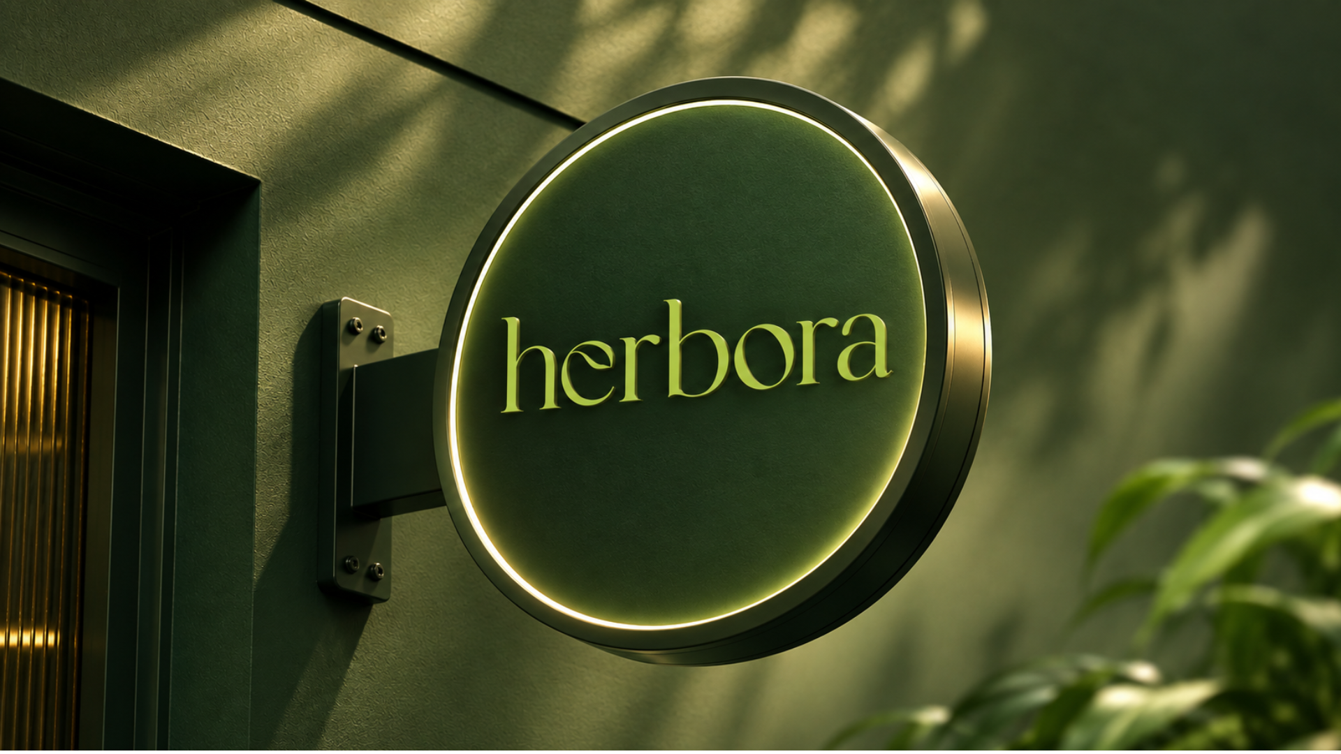
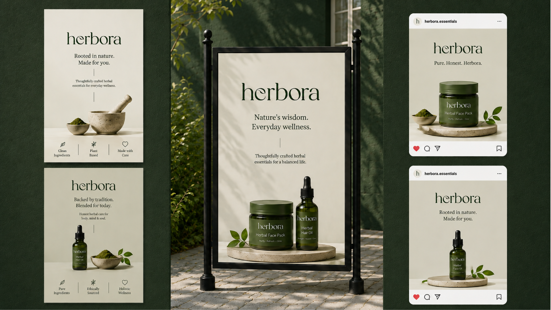
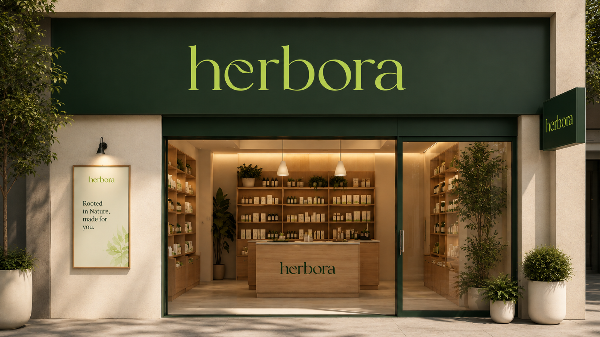
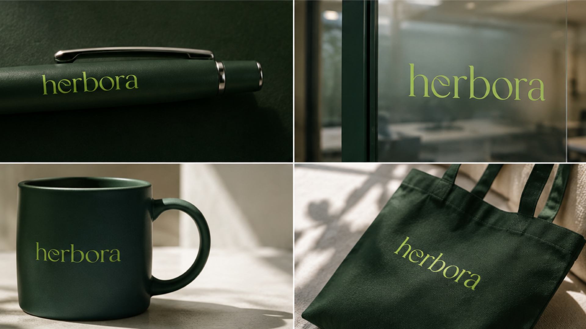
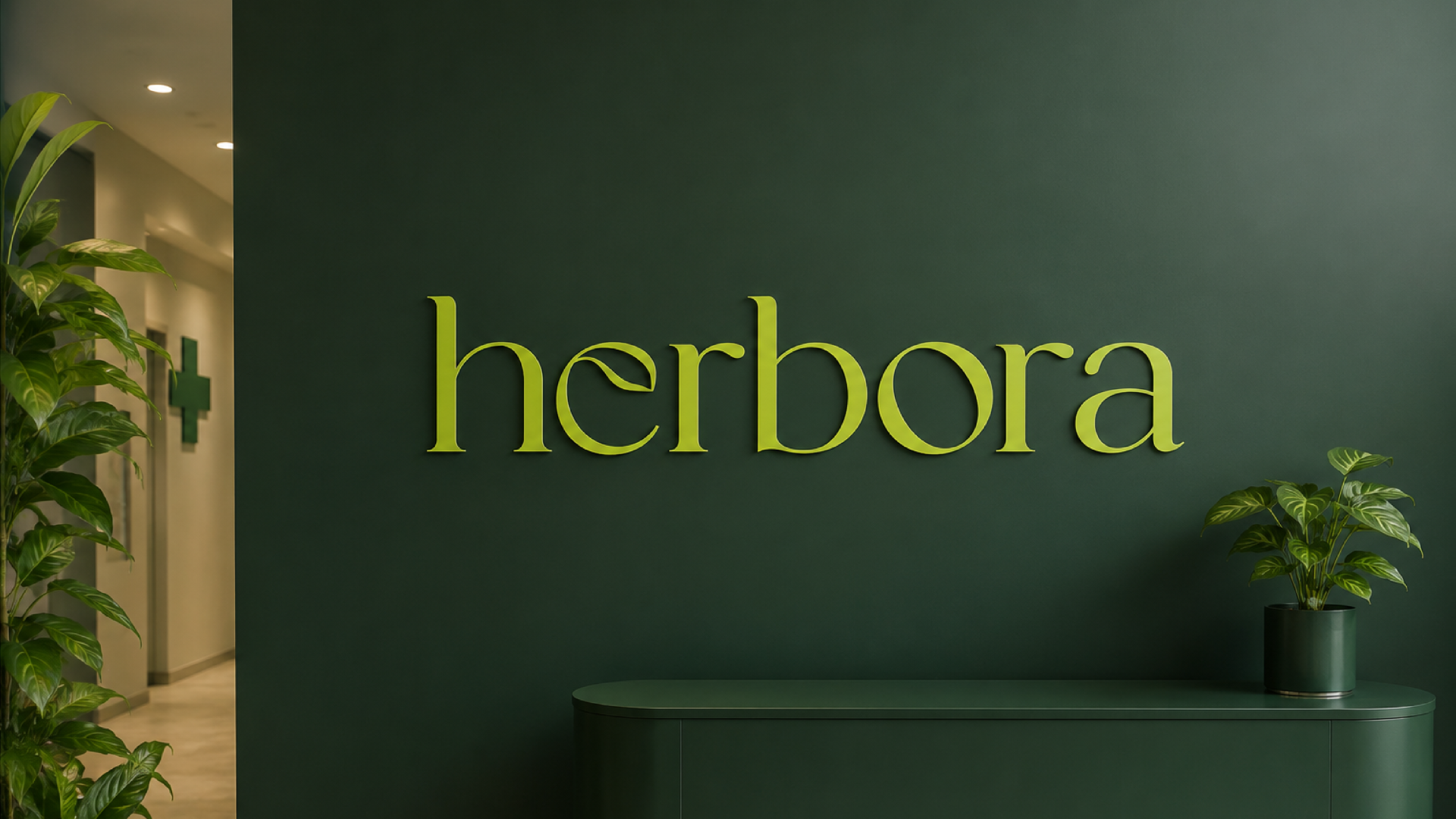
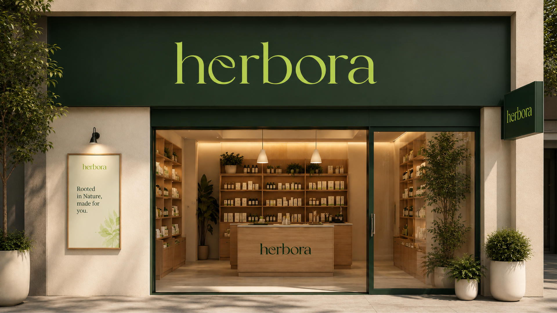
Herbora is a modern herbal wellness brand founded on the purity and restorative power of nature. The project reimagines traditional herbal care through a contemporary visual language designed to feel natural, effective and trustworthy. The identity avoids predictable botanical illustrations in favour of a refined typographic concept. A subtle leaf is integrated into the letter “e” of the custom Herbora wordmark, bringing herbal symbolism directly into the brand name. This detail creates a recognisable visual signature while maintaining the identity’s minimal and premium character. The colour palette draws from the natural environment. Deep forest green communicates trust, balance and holistic wellness, while fresh leaf green represents growth, vitality and renewal. Warm neutral tones soften the system and support a calm, contemporary skincare experience. The packaging uses clean layouts, carefully considered spacing and elegant typography to create clarity and strong shelf presence. The identity extends consistently across jars, stationery, environmental graphics, retail displays, digital campaigns and branded merchandise. Guided by the message “Rooted in Nature, Made for You,” Herbora connects the wisdom of herbal care with the needs and expectations of modern consumers.
 Up-Brands
 Almighty
 Desember Design Studio
 Daria Levina
 Yuliya Likhacheva
 carola matalinares
 daniitenaa
 StudioMordius
 Simon Pendry Creative
 Sti&Co Design
 Yasmin Sherif
 Roberto De Simone
 aseelstudio
 Rabia zouina
 UPRISE
 HazelBishop
 Qianyu Liu
 siyajacob
 Rohan Barwal | D2C Brand Identity, Logo & Packaging Designer
 Karen Salem
 omarchafik
 nastyaabeketova
 Roberto Núñez Studio