

Overview
Hibr is a premium artisan ink atelier built on over a thousand years of Arabic manuscript tradition. The brand takes its name from the classical Arabic word for “ink,” a term that appears in scribal treatises as early as the 9th century, referencing not just the liquid but its continuity, its extension through time.
The Challenge
The design problem was structural. There is no premium, Arabic-origin ink brand anywhere in the world. Competitors like Arcalliq and Arabic Calligraphy Supplies serve the practitioner market on function alone, with no cultural narrative and no design investment. Western heritage brands J. Herbin, founded in 1670, and Pilot Iroshizuku have proven the model: origin story plus poetic naming system plus considered packaging equals collector-grade appeal.
The Solution
The solution was to design an identity that showcased the history and depth of the ink industry in a modern way. The Arabic logo was constructed in a free-form, italic script to express the freedom and flexibility of ink in writing, with the word “hibr” modified to suit the identity’s direction and flexibility, creating harmony with the Arabic logo.
Packaging System
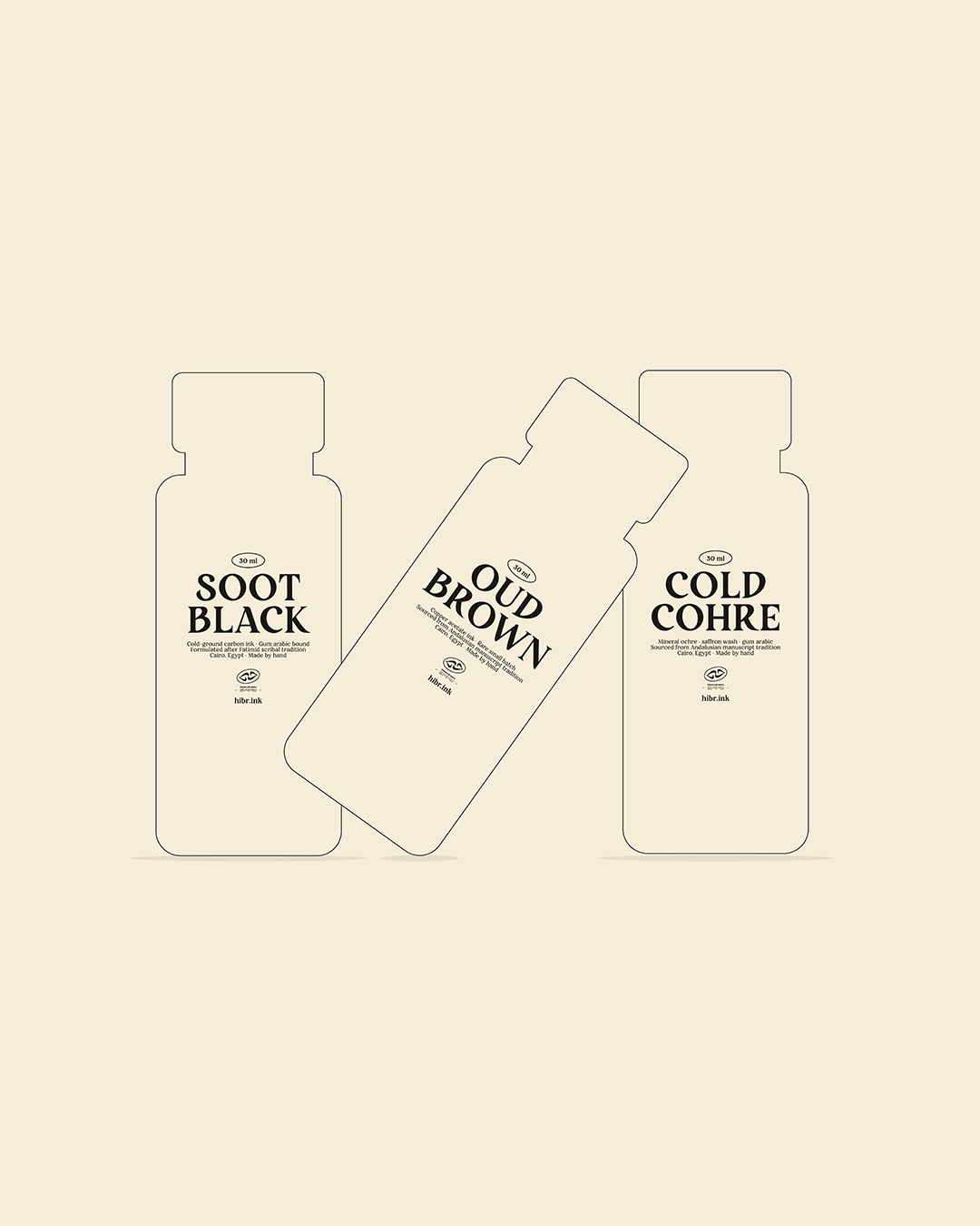
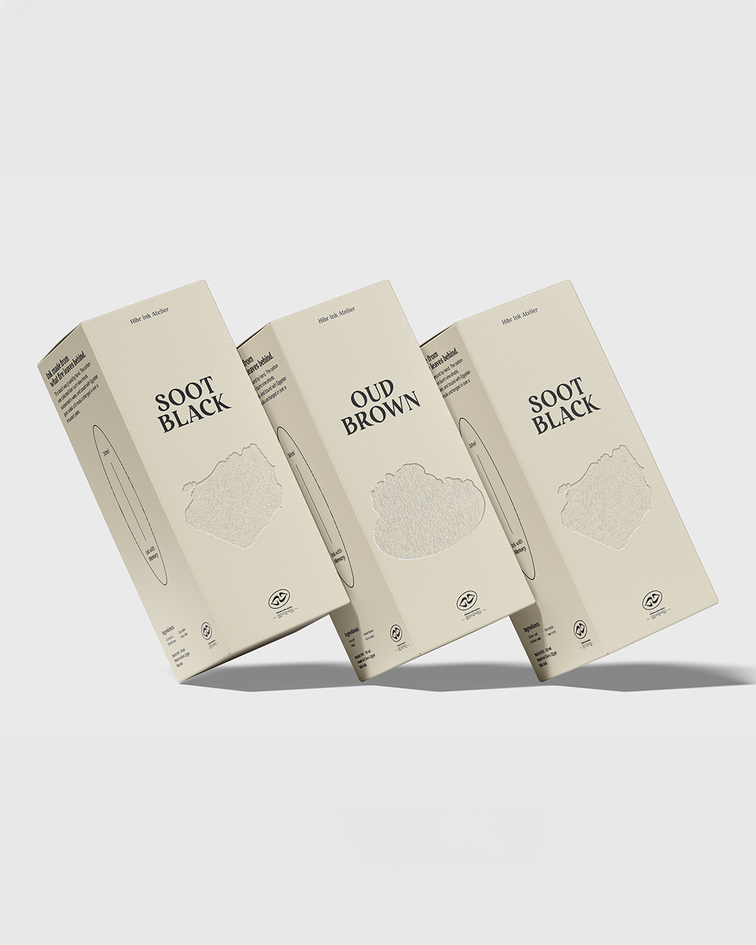
In the packaging design, visual elements inspired by ink components such as soot, gum arabic, and gallnut tannin were used and integrated harmoniously with the outer packaging and bottles to create coherent and interconnected visual products.





 Stefano Bracci
 Backbar Studios
 Leyma Design
 AUN BRANDS
 Melo Studio
 Agniya Karelskaya
 monther al omari
 Blend Strategy Company
 宏洛图品牌设计HONGLT
 M.I.L.K.
 madns
madns Oksana
 EvaArias
 Sara Trefz
 Heramb Arora
 Carreto Concepts Design Studio
 Modern Theory
 DESIGN CONCEPTS
 Andrea Del Prete
 Le Studio G
 Julia M.
 eliza
eliza B&WGraphicLab