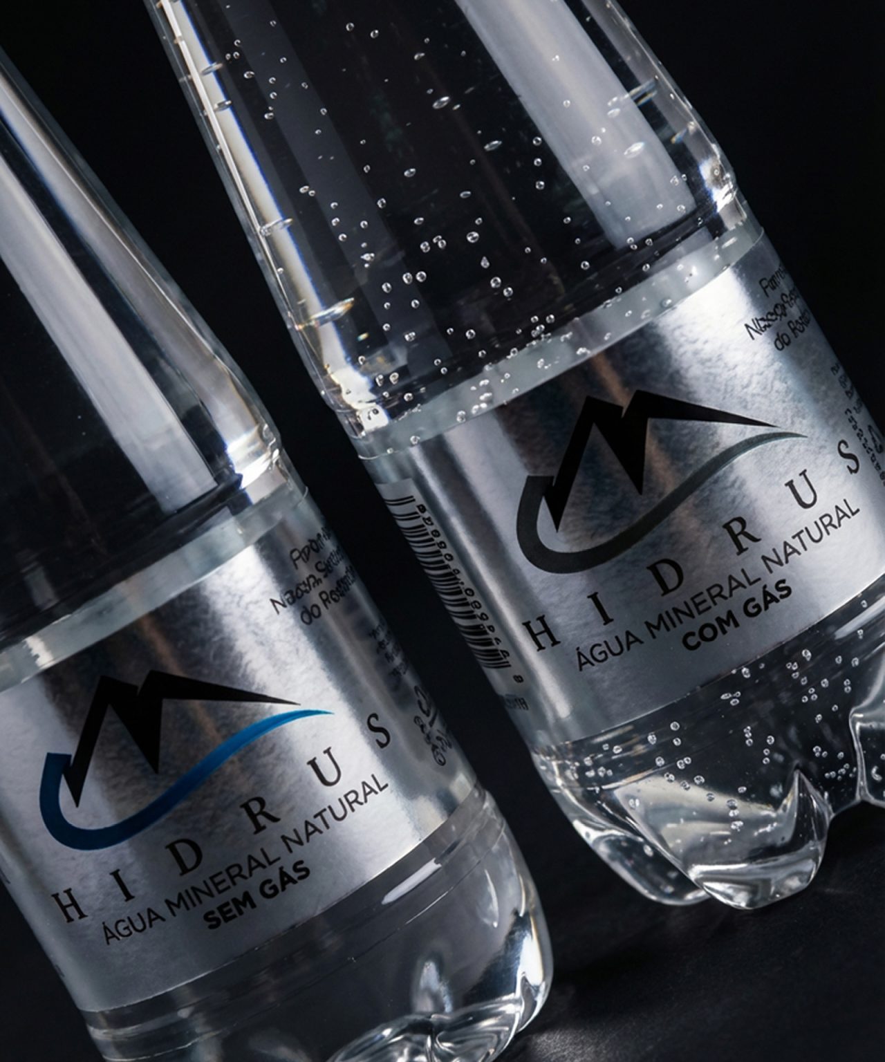

HIDRUS — Premium Mineral Water Packaging Design
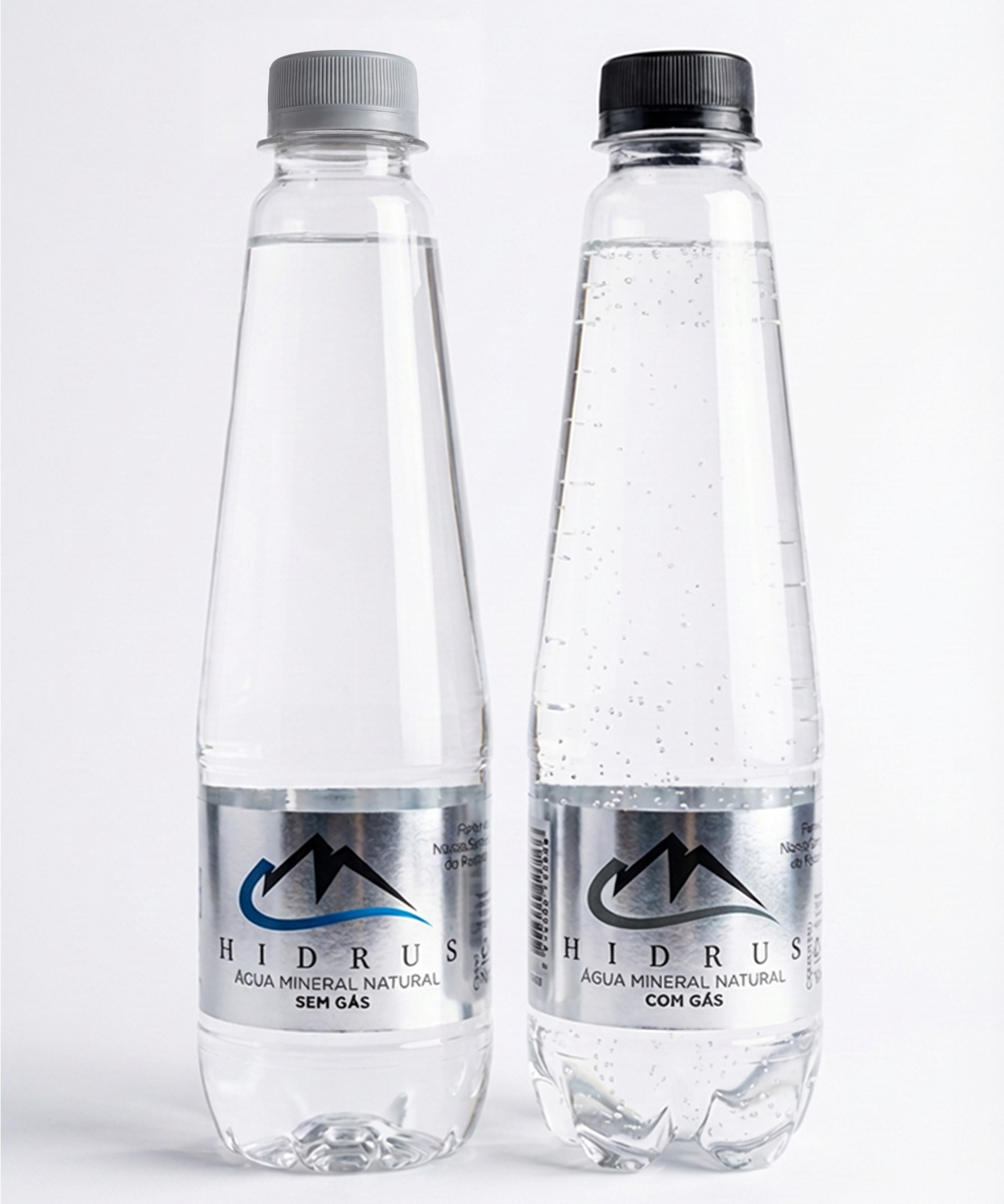
HIDRUS is a natural mineral water brand positioned in the premium segment. The project focused on creating a clean, elegant, and distinctive packaging design that reflects purity, balance, and sophistication.
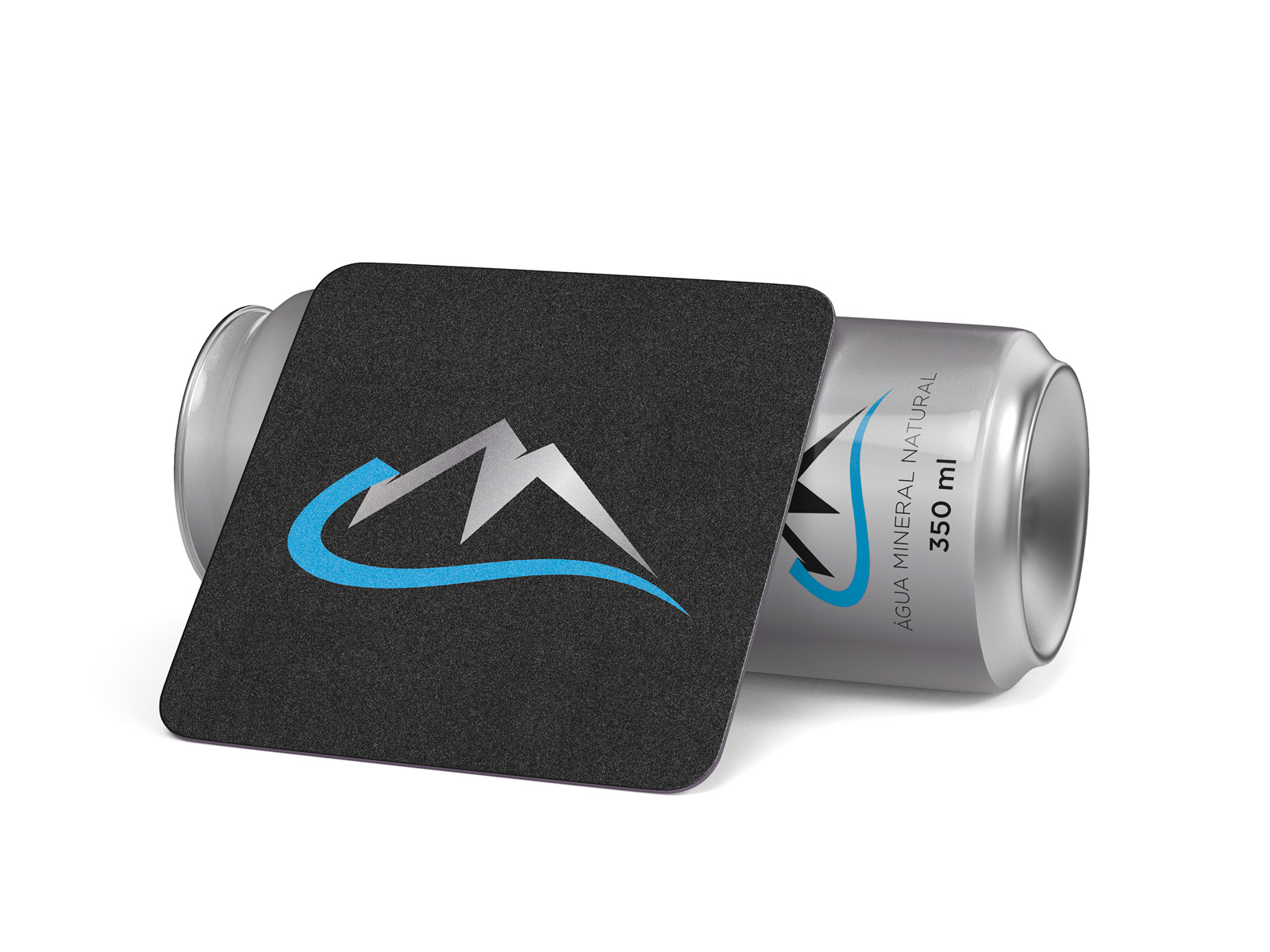
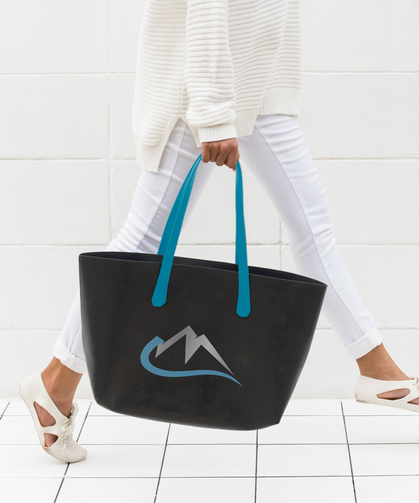
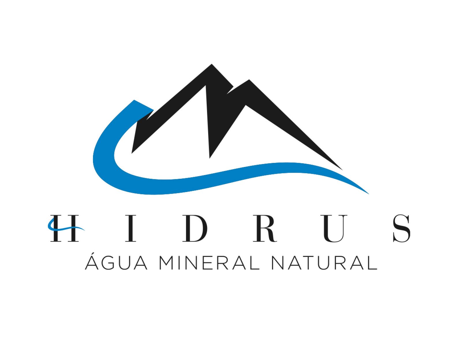
The visual concept is inspired by the origin of water. The symbol combines mountains and flowing water, representing the spring and the natural movement behind the brand name. This idea is translated into a minimal and refined label design, reinforcing clarity and lightness.
The typography was carefully chosen to enhance readability while conveying a sense of quality and premium positioning. Generous spacing and a balanced composition contribute to a calm and sophisticated visual presence on the shelf.
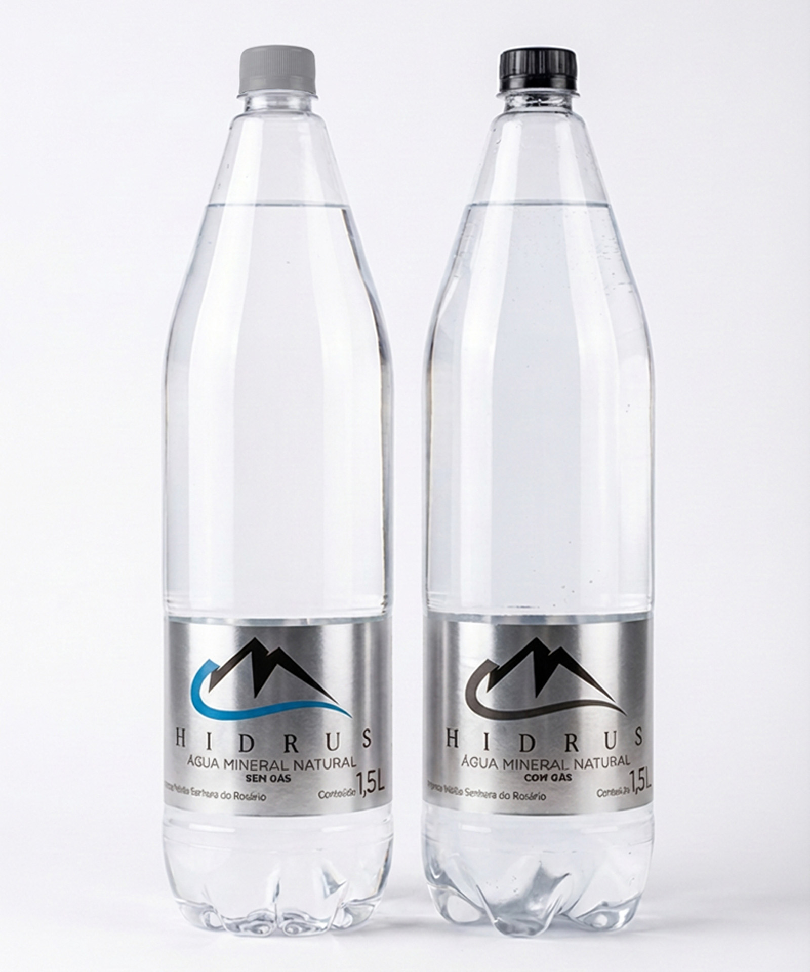
The label system was developed to ensure consistency across different applications, maintaining a strong and recognizable identity in various formats and touchpoints.
The final result is a modern and cohesive packaging solution that highlights the product’s natural origin and strengthens its presence in the premium mineral water market.

 NEV
NEV Stefano Bracci
 Alina
Alina monther al omari
 Lizakjx
 JOAOMARCOSDESIGN
 alchimistestudioParis
 Harriet Neild
 octavio rojo
 宏洛图品牌设计HONGLT
 DESIGN CONCEPTS
 Alexander Skurihin
 Studio K95
 ARMBRAND
 Richa Rai
 houseoferas by Miti
 Agence des Coteaux
 Kushi Eaknath
 Ann Treasa
 Xiao Ning
 krrrrrllii
 babyage
 Deep
Deep