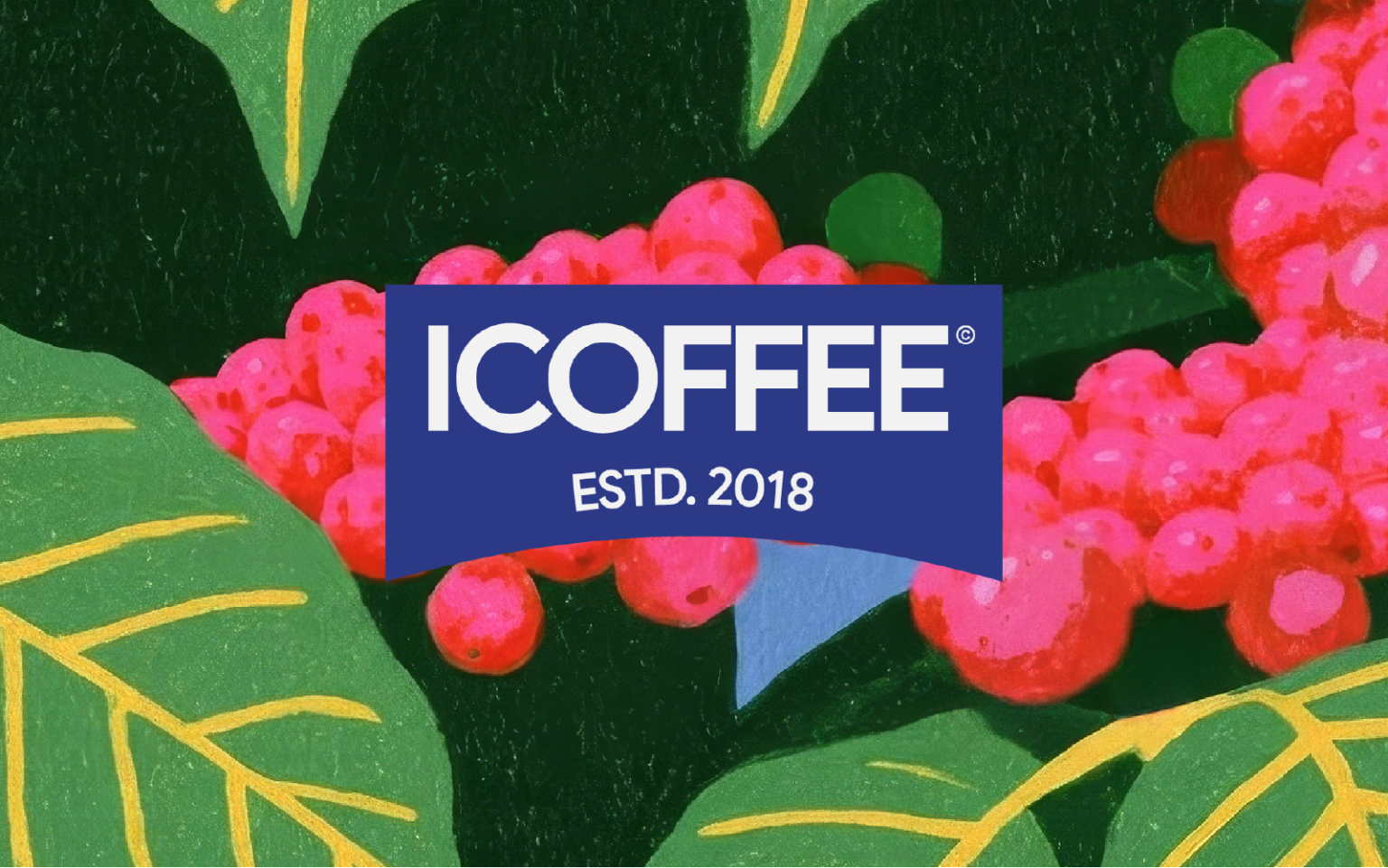

About ICoffee©
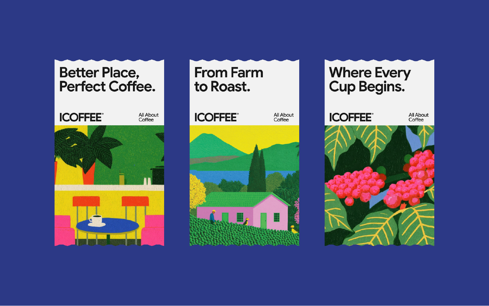
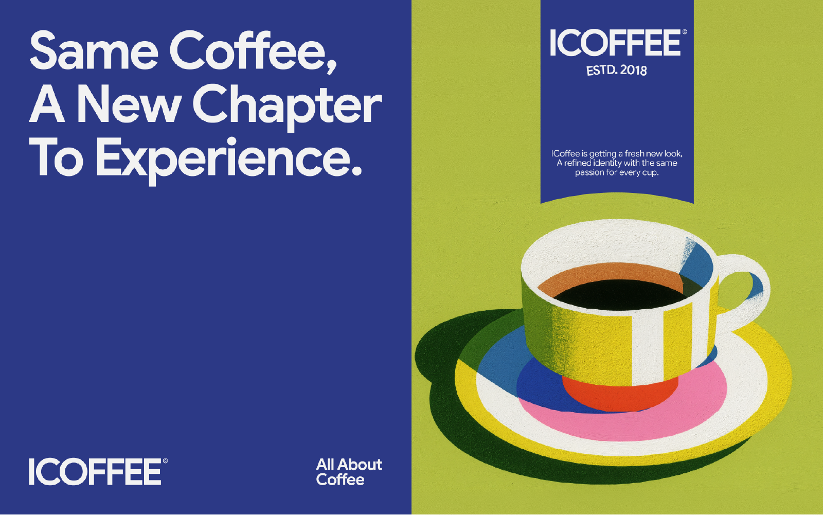
ICOFFEE is all about coffee literally.Built around a love for coffee in all its forms, ICOFFEE brings different coffee cultures, rituals, and tastes together under one distinctive brand. From Arabic and Turkish coffee to Espresso, American and French coffee, the brand celebrates the variety of the coffee experience while keeping it simple, approachable, and full of character. The rebrand gives ICOFFEE a more contemporary and expressive identity one that feels confident on shelf, flexible across different products, and recognizable wherever the brand appears. “All About Coffee” became more than a tagline. It became the idea behind the entire identity: one brand, many ways to experience coffee.
Creative Direction
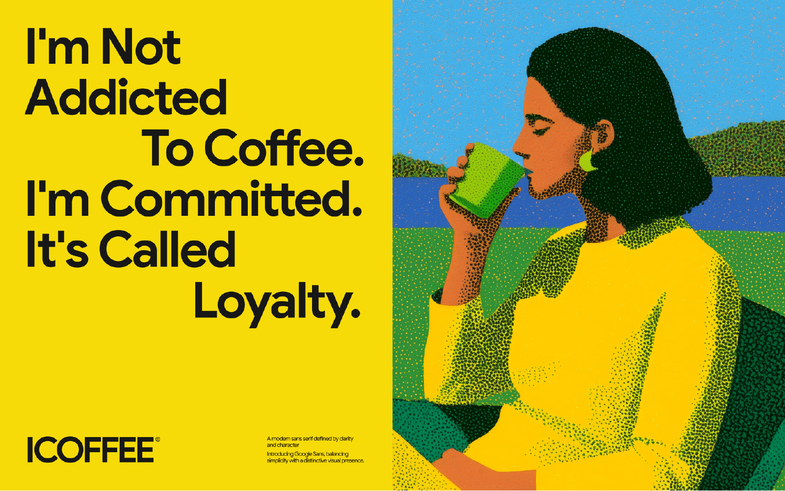
The creative direction was built around one central idea “Coffee can be familiar without looking familiar”
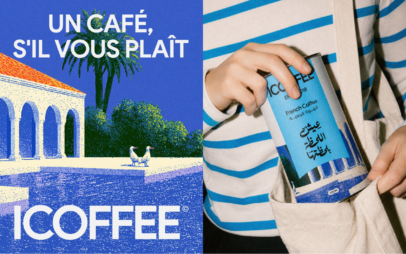
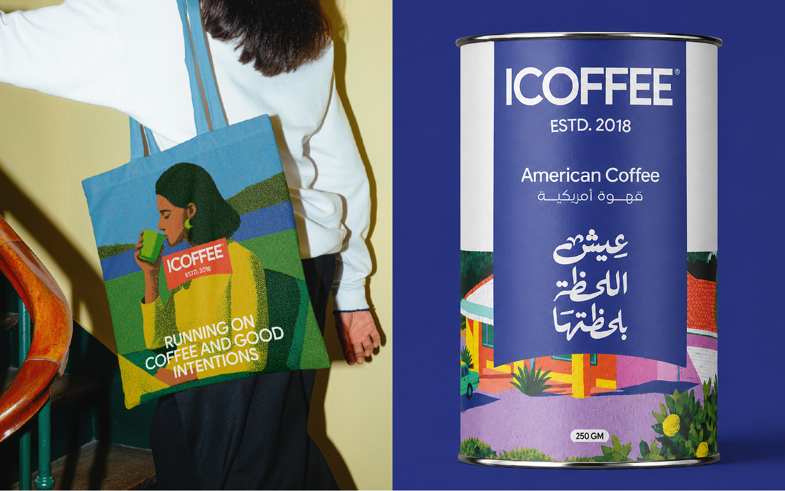
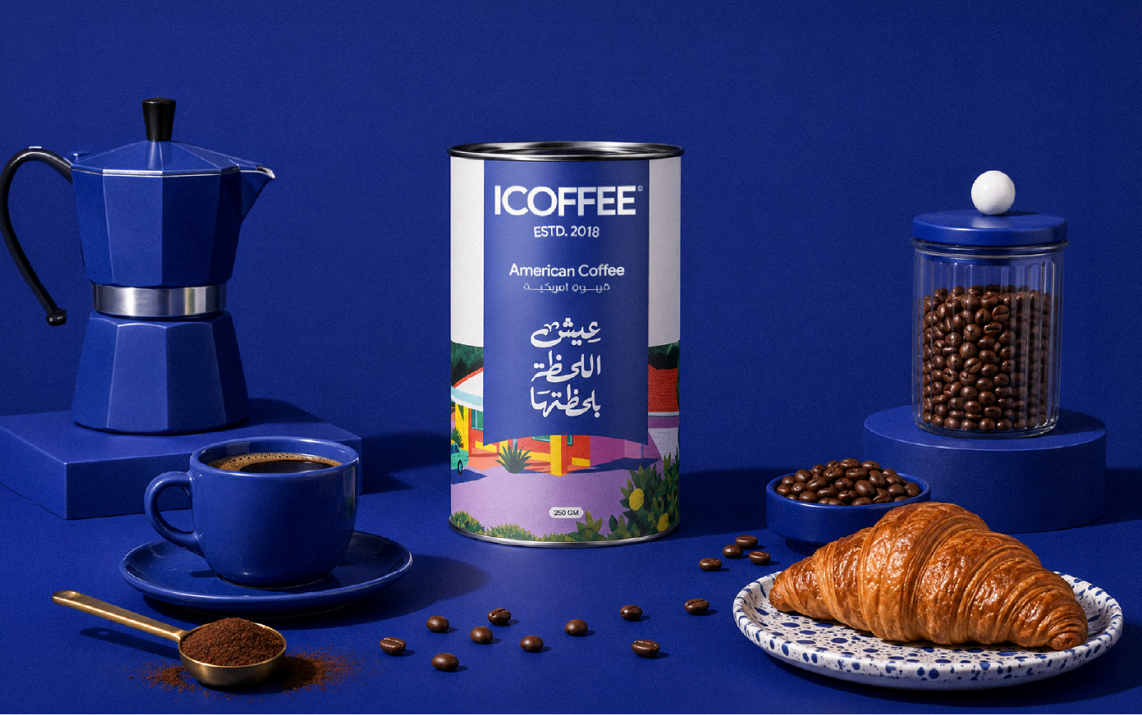
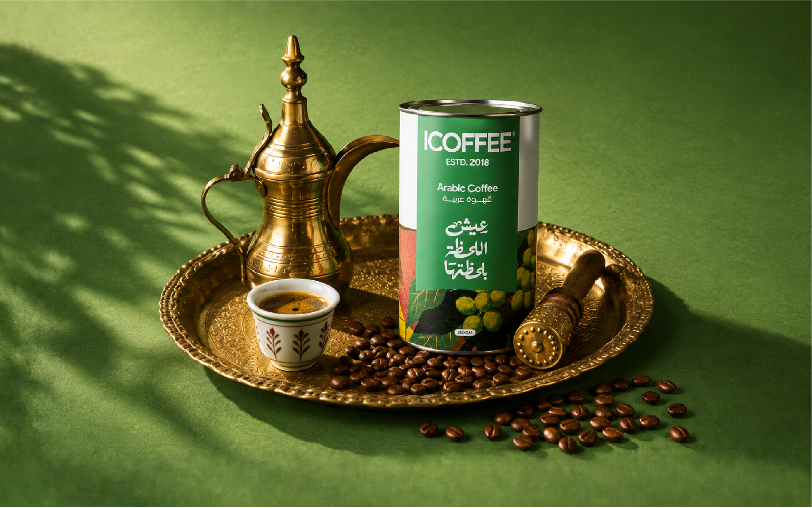
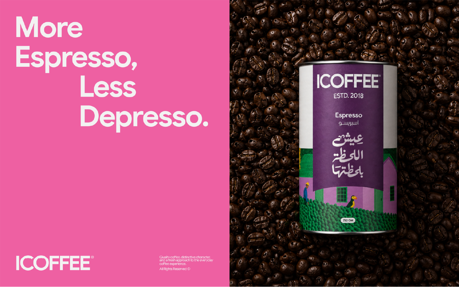
Instead of relying on the traditional visual language of coffee, dark browns, wooden surfaces, beans and rustic café imagery ICOFFEE enters a much more colorful, graphic and contemporary world. The photography combines bold color blocking, direct flash, hard directional light, graphic shadows, playful compositions and tactile human interaction. Products are photographed inside monochromatic environments, fashion-inspired lifestyle scenes and highly art-directed still lifes that make the packaging feel like part of contemporary culture rather than a conventional coffee advertisement. Some compositions are clean and sculptural, while others introduce repetition, unexpected crops and controlled visual chaos. Across both approaches, the packaging always remains the visual hero. A subtle analog character, natural imperfections and tactile textures keep the imagery feeling photographed and human rather than overly polished or CGI.
Packaging System
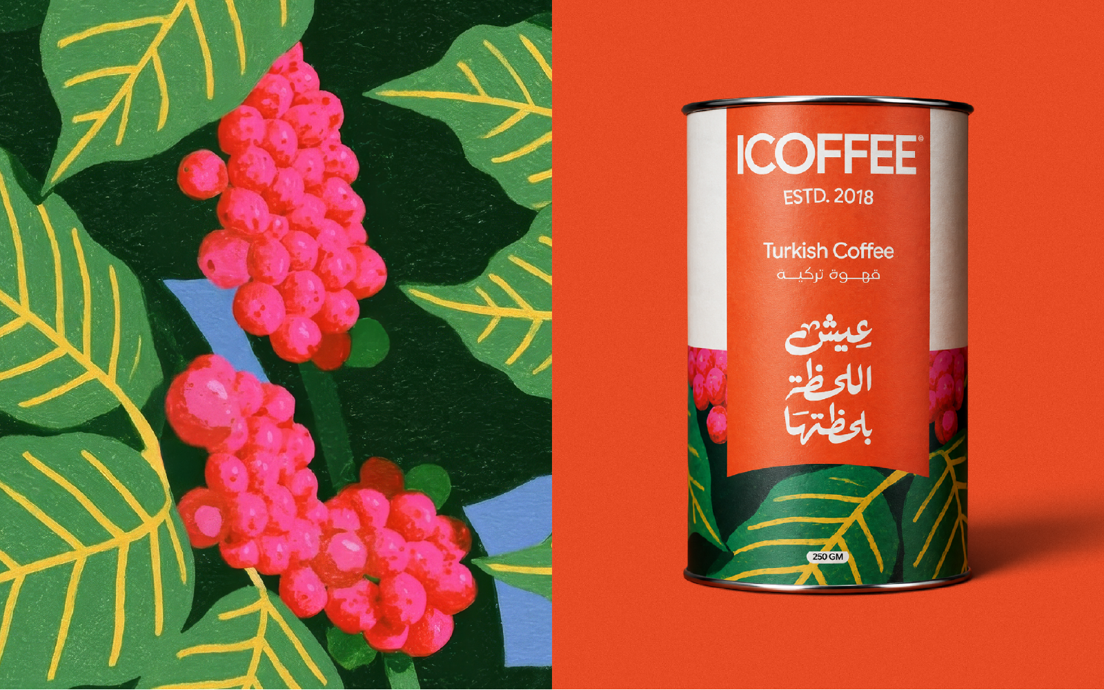
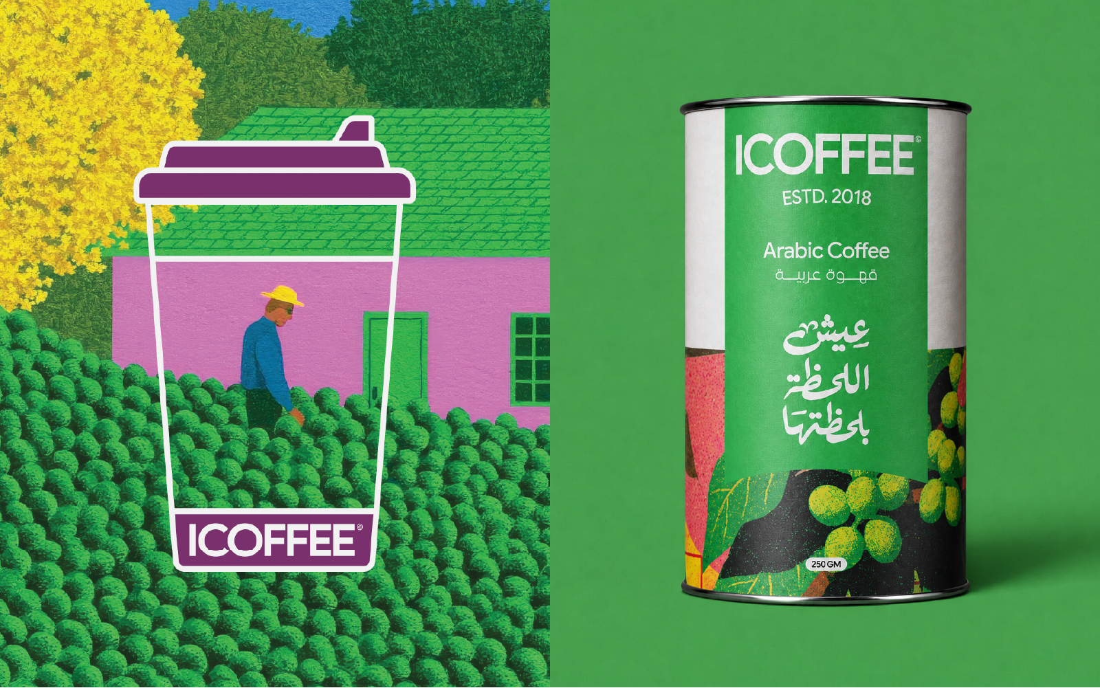
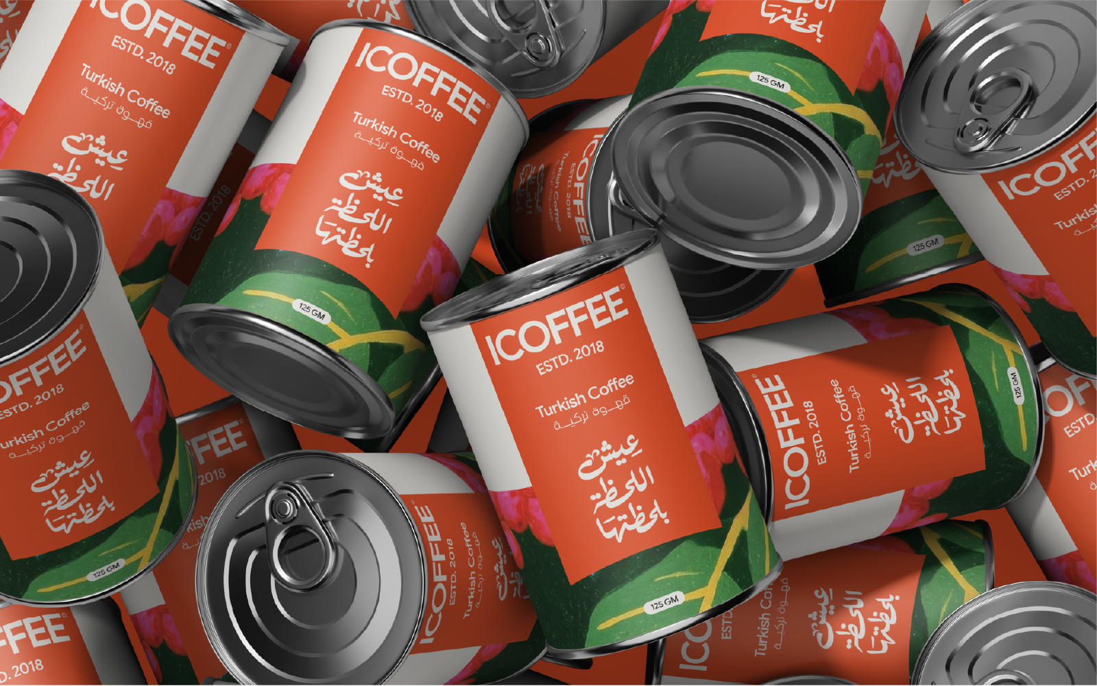
The packaging system was designed to create strong family recognition while giving every coffee type its own personality.
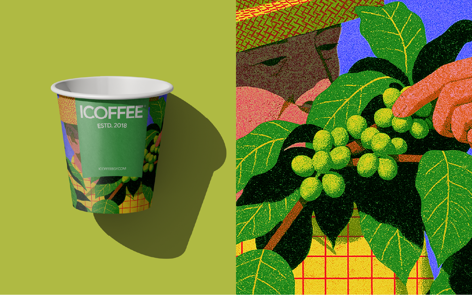
A consistent structural language connects the entire range: the ICOFFEE wordmark, ESTD. 2018, bilingual product naming, expressive Arabic calligraphy, white side panels, metallic can construction and a distinctive central color field. Each coffee variety is then identified through its own bold color and illustrated world, creating immediate differentiation across the range while maintaining a unified shelf presence. The illustrations bring another layer of storytelling to the system. Rather than using predictable coffee imagery, each pack introduces a more expressive visual scene inspired by culture, place and everyday life. The result is a modular packaging system where “Structure creates consistency, Color creates distinction, Illustration creates character.
Together, these elements allow every pack to stand confidently on its own while remaining unmistakably ICOFFEE.






 Derrick Lin
 salutifg
 WeAreDepot
 Manuvila
 Yellow Umbrella Creative
 Toka
Toka Studio Zak
 Atiq Alam
 monther al omari
 Modern Theory
 Sirka Agency
 DESIGN CONCEPTS
 Eva Chistyakova
 Puigdemont Roca
 marianaaworks
 bloomburo
 andreamarinnn
 Alina
Alina Saadmost
 Bruhken
 Maruf Nishat
 Richest Branding Pvt. Ltd.
 Sophiagdotcom
 saifullahmaslool
 Up-Brands