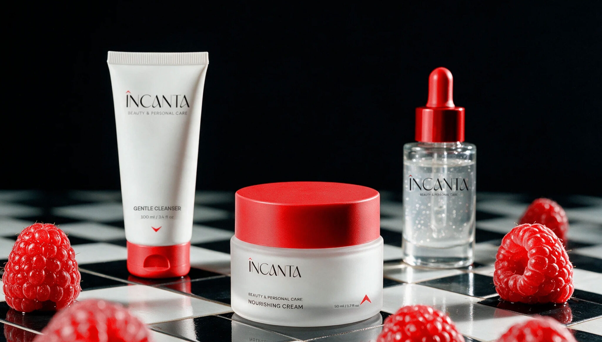

INCANTA — Beauty & Personal Care Concept
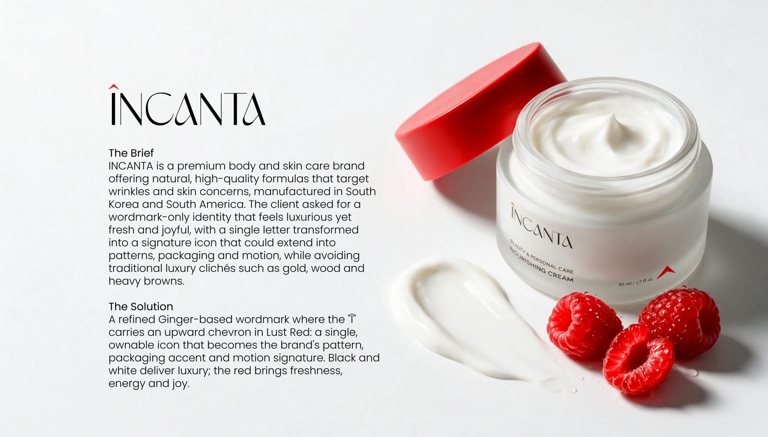
INCANTA is a premium skin and body care brand offering natural, high-quality formulas that target wrinkles and skin concerns, manufactured in South Korea and South America. Its name blends INCA, the ancient civilisation of Peru, with ENCANTO, the Spanish word for charm and enchantment.
The client asked for packaging that feels luxurious yet fresh and joyful, avoiding traditional luxury clichés such as gold, wood and heavy browns, with one letter of the wordmark becoming the brand’s signature.
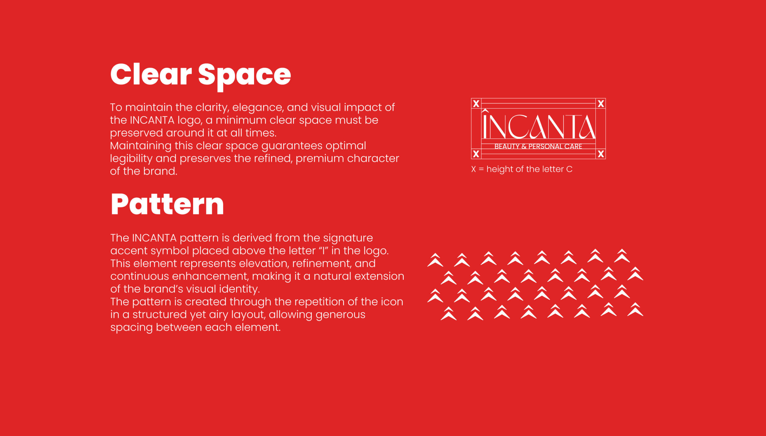
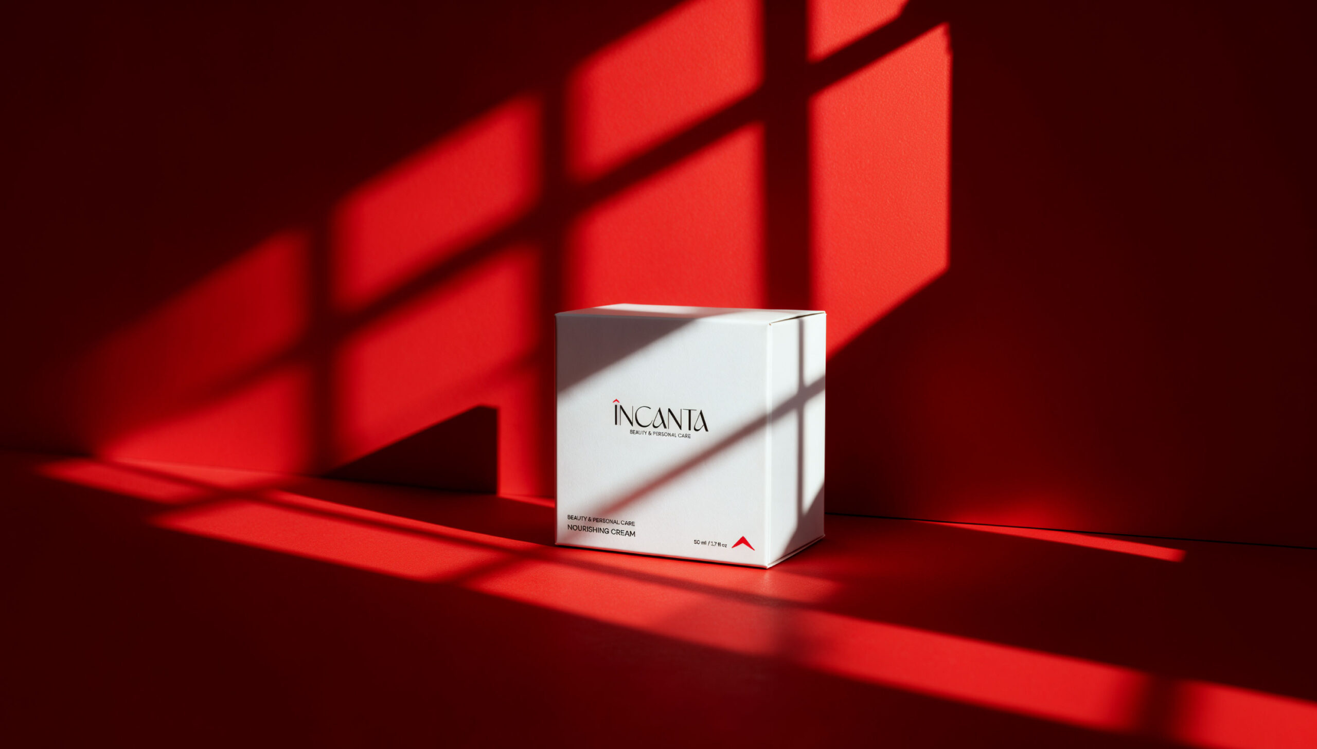
The identity is built on a single detail: an upward chevron above the “Δ in Lust Red (#E02726), symbolising elevation and transformation. On the packaging, that chevron becomes the one recurring accent across the range.
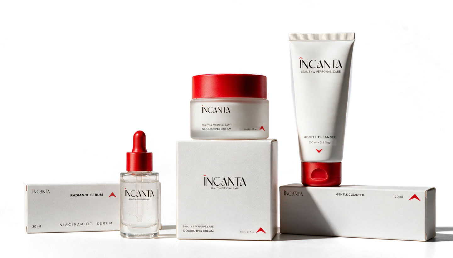
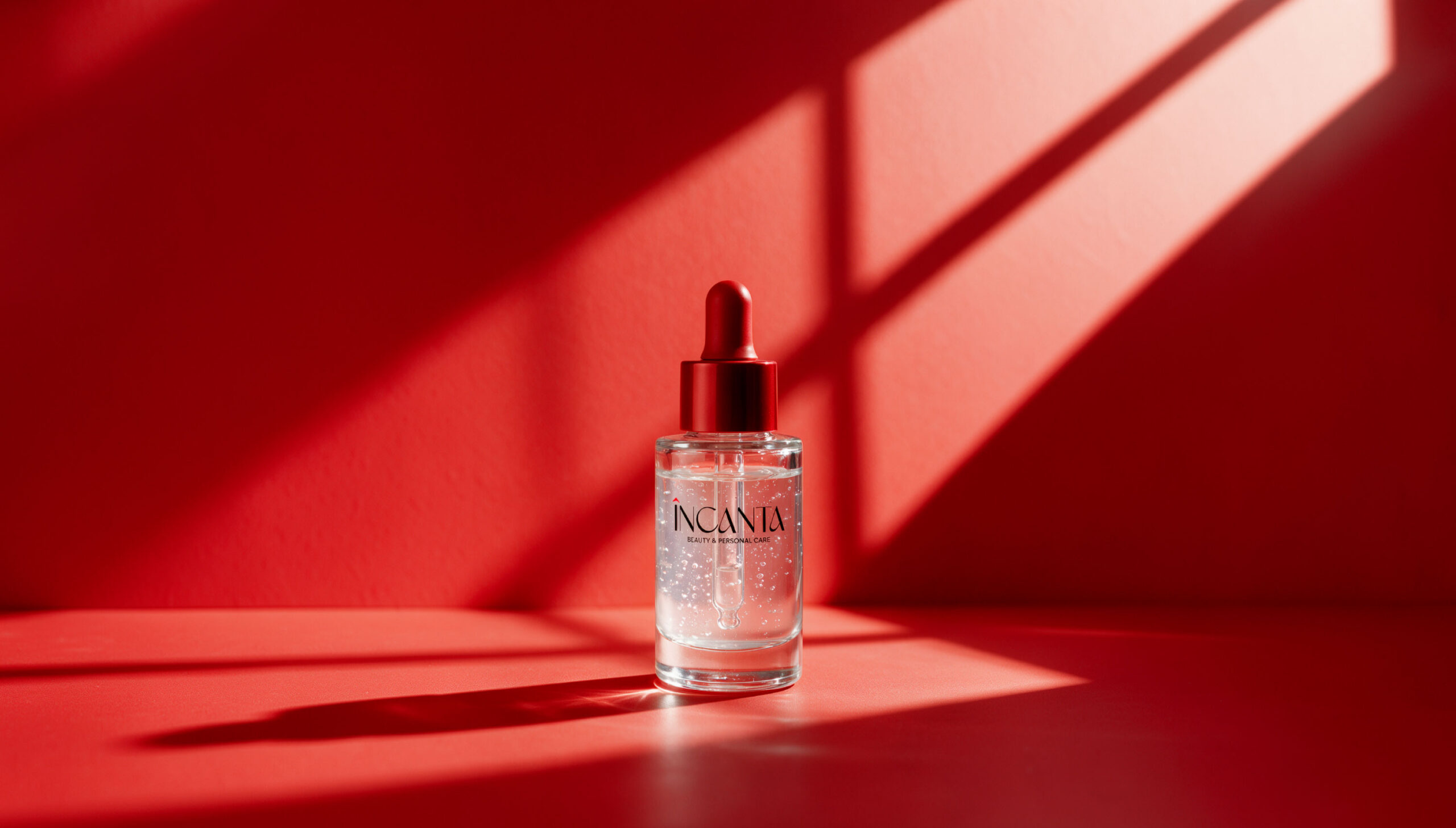
The three products, a Gentle Cleanser, a Nourishing Cream and a Niacinamide Radiance Serum, share a restrained white base with black typography, while red is kept for the caps, lids and the chevron alone. Cartons follow the same logic: clean white surfaces, vertical type on the slim boxes, and the chevron marking each product.
The e-commerce mailer box turns the chevron into a pattern: a solid red exterior with the white wordmark, opening to a patterned interior and a white insert that holds the full routine.
RESULT
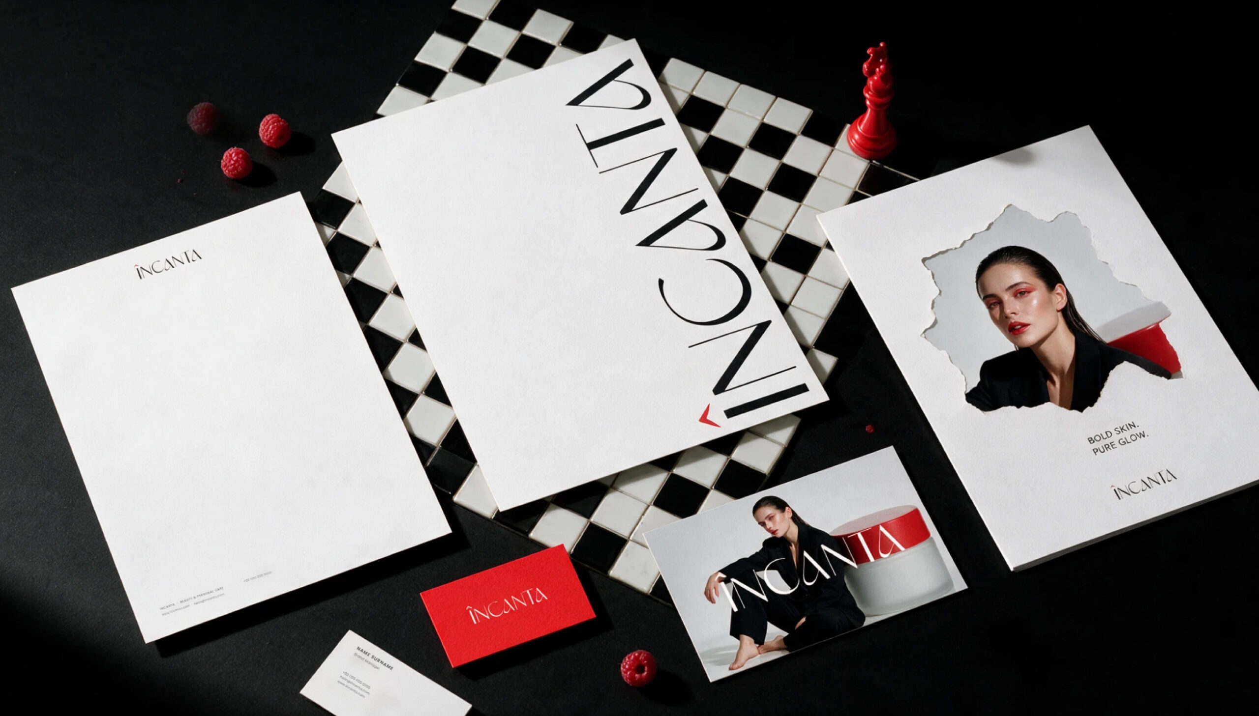
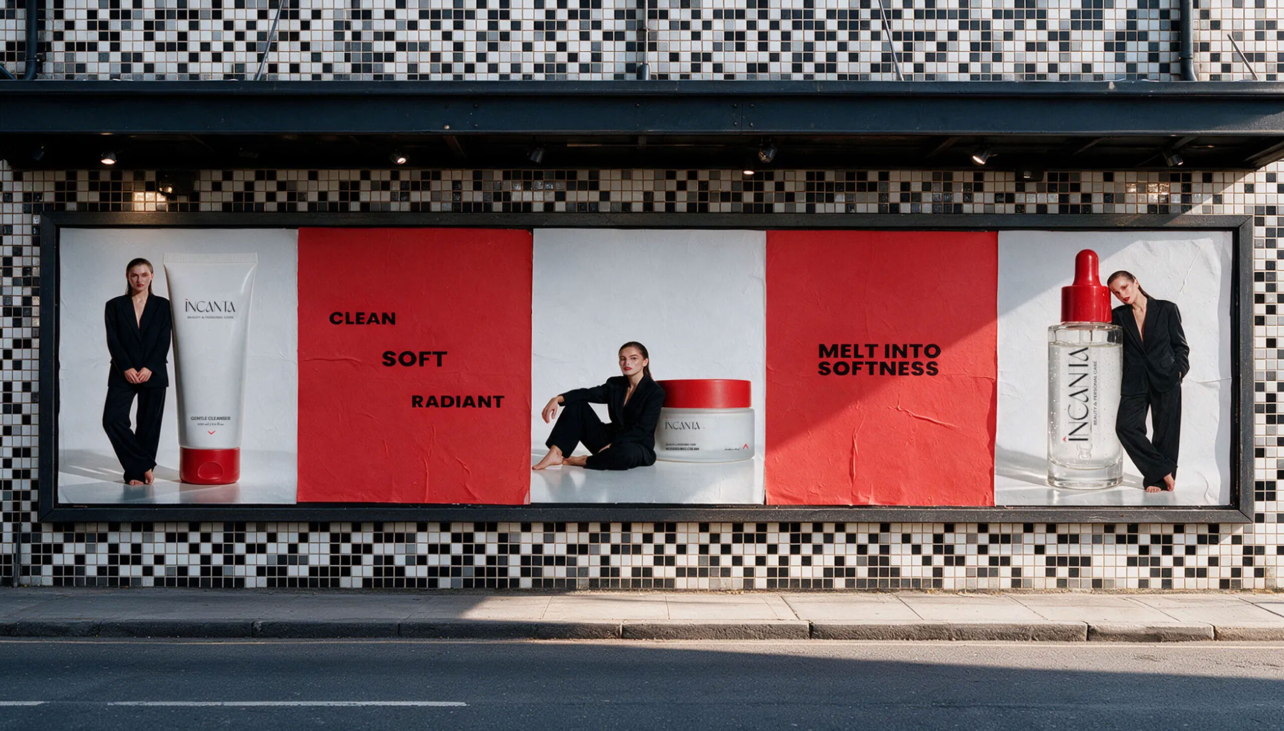
A calm, recognisable system where one red accent carries the brand from shelf to doorstep. The same chevron connects the products, the unboxing, the stationery and the outdoor campaign under the line “INCANTA, for every skin”.
Design: Samar Abdelmonem Studio
Client: Confidintial
Country: United Arab Emirates
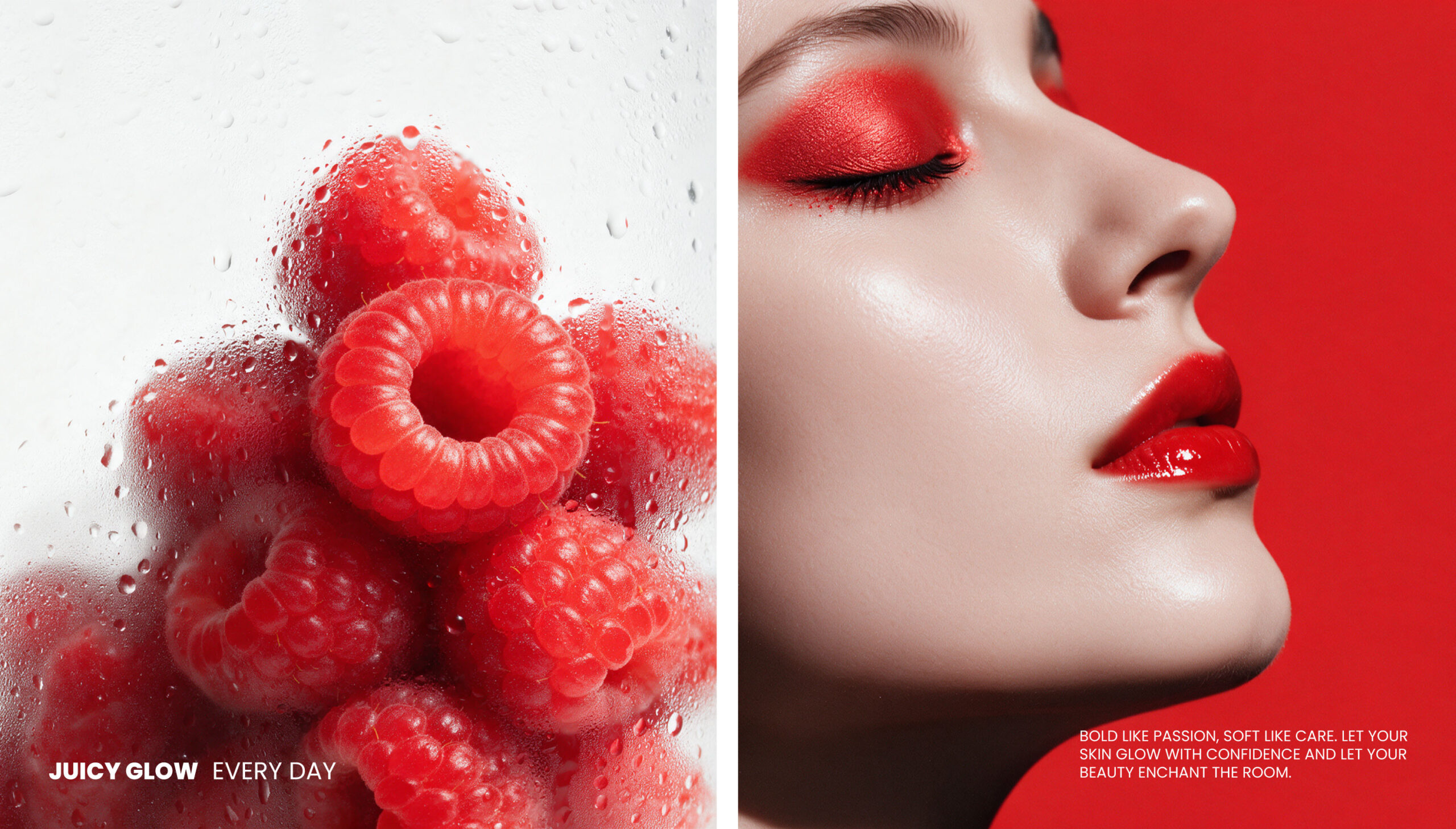
Product and campaign imagery was visualised with AI-assisted tools; the identity, logo and packaging design are by the designer.











 monther al omari
 Ximena Ureta Design Studio.
 vitoramockup
 Up-Brands
 Sophiagdotcom
 Peter said
 ayeidadezigns
 Tancybox
 宏洛图品牌设计HONGLT
 Modern Theory
 Dozen Agency
 Atiq Alam
 Olio Studio
 Ruchi S. Joshi
 mmdesign
 awaiskhadim
 Octasoft
 United Creatives Studio
 Kingdom & Sparrow
 Anastasia Bakhmatskaya
 CreativeWise
 Great and Golden