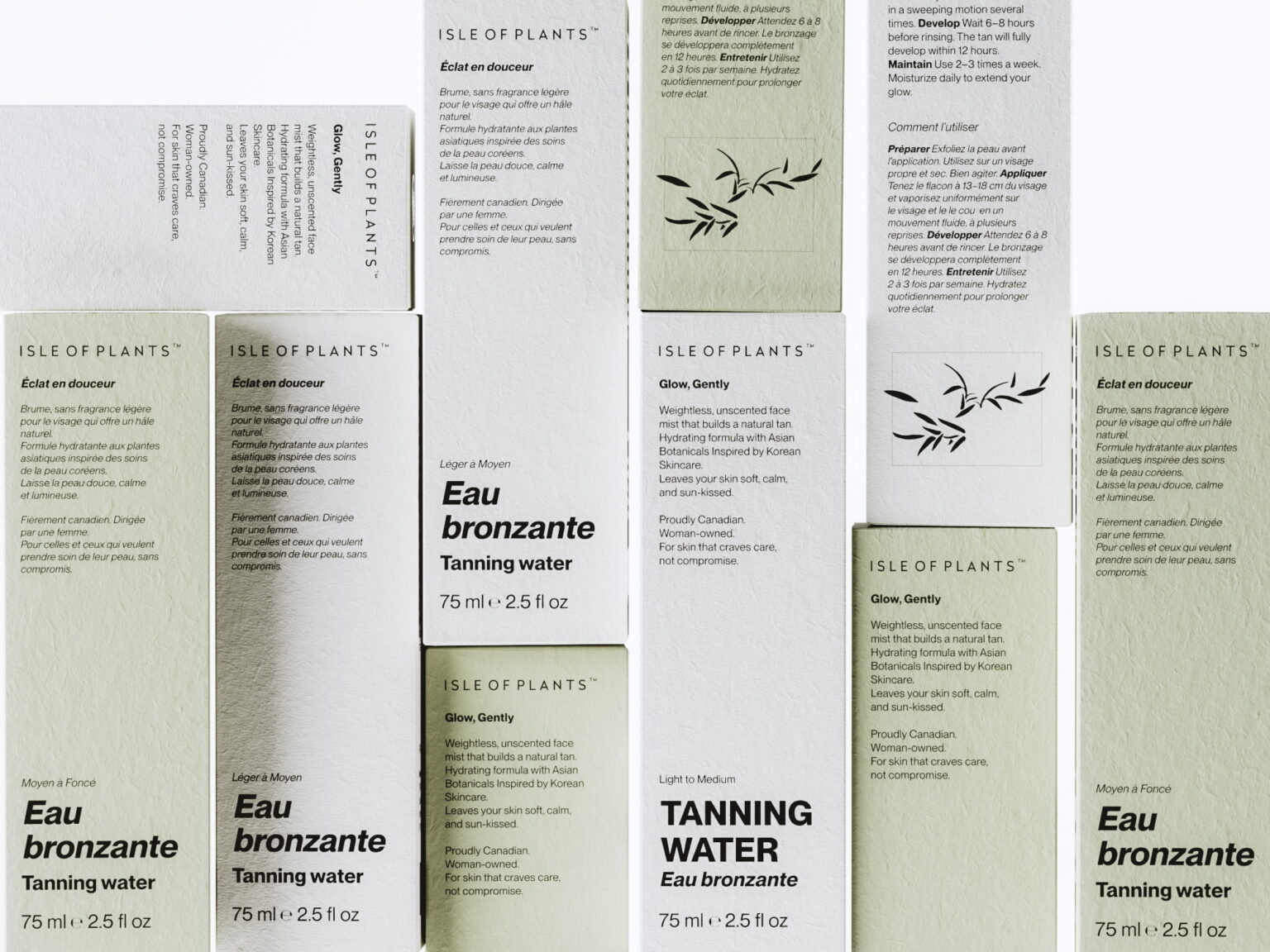

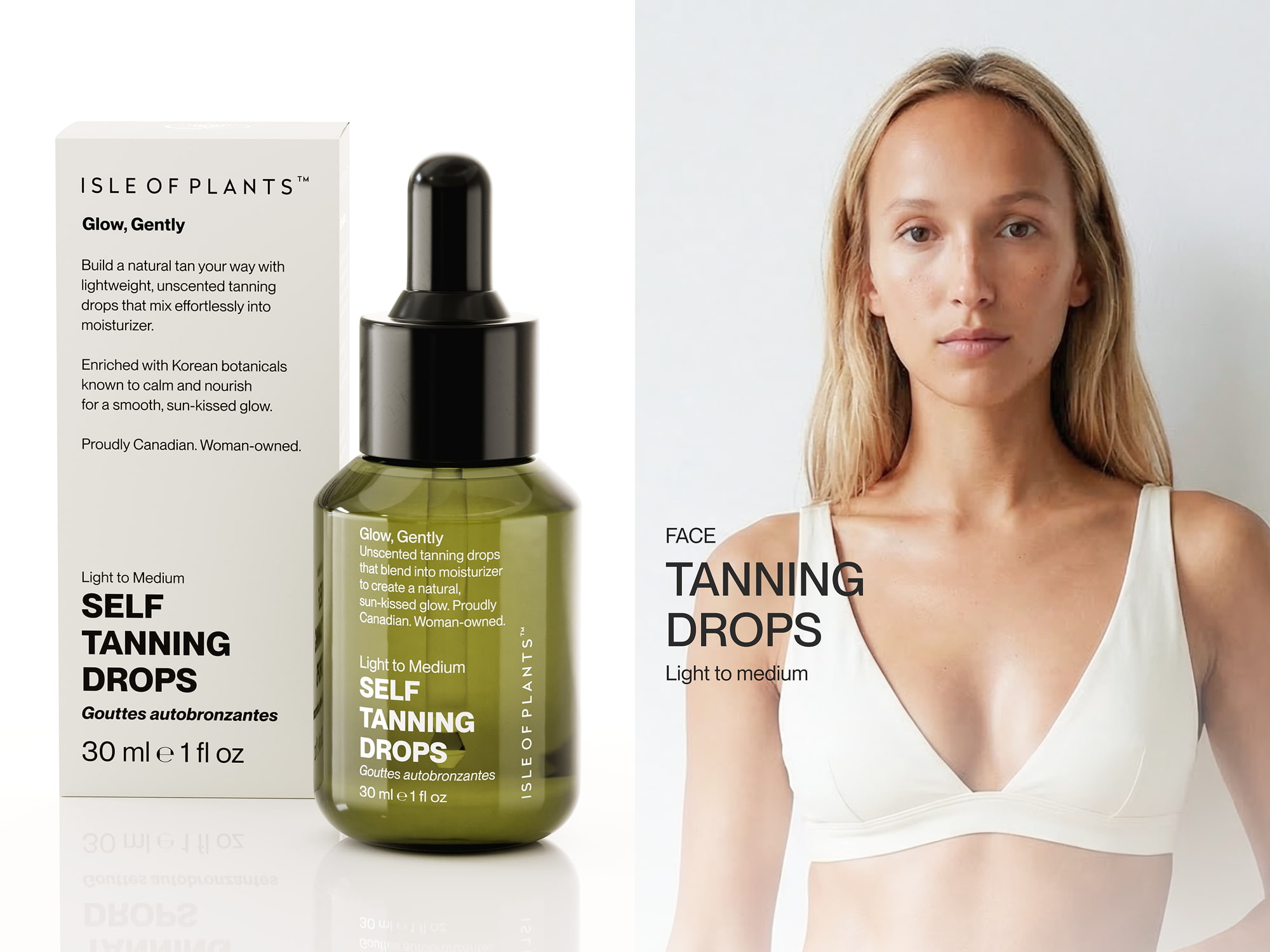
Isle of Plants is a Canadian self-tanning brand from Quebec with a skin-first approach and formulas enriched with Korean botanicals. The brief was to bring self-tan into the visual world of everyday skincare, moving away from the bronze and orange palette familiar to the category. Olive-green bottles, off-white cartons, and muted green cartons create a quieter alternative, with the two carton colors distinguishing Light to Medium from Medium to Dark.
The Map Is the Pattern.
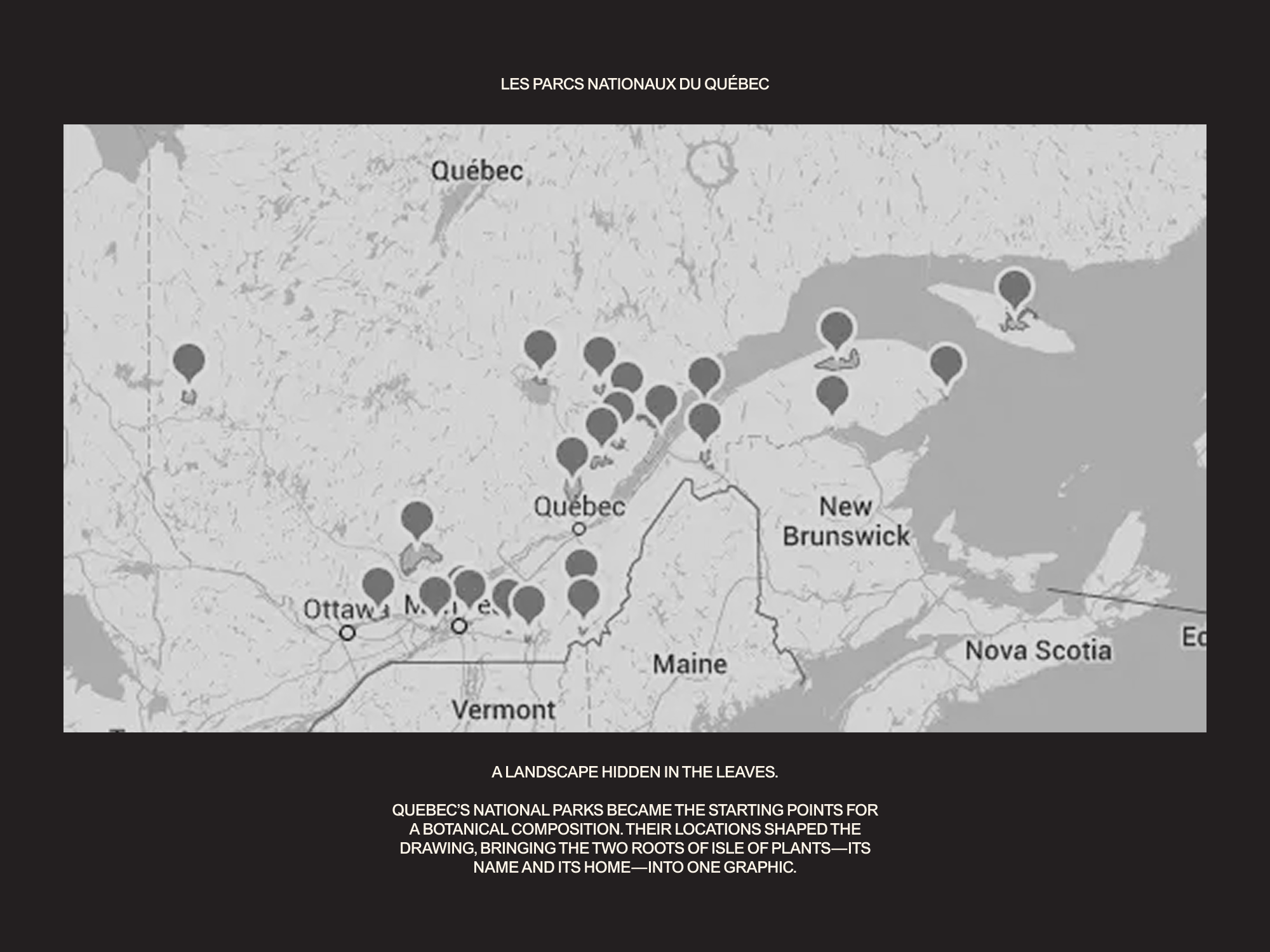
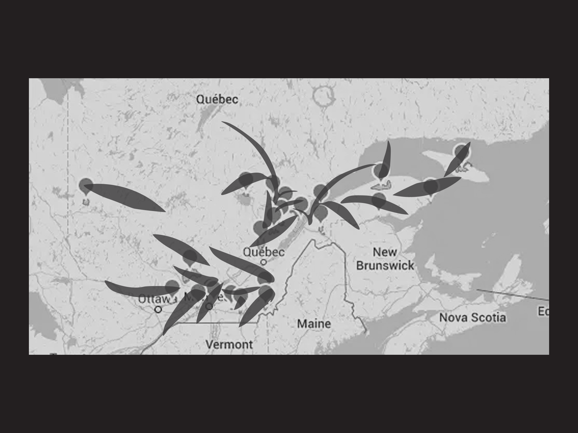
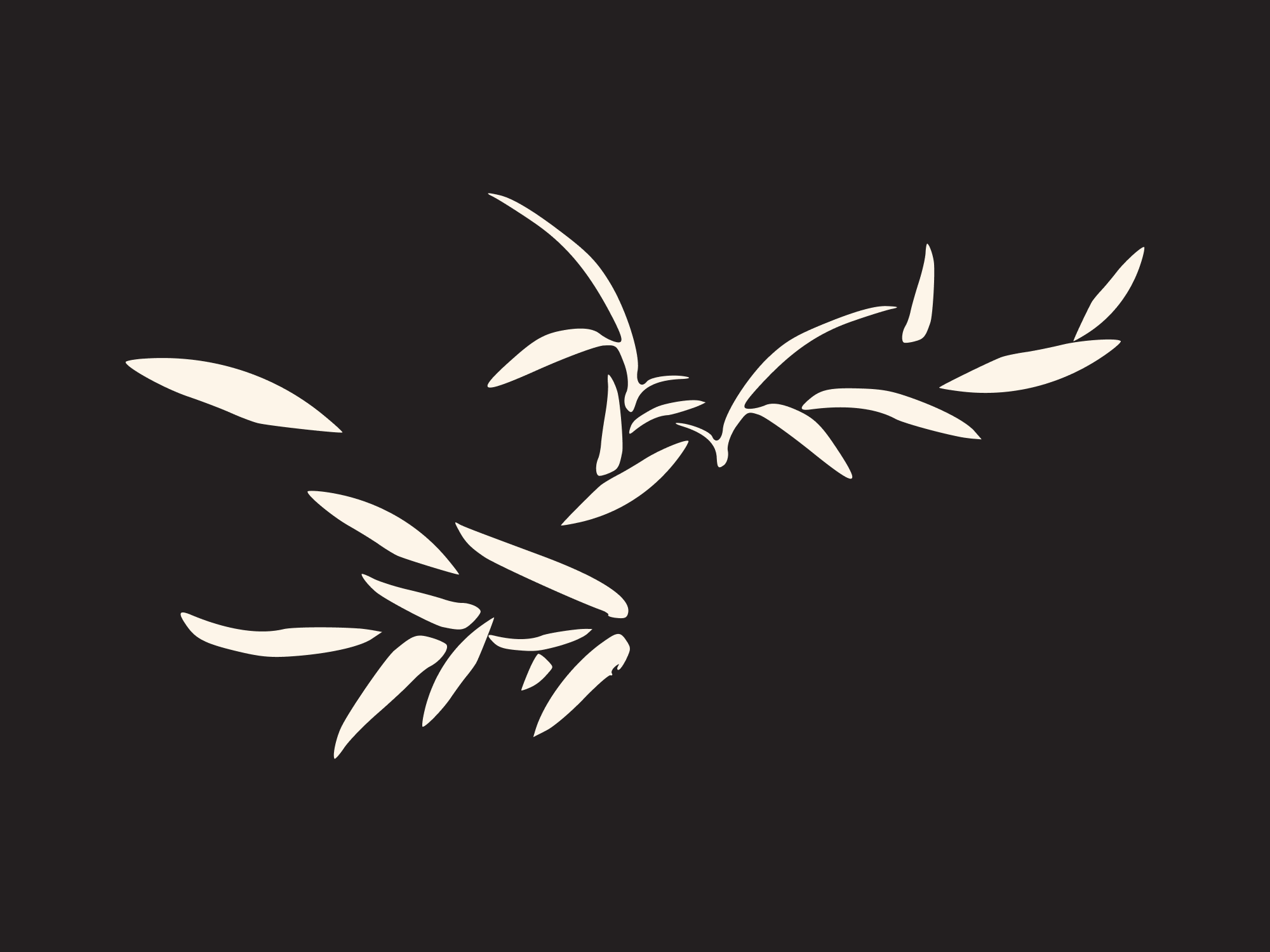
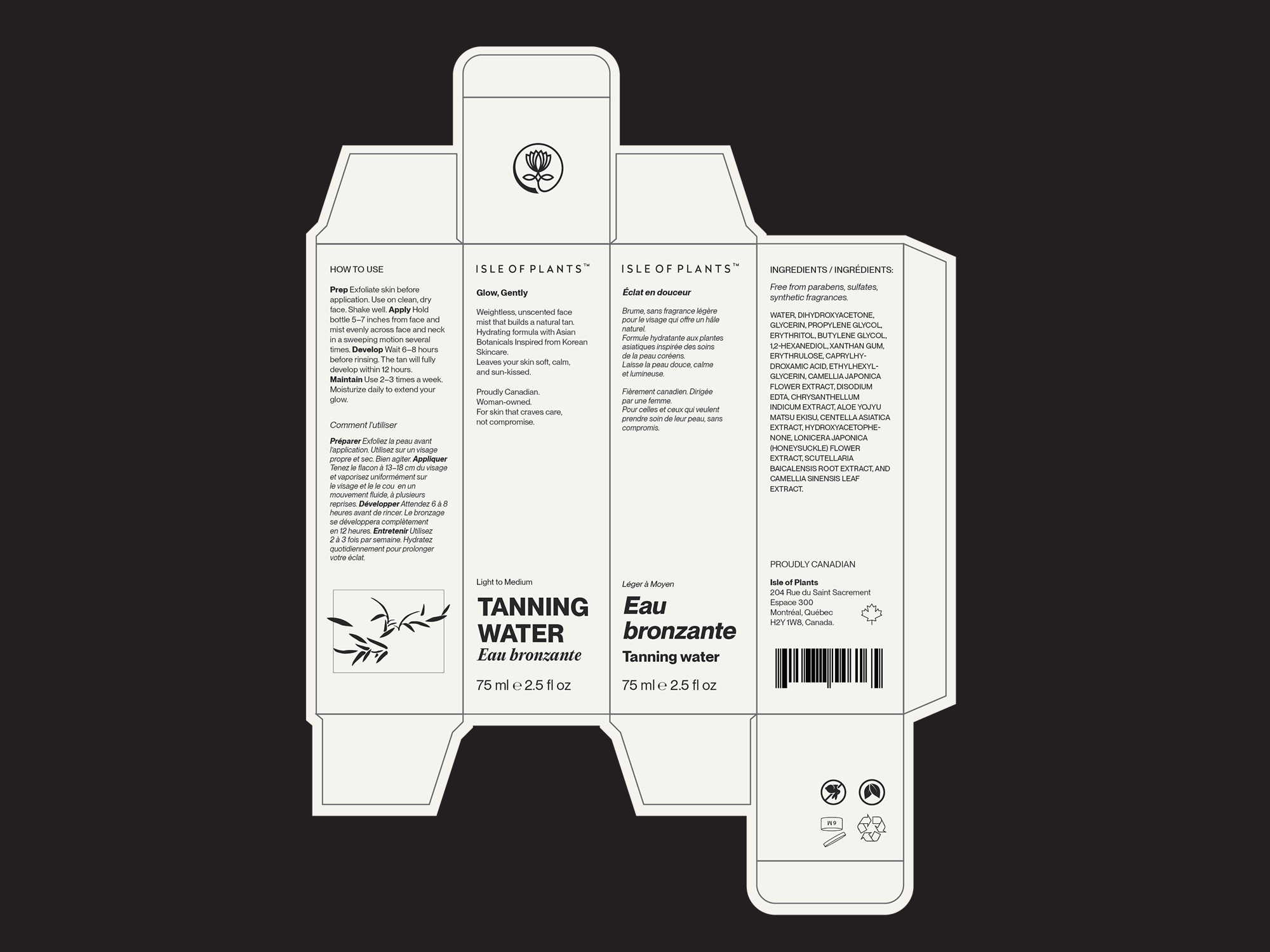
The botanical drawing began with a map of Quebec’s national parks and nature reserves. Their locations became anchors for a composition of leaves and stems: a piece of the province’s geography hidden in the foliage. The graphic brings the two parts of the brand’s story—plants and place—together on the packaging.
Two Languages. Equal Visual Weight.
The cartons have two fronts: one English, one French. Both panels carry the same visual weight, allowing either language to face the customer. Bold upright English type and expressive French italics give each side its own rhythm within a shared layout.
A Type Choice Close to Home.
PP Neue Montreal by Pangram Pangram adds another reference to the brand’s Quebec roots. The connection is carried through typography as well as imagery—a reference to Montreal alongside a botanical drawing shaped by the province’s landscape.
E-Commerce and Launch Imagery.
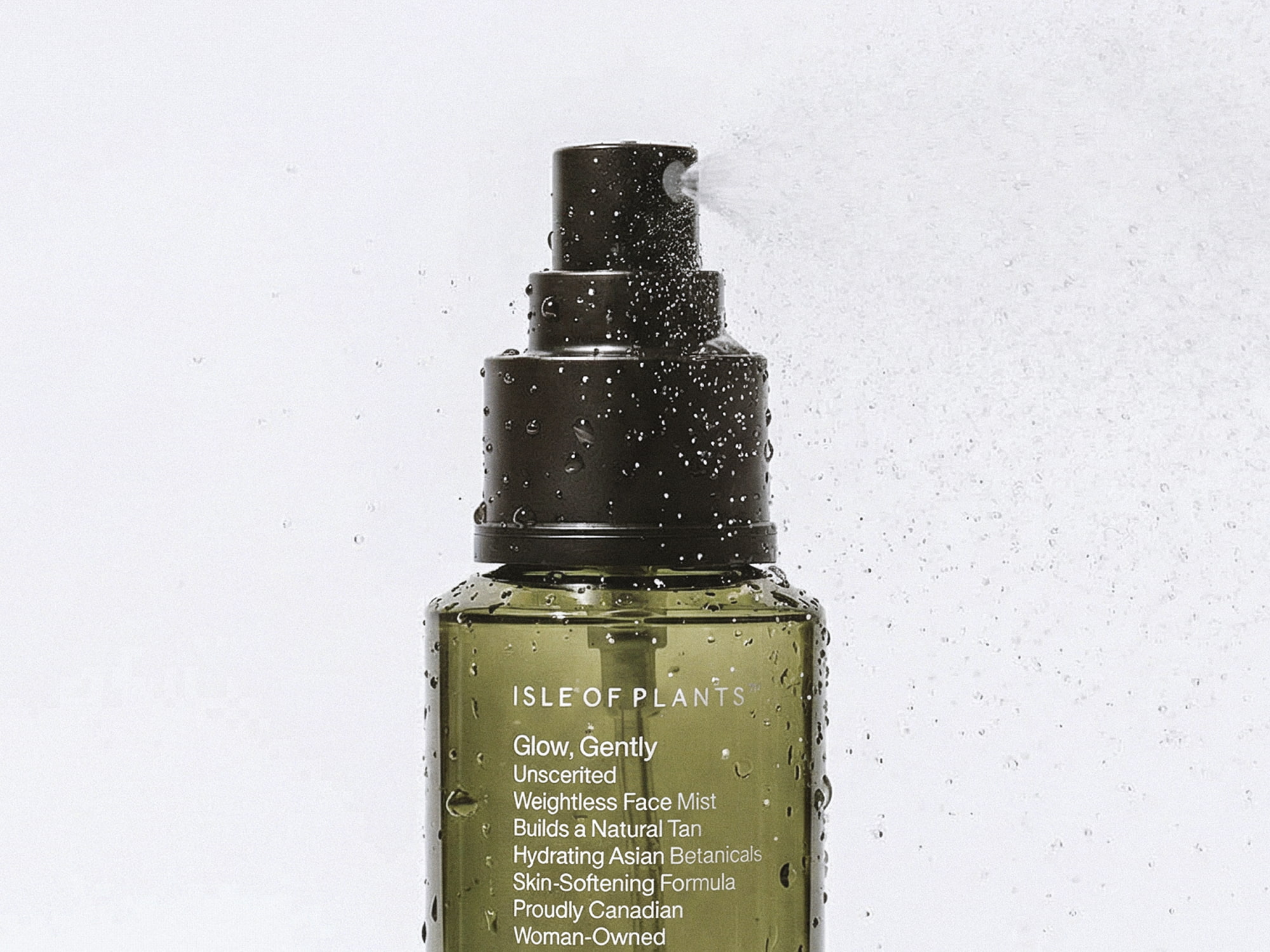
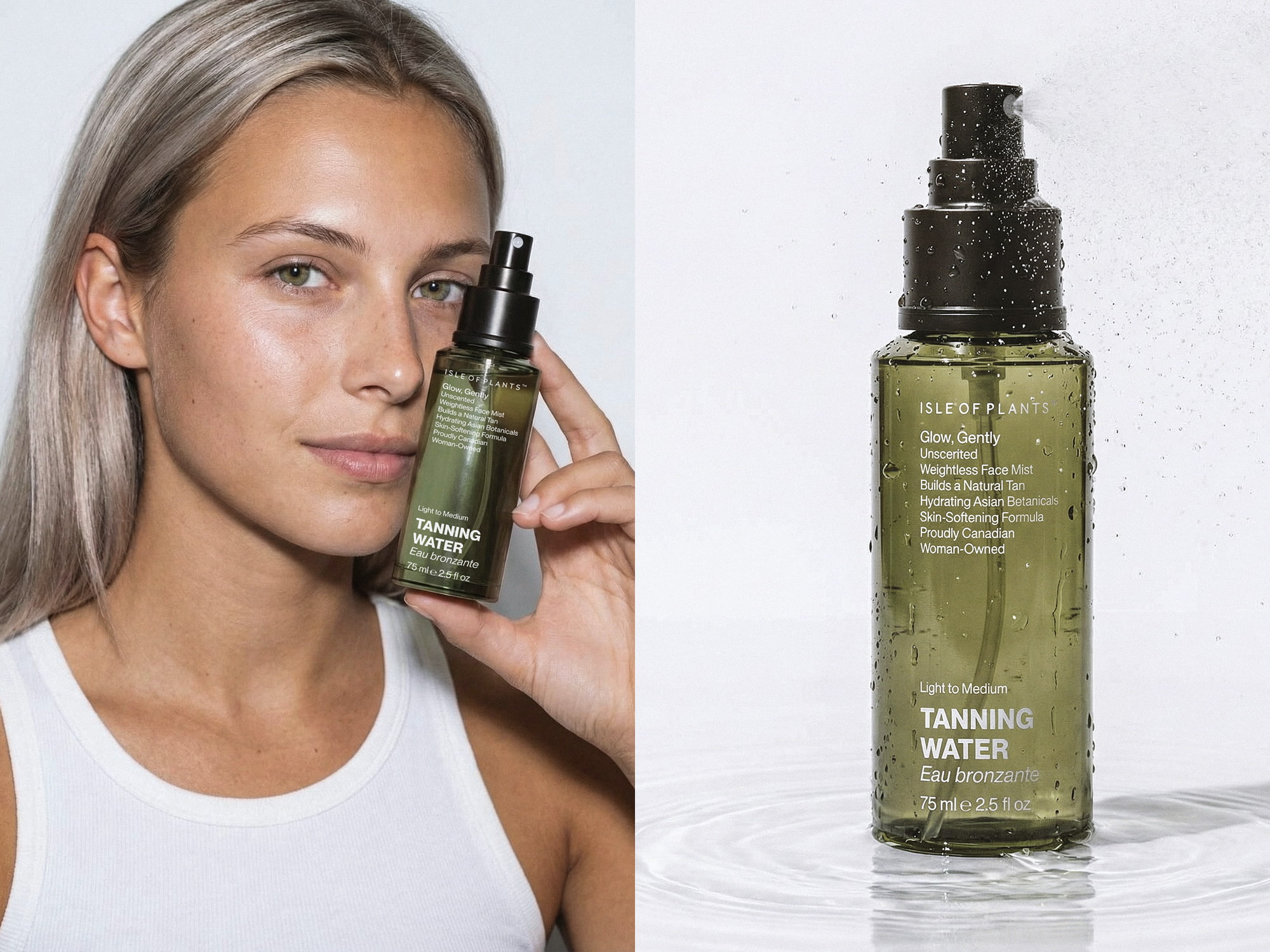
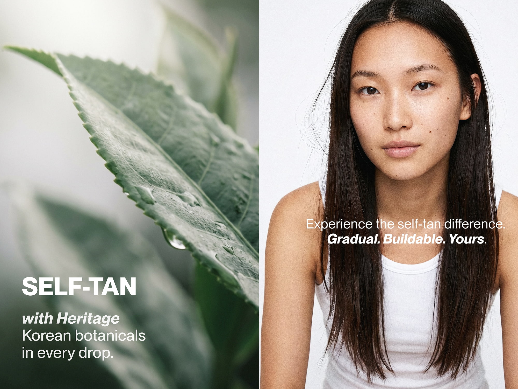
An online launch was planned from the outset, so the project extended beyond packaging into 3D product imagery and e-commerce content. Daylight, visible skin texture, and botanical details bring warmth to the restrained design, placing self-tan among the products used to care for skin every day.
 ANONIMA/
 Armoder Arte y Diseño
 eimanbeh
 Biaa
 Hartson Creative
 Karen Danielyan
 AUN BRANDS
 Studio Zak
 Hey Joe Studio
 Blue.labs
 Jasmine Tsan
 Atiq Alam
 Modern Theory
 Tancybox
 Artrime Graphic Design
 WhiteWarblerCo
 Simple Studio
 M&A CREATIVE AGENCY
 monther al omari
 Husain Studio
 JDO
 INTSIGN
 Agence des Coteaux
 Yaniv Vaknin