

Rieger & Co. was founded in Kansas City in 1887 and grew into one of the most significant whiskey operations in the United States before Prohibition brought it to a halt. When the brand returned, the question was not how to modernise it. The question was how to build something worthy of what it had been.
The previous packaging relied on a stock bottle shared across competing labels. It offered no structural claim, no shelf presence, and no connection to the brand’s own history. That gap demanded more than a visual update.
The process began in the archive. By studying the range of bottles J. Rieger & Co. used throughout its early years, the project recovered something more useful than aesthetics: the underlying logic of those objects, their proportions, their weight, their sense of occasion. That logic informed every decision in the new structure.
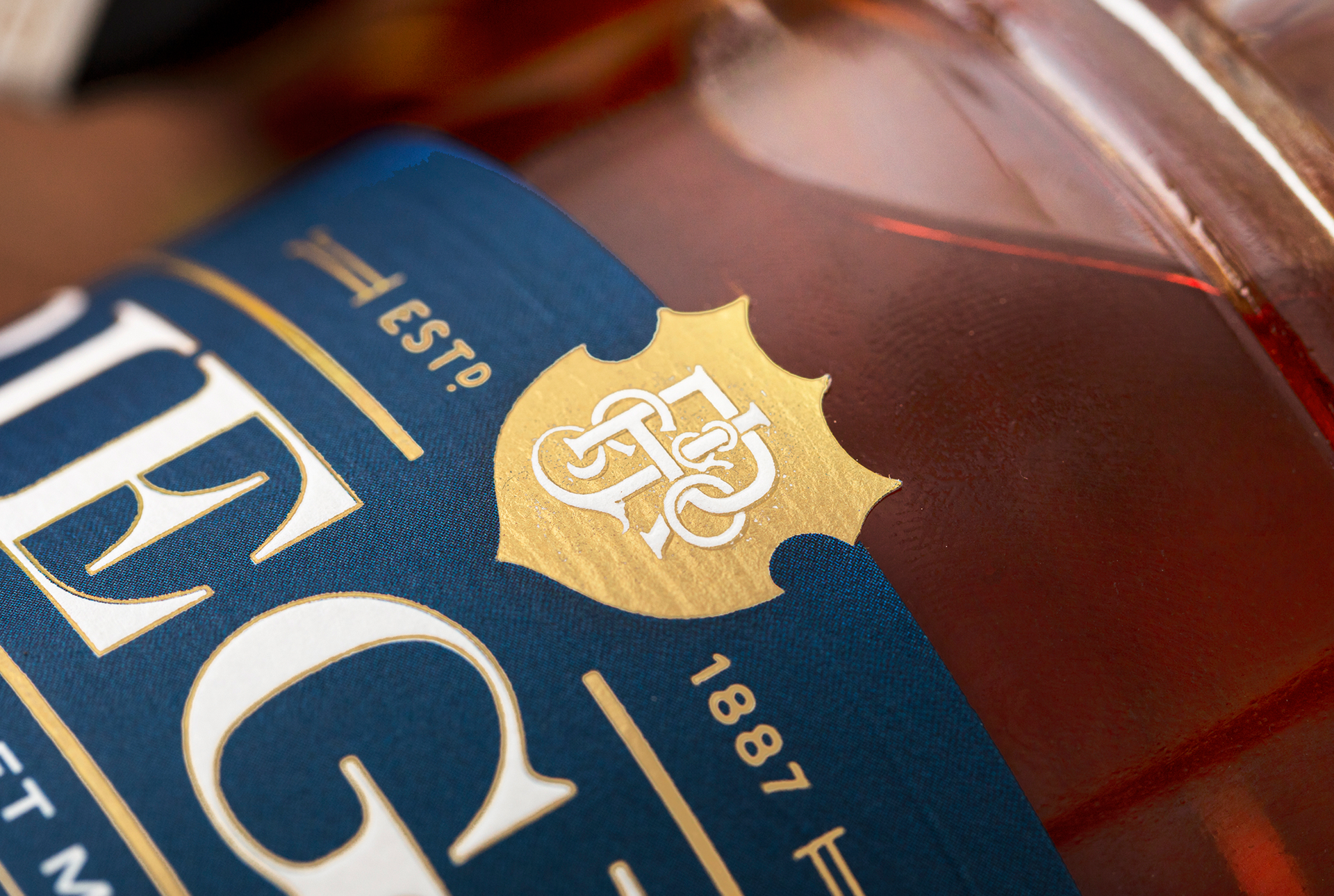
The resulting bottle belongs to no one else. A custom silhouette built to carry the brand’s gravity without referencing it literally. Alongside it, a redesigned label system brings coherence to the current expressions and leaves room for the portfolio to grow.
This was not a project about updating a look. It was about building a vessel that a brand with a century of history, and another century ahead, could actually stand behind.


 Lisa Pokrovskaya
 Simple Studio
 Studio Unbound
 David Byerlee
 M&A CREATIVE AGENCY
 alchimistestudioParis
 monther al omari
 Studio Be Design
 LogoSayLove
 agenciabud
 Shustova p
 mutta
mutta @Allenarts13
 Sirka Agency
 Atiq Alam
 Dozen Agency
 j.substance
 SCD
SCD Cristian Lepore | crilep Copia
 Chris Creative Works