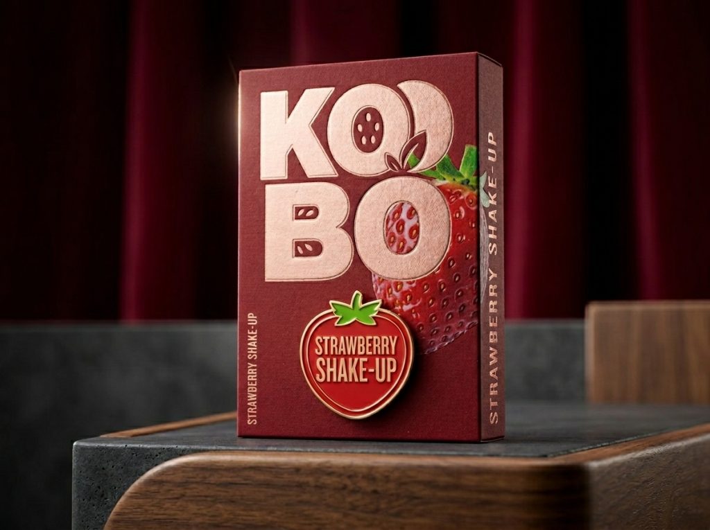

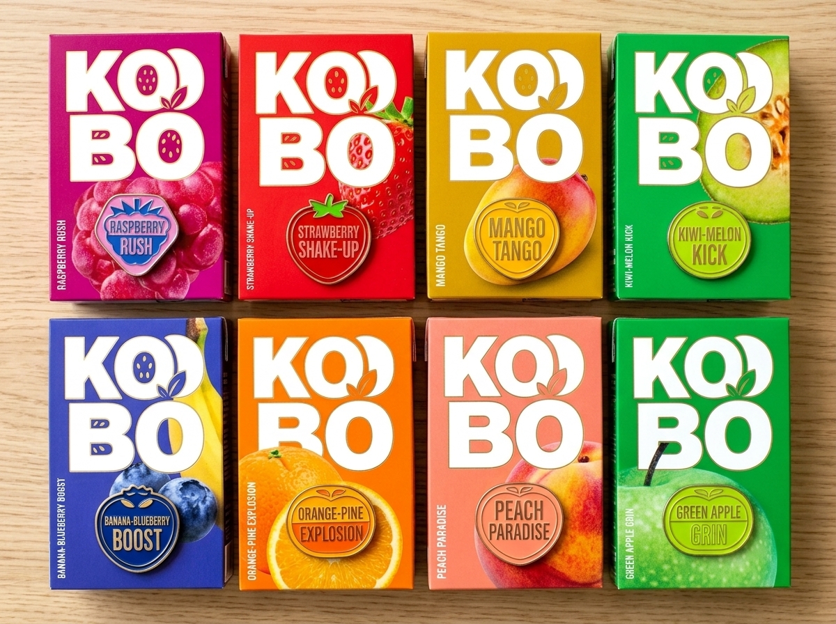
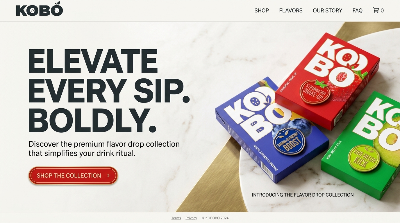
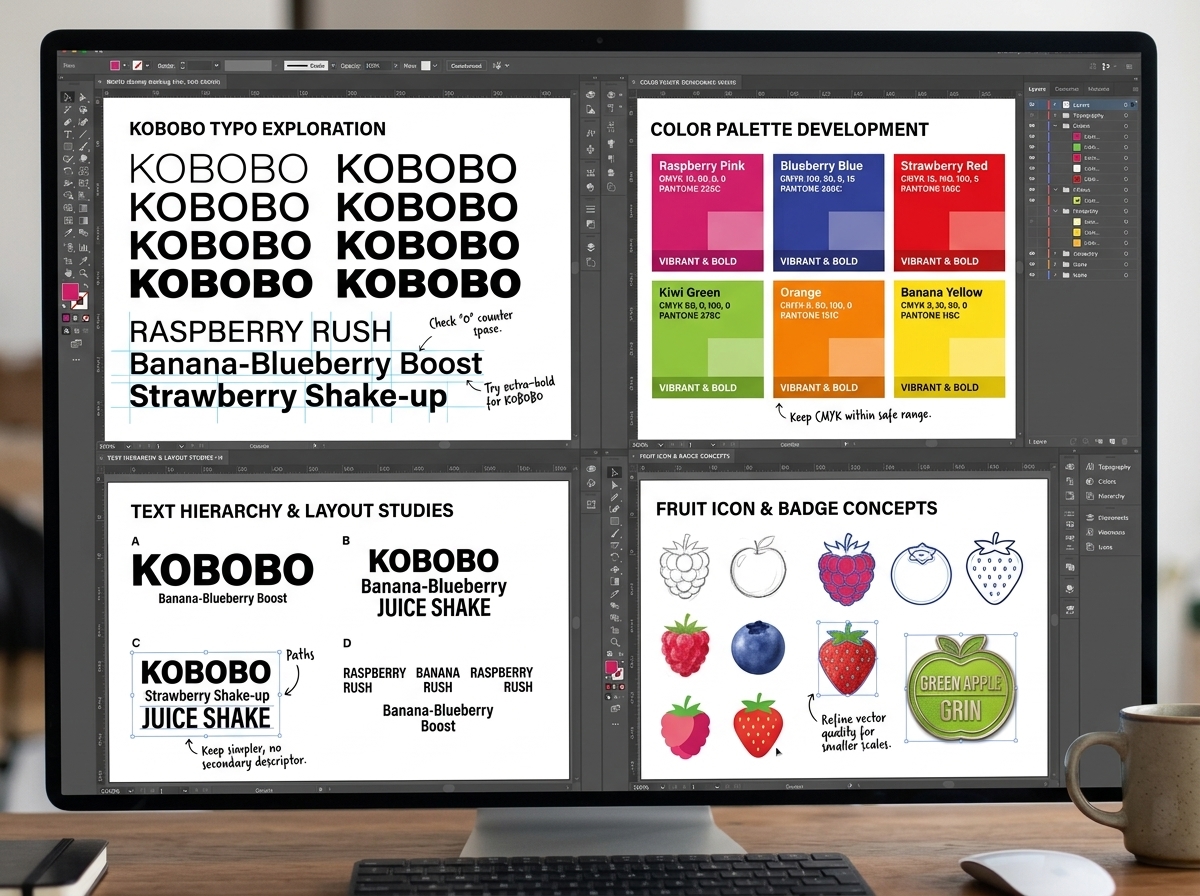
KOBO is a vibrant fruit beverage packaging concept designed to maximize shelf visibility through bold typography, expressive color, and flavor-led storytelling. The identity places the brand name at the center of the experience, using oversized letterforms and fruit-inspired graphics to create immediate recognition across the range. Each flavor is distinguished through a unique color palette and illustrative fruit cues while maintaining a consistent packaging architecture. Inspired by contemporary beverage brands and pop-inspired graphic design, the system balances energy, clarity, and memorability. The result is a highly scalable packaging platform that transforms everyday fruit drinks into a distinctive, personality-driven consumer brand.







 Derrick Lin
 Biaa
Biaa Petitmoulin Studio
 White Bear Studio
 Eva Chistyakova
 monther al omari
 Atipus
 alchimistestudioParis
 oneandother
 bloomburo
 helocrene
 Shapers Studio
 Denver Design
 Aidearte
 andrew.huerta
 softmachine
 airobtq
 Buzz & Co.
 Ruby
Ruby themythographer
 IDNB Inc.
 viktorflr
 Zenpack